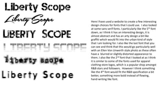
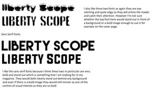
The document discusses font choices for a magazine. The author likes the 5th font as it has an abstract, arty, graffiti-like style fitting their urban theme. They also like the last font for its blurred, distorted look suiting Ellen Von Unwerth photos. While the 2nd font resembles apparel store logos popular with R&B stars, the 4th bold font better fits the R&B specification. The author prefers sans serif fonts for their bold, eye-catching style that stands out from backgrounds and images, though questions if the top font does so enough for a cover page.