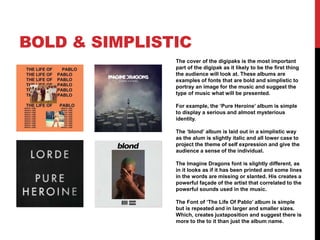
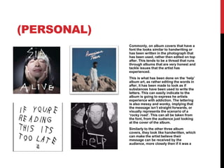
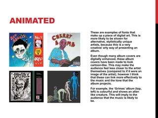
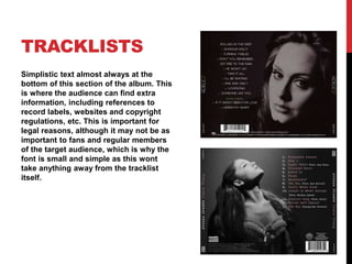
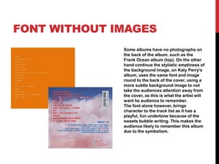
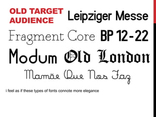
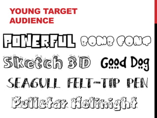
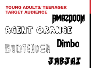
The document discusses font choices for album covers and how they portray the music's style and themes. It provides examples of fonts for different genres and target audiences. Bold, simplistic fonts are best for digipaks to draw attention. Handwritten fonts on albums tackling personal issues imply honesty. Cartoon-like, animated fonts suit creative artists by linking to their music's tone in an artistic way. Tracklist fonts are small and simple as extra text is less important. Fonts should correlate with the image and target audience's expected age and gender.