SlideShare a Scribd company logo
In what ways does your media product
use, develop or challenge forms and
conventions of real media products?
Introduction:
For my print production, I aimed to create a subtle, yet noticeable, link between my music
video and the print productions. In terms of the genre compliance, I think my print
productions keep intact with the genre of my music video. For inspiration I used the
minimalistic art movement to help project the ideologies behind my print productions.
Another key theme to my print productions was the theme of creating identity. I wanted to
create print productions that would implant the whole artist, into the minds of the
audience, not just the name.
Narrative and representation:
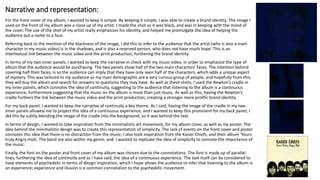
For the front cover of my album, I wanted to keep it simple. By keeping it simple, I was able to create a brand identity. The image I
used on the front of my album was a close up of my artist. I made the shot so it was black, and was in keeping with the mood of
the cover. The use of the shot of my artist really emphasizes his identity, and helped me promulgate the idea of helping the
audience put a name to a face.
Referring back to the mention of the blackness of the image, I did this to infer to the audience that the artist (who is also a main
character in my music video) is in the shadows, and is also a reserved person, who does not have much hope. This is an
intertextual link between the music video and the print production, furthering the brand identity.
In terms of my two inner panels, I wanted to keep the narrative in check with my music video, in order to emphasize the type of
album that the audience would be purchasing. The two panels show half of the two main characters’ faces. The intention behind
covering half their faces, is so the audience can imply that they have only seen half of the characters, which adds a unique aspect
of mystery. This was tailored to my audience as my main demographic are a very curious group of people, and hopefully from this;
they will buy the album and search for answers to questions they may have. As well as these shots, I used the Newton’s cradle in
my inner panels, which connotes the idea of continuity, suggesting to the audience that listening to the album is a continuous
experience, furthermore suggesting that the music on the album is more than just music. As well as this, having the Newton’s
cradle furthers the link between the music video and the print production, creating a stronger more prolific brand identity.
For my back panel, I wanted to keep the narrative of continuity a key theme. As I said, having the image of the cradle in my two
inner panels allowed me to project this idea of a continuous experience, and I wanted to keep this prominent for my back panel; I
did this by subtly blending the image of the cradle into the background, so it was behind the text.
In terms of design, I wanted to take inspiration from the minimalistic art movement, for my album cover, as well as my poster. The
idea behind the minimalistic design was to create this representation of simplicity. The lack of events on the front cover and poster
connotes this idea that there is no distraction from the music, I also took inspiration from the Kaiser Chiefs, and their album ‘Yours
truly Angry mob’. The band are also within my genre, and. I wanted to replicate the idea of simplicity to connote the importance of
the music.
Finally, the font on the poster and front cover of my album was chosen due to the connotations. The font is made up of parallel
lines, furthering the idea of continuity and as I have said, the idea of a continuous experience. The text itself can be considered to
have elements of psychedelic in terms of design inspiration, which I hope allows the audience to infer that listening to the album is
an experience; experience and illusion is a common connotation to the psychedelic movement.
Mise-en-scene:
In terms of the setting, I made sure that I cut out any potential inferences of where the photos could
have been taking. I removed any background from all the images I used in my production to create an
element of mystery. But also to draw attention to the artist, which furthers my intention of creating a
brand identity, and as I’ve said multiple times, putting a name to a face.
The only prop that I used was the newton's cradle. In my analysis of the music video I talked about how
the cradle has multiple connotations, however they don’t all apply to the connotations I was aiming to
project in my print production. The connotation I wanted to essentially copy and paste was the idea of
continuity. In the last side I talked about how the continuity comes from me wanting my audience to
know that listening to the album is more than just listening to music, but instead its an experience, one
that they will have continuously. I had these images on the inside and back panels of my album, but not
on my album cover and poster. The reason being that I wanted to prioritize brand identity for my artist,
over this intertextual reference.
Within the bracket of mise-en-scene, direct mode of address is an important part of my print
productions. For the front cover of my album and poster, I wanted to create a sense easiness. The centre
of attention of the two print productions is the close up shot of my artist. For me personally, it was vital
that the audience and the artist are not making eye contact, because I believe that it tones down the
intensity and creates an inference to the audience that the artist is an easy going guy; which makes the
artist and hopefully the album more attractive to the audience. However, to contradict this, within the
inside panels I wanted to create the opposite inference, but for a different reason. The two shots on my
inside panels are extreme, intense close-ups of the artist and the other character in my music video. Not
only does it create a stronger link between the print production and the video, but it also creates an
intense atmosphere; so hopefully to the audience they open up the album and feel as if they are about
to experience something that’s intense and more than just sticking a CD into a stereo.
Camerawork and composition:
For the front cover for my album, and the magazine advert, I decided to use a close-up shot of my artist.
I have touched upon why in my previous analysis of the shot. However I excluded some of my
justification for my choice. The use of a close-up creates this sense of being personal, the close-up
creates an intimate relationship between the audience and the artist. This is intended so the audience
can infer the type of person my artist is; of which is an easy going, open person. Making him more
attractive to the audience. For this particular shot, I decided to defy the general rule of keeping the
subject of the image out of the centre of the frame. By doing this I was able to further the idea of having
my artist at the centre of attention. As I said, by doing this I am able to further the brand identity, as the
audience can infer that my artist is the centre of attention; to which I can promulgate the brand identity.
Within my inner panels for my audience, I decided to use a more direct and personal shot. I decided to
use extreme close ups of my artist and one of the characters in my music video. This creates a more
direct mode of address, giving the album a more personal touch, in terms of how it regards and
addresses the audience. I decided to comply these shots with the rule of thirds, by placing the subjects
on the left and right of the image, I was able to create a more ‘artsy’ and creative image. As well as this, I
was able to create some dead space, to which I could utilize in any way I wanted; of which I filled it with
shots of the newton’s cradle. Furthermore, I made sure these shots were at eye-level, for the exact same
reason as using the extreme close up. Of which is the idea of inferring a more personal and intimate
relationship between the audience and the artist.
In terms of where to improve my work, I would like to have modified the position of my artist in the
poster and album cover. I liked the idea of having the artist not making eye-contact, but I believe that I
went a bit overkill in terms of where the subject is looking. If I was to do it again, I would have the
subject looking a bit more central, so the audience don’t feel as if they’re being disregarded.
Design, layout and editing:
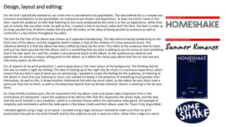
For the font I specifically wanted to use a font that is considered to be psychedelic. The idea behind this is a simple one.
Common connotations to the psychedelic art movement are illusion and experience. To have my artist’s name in this
font, I want the audience to infer that listening to the music produced by this artist is in fact an experience, rather than
just an activity like any other artist. As well as this, I created a link to my music video with this font. The font is made up
on long, parallel lines of which creates the link with the video, as the ideas of being parallel to someone as well as
continuity is a key theme throughout my video.
The font for the title of the album was chosen as it replicates handwriting. The idea behind having handwriting on the
front over of the album, and the magazine advert creates is that of the creation of a more personal touch. The
inference behind it is that the album has been crafted by hand, by the artist. This infers to the audience that his heart
and soul has been poured into the album, and it is something that my artist is willing to put his name on and something
that is his own work. As I said this creates a very personal touch to the album, as the audience can observe and
appreciate. Its almost a unique selling point to the album, as it defies the classic pop album that has no real care put
into every aspect, by the artist.
For all aspects of my print production, I used a deep blue as the main colour of my background. The thinking behind
this was to create a night-sky feeling. The idea of looking up at the night sky, for most, is a numinous experience, which
means that you feel in awe of what you are witnessing. I wanted to create this feeling for the audience, as listening to
the album is more than just listening to music, but instead it’s being in the presence of something much greater than
themselves. As well as this, it draws another intertextual link with my music video, as the videos lip-sync shots have a
particular blue tint to them, as well as the deep blue lipstick that my female character Yasmin is wearing in her lip-sync
shots.
As I have briefly touched upon, the art movement that my album cover and poster takes inspiration from is the
minimalism art movement. I want the audience to be able to infer that this represents the artists style, and the idea
that the artist himself is very simplistic, which is a common theme within the alternative indie genre. An example of
simplicity and minimalism within the indie genre is the Kaiser chiefs and their album cover for ‘Yours Truly Angry Mob’.
I decided against using a logo, so to speak. I avoided using a logo, because I wanted to make sure that my print
productions focused on my artist himself, and for the audience to put a name to a face, rather than a logo to a name.

More Related Content

What's hot

A2 media studies evaluation
A2 media studies evaluationA2 media studies evaluation
A2 media studies evaluation
guest1f8389
 
Digipak design.
Digipak design.Digipak design.
Digipak design.
Helen1245
 
Question 2 - Evaluation
Question 2 - Evaluation Question 2 - Evaluation
Question 2 - Evaluation
jodieeb
 
Evaluation question 2: How effective is the combination of your main and anci...
Evaluation question 2: How effective is the combination of your main and anci...Evaluation question 2: How effective is the combination of your main and anci...
Evaluation question 2: How effective is the combination of your main and anci...
Helen1245
 
Evaluation question 1.
Evaluation question 1.Evaluation question 1.
Evaluation question 1.
katiemorrice17
 
Evaluation question 2
Evaluation question 2Evaluation question 2
Evaluation question 2
Harry Ames
 
Evaluation 1.2
Evaluation 1.2Evaluation 1.2
Evaluation 1.2
Sophie Ratcliffe
 
Q1 media
Q1  mediaQ1  media
Question2
Question2Question2
Question2
Becca Smith
 
Question 1
Question 1Question 1
Question 1
Amy Wichelow
 
Question 2
Question 2Question 2
Question 2
Amy Wichelow
 
Question 1 .
Question 1  . Question 1  .
Question 1 .
Imogen Saye
 
Question 3
Question 3Question 3
Question 3
Amy Wichelow
 
Question two
Question two Question two
Question two
bethellis16
 
3. research version 2 (1)
3. research version 2 (1)3. research version 2 (1)
3. research version 2 (1)
AntonySibanda2
 
Media evaluation question 1
Media evaluation question 1Media evaluation question 1
Media evaluation question 1
helenalatamsing123
 
Question 1
Question 1Question 1
Question 1
Connor Southwell
 
Question 1- In what ways does your media product, use, develop, challenge for...
Question 1- In what ways does your media product, use, develop, challenge for...Question 1- In what ways does your media product, use, develop, challenge for...
Question 1- In what ways does your media product, use, develop, challenge for...
Ayesha A2 Media
 
In what ways does your media product use, develop or challenge forms and conv...
In what ways does your media product use, develop or challenge forms and conv...In what ways does your media product use, develop or challenge forms and conv...
In what ways does your media product use, develop or challenge forms and conv...
Molly Strike
 
Media evaluation question 1
Media evaluation question 1Media evaluation question 1
Media evaluation question 1
jackahern11
 

What's hot (20)

A2 media studies evaluation
A2 media studies evaluationA2 media studies evaluation
A2 media studies evaluation
 
Digipak design.
Digipak design.Digipak design.
Digipak design.
 
Question 2 - Evaluation
Question 2 - Evaluation Question 2 - Evaluation
Question 2 - Evaluation
 
Evaluation question 2: How effective is the combination of your main and anci...
Evaluation question 2: How effective is the combination of your main and anci...Evaluation question 2: How effective is the combination of your main and anci...
Evaluation question 2: How effective is the combination of your main and anci...
 
Evaluation question 1.
Evaluation question 1.Evaluation question 1.
Evaluation question 1.
 
Evaluation question 2
Evaluation question 2Evaluation question 2
Evaluation question 2
 
Evaluation 1.2
Evaluation 1.2Evaluation 1.2
Evaluation 1.2
 
Q1 media
Q1  mediaQ1  media
Q1 media
 
Question2
Question2Question2
Question2
 
Question 1
Question 1Question 1
Question 1
 
Question 2
Question 2Question 2
Question 2
 
Question 1 .
Question 1  . Question 1  .
Question 1 .
 
Question 3
Question 3Question 3
Question 3
 
Question two
Question two Question two
Question two
 
3. research version 2 (1)
3. research version 2 (1)3. research version 2 (1)
3. research version 2 (1)
 
Media evaluation question 1
Media evaluation question 1Media evaluation question 1
Media evaluation question 1
 
Question 1
Question 1Question 1
Question 1
 
Question 1- In what ways does your media product, use, develop, challenge for...
Question 1- In what ways does your media product, use, develop, challenge for...Question 1- In what ways does your media product, use, develop, challenge for...
Question 1- In what ways does your media product, use, develop, challenge for...
 
In what ways does your media product use, develop or challenge forms and conv...
In what ways does your media product use, develop or challenge forms and conv...In what ways does your media product use, develop or challenge forms and conv...
In what ways does your media product use, develop or challenge forms and conv...
 
Media evaluation question 1
Media evaluation question 1Media evaluation question 1
Media evaluation question 1
 

Similar to Question 1 part b

Evaluation question magazine
Evaluation question magazineEvaluation question magazine
Evaluation question magazine
caseyleebennett0805
 
Evaluation 2
Evaluation 2Evaluation 2
Evaluation 2
Laura Burgess
 
How effective is the combination of your main updated
How effective is the combination of your main updatedHow effective is the combination of your main updated
How effective is the combination of your main updated
Fergus Bell
 
Evaluation-Question 1
Evaluation-Question 1Evaluation-Question 1
Evaluation-Question 1
kelly_alade
 
Question 1
Question 1Question 1
Question 1
kelly_alade
 
Evaluation Question 2
Evaluation Question 2Evaluation Question 2
Evaluation Question 2
Alice Western
 
Advanced Media Production Evaluation
Advanced Media Production EvaluationAdvanced Media Production Evaluation
Advanced Media Production Evaluation
stacey-perkin
 
Advanced Production Evaluation
Advanced Production EvaluationAdvanced Production Evaluation
Advanced Production Evaluation
stacey-perkin
 
Advanced Media Production Evaluation
Advanced Media Production EvaluationAdvanced Media Production Evaluation
Advanced Media Production Evaluation
Stacey Perkin
 
Advanced Media Production Evaluation
Advanced Media Production EvaluationAdvanced Media Production Evaluation
Advanced Media Production Evaluation
stacey-perkin
 
Advanced Media Production Evaluation
Advanced Media Production EvaluationAdvanced Media Production Evaluation
Advanced Media Production Evaluation
stacey-perkin
 
evaluation exlovers
evaluation exloversevaluation exlovers
evaluation exlovers
emisquem
 
Evaluation
Evaluation Evaluation
Evaluation
emisquem
 
Evaluation: Question 2
Evaluation: Question 2Evaluation: Question 2
Evaluation: Question 2
CoombeMedia
 
How effective is the combination of your main product and ancillary texts?
How effective is the combination of your main product and ancillary texts?How effective is the combination of your main product and ancillary texts?
How effective is the combination of your main product and ancillary texts?
emilyllaw
 
Answer to Media Question Two
Answer to Media Question TwoAnswer to Media Question Two
Answer to Media Question Two
emilyllaw
 
Final media yo
Final media yoFinal media yo
Final media yo
emisquem
 
evaluation final
evaluation finalevaluation final
evaluation final
emisquem
 
A2 media coursework evaluation
A2 media coursework evaluationA2 media coursework evaluation
A2 media coursework evaluation
Demi Macluskey
 
Media evautaion a2
Media evautaion a2Media evautaion a2
Media evautaion a2
CharLilyMay
 

Similar to Question 1 part b (20)

Evaluation question magazine
Evaluation question magazineEvaluation question magazine
Evaluation question magazine
 
Evaluation 2
Evaluation 2Evaluation 2
Evaluation 2
 
How effective is the combination of your main updated
How effective is the combination of your main updatedHow effective is the combination of your main updated
How effective is the combination of your main updated
 
Evaluation-Question 1
Evaluation-Question 1Evaluation-Question 1
Evaluation-Question 1
 
Question 1
Question 1Question 1
Question 1
 
Evaluation Question 2
Evaluation Question 2Evaluation Question 2
Evaluation Question 2
 
Advanced Media Production Evaluation
Advanced Media Production EvaluationAdvanced Media Production Evaluation
Advanced Media Production Evaluation
 
Advanced Production Evaluation
Advanced Production EvaluationAdvanced Production Evaluation
Advanced Production Evaluation
 
Advanced Media Production Evaluation
Advanced Media Production EvaluationAdvanced Media Production Evaluation
Advanced Media Production Evaluation
 
Advanced Media Production Evaluation
Advanced Media Production EvaluationAdvanced Media Production Evaluation
Advanced Media Production Evaluation
 
Advanced Media Production Evaluation
Advanced Media Production EvaluationAdvanced Media Production Evaluation
Advanced Media Production Evaluation
 
evaluation exlovers
evaluation exloversevaluation exlovers
evaluation exlovers
 
Evaluation
Evaluation Evaluation
Evaluation
 
Evaluation: Question 2
Evaluation: Question 2Evaluation: Question 2
Evaluation: Question 2
 
How effective is the combination of your main product and ancillary texts?
How effective is the combination of your main product and ancillary texts?How effective is the combination of your main product and ancillary texts?
How effective is the combination of your main product and ancillary texts?
 
Answer to Media Question Two
Answer to Media Question TwoAnswer to Media Question Two
Answer to Media Question Two
 
Final media yo
Final media yoFinal media yo
Final media yo
 
evaluation final
evaluation finalevaluation final
evaluation final
 
A2 media coursework evaluation
A2 media coursework evaluationA2 media coursework evaluation
A2 media coursework evaluation
 
Media evautaion a2
Media evautaion a2Media evautaion a2
Media evautaion a2
 

More from Ben Ambrose

Question 4
Question 4Question 4
Question 4
Ben Ambrose
 
Presentation1
Presentation1Presentation1
Presentation1
Ben Ambrose
 
Question 1 part a
Question 1 part aQuestion 1 part a
Question 1 part a
Ben Ambrose
 
Potential images to use on print productions
Potential images to use on print productionsPotential images to use on print productions
Potential images to use on print productions
Ben Ambrose
 
Initial ideas music vid
Initial ideas music vidInitial ideas music vid
Initial ideas music vid
Ben Ambrose
 
Print production initial ideas
Print production initial ideasPrint production initial ideas
Print production initial ideas
Ben Ambrose
 
Kaiser chiefs case study
Kaiser chiefs case studyKaiser chiefs case study
Kaiser chiefs case study
Ben Ambrose
 
Fonts print production
Fonts print productionFonts print production
Fonts print production
Ben Ambrose
 
Narratives case study
Narratives case studyNarratives case study
Narratives case study
Ben Ambrose
 
My target audience
My target audienceMy target audience
My target audience
Ben Ambrose
 
Print production mood board
Print production mood boardPrint production mood board
Print production mood board
Ben Ambrose
 
Visual style
Visual styleVisual style
Visual style
Ben Ambrose
 
Intertextuality in my music video
Intertextuality in my music videoIntertextuality in my music video
Intertextuality in my music video
Ben Ambrose
 
Narrative structure in my music video
Narrative structure in my music videoNarrative structure in my music video
Narrative structure in my music video
Ben Ambrose
 
Representation in radioactive 1
Representation in radioactive 1Representation in radioactive 1
Representation in radioactive 1
Ben Ambrose
 
Representation in radioactive
Representation in radioactiveRepresentation in radioactive
Representation in radioactive
Ben Ambrose
 
Location of music video
Location of music videoLocation of music video
Location of music video
Ben Ambrose
 
Costumes
CostumesCostumes
Costumes
Ben Ambrose
 
James tw presentation
James tw presentationJames tw presentation
James tw presentation
Ben Ambrose
 
Lyric analysis
Lyric analysisLyric analysis
Lyric analysis
Ben Ambrose
 

More from Ben Ambrose (20)

Question 4
Question 4Question 4
Question 4
 
Presentation1
Presentation1Presentation1
Presentation1
 
Question 1 part a
Question 1 part aQuestion 1 part a
Question 1 part a
 
Potential images to use on print productions
Potential images to use on print productionsPotential images to use on print productions
Potential images to use on print productions
 
Initial ideas music vid
Initial ideas music vidInitial ideas music vid
Initial ideas music vid
 
Print production initial ideas
Print production initial ideasPrint production initial ideas
Print production initial ideas
 
Kaiser chiefs case study
Kaiser chiefs case studyKaiser chiefs case study
Kaiser chiefs case study
 
Fonts print production
Fonts print productionFonts print production
Fonts print production
 
Narratives case study
Narratives case studyNarratives case study
Narratives case study
 
My target audience
My target audienceMy target audience
My target audience
 
Print production mood board
Print production mood boardPrint production mood board
Print production mood board
 
Visual style
Visual styleVisual style
Visual style
 
Intertextuality in my music video
Intertextuality in my music videoIntertextuality in my music video
Intertextuality in my music video
 
Narrative structure in my music video
Narrative structure in my music videoNarrative structure in my music video
Narrative structure in my music video
 
Representation in radioactive 1
Representation in radioactive 1Representation in radioactive 1
Representation in radioactive 1
 
Representation in radioactive
Representation in radioactiveRepresentation in radioactive
Representation in radioactive
 
Location of music video
Location of music videoLocation of music video
Location of music video
 
Costumes
CostumesCostumes
Costumes
 
James tw presentation
James tw presentationJames tw presentation
James tw presentation
 
Lyric analysis
Lyric analysisLyric analysis
Lyric analysis
 

Recently uploaded

The basics of sentences session 6pptx.pptx
The basics of sentences session 6pptx.pptxThe basics of sentences session 6pptx.pptx
The basics of sentences session 6pptx.pptx
heathfieldcps1
 
How to Build a Module in Odoo 17 Using the Scaffold Method
How to Build a Module in Odoo 17 Using the Scaffold MethodHow to Build a Module in Odoo 17 Using the Scaffold Method
How to Build a Module in Odoo 17 Using the Scaffold Method
Celine George
 
Cognitive Development Adolescence Psychology
Cognitive Development Adolescence PsychologyCognitive Development Adolescence Psychology
Cognitive Development Adolescence Psychology
paigestewart1632
 
C1 Rubenstein AP HuG xxxxxxxxxxxxxx.pptx
C1 Rubenstein AP HuG xxxxxxxxxxxxxx.pptxC1 Rubenstein AP HuG xxxxxxxxxxxxxx.pptx
C1 Rubenstein AP HuG xxxxxxxxxxxxxx.pptx
mulvey2
 
ISO/IEC 27001, ISO/IEC 42001, and GDPR: Best Practices for Implementation and...
ISO/IEC 27001, ISO/IEC 42001, and GDPR: Best Practices for Implementation and...ISO/IEC 27001, ISO/IEC 42001, and GDPR: Best Practices for Implementation and...
ISO/IEC 27001, ISO/IEC 42001, and GDPR: Best Practices for Implementation and...
PECB
 
Natural birth techniques - Mrs.Akanksha Trivedi Rama University
Natural birth techniques - Mrs.Akanksha Trivedi Rama UniversityNatural birth techniques - Mrs.Akanksha Trivedi Rama University
Natural birth techniques - Mrs.Akanksha Trivedi Rama University
Akanksha trivedi rama nursing college kanpur.
 
DRUGS AND ITS classification slide share
DRUGS AND ITS classification slide shareDRUGS AND ITS classification slide share
DRUGS AND ITS classification slide share
taiba qazi
 
Community pharmacy- Social and preventive pharmacy UNIT 5
Community pharmacy- Social and preventive pharmacy UNIT 5Community pharmacy- Social and preventive pharmacy UNIT 5
Community pharmacy- Social and preventive pharmacy UNIT 5
sayalidalavi006
 
Life upper-Intermediate B2 Workbook for student
Life upper-Intermediate B2 Workbook for studentLife upper-Intermediate B2 Workbook for student
Life upper-Intermediate B2 Workbook for student
NgcHiNguyn25
 
The Diamonds of 2023-2024 in the IGRA collection
The Diamonds of 2023-2024 in the IGRA collectionThe Diamonds of 2023-2024 in the IGRA collection
The Diamonds of 2023-2024 in the IGRA collection
Israel Genealogy Research Association
 
Main Java[All of the Base Concepts}.docx
Main Java[All of the Base Concepts}.docxMain Java[All of the Base Concepts}.docx
Main Java[All of the Base Concepts}.docx
adhitya5119
 
BÀI TẬP BỔ TRỢ TIẾNG ANH 8 CẢ NĂM - GLOBAL SUCCESS - NĂM HỌC 2023-2024 (CÓ FI...
BÀI TẬP BỔ TRỢ TIẾNG ANH 8 CẢ NĂM - GLOBAL SUCCESS - NĂM HỌC 2023-2024 (CÓ FI...BÀI TẬP BỔ TRỢ TIẾNG ANH 8 CẢ NĂM - GLOBAL SUCCESS - NĂM HỌC 2023-2024 (CÓ FI...
BÀI TẬP BỔ TRỢ TIẾNG ANH 8 CẢ NĂM - GLOBAL SUCCESS - NĂM HỌC 2023-2024 (CÓ FI...
Nguyen Thanh Tu Collection
 
World environment day ppt For 5 June 2024
World environment day ppt For 5 June 2024World environment day ppt For 5 June 2024
World environment day ppt For 5 June 2024
ak6969907
 
PIMS Job Advertisement 2024.pdf Islamabad
PIMS Job Advertisement 2024.pdf IslamabadPIMS Job Advertisement 2024.pdf Islamabad
PIMS Job Advertisement 2024.pdf Islamabad
AyyanKhan40
 
Chapter 4 - Islamic Financial Institutions in Malaysia.pptx
Chapter 4 - Islamic Financial Institutions in Malaysia.pptxChapter 4 - Islamic Financial Institutions in Malaysia.pptx
Chapter 4 - Islamic Financial Institutions in Malaysia.pptx
Mohd Adib Abd Muin, Senior Lecturer at Universiti Utara Malaysia
 
How to Setup Warehouse & Location in Odoo 17 Inventory
How to Setup Warehouse & Location in Odoo 17 InventoryHow to Setup Warehouse & Location in Odoo 17 Inventory
How to Setup Warehouse & Location in Odoo 17 Inventory
Celine George
 
MARY JANE WILSON, A “BOA MÃE” .
MARY JANE WILSON, A “BOA MÃE”           .MARY JANE WILSON, A “BOA MÃE”           .
MARY JANE WILSON, A “BOA MÃE” .
Colégio Santa Teresinha
 
How to Manage Your Lost Opportunities in Odoo 17 CRM
How to Manage Your Lost Opportunities in Odoo 17 CRMHow to Manage Your Lost Opportunities in Odoo 17 CRM
How to Manage Your Lost Opportunities in Odoo 17 CRM
Celine George
 
Pollock and Snow "DEIA in the Scholarly Landscape, Session One: Setting Expec...
Pollock and Snow "DEIA in the Scholarly Landscape, Session One: Setting Expec...Pollock and Snow "DEIA in the Scholarly Landscape, Session One: Setting Expec...
Pollock and Snow "DEIA in the Scholarly Landscape, Session One: Setting Expec...
National Information Standards Organization (NISO)
 
South African Journal of Science: Writing with integrity workshop (2024)
South African Journal of Science: Writing with integrity workshop (2024)South African Journal of Science: Writing with integrity workshop (2024)
South African Journal of Science: Writing with integrity workshop (2024)
Academy of Science of South Africa
 

Recently uploaded (20)

The basics of sentences session 6pptx.pptx
The basics of sentences session 6pptx.pptxThe basics of sentences session 6pptx.pptx
The basics of sentences session 6pptx.pptx
 
How to Build a Module in Odoo 17 Using the Scaffold Method
How to Build a Module in Odoo 17 Using the Scaffold MethodHow to Build a Module in Odoo 17 Using the Scaffold Method
How to Build a Module in Odoo 17 Using the Scaffold Method
 
Cognitive Development Adolescence Psychology
Cognitive Development Adolescence PsychologyCognitive Development Adolescence Psychology
Cognitive Development Adolescence Psychology
 
C1 Rubenstein AP HuG xxxxxxxxxxxxxx.pptx
C1 Rubenstein AP HuG xxxxxxxxxxxxxx.pptxC1 Rubenstein AP HuG xxxxxxxxxxxxxx.pptx
C1 Rubenstein AP HuG xxxxxxxxxxxxxx.pptx
 
ISO/IEC 27001, ISO/IEC 42001, and GDPR: Best Practices for Implementation and...
ISO/IEC 27001, ISO/IEC 42001, and GDPR: Best Practices for Implementation and...ISO/IEC 27001, ISO/IEC 42001, and GDPR: Best Practices for Implementation and...
ISO/IEC 27001, ISO/IEC 42001, and GDPR: Best Practices for Implementation and...
 
Natural birth techniques - Mrs.Akanksha Trivedi Rama University
Natural birth techniques - Mrs.Akanksha Trivedi Rama UniversityNatural birth techniques - Mrs.Akanksha Trivedi Rama University
Natural birth techniques - Mrs.Akanksha Trivedi Rama University
 
DRUGS AND ITS classification slide share
DRUGS AND ITS classification slide shareDRUGS AND ITS classification slide share
DRUGS AND ITS classification slide share
 
Community pharmacy- Social and preventive pharmacy UNIT 5
Community pharmacy- Social and preventive pharmacy UNIT 5Community pharmacy- Social and preventive pharmacy UNIT 5
Community pharmacy- Social and preventive pharmacy UNIT 5
 
Life upper-Intermediate B2 Workbook for student
Life upper-Intermediate B2 Workbook for studentLife upper-Intermediate B2 Workbook for student
Life upper-Intermediate B2 Workbook for student
 
The Diamonds of 2023-2024 in the IGRA collection
The Diamonds of 2023-2024 in the IGRA collectionThe Diamonds of 2023-2024 in the IGRA collection
The Diamonds of 2023-2024 in the IGRA collection
 
Main Java[All of the Base Concepts}.docx
Main Java[All of the Base Concepts}.docxMain Java[All of the Base Concepts}.docx
Main Java[All of the Base Concepts}.docx
 
BÀI TẬP BỔ TRỢ TIẾNG ANH 8 CẢ NĂM - GLOBAL SUCCESS - NĂM HỌC 2023-2024 (CÓ FI...
BÀI TẬP BỔ TRỢ TIẾNG ANH 8 CẢ NĂM - GLOBAL SUCCESS - NĂM HỌC 2023-2024 (CÓ FI...BÀI TẬP BỔ TRỢ TIẾNG ANH 8 CẢ NĂM - GLOBAL SUCCESS - NĂM HỌC 2023-2024 (CÓ FI...
BÀI TẬP BỔ TRỢ TIẾNG ANH 8 CẢ NĂM - GLOBAL SUCCESS - NĂM HỌC 2023-2024 (CÓ FI...
 
World environment day ppt For 5 June 2024
World environment day ppt For 5 June 2024World environment day ppt For 5 June 2024
World environment day ppt For 5 June 2024
 
PIMS Job Advertisement 2024.pdf Islamabad
PIMS Job Advertisement 2024.pdf IslamabadPIMS Job Advertisement 2024.pdf Islamabad
PIMS Job Advertisement 2024.pdf Islamabad
 
Chapter 4 - Islamic Financial Institutions in Malaysia.pptx
Chapter 4 - Islamic Financial Institutions in Malaysia.pptxChapter 4 - Islamic Financial Institutions in Malaysia.pptx
Chapter 4 - Islamic Financial Institutions in Malaysia.pptx
 
How to Setup Warehouse & Location in Odoo 17 Inventory
How to Setup Warehouse & Location in Odoo 17 InventoryHow to Setup Warehouse & Location in Odoo 17 Inventory
How to Setup Warehouse & Location in Odoo 17 Inventory
 
MARY JANE WILSON, A “BOA MÃE” .
MARY JANE WILSON, A “BOA MÃE”           .MARY JANE WILSON, A “BOA MÃE”           .
MARY JANE WILSON, A “BOA MÃE” .
 
How to Manage Your Lost Opportunities in Odoo 17 CRM
How to Manage Your Lost Opportunities in Odoo 17 CRMHow to Manage Your Lost Opportunities in Odoo 17 CRM
How to Manage Your Lost Opportunities in Odoo 17 CRM
 
Pollock and Snow "DEIA in the Scholarly Landscape, Session One: Setting Expec...
Pollock and Snow "DEIA in the Scholarly Landscape, Session One: Setting Expec...Pollock and Snow "DEIA in the Scholarly Landscape, Session One: Setting Expec...
Pollock and Snow "DEIA in the Scholarly Landscape, Session One: Setting Expec...
 
South African Journal of Science: Writing with integrity workshop (2024)
South African Journal of Science: Writing with integrity workshop (2024)South African Journal of Science: Writing with integrity workshop (2024)
South African Journal of Science: Writing with integrity workshop (2024)
 

Question 1 part b

  • 1. In what ways does your media product use, develop or challenge forms and conventions of real media products?
  • 2. Introduction: For my print production, I aimed to create a subtle, yet noticeable, link between my music video and the print productions. In terms of the genre compliance, I think my print productions keep intact with the genre of my music video. For inspiration I used the minimalistic art movement to help project the ideologies behind my print productions. Another key theme to my print productions was the theme of creating identity. I wanted to create print productions that would implant the whole artist, into the minds of the audience, not just the name.
  • 3. Narrative and representation: For the front cover of my album, I wanted to keep it simple. By keeping it simple, I was able to create a brand identity. The image I used on the front of my album was a close up of my artist. I made the shot so it was black, and was in keeping with the mood of the cover. The use of the shot of my artist really emphasizes his identity, and helped me promulgate the idea of helping the audience put a name to a face. Referring back to the mention of the blackness of the image, I did this to infer to the audience that the artist (who is also a main character in my music video) is in the shadows, and is also a reserved person, who does not have much hope. This is an intertextual link between the music video and the print production, furthering the brand identity. In terms of my two inner panels, I wanted to keep the narrative in check with my music video, in order to emphasize the type of album that the audience would be purchasing. The two panels show half of the two main characters’ faces. The intention behind covering half their faces, is so the audience can imply that they have only seen half of the characters, which adds a unique aspect of mystery. This was tailored to my audience as my main demographic are a very curious group of people, and hopefully from this; they will buy the album and search for answers to questions they may have. As well as these shots, I used the Newton’s cradle in my inner panels, which connotes the idea of continuity, suggesting to the audience that listening to the album is a continuous experience, furthermore suggesting that the music on the album is more than just music. As well as this, having the Newton’s cradle furthers the link between the music video and the print production, creating a stronger more prolific brand identity. For my back panel, I wanted to keep the narrative of continuity a key theme. As I said, having the image of the cradle in my two inner panels allowed me to project this idea of a continuous experience, and I wanted to keep this prominent for my back panel; I did this by subtly blending the image of the cradle into the background, so it was behind the text. In terms of design, I wanted to take inspiration from the minimalistic art movement, for my album cover, as well as my poster. The idea behind the minimalistic design was to create this representation of simplicity. The lack of events on the front cover and poster connotes this idea that there is no distraction from the music, I also took inspiration from the Kaiser Chiefs, and their album ‘Yours truly Angry mob’. The band are also within my genre, and. I wanted to replicate the idea of simplicity to connote the importance of the music. Finally, the font on the poster and front cover of my album was chosen due to the connotations. The font is made up of parallel lines, furthering the idea of continuity and as I have said, the idea of a continuous experience. The text itself can be considered to have elements of psychedelic in terms of design inspiration, which I hope allows the audience to infer that listening to the album is an experience; experience and illusion is a common connotation to the psychedelic movement.
  • 4. Mise-en-scene: In terms of the setting, I made sure that I cut out any potential inferences of where the photos could have been taking. I removed any background from all the images I used in my production to create an element of mystery. But also to draw attention to the artist, which furthers my intention of creating a brand identity, and as I’ve said multiple times, putting a name to a face. The only prop that I used was the newton's cradle. In my analysis of the music video I talked about how the cradle has multiple connotations, however they don’t all apply to the connotations I was aiming to project in my print production. The connotation I wanted to essentially copy and paste was the idea of continuity. In the last side I talked about how the continuity comes from me wanting my audience to know that listening to the album is more than just listening to music, but instead its an experience, one that they will have continuously. I had these images on the inside and back panels of my album, but not on my album cover and poster. The reason being that I wanted to prioritize brand identity for my artist, over this intertextual reference. Within the bracket of mise-en-scene, direct mode of address is an important part of my print productions. For the front cover of my album and poster, I wanted to create a sense easiness. The centre of attention of the two print productions is the close up shot of my artist. For me personally, it was vital that the audience and the artist are not making eye contact, because I believe that it tones down the intensity and creates an inference to the audience that the artist is an easy going guy; which makes the artist and hopefully the album more attractive to the audience. However, to contradict this, within the inside panels I wanted to create the opposite inference, but for a different reason. The two shots on my inside panels are extreme, intense close-ups of the artist and the other character in my music video. Not only does it create a stronger link between the print production and the video, but it also creates an intense atmosphere; so hopefully to the audience they open up the album and feel as if they are about to experience something that’s intense and more than just sticking a CD into a stereo.
  • 5. Camerawork and composition: For the front cover for my album, and the magazine advert, I decided to use a close-up shot of my artist. I have touched upon why in my previous analysis of the shot. However I excluded some of my justification for my choice. The use of a close-up creates this sense of being personal, the close-up creates an intimate relationship between the audience and the artist. This is intended so the audience can infer the type of person my artist is; of which is an easy going, open person. Making him more attractive to the audience. For this particular shot, I decided to defy the general rule of keeping the subject of the image out of the centre of the frame. By doing this I was able to further the idea of having my artist at the centre of attention. As I said, by doing this I am able to further the brand identity, as the audience can infer that my artist is the centre of attention; to which I can promulgate the brand identity. Within my inner panels for my audience, I decided to use a more direct and personal shot. I decided to use extreme close ups of my artist and one of the characters in my music video. This creates a more direct mode of address, giving the album a more personal touch, in terms of how it regards and addresses the audience. I decided to comply these shots with the rule of thirds, by placing the subjects on the left and right of the image, I was able to create a more ‘artsy’ and creative image. As well as this, I was able to create some dead space, to which I could utilize in any way I wanted; of which I filled it with shots of the newton’s cradle. Furthermore, I made sure these shots were at eye-level, for the exact same reason as using the extreme close up. Of which is the idea of inferring a more personal and intimate relationship between the audience and the artist. In terms of where to improve my work, I would like to have modified the position of my artist in the poster and album cover. I liked the idea of having the artist not making eye-contact, but I believe that I went a bit overkill in terms of where the subject is looking. If I was to do it again, I would have the subject looking a bit more central, so the audience don’t feel as if they’re being disregarded.
  • 6. Design, layout and editing: For the font I specifically wanted to use a font that is considered to be psychedelic. The idea behind this is a simple one. Common connotations to the psychedelic art movement are illusion and experience. To have my artist’s name in this font, I want the audience to infer that listening to the music produced by this artist is in fact an experience, rather than just an activity like any other artist. As well as this, I created a link to my music video with this font. The font is made up on long, parallel lines of which creates the link with the video, as the ideas of being parallel to someone as well as continuity is a key theme throughout my video. The font for the title of the album was chosen as it replicates handwriting. The idea behind having handwriting on the front over of the album, and the magazine advert creates is that of the creation of a more personal touch. The inference behind it is that the album has been crafted by hand, by the artist. This infers to the audience that his heart and soul has been poured into the album, and it is something that my artist is willing to put his name on and something that is his own work. As I said this creates a very personal touch to the album, as the audience can observe and appreciate. Its almost a unique selling point to the album, as it defies the classic pop album that has no real care put into every aspect, by the artist. For all aspects of my print production, I used a deep blue as the main colour of my background. The thinking behind this was to create a night-sky feeling. The idea of looking up at the night sky, for most, is a numinous experience, which means that you feel in awe of what you are witnessing. I wanted to create this feeling for the audience, as listening to the album is more than just listening to music, but instead it’s being in the presence of something much greater than themselves. As well as this, it draws another intertextual link with my music video, as the videos lip-sync shots have a particular blue tint to them, as well as the deep blue lipstick that my female character Yasmin is wearing in her lip-sync shots. As I have briefly touched upon, the art movement that my album cover and poster takes inspiration from is the minimalism art movement. I want the audience to be able to infer that this represents the artists style, and the idea that the artist himself is very simplistic, which is a common theme within the alternative indie genre. An example of simplicity and minimalism within the indie genre is the Kaiser chiefs and their album cover for ‘Yours Truly Angry Mob’. I decided against using a logo, so to speak. I avoided using a logo, because I wanted to make sure that my print productions focused on my artist himself, and for the audience to put a name to a face, rather than a logo to a name.