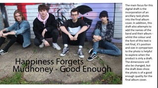
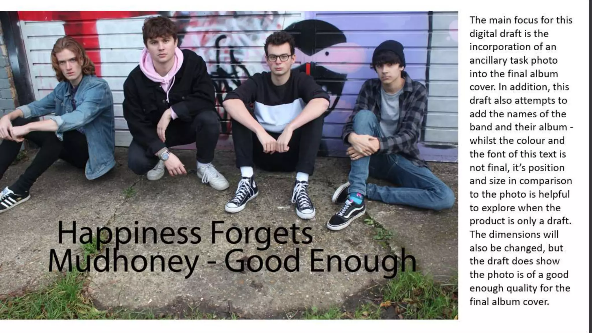
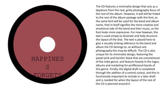
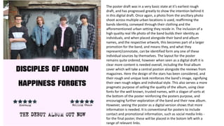
The digital draft for the back cover of the album is a
development of the rough digipack design as it features
actual images and gives a far greater insight into what the
final product will actually look like. The background photo
is from the ancillary photoshoot, and a higer quality
version of it will be used in the actual back cover. This
photo is clearly part of the same location as the front
cover, meaning the digipack is linked overall, however it
has less direct address and is overall less intense than the
front cover photo; however, the more casual look serves
as a conclusion of sorts to the photography of the album
art. Despite this, the band still showcases their identity
through the clothing and the urban, average looking
location for the photgraphy that dominates this part of
the digipack. Furthermore, the attention is not necessarily
focussed entirely on the band, as there is a tracklist on the
back cover. This makes it more prominent on the album,
and therefore more accessible for any potential audience.
The font and colours will be changed to ensure the same
two fonts are used consistently across the album - in the
final product, a lighter colour will be used, however the
layout will remain the same. Finally, a barcode has been
added in the bottom corner, completing the digital draft
and fulfilling a base requirement and convention of this
part of the digipack.
HAPPINES
S
FORGETS
The CD features a minimalist design that acts as a
depature from the real, gritty photography focus of
the rest of the album. However, it will still be linked
to the rest of the album package with the font, as
the same font will be used for the band and album
name, that in itself signifies the more creative and
emotional side of the band and their music, as the
font looks more expressive. For now however, the
text is used simply to illustrate and help structure
the layout of the disk. The text is placed here to
give a visually striking reference to the band and
album the CD belongs to, as without any
photography this may be diffuclt. The CD is also
unique for its minimalist design, featuring the
pastel pink and harsher black that are convnetional
of the indie genre, and feature heavily in the logos,
albums and marketing for proffesional bands of
this genre. Finally, the digital draft is completed
through the additon of a central cutout, and this in
functionally important to include in a later draft
and is needed for when the layout of the rest of
the CD is planned around it.
The inside cover of the album can be an overlooked part
of the digipack, but nevertheless it requires proper
planning to be successful. The digital draft furthers the
inital layout planning of the rough draft by adding in the
photography that makes up the majority of the artwork.
The same photo is used on the inside cover as on the
front cover, as it is the immediatee continuation of the
front cover, showing the band in the same way with the
focus almost entirely on them. The mise-en-scene still as
important for this photo, as having the same image
shows a reinforcement of the band identity, using
clothing and locations conventional and appropriate of
the genre. The font will also be changed further on
(although the color will kept the same), as using the
same font for the album name throughout also creates a
close relation to the band itself, no matter which part of
the digipack it appears on. As this cover appears on the
inside of the album itslref, there will be more of a focus
on the music itself, drawing from the most important
and marketed song and its lyrics as the content for this
inside cover. Overall this begins to shift the focus from
the band, whom the audience will be already thoroughly
engaged with, and the music and album itself as an
individual entity, bridging the gap between the majority
focus on the band members and the majority focus on
the music, as emphasised through the CD design.
The poster draft was in a very basic state at it's earliest rough
draft, and has progressed greatly to show the intention behind it
in this digital draft. Once again, a photo from the ancillary photo
shoot across multiple urban locations is used, reaffirming the
bands identity, conveyed through their clothing and the
afforementioned urban setting they reside in. The inclusion of a
high quality real life photo of the band builds their identity as
individuals, and when placed alongside their band and album
names, and the respective artwork, this becomes part of a larger
promotion for the band, and means they, and what they
represent/connotate, can be identified form any one of these
individual sources by themselves. The layout for the poster
remains quite ordered, however when seen as a digital draft it is
clear more content is needed overall, including the final album
cover which will take a central postion alongside the reviews from
magazines. Here the design of the stars has been considered, and
their rough and unique look reinforces the band's image, signifying
their own rough edges and individual style. This also serves a more
pragmatic purpose of selling the quality of the album, using clear
fonts for the well known, trusted names, with a slogan of sorts at
the bottom of the poster reinforcing the posters purpose, and
encouraging further exploration of the band and their new album.
However, seeing the poster as a digital version shows that more
information is needed. It is conventional for posters to include
contact and promotional information, such as social media links -
for the final poster, these will be placed in the botom left with a
range of relevant links.

Digital digipack draft

  • 2.
    The digital draftfor the back cover of the album is a development of the rough digipack design as it features actual images and gives a far greater insight into what the final product will actually look like. The background photo is from the ancillary photoshoot, and a higer quality version of it will be used in the actual back cover. This photo is clearly part of the same location as the front cover, meaning the digipack is linked overall, however it has less direct address and is overall less intense than the front cover photo; however, the more casual look serves as a conclusion of sorts to the photography of the album art. Despite this, the band still showcases their identity through the clothing and the urban, average looking location for the photgraphy that dominates this part of the digipack. Furthermore, the attention is not necessarily focussed entirely on the band, as there is a tracklist on the back cover. This makes it more prominent on the album, and therefore more accessible for any potential audience. The font and colours will be changed to ensure the same two fonts are used consistently across the album - in the final product, a lighter colour will be used, however the layout will remain the same. Finally, a barcode has been added in the bottom corner, completing the digital draft and fulfilling a base requirement and convention of this part of the digipack.
  • 3.
    HAPPINES S FORGETS The CD featuresa minimalist design that acts as a depature from the real, gritty photography focus of the rest of the album. However, it will still be linked to the rest of the album package with the font, as the same font will be used for the band and album name, that in itself signifies the more creative and emotional side of the band and their music, as the font looks more expressive. For now however, the text is used simply to illustrate and help structure the layout of the disk. The text is placed here to give a visually striking reference to the band and album the CD belongs to, as without any photography this may be diffuclt. The CD is also unique for its minimalist design, featuring the pastel pink and harsher black that are convnetional of the indie genre, and feature heavily in the logos, albums and marketing for proffesional bands of this genre. Finally, the digital draft is completed through the additon of a central cutout, and this in functionally important to include in a later draft and is needed for when the layout of the rest of the CD is planned around it.
  • 4.
    The inside coverof the album can be an overlooked part of the digipack, but nevertheless it requires proper planning to be successful. The digital draft furthers the inital layout planning of the rough draft by adding in the photography that makes up the majority of the artwork. The same photo is used on the inside cover as on the front cover, as it is the immediatee continuation of the front cover, showing the band in the same way with the focus almost entirely on them. The mise-en-scene still as important for this photo, as having the same image shows a reinforcement of the band identity, using clothing and locations conventional and appropriate of the genre. The font will also be changed further on (although the color will kept the same), as using the same font for the album name throughout also creates a close relation to the band itself, no matter which part of the digipack it appears on. As this cover appears on the inside of the album itslref, there will be more of a focus on the music itself, drawing from the most important and marketed song and its lyrics as the content for this inside cover. Overall this begins to shift the focus from the band, whom the audience will be already thoroughly engaged with, and the music and album itself as an individual entity, bridging the gap between the majority focus on the band members and the majority focus on the music, as emphasised through the CD design.
  • 5.
    The poster draftwas in a very basic state at it's earliest rough draft, and has progressed greatly to show the intention behind it in this digital draft. Once again, a photo from the ancillary photo shoot across multiple urban locations is used, reaffirming the bands identity, conveyed through their clothing and the afforementioned urban setting they reside in. The inclusion of a high quality real life photo of the band builds their identity as individuals, and when placed alongside their band and album names, and the respective artwork, this becomes part of a larger promotion for the band, and means they, and what they represent/connotate, can be identified form any one of these individual sources by themselves. The layout for the poster remains quite ordered, however when seen as a digital draft it is clear more content is needed overall, including the final album cover which will take a central postion alongside the reviews from magazines. Here the design of the stars has been considered, and their rough and unique look reinforces the band's image, signifying their own rough edges and individual style. This also serves a more pragmatic purpose of selling the quality of the album, using clear fonts for the well known, trusted names, with a slogan of sorts at the bottom of the poster reinforcing the posters purpose, and encouraging further exploration of the band and their new album. However, seeing the poster as a digital version shows that more information is needed. It is conventional for posters to include contact and promotional information, such as social media links - for the final poster, these will be placed in the botom left with a range of relevant links.