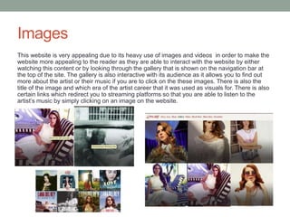
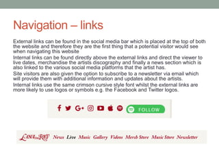
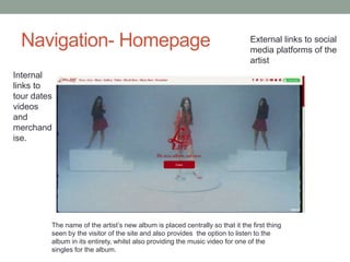
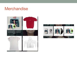
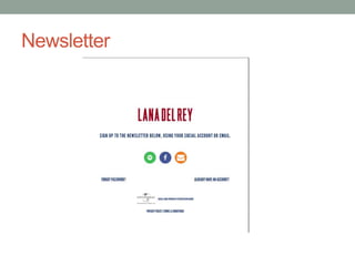
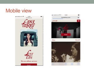
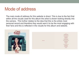
TEXTUAL
ANALYSIS:WEBSITE
By Ryan Griffiths
Website layout – www.lanadelrey.com
The homepage for Lana Del
Rey’s website acts as a
welcome page and takes on a
minimalistic style. This
homepage also features the
album cover and informs the
reader that the album is out
and gives them the option to
either listen now, redirecting
them to music st reaming
platforms or enter the website
in order to find out more
information on the artist.
Font
Lana Del Rey’s website uses a simplistic but bold serif font. This is used in order to
be easily seen and read. A bespoke style is used that is unique to the artist and is
therefore one of her USP’s as it is unlikely that our group would be able to create
something similar to using Photoshop. There is also cursive elements to the logo
used and the album title’s font. This also looks quite similar to handwriting. This
also reflects the albums trailer that was released prior to the record in which the
artist is shown to be writing out the album’s title on a chalkboard in a similar
handwriting style to that on the album cover and website/This may also be
reflective of the idea that this is the artists most personal record and therefore by
using this font it would define it as unique as it is using a different font as opposed
to the rest of her albums.
Album trailer Album cover
Colour scheme
This website is very minimalistic in style and uses a magnolia
background with a de-saturated crimson colour used for the font.
The crimson shade of red is effective in relation to the album’s
title of ‘Lust for Life’ as in relation to Barthes's semantic code as
the colour red is something we would stereotypically associate
with love, passion or lust.
The colour scheme for this website and album are the colours;
magnolia, crimson, teal white and yellow all of which are
naturalistic colours which is reflected in the album cover as the
artist is presented as having flowers in her hair and standing
against the background of a blue sky.
Images
This website is very appealing due to its heavy use of images and videos in order to make the
website more appealing to the reader as they are able to interact with the website by either
watching this content or by looking through the gallery that is shown on the navigation bar at
the top of the site. The gallery is also interactive with its audience as it allows you to find out
more about the artist or their music if you are to click on the these images. There is also the
title of the image and which era of the artist career that it was used as visuals for. There is also
certain links which redirect you to streaming platforms so that you are able to listen to the
artist’s music by simply clicking on an image on the website.
Navigation – links
External links can be found in the social media bar which is placed at the top of both
the website and therefore they are the first thing that a potential visitor would see
when navigating this website
Internal links can be found directly above the external links and direct the viewer to
live dates, merchandise the artists discography and finally a news section which is
also linked to the various social media platforms that the artist has.
Site visitors are also given the option to subscribe to a newsletter via email which
will provide them with additional information and updates about the artists.
Internal links use the same crimson cursive style font whilst the external links are
more likely to use logos or symbols e.g. the Facebook and Twitter logos.
Navigation- Homepage External links to social
media platforms of the
artist
Internal
links to
tour dates
videos
and
merchand
ise.
The name of the artist’s new album is placed centrally so that it the first thing
seen by the visitor of the site and also provides the option to listen to the
album in its entirety, whilst also providing the music video for one of the
singles for the album.
Tour dates
Merchandise
Newsletter
Mobile view
Mode of address
The main mode of address for this website is direct. This is due to the fact that
within all the visuals used for this album the artist is shown looking directly into
the camera . This further relates to the idea that this is the artists most
personal record and therefore they would want it to be the most engaging with
their fans and this is reflected in the visuals for this album and website.

Textual analysis website 1

  • 1.
  • 2.
    Website layout –www.lanadelrey.com The homepage for Lana Del Rey’s website acts as a welcome page and takes on a minimalistic style. This homepage also features the album cover and informs the reader that the album is out and gives them the option to either listen now, redirecting them to music st reaming platforms or enter the website in order to find out more information on the artist.
  • 3.
    Font Lana Del Rey’swebsite uses a simplistic but bold serif font. This is used in order to be easily seen and read. A bespoke style is used that is unique to the artist and is therefore one of her USP’s as it is unlikely that our group would be able to create something similar to using Photoshop. There is also cursive elements to the logo used and the album title’s font. This also looks quite similar to handwriting. This also reflects the albums trailer that was released prior to the record in which the artist is shown to be writing out the album’s title on a chalkboard in a similar handwriting style to that on the album cover and website/This may also be reflective of the idea that this is the artists most personal record and therefore by using this font it would define it as unique as it is using a different font as opposed to the rest of her albums. Album trailer Album cover
  • 4.
    Colour scheme This websiteis very minimalistic in style and uses a magnolia background with a de-saturated crimson colour used for the font. The crimson shade of red is effective in relation to the album’s title of ‘Lust for Life’ as in relation to Barthes's semantic code as the colour red is something we would stereotypically associate with love, passion or lust. The colour scheme for this website and album are the colours; magnolia, crimson, teal white and yellow all of which are naturalistic colours which is reflected in the album cover as the artist is presented as having flowers in her hair and standing against the background of a blue sky.
  • 5.
    Images This website isvery appealing due to its heavy use of images and videos in order to make the website more appealing to the reader as they are able to interact with the website by either watching this content or by looking through the gallery that is shown on the navigation bar at the top of the site. The gallery is also interactive with its audience as it allows you to find out more about the artist or their music if you are to click on the these images. There is also the title of the image and which era of the artist career that it was used as visuals for. There is also certain links which redirect you to streaming platforms so that you are able to listen to the artist’s music by simply clicking on an image on the website.
  • 6.
    Navigation – links Externallinks can be found in the social media bar which is placed at the top of both the website and therefore they are the first thing that a potential visitor would see when navigating this website Internal links can be found directly above the external links and direct the viewer to live dates, merchandise the artists discography and finally a news section which is also linked to the various social media platforms that the artist has. Site visitors are also given the option to subscribe to a newsletter via email which will provide them with additional information and updates about the artists. Internal links use the same crimson cursive style font whilst the external links are more likely to use logos or symbols e.g. the Facebook and Twitter logos.
  • 7.
    Navigation- Homepage Externallinks to social media platforms of the artist Internal links to tour dates videos and merchand ise. The name of the artist’s new album is placed centrally so that it the first thing seen by the visitor of the site and also provides the option to listen to the album in its entirety, whilst also providing the music video for one of the singles for the album.
  • 8.
  • 9.
  • 10.
  • 11.
  • 12.
    Mode of address Themain mode of address for this website is direct. This is due to the fact that within all the visuals used for this album the artist is shown looking directly into the camera . This further relates to the idea that this is the artists most personal record and therefore they would want it to be the most engaging with their fans and this is reflected in the visuals for this album and website.