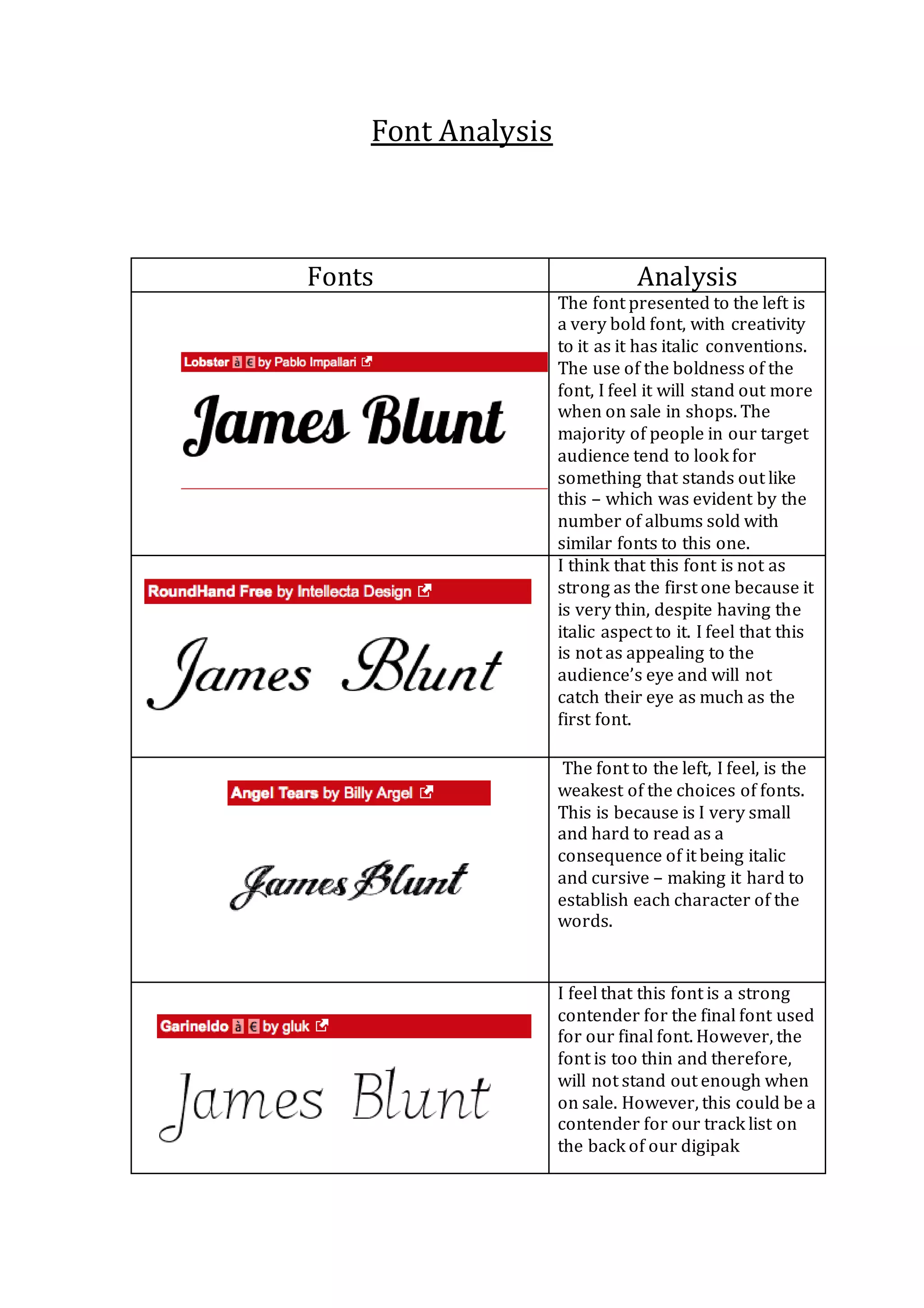
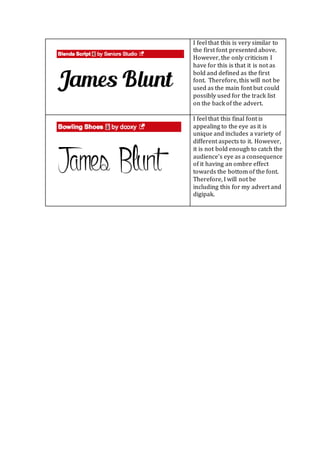
The document analyzes and compares several fonts for their suitability for an album cover and digipak. The first font is deemed the best as it is bold with italics, which will make it stand out to target audiences who prefer eye-catching designs. The second font is considered too thin despite italics, and the third is the weakest as it is small and hard to read due to being italic and cursive. While later fonts have merits, they are not bold enough to catch viewers' eyes from a distance like the first font can.