Font Analysis
Different fonts for album title.
The boldness of this font will stand out on the album due to the thickness and style of the font. It is easy
to read as there is suitable spacing between each word and there fancy flicks or curves on the letters like
old fashioned fonts.
This is quite a modern font meaning that it would be suitable for my album cover due to the design and
the genre of the music. As the genre of the music is house/dance it means that by having modern, funky
writing that it shows the personality of the album. This may make it appeal more to the target audience
who listen to house music as it is not a serious font. It can give the album more of a happy fun feel.
However, flaws with this font is that it may not appeal to the audience if it is just in black colour. Black
fonts can be seen as dull and not as interesting as other colourful fonts. The font also has a stone age
looking feel, meaning that if the font does not match the album cover, then it can misinterpret the genre
of the music.
This font is more of a modern font that may be used to appeal to a younger audience. The thin spaced out
letters may appear to show the genre of the album a lot more easier as it shows that it is quite a funky font.
The spacing between each word is a suitable distance as it is easy to understand each word. If the words were
too close together then it would mean that it would not be easy to understand.
This font could also be easy to place onto an album cover as it can match with many different types of album
covers without looking out of place. This is due to the modern feel to the font.
In order to make the font better it could perhaps have more colour to it as just having it in a black font may not
appeal to the target audience as it may look boring. However, this is all based on how well it matches the
album cover. Disadvantages with this album font is that it may seem fairly feminine based, meaning it may not
appeal to males.
This is a much more sketchy font that stands out due to the thickness of the letters and pencil drawn look and
feel.
This may make the album cover have a much more serious feel and somewhat horror sense to the album
cover. This is because of the sketchy look which is sometimes seen on horror films.
To improve this font it could perhaps be used in another colour in order to get rid of the sketchy horror feel. If
the font was in a white colour which was visible compared to the album cover background then it may seem
more friendly and less scary.
Disadvantages with this album font is that it may not represent the house genre very well. When the target
audience see this album font they may feel that the genre is more of a heavier/serious genre of music.
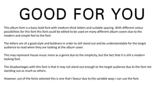
This album font is a basic bold font with medium-thick letters and suitable spacing. With different colour
possibilities for this font this font could be edited to be used on many different album covers due to the
modern and simple feel to the font.
The letters are of a good style and boldness in order to still stand out and be understandable for the target
audience to read when they are looking at the album cover.
This may represent house music more as a genre due to the simplicity, but the fact that it is still a modern
looking font.
The disadvantages with this font is that it may not stand out enough to the target audience due to the font not
standing out as much as others.
However, out of the fonts selected this is one that I favour due to the variable ways I can use the font.

Font analysis

  • 1.
  • 2.
    The boldness ofthis font will stand out on the album due to the thickness and style of the font. It is easy to read as there is suitable spacing between each word and there fancy flicks or curves on the letters like old fashioned fonts. This is quite a modern font meaning that it would be suitable for my album cover due to the design and the genre of the music. As the genre of the music is house/dance it means that by having modern, funky writing that it shows the personality of the album. This may make it appeal more to the target audience who listen to house music as it is not a serious font. It can give the album more of a happy fun feel. However, flaws with this font is that it may not appeal to the audience if it is just in black colour. Black fonts can be seen as dull and not as interesting as other colourful fonts. The font also has a stone age looking feel, meaning that if the font does not match the album cover, then it can misinterpret the genre of the music.
  • 3.
    This font ismore of a modern font that may be used to appeal to a younger audience. The thin spaced out letters may appear to show the genre of the album a lot more easier as it shows that it is quite a funky font. The spacing between each word is a suitable distance as it is easy to understand each word. If the words were too close together then it would mean that it would not be easy to understand. This font could also be easy to place onto an album cover as it can match with many different types of album covers without looking out of place. This is due to the modern feel to the font. In order to make the font better it could perhaps have more colour to it as just having it in a black font may not appeal to the target audience as it may look boring. However, this is all based on how well it matches the album cover. Disadvantages with this album font is that it may seem fairly feminine based, meaning it may not appeal to males.
  • 4.
    This is amuch more sketchy font that stands out due to the thickness of the letters and pencil drawn look and feel. This may make the album cover have a much more serious feel and somewhat horror sense to the album cover. This is because of the sketchy look which is sometimes seen on horror films. To improve this font it could perhaps be used in another colour in order to get rid of the sketchy horror feel. If the font was in a white colour which was visible compared to the album cover background then it may seem more friendly and less scary. Disadvantages with this album font is that it may not represent the house genre very well. When the target audience see this album font they may feel that the genre is more of a heavier/serious genre of music.
  • 5.
    This album fontis a basic bold font with medium-thick letters and suitable spacing. With different colour possibilities for this font this font could be edited to be used on many different album covers due to the modern and simple feel to the font. The letters are of a good style and boldness in order to still stand out and be understandable for the target audience to read when they are looking at the album cover. This may represent house music more as a genre due to the simplicity, but the fact that it is still a modern looking font. The disadvantages with this font is that it may not stand out enough to the target audience due to the font not standing out as much as others. However, out of the fonts selected this is one that I favour due to the variable ways I can use the font.