
Recommended
More Related Content
What's hot
What's hot (19)
Viewers also liked
Viewers also liked (16)
Similar to Font analysis
Similar to Font analysis (20)
More from Steph2000
More from Steph2000 (20)
Recently uploaded
Recently uploaded (20)
Font analysis
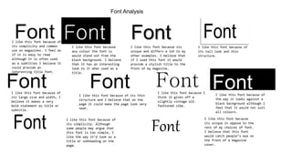
- 1. Font Analysis FontI like this font because of its simplicity and common use on magazines. I feel as if it is easy to read although it is often used as a subtitles I believe it could provide an interesting title font. FontI like this font because any colour the font is would stand out from the black background. I believe that it has an interesting look to it when used as a title. FontI like this font because its unique and differs a lot to my other examples. I believe that if I used this font it would provide a stylish title to the front of my magazine. Font I like this font because of its tall look and thin structure. FontI like this font because of its large size and width, I believe it makes a very bold statement as title or subtitle. FontI like this font because of its thin structure and I believe that on the page it could make the page look very neat. FontI like this font because I think it gives off a slightly vintage old fashioned vibe. I like this font because of the way it looks against a black background although I feel that it would not suit all colours. Font Font I like this font because of its simplicity. Although some people may argue that this font is too simple, I like the way it’d look as a title or subheading on the page. Font I like this font because its unique in oppose to the rest of my choices of font. I believe that this font would catch people’s eye on the front of a magazine cover.