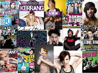
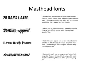
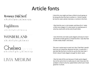
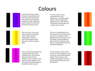
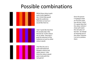
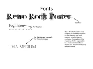
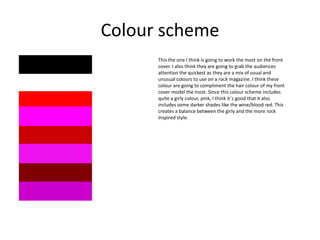
This document discusses style choices for a rock magazine, including fonts and color schemes. For fonts, a simple yet elegant font is selected for articles, a distinctive font is chosen for mastheads to be eye-catching but readable, and a third font is picked for titles and contents to complement the other fonts. The selected color scheme mixes typical rock colors like red with less common shades like pink to appeal to both female readers and rock audiences while standing out from other magazines through its color balance.


![[Challenge:Future] Moral underpinnigs of capitalism](https://cdn.slidesharecdn.com/ss_thumbnails/velimircfdpm2014-140505050814-phpapp01-thumbnail.jpg?width=640&height=640&fit=bounds)
![[Challenge:Future] S FOR LIFE](https://cdn.slidesharecdn.com/ss_thumbnails/challengefuture-s-for-life4085-130529085805-phpapp01-thumbnail.jpg?width=640&height=640&fit=bounds)


![[Challenge:Future] Interactive Opportunities](https://cdn.slidesharecdn.com/ss_thumbnails/challengefuture-interactive-opportunities53-140318141605-phpapp01-thumbnail.jpg?width=640&height=640&fit=bounds)


![[Challenge:Future] Everyone has the right to access information!](https://cdn.slidesharecdn.com/ss_thumbnails/challengefuture-everyone-has-the-right-to-access-information1466-130530044618-phpapp01-thumbnail.jpg?width=640&height=640&fit=bounds)


