Report
Share
Recommended
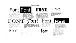
Title analysis
The document analyzes magazine title designs of several magazines including CLASH, NME, and Rolling Stone. It notes that CLASH uses a simple bold font that stands out, sometimes overlaying the title with photos. NME also makes their title stand out against the busy magazine using bold large font and merging the background image behind the title. Rolling Stone uses an interesting retro font with a shadow and outline that brings an iconic look, and sometimes overlays the title with photos or adds effects like lines to the lettering. The document suggests incorporating techniques like these to make a magazine title stand out.
Analysis 3 NME magazine
This powerpoint contains information about the analysis of the contents page, title page and double page spread of NME magazine.
Language register
The writer wishes to adopt a relaxed, informal writing style in their magazine similar to CLASH magazine to engage and connect with readers, especially those interested in new alternative music. They believe this style will be easier for readers to understand and will help gain readers' attention by including the latest news about artists. The writer also aims to include short interviews and insights about bands' lives, as they've seen magazines like NME and CLASH do successfully.
Band mood board
Here is a mood board displaying new and old bands such as The Offspring, The Amazons, The Vaccines and Kasabian.
Analysis of colours
The document analyzes several color palettes and discusses their suitability for different types of magazines. It considers how colors like reds, blacks, blues and greys could work for magazines with themes related to alternative music, fashion, or content appealing to both male and female audiences. The author's favorite palette incorporates light and dark colors like black, blue and grey that contrast strongly yet seem relaxed. This palette is seen as fitting their magazine's alternative music theme while appealing to both genders.
Audience opinion on layout
The target audience provided feedback on the layout of the flat plan. While one member loved the layout, they felt it needed more space to provide enough information. A second opinion found the layout intriguing and easy to follow. Another member found it similar to an appealing magazine. Finally, an older member said the magazine layout was basic but looked like an easy read.
analysis of magazines
The document analyzes magazine layout and design. It discusses liking the busy but well-structured layout of Vogue magazine. It also notes the iconic pink font used for the title and how the overlapped photograph brings a three-dimensional element. Finally, it comments on how ELLE magazine has a unique tall and eye-catching font, and how positioning photographs behind text gives magazines a nice, original look.
Technologies
Throughout the process of constructing a magazine, the author learned how to use several technologies effectively. They learned how to use a Nikon D3200 camera including techniques like proxemics and different shot types. Photoshop was useful for editing photos by adjusting brightness, color, and applying skin smoothing effects. Blogger helped document the process and display content professionally. Microsoft Office, Google, and Prezi were also used to research, plan, present information, and potential advertise the magazine. Overall, the author gained valuable experience using various technologies essential for creating a magazine.
Recommended
Title analysis
The document analyzes magazine title designs of several magazines including CLASH, NME, and Rolling Stone. It notes that CLASH uses a simple bold font that stands out, sometimes overlaying the title with photos. NME also makes their title stand out against the busy magazine using bold large font and merging the background image behind the title. Rolling Stone uses an interesting retro font with a shadow and outline that brings an iconic look, and sometimes overlays the title with photos or adds effects like lines to the lettering. The document suggests incorporating techniques like these to make a magazine title stand out.
Analysis 3 NME magazine
This powerpoint contains information about the analysis of the contents page, title page and double page spread of NME magazine.
Language register
The writer wishes to adopt a relaxed, informal writing style in their magazine similar to CLASH magazine to engage and connect with readers, especially those interested in new alternative music. They believe this style will be easier for readers to understand and will help gain readers' attention by including the latest news about artists. The writer also aims to include short interviews and insights about bands' lives, as they've seen magazines like NME and CLASH do successfully.
Band mood board
Here is a mood board displaying new and old bands such as The Offspring, The Amazons, The Vaccines and Kasabian.
Analysis of colours
The document analyzes several color palettes and discusses their suitability for different types of magazines. It considers how colors like reds, blacks, blues and greys could work for magazines with themes related to alternative music, fashion, or content appealing to both male and female audiences. The author's favorite palette incorporates light and dark colors like black, blue and grey that contrast strongly yet seem relaxed. This palette is seen as fitting their magazine's alternative music theme while appealing to both genders.
Audience opinion on layout
The target audience provided feedback on the layout of the flat plan. While one member loved the layout, they felt it needed more space to provide enough information. A second opinion found the layout intriguing and easy to follow. Another member found it similar to an appealing magazine. Finally, an older member said the magazine layout was basic but looked like an easy read.
analysis of magazines
The document analyzes magazine layout and design. It discusses liking the busy but well-structured layout of Vogue magazine. It also notes the iconic pink font used for the title and how the overlapped photograph brings a three-dimensional element. Finally, it comments on how ELLE magazine has a unique tall and eye-catching font, and how positioning photographs behind text gives magazines a nice, original look.
Technologies
Throughout the process of constructing a magazine, the author learned how to use several technologies effectively. They learned how to use a Nikon D3200 camera including techniques like proxemics and different shot types. Photoshop was useful for editing photos by adjusting brightness, color, and applying skin smoothing effects. Blogger helped document the process and display content professionally. Microsoft Office, Google, and Prezi were also used to research, plan, present information, and potential advertise the magazine. Overall, the author gained valuable experience using various technologies essential for creating a magazine.
My Filter Bubble
This document appears to be a list of terms related to a student studying journalism who uses social media platforms like Instagram, Twitter, and Snapchat and listens to radio stations such as BBC Radio 1 and Capital FM. The list also includes references to friends/family and locations like Leicester and Liverpool.
Magazine Advert And Digipak Evaluation 3
The document discusses feedback received on magazine advertisements and digipaks created as ancillary products for an album. Feedback from teachers helped make the products more professional by changing the main image, font size, information alignment, release date, and removing redundant text. This feedback helped address issues that may not be obvious to the target audience. Feedback from the target audience was also valuable, indicating a preference for the main car image, inclusion of the artist, and color scheme used across products. Both teacher and target audience feedback helped improve the products' professionalism and audience appeal.
Magazine Advert Evaluation Question 1
The document discusses how the creator followed common conventions when designing a magazine advertisement for an album. Specifically, the creator made the advert look similar to the album design by using the same images, font, colors, and layout. Key information included on the advert, such as the album title, artist name, song names, and purchase options, are conventions followed by other successful album ads. The goal was to make the advert look professional and familiar to help effectively promote the album and artist.
Digipak Evaluation Question 1
The document discusses the design choices made for a digipak album cover. It follows common conventions such as using the rule of thirds for panel layout, a consistent font and color scheme, and including the album title and artist name on the front cover. It challenges some conventions by placing the album title above the artist name and including a photo of the artist on the back cover. Overall, the design draws inspiration from other albums and aims to make the project memorable and appeal to the target audience.
Evaluation Question 1 Inspiration
The creators took inspiration from several sources for their music video:
1) Sia's music videos which feature minimalist costumes and solo dancers to convey the song.
2) Dance performances by Pink, Ed Sheeran, and a show they attended for contemporary dance styles.
3) Professional music videos for lighting techniques like colored lighting to create interest.
4) Solo artist music videos for shot styles like panning and zooming to film the performer.
They made changes based on audience feedback, such as changing the setting from a church to a stage.
Further Theorists Evaluation Question 1
Sven E Carlsson's theory states that music videos can be categorized as either performance or conceptual videos. The document discusses how their video fits Carlsson's definition of a performance video by including shots of the artist and dancers performing. According to theorist Steve Archer, using camera movement paired with lighting enhances the mood and effectiveness of a music video. The document discusses how the creators improved their video by adding more camera movement and limiting static shots, as inspired by Archer's theory.
Evaluation Question 1 Inspiration
The document discusses the sources of inspiration for the creators' music video. They took inspiration from Sia's music videos which feature minimalist costumes and solo dancers to convey the song. They were also inspired by Pink and Ed Sheeran music videos containing dance routines. The creators chose to use two female dancers instead of a romantic duo. They attended a dance show performing to the song which inspired their contemporary dance style and lighting choices. Professional music videos also informed their lighting design. Through this process and audience feedback, they refined their ideas and location from a church to a stage setting.
Stages Of Magazine Advert
Creating an effective magazine ad requires several stages of development. First, the advertising agency brainstorms ideas that align with the client's goals and brand. Next, concepts are refined into rough layouts which are presented to the client for feedback. Based on the client's input, a final design is produced that captures their vision within the publication's space and formatting requirements.
Stages Of Digipak
The document outlines the stages of the digipak creative process. It begins with concept development where the overall theme, images, and messaging are determined. Next is design where the layout, graphics, and packaging components are created. The final stage is production where the physical digipaks are printed, assembled, and prepared for distribution.
Digipak Planning
The document discusses planning for a digipak album including potential song titles and photo ideas. It lists 14 proposed song titles and provides categories of photos considering including locations, nature, churches, motorways/headlights, and random photos that may relate to some of the song titles and be used across the different sides of the digipak.
Magazine Advert Analysis
The document analyzes magazine advertisements for albums by three indie artists: Tom Odell, The Wombats, and Florence + The Machine. For Tom Odell's ad, it highlights the use of a close-up artist photo with blurred background, simple color scheme, and hierarchical text layout. For The Wombats, it notes the bright blue color scheme and use of yellow text to highlight key details. For Florence + The Machine, it discusses the painted portrait of Florence Welch and placement of text information by size.
Digipak Analysis
The document analyzes the design elements of three different album digipaks: Birdy's "Fire Within", Lana Del Rey's "Born to Die", and Walk the Moon's "Talking is Hard". Some key points made:
- Birdy's digipak uses a monochrome color scheme of greys, blacks, and whites, with a close-up shot of Birdy on the front to create direct address.
- Lana Del Rey's uses pastel colors for a vintage feel, with her image on the front also creating direct address.
- Walk the Moon's uses bright colors like yellow for simplicity and minimalism, featuring the band members across the front with album name
Digipak Analysis
The document analyzes the design elements of three different album digipaks: Birdy's "Fire Within", Lana Del Rey's "Born to Die", and Walk the Moon's "Talking is Hard". Some key points made:
- Birdy's digipak uses a monochrome color scheme of greys, black, and white, with Birdy's close-up image on the front. This minimal design effectively portrays the indie genre.
- Lana Del Rey's uses a pastel color palette and vintage-inspired imagery and fonts. The artist's name is prominently displayed on the front in bold.
- Walk the Moon's features bright colors and a simple design with
Narrative Theorists
Carlsson believes music videos can be categorized as either performance or conceptual videos. Performance videos feature an artist singing and/or dancing, and can be further divided into song, dance, or instrumental performances. Archer stresses the importance of camerawork in music videos, believing movement, close-ups, and lighting can enhance engagement and drama. The document discusses applying these theorists' ideas to a planned music video featuring dancing and a singing artist, with an emphasis on camera movement, close-ups, and lighting design.
Storyboard Progress
Ceri and I have created our initial storyboard but plan to add footage of a dance performance to complete it. We have begun planning our storyboard and will continue working on incorporating a dance sequence. The storyboard is in progress as we aim to include a recorded dance performance.
Lighting Ideas and Planning
The document discusses lighting ideas and plans for an indie music video. It proposes using purple colored lighting and projecting the outline of a stained glass window onto the background. Solo shots of the artist would use a single light, while group shots and those including the artist would utilize the stained glass window effect. The lighting aims to appeal to the target indie audience and recreate the feel of a church to illustrate the song's message and lyrics. Colored lighting, particularly purple, will add visual interest and drama to engage audiences throughout all parts of the video.
NHL Stenden University of Applied Sciences Diploma Degree Transcript
办NHL Stenden毕业证书制作荷兰斯坦德应用科技大學假文凭定制Q微168899991办NHL Stenden留信网教留服认证海牙认证改NHL Stenden成绩单GPA办NHL Stenden高仿学位证毕业证电子版ID驾照如何申请斯坦德应用科技NHL Stenden University of Applied Sciences Diploma Degree Transcript
More Related Content
More from Steph2000
My Filter Bubble
This document appears to be a list of terms related to a student studying journalism who uses social media platforms like Instagram, Twitter, and Snapchat and listens to radio stations such as BBC Radio 1 and Capital FM. The list also includes references to friends/family and locations like Leicester and Liverpool.
Magazine Advert And Digipak Evaluation 3
The document discusses feedback received on magazine advertisements and digipaks created as ancillary products for an album. Feedback from teachers helped make the products more professional by changing the main image, font size, information alignment, release date, and removing redundant text. This feedback helped address issues that may not be obvious to the target audience. Feedback from the target audience was also valuable, indicating a preference for the main car image, inclusion of the artist, and color scheme used across products. Both teacher and target audience feedback helped improve the products' professionalism and audience appeal.
Magazine Advert Evaluation Question 1
The document discusses how the creator followed common conventions when designing a magazine advertisement for an album. Specifically, the creator made the advert look similar to the album design by using the same images, font, colors, and layout. Key information included on the advert, such as the album title, artist name, song names, and purchase options, are conventions followed by other successful album ads. The goal was to make the advert look professional and familiar to help effectively promote the album and artist.
Digipak Evaluation Question 1
The document discusses the design choices made for a digipak album cover. It follows common conventions such as using the rule of thirds for panel layout, a consistent font and color scheme, and including the album title and artist name on the front cover. It challenges some conventions by placing the album title above the artist name and including a photo of the artist on the back cover. Overall, the design draws inspiration from other albums and aims to make the project memorable and appeal to the target audience.
Evaluation Question 1 Inspiration
The creators took inspiration from several sources for their music video:
1) Sia's music videos which feature minimalist costumes and solo dancers to convey the song.
2) Dance performances by Pink, Ed Sheeran, and a show they attended for contemporary dance styles.
3) Professional music videos for lighting techniques like colored lighting to create interest.
4) Solo artist music videos for shot styles like panning and zooming to film the performer.
They made changes based on audience feedback, such as changing the setting from a church to a stage.
Further Theorists Evaluation Question 1
Sven E Carlsson's theory states that music videos can be categorized as either performance or conceptual videos. The document discusses how their video fits Carlsson's definition of a performance video by including shots of the artist and dancers performing. According to theorist Steve Archer, using camera movement paired with lighting enhances the mood and effectiveness of a music video. The document discusses how the creators improved their video by adding more camera movement and limiting static shots, as inspired by Archer's theory.
Evaluation Question 1 Inspiration
The document discusses the sources of inspiration for the creators' music video. They took inspiration from Sia's music videos which feature minimalist costumes and solo dancers to convey the song. They were also inspired by Pink and Ed Sheeran music videos containing dance routines. The creators chose to use two female dancers instead of a romantic duo. They attended a dance show performing to the song which inspired their contemporary dance style and lighting choices. Professional music videos also informed their lighting design. Through this process and audience feedback, they refined their ideas and location from a church to a stage setting.
Stages Of Magazine Advert
Creating an effective magazine ad requires several stages of development. First, the advertising agency brainstorms ideas that align with the client's goals and brand. Next, concepts are refined into rough layouts which are presented to the client for feedback. Based on the client's input, a final design is produced that captures their vision within the publication's space and formatting requirements.
Stages Of Digipak
The document outlines the stages of the digipak creative process. It begins with concept development where the overall theme, images, and messaging are determined. Next is design where the layout, graphics, and packaging components are created. The final stage is production where the physical digipaks are printed, assembled, and prepared for distribution.
Digipak Planning
The document discusses planning for a digipak album including potential song titles and photo ideas. It lists 14 proposed song titles and provides categories of photos considering including locations, nature, churches, motorways/headlights, and random photos that may relate to some of the song titles and be used across the different sides of the digipak.
Magazine Advert Analysis
The document analyzes magazine advertisements for albums by three indie artists: Tom Odell, The Wombats, and Florence + The Machine. For Tom Odell's ad, it highlights the use of a close-up artist photo with blurred background, simple color scheme, and hierarchical text layout. For The Wombats, it notes the bright blue color scheme and use of yellow text to highlight key details. For Florence + The Machine, it discusses the painted portrait of Florence Welch and placement of text information by size.
Digipak Analysis
The document analyzes the design elements of three different album digipaks: Birdy's "Fire Within", Lana Del Rey's "Born to Die", and Walk the Moon's "Talking is Hard". Some key points made:
- Birdy's digipak uses a monochrome color scheme of greys, blacks, and whites, with a close-up shot of Birdy on the front to create direct address.
- Lana Del Rey's uses pastel colors for a vintage feel, with her image on the front also creating direct address.
- Walk the Moon's uses bright colors like yellow for simplicity and minimalism, featuring the band members across the front with album name
Digipak Analysis
The document analyzes the design elements of three different album digipaks: Birdy's "Fire Within", Lana Del Rey's "Born to Die", and Walk the Moon's "Talking is Hard". Some key points made:
- Birdy's digipak uses a monochrome color scheme of greys, black, and white, with Birdy's close-up image on the front. This minimal design effectively portrays the indie genre.
- Lana Del Rey's uses a pastel color palette and vintage-inspired imagery and fonts. The artist's name is prominently displayed on the front in bold.
- Walk the Moon's features bright colors and a simple design with
Narrative Theorists
Carlsson believes music videos can be categorized as either performance or conceptual videos. Performance videos feature an artist singing and/or dancing, and can be further divided into song, dance, or instrumental performances. Archer stresses the importance of camerawork in music videos, believing movement, close-ups, and lighting can enhance engagement and drama. The document discusses applying these theorists' ideas to a planned music video featuring dancing and a singing artist, with an emphasis on camera movement, close-ups, and lighting design.
Storyboard Progress
Ceri and I have created our initial storyboard but plan to add footage of a dance performance to complete it. We have begun planning our storyboard and will continue working on incorporating a dance sequence. The storyboard is in progress as we aim to include a recorded dance performance.
Lighting Ideas and Planning
The document discusses lighting ideas and plans for an indie music video. It proposes using purple colored lighting and projecting the outline of a stained glass window onto the background. Solo shots of the artist would use a single light, while group shots and those including the artist would utilize the stained glass window effect. The lighting aims to appeal to the target indie audience and recreate the feel of a church to illustrate the song's message and lyrics. Colored lighting, particularly purple, will add visual interest and drama to engage audiences throughout all parts of the video.
More from Steph2000 (20)
Recently uploaded
NHL Stenden University of Applied Sciences Diploma Degree Transcript
办NHL Stenden毕业证书制作荷兰斯坦德应用科技大學假文凭定制Q微168899991办NHL Stenden留信网教留服认证海牙认证改NHL Stenden成绩单GPA办NHL Stenden高仿学位证毕业证电子版ID驾照如何申请斯坦德应用科技NHL Stenden University of Applied Sciences Diploma Degree Transcript
Heuristics Evaluation - How to Guide.pdf
This guide helps identify potential issues related to navigation, clarity, consistency, and other factors that can affect user experience.
Getting Data Ready for Culture Hack by Neontribe
Sometime in the 2010s, this is how explained how to make data "hackday ready"
一比一原版(LSBU毕业证书)伦敦南岸大学毕业证如何办理
学校原件一模一样【微信:6496090 】【(LSBU毕业证书)伦敦南岸大学毕业证成绩单】【微信:6496090 】学位证,留信认证(真实可查,永久存档)原件一模一样纸张工艺/offer、雅思、外壳等材料/诚信可靠,可直接看成品样本,帮您解决无法毕业带来的各种难题!外壳,原版制作,诚信可靠,可直接看成品样本。行业标杆!精益求精,诚心合作,真诚制作!多年品质 ,按需精细制作,24小时接单,全套进口原装设备。十五年致力于帮助留学生解决难题,包您满意。
本公司拥有海外各大学样板无数,能完美还原。
1:1完美还原海外各大学毕业材料上的工艺:水印,阴影底纹,钢印LOGO烫金烫银,LOGO烫金烫银复合重叠。文字图案浮雕、激光镭射、紫外荧光、温感、复印防伪等防伪工艺。材料咨询办理、认证咨询办理请加学历顾问Q/微6496090
【主营项目】
一.毕业证【q微6496090】成绩单、使馆认证、教育部认证、雅思托福成绩单、学生卡等!
二.真实使馆公证(即留学回国人员证明,不成功不收费)
三.真实教育部学历学位认证(教育部存档!教育部留服网站永久可查)
四.办理各国各大学文凭(一对一专业服务,可全程监控跟踪进度)
如果您处于以下几种情况:
◇在校期间,因各种原因未能顺利毕业……拿不到官方毕业证【q/微6496090】
◇面对父母的压力,希望尽快拿到;
◇不清楚认证流程以及材料该如何准备;
◇回国时间很长,忘记办理;
◇回国马上就要找工作,办给用人单位看;
◇企事业单位必须要求办理的
◇需要报考公务员、购买免税车、落转户口
◇申请留学生创业基金
留信网认证的作用:
1:该专业认证可证明留学生真实身份
2:同时对留学生所学专业登记给予评定
3:国家专业人才认证中心颁发入库证书
4:这个认证书并且可以归档倒地方
5:凡事获得留信网入网的信息将会逐步更新到个人身份内,将在公安局网内查询个人身份证信息后,同步读取人才网入库信息
6:个人职称评审加20分
7:个人信誉贷款加10分
8:在国家人才网主办的国家网络招聘大会中纳入资料,供国家高端企业选择人才
办理(LSBU毕业证书)伦敦南岸大学毕业证【微信:6496090 】外观非常简单,由纸质材料制成,上面印有校徽、校名、毕业生姓名、专业等信息。
办理(LSBU毕业证书)伦敦南岸大学毕业证【微信:6496090 】格式相对统一,各专业都有相应的模板。通常包括以下部分:
校徽:象征着学校的荣誉和传承。
校名:学校英文全称
授予学位:本部分将注明获得的具体学位名称。
毕业生姓名:这是最重要的信息之一,标志着该证书是由特定人员获得的。
颁发日期:这是毕业正式生效的时间,也代表着毕业生学业的结束。
其他信息:根据不同的专业和学位,可能会有一些特定的信息或章节。
办理(LSBU毕业证书)伦敦南岸大学毕业证【微信:6496090 】价值很高,需要妥善保管。一般来说,应放置在安全、干燥、防潮的地方,避免长时间暴露在阳光下。如需使用,最好使用复印件而不是原件,以免丢失。
综上所述,办理(LSBU毕业证书)伦敦南岸大学毕业证【微信:6496090 】是证明身份和学历的高价值文件。外观简单庄重,格式统一,包括重要的个人信息和发布日期。对持有人来说,妥善保管是非常重要的。
Graphic Design Tools and Software .pptx
Explore the essential graphic design tools and software that can elevate your creative projects. Discover industry favorites and innovative solutions for stunning design results.
ARENA - Young adults in the workplace (Knight Moves).pdf
Presentations of Bavo Raeymaekers (Project lead youth unemployment at the City of Antwerp), Suzan Martens (Service designer at Knight Moves) and Adriaan De Keersmaeker (Community manager at Talk to C)
during the 'Arena • Young adults in the workplace' conference hosted by Knight Moves.
一比一原版亚利桑那大学毕业证(UA毕业证书)如何办理
学校原件一模一样【微信:6496090】【亚利桑那大学毕业证(UA毕业证书)成绩单学位证】【微信:6496090】(留信学历认证永久存档查询)采用学校原版纸张、特殊工艺完全按照原版一比一制作(包括:隐形水印,阴影底纹,钢印LOGO烫金烫银,LOGO烫金烫银复合重叠,文字图案浮雕,激光镭射,紫外荧光,温感,复印防伪)行业标杆!精益求精,诚心合作,真诚制作!多年品质 ,按需精细制作,24小时接单,全套进口原装设备,十五年致力于帮助留学生解决难题,业务范围有加拿大、英国、澳洲、韩国、美国、新加坡,新西兰等学历材料,包您满意。
【业务选择办理准则】
一、工作未确定,回国需先给父母、亲戚朋友看下文凭的情况,办理一份就读学校的毕业证【微信:6496090】文凭即可
二、回国进私企、外企、自己做生意的情况,这些单位是不查询毕业证真伪的,而且国内没有渠道去查询国外文凭的真假,也不需要提供真实教育部认证。鉴于此,办理一份毕业证【微信:6496090】即可
三、进国企,银行,事业单位,考公务员等等,这些单位是必需要提供真实教育部认证的,办理教育部认证所需资料众多且烦琐,所有材料您都必须提供原件,我们凭借丰富的经验,快捷的绿色通道帮您快速整合材料,让您少走弯路。
留信网认证的作用:
1:该专业认证可证明留学生真实身份【微信:6496090】
2:同时对留学生所学专业登记给予评定
3:国家专业人才认证中心颁发入库证书
4:这个认证书并且可以归档倒地方
5:凡事获得留信网入网的信息将会逐步更新到个人身份内,将在公安局网内查询个人身份证信息后,同步读取人才网入库信息
6:个人职称评审加20分
7:个人信誉贷款加10分
8:在国家人才网主办的国家网络招聘大会中纳入资料,供国家高端企业选择人才
→ 【关于价格问题(保证一手价格)
我们所定的价格是非常合理的,而且我们现在做得单子大多数都是代理和回头客户介绍的所以一般现在有新的单子 我给客户的都是第一手的代理价格,因为我想坦诚对待大家 不想跟大家在价格方面浪费时间
对于老客户或者被老客户介绍过来的朋友,我们都会适当给一些优惠。
选择实体注册公司办理,更放心,更安全!我们的承诺:可来公司面谈,可签订合同,会陪同客户一起到教育部认证窗口递交认证材料,客户在教育部官方认证查询网站查询到认证通过结果后付款,不成功不收费!
办理亚利桑那大学毕业证(UA毕业证书)【微信:6496090 】外观非常简单,由纸质材料制成,上面印有校徽、校名、毕业生姓名、专业等信息。
办理亚利桑那大学毕业证(UA毕业证书)【微信:6496090 】格式相对统一,各专业都有相应的模板。通常包括以下部分:
校徽:象征着学校的荣誉和传承。
校名:学校英文全称
授予学位:本部分将注明获得的具体学位名称。
毕业生姓名:这是最重要的信息之一,标志着该证书是由特定人员获得的。
颁发日期:这是毕业正式生效的时间,也代表着毕业生学业的结束。
其他信息:根据不同的专业和学位,可能会有一些特定的信息或章节。
办理亚利桑那大学毕业证(UA毕业证书)【微信:6496090 】价值很高,需要妥善保管。一般来说,应放置在安全、干燥、防潮的地方,避免长时间暴露在阳光下。如需使用,最好使用复印件而不是原件,以免丢失。
综上所述,办理亚利桑那大学毕业证(UA毕业证书)【微信:6496090 】是证明身份和学历的高价值文件。外观简单庄重,格式统一,包括重要的个人信息和发布日期。对持有人来说,妥善保管是非常重要的。
哪里办理美国中央华盛顿大学毕业证双学位证书原版一模一样
原版一模一样【微信:741003700 】【美国中央华盛顿大学毕业证双学位证书】【微信:741003700 】学位证,留信认证(真实可查,永久存档)offer、雅思、外壳等材料/诚信可靠,可直接看成品样本,帮您解决无法毕业带来的各种难题!外壳,原版制作,诚信可靠,可直接看成品样本。行业标杆!精益求精,诚心合作,真诚制作!多年品质 ,按需精细制作,24小时接单,全套进口原装设备。十五年致力于帮助留学生解决难题,包您满意。
本公司拥有海外各大学样板无数,能完美还原海外各大学 Bachelor Diploma degree, Master Degree Diploma
1:1完美还原海外各大学毕业材料上的工艺:水印,阴影底纹,钢印LOGO烫金烫银,LOGO烫金烫银复合重叠。文字图案浮雕、激光镭射、紫外荧光、温感、复印防伪等防伪工艺。材料咨询办理、认证咨询办理请加学历顾问Q/微741003700
留信网认证的作用:
1:该专业认证可证明留学生真实身份
2:同时对留学生所学专业登记给予评定
3:国家专业人才认证中心颁发入库证书
4:这个认证书并且可以归档倒地方
5:凡事获得留信网入网的信息将会逐步更新到个人身份内,将在公安局网内查询个人身份证信息后,同步读取人才网入库信息
6:个人职称评审加20分
7:个人信誉贷款加10分
8:在国家人才网主办的国家网络招聘大会中纳入资料,供国家高端企业选择人才
一比一原版肯特大学毕业证UKC成绩单一模一样
原件一模一样【微信:6496090】【肯特大学毕业证UKC学位证成绩单】【微信:6496090】(留信学历认证永久存档查询)采用学校原版纸张、特殊工艺完全按照原版一比一制作(包括:隐形水印,阴影底纹,钢印LOGO烫金烫银,LOGO烫金烫银复合重叠,文字图案浮雕,激光镭射,紫外荧光,温感,复印防伪)行业标杆!精益求精,诚心合作,真诚制作!多年品质 ,按需精细制作,24小时接单,全套进口原装设备,十五年致力于帮助留学生解决难题,业务范围有加拿大、英国、澳洲、韩国、美国、新加坡,新西兰等学历材料,包您满意。
【业务选择办理准则】
一、工作未确定,回国需先给父母、亲戚朋友看下文凭的情况,办理一份就读学校的毕业证【微信:6496090】文凭即可
二、回国进私企、外企、自己做生意的情况,这些单位是不查询毕业证真伪的,而且国内没有渠道去查询国外文凭的真假,也不需要提供真实教育部认证。鉴于此,办理一份毕业证【微信:6496090】即可
三、进国企,银行,事业单位,考公务员等等,这些单位是必需要提供真实教育部认证的,办理教育部认证所需资料众多且烦琐,所有材料您都必须提供原件,我们凭借丰富的经验,快捷的绿色通道帮您快速整合材料,让您少走弯路。
留信网认证的作用:
1:该专业认证可证明留学生真实身份【微信:6496090】
2:同时对留学生所学专业登记给予评定
3:国家专业人才认证中心颁发入库证书
4:这个认证书并且可以归档倒地方
5:凡事获得留信网入网的信息将会逐步更新到个人身份内,将在公安局网内查询个人身份证信息后,同步读取人才网入库信息
6:个人职称评审加20分
7:个人信誉贷款加10分
8:在国家人才网主办的国家网络招聘大会中纳入资料,供国家高端企业选择人才
→ 【关于价格问题(保证一手价格)
我们所定的价格是非常合理的,而且我们现在做得单子大多数都是代理和回头客户介绍的所以一般现在有新的单子 我给客户的都是第一手的代理价格,因为我想坦诚对待大家 不想跟大家在价格方面浪费时间
对于老客户或者被老客户介绍过来的朋友,我们都会适当给一些优惠。
选择实体注册公司办理,更放心,更安全!我们的承诺:可来公司面谈,可签订合同,会陪同客户一起到教育部认证窗口递交认证材料,客户在教育部官方认证查询网站查询到认证通过结果后付款,不成功不收费!
办理肯特大学毕业证UKC学位证【微信:6496090 】外观非常精致,由特殊纸质材料制成,上面印有校徽、校名、毕业生姓名、专业等信息。
办理肯特大学毕业证UKC学位证【微信:6496090 】格式相对统一,各专业都有相应的模板。通常包括以下部分:
校徽:象征着学校的荣誉和传承。
校名:学校英文全称
授予学位:本部分将注明获得的具体学位名称。
毕业生姓名:这是最重要的信息之一,标志着该证书是由特定人员获得的。
颁发日期:这是毕业正式生效的时间,也代表着毕业生学业的结束。
其他信息:根据不同的专业和学位,可能会有一些特定的信息或章节。
办理肯特大学毕业证UKC学位证【微信:6496090 】价值很高,需要妥善保管。一般来说,应放置在安全、干燥、防潮的地方,避免长时间暴露在阳光下。如需使用,最好使用复印件而不是原件,以免丢失。
综上所述,办理肯特大学毕业证UKC学位证【微信:6496090 】是证明身份和学历的高价值文件。外观简单庄重,格式统一,包括重要的个人信息和发布日期。对持有人来说,妥善保管是非常重要的。
一比一原版阿肯色大学毕业证(UCSF毕业证书)如何办理
学校原件一模一样【微信:6496090】【阿肯色大学毕业证(UCSF毕业证书)成绩单学位证】【微信:6496090】(留信学历认证永久存档查询)采用学校原版纸张、特殊工艺完全按照原版一比一制作(包括:隐形水印,阴影底纹,钢印LOGO烫金烫银,LOGO烫金烫银复合重叠,文字图案浮雕,激光镭射,紫外荧光,温感,复印防伪)行业标杆!精益求精,诚心合作,真诚制作!多年品质 ,按需精细制作,24小时接单,全套进口原装设备,十五年致力于帮助留学生解决难题,业务范围有加拿大、英国、澳洲、韩国、美国、新加坡,新西兰等学历材料,包您满意。
【业务选择办理准则】
一、工作未确定,回国需先给父母、亲戚朋友看下文凭的情况,办理一份就读学校的毕业证【微信:6496090】文凭即可
二、回国进私企、外企、自己做生意的情况,这些单位是不查询毕业证真伪的,而且国内没有渠道去查询国外文凭的真假,也不需要提供真实教育部认证。鉴于此,办理一份毕业证【微信:6496090】即可
三、进国企,银行,事业单位,考公务员等等,这些单位是必需要提供真实教育部认证的,办理教育部认证所需资料众多且烦琐,所有材料您都必须提供原件,我们凭借丰富的经验,快捷的绿色通道帮您快速整合材料,让您少走弯路。
留信网认证的作用:
1:该专业认证可证明留学生真实身份【微信:6496090】
2:同时对留学生所学专业登记给予评定
3:国家专业人才认证中心颁发入库证书
4:这个认证书并且可以归档倒地方
5:凡事获得留信网入网的信息将会逐步更新到个人身份内,将在公安局网内查询个人身份证信息后,同步读取人才网入库信息
6:个人职称评审加20分
7:个人信誉贷款加10分
8:在国家人才网主办的国家网络招聘大会中纳入资料,供国家高端企业选择人才
→ 【关于价格问题(保证一手价格)
我们所定的价格是非常合理的,而且我们现在做得单子大多数都是代理和回头客户介绍的所以一般现在有新的单子 我给客户的都是第一手的代理价格,因为我想坦诚对待大家 不想跟大家在价格方面浪费时间
对于老客户或者被老客户介绍过来的朋友,我们都会适当给一些优惠。
选择实体注册公司办理,更放心,更安全!我们的承诺:可来公司面谈,可签订合同,会陪同客户一起到教育部认证窗口递交认证材料,客户在教育部官方认证查询网站查询到认证通过结果后付款,不成功不收费!
办理阿肯色大学毕业证(UCSF毕业证书)【微信:6496090 】外观非常简单,由纸质材料制成,上面印有校徽、校名、毕业生姓名、专业等信息。
办理阿肯色大学毕业证(UCSF毕业证书)【微信:6496090 】格式相对统一,各专业都有相应的模板。通常包括以下部分:
校徽:象征着学校的荣誉和传承。
校名:学校英文全称
授予学位:本部分将注明获得的具体学位名称。
毕业生姓名:这是最重要的信息之一,标志着该证书是由特定人员获得的。
颁发日期:这是毕业正式生效的时间,也代表着毕业生学业的结束。
其他信息:根据不同的专业和学位,可能会有一些特定的信息或章节。
办理阿肯色大学毕业证(UCSF毕业证书)【微信:6496090 】价值很高,需要妥善保管。一般来说,应放置在安全、干燥、防潮的地方,避免长时间暴露在阳光下。如需使用,最好使用复印件而不是原件,以免丢失。
综上所述,办理阿肯色大学毕业证(UCSF毕业证书)【微信:6496090 】是证明身份和学历的高价值文件。外观简单庄重,格式统一,包括重要的个人信息和发布日期。对持有人来说,妥善保管是非常重要的。
Practical eLearning Makeovers for Everyone
Welcome to Practical eLearning Makeovers for Everyone. In this presentation, we’ll take a look at a bunch of easy-to-use visual design tips and tricks. And we’ll do this by using them to spruce up some eLearning screens that are in dire need of a new look.
AHMED TALAAT ARCHITECTURE PORTFOLIO .pdf
Architectural and constructions management experience since 2003 including 18 years located in UAE.
Coordinate and oversee all technical activities relating to architectural and construction projects,
including directing the design team, reviewing drafts and computer models, and approving design
changes.
Organize and typically develop, and review building plans, ensuring that a project meets all safety and
environmental standards.
Prepare feasibility studies, construction contracts, and tender documents with specifications and
tender analyses.
Consulting with clients, work on formulating equipment and labor cost estimates, ensuring a project
meets environmental, safety, structural, zoning, and aesthetic standards.
Monitoring the progress of a project to assess whether or not it is in compliance with building plans
and project deadlines.
Attention to detail, exceptional time management, and strong problem-solving and communication
skills are required for this role.
一比一原版马来西亚世纪大学毕业证成绩单一模一样
原件一模一样【微信:6496090】【马来西亚世纪大学毕业证学位证成绩单】【微信:6496090】(留信学历认证永久存档查询)采用学校原版纸张、特殊工艺完全按照原版一比一制作(包括:隐形水印,阴影底纹,钢印LOGO烫金烫银,LOGO烫金烫银复合重叠,文字图案浮雕,激光镭射,紫外荧光,温感,复印防伪)行业标杆!精益求精,诚心合作,真诚制作!多年品质 ,按需精细制作,24小时接单,全套进口原装设备,十五年致力于帮助留学生解决难题,业务范围有加拿大、英国、澳洲、韩国、美国、新加坡,新西兰等学历材料,包您满意。
【业务选择办理准则】
一、工作未确定,回国需先给父母、亲戚朋友看下文凭的情况,办理一份就读学校的毕业证【微信:6496090】文凭即可
二、回国进私企、外企、自己做生意的情况,这些单位是不查询毕业证真伪的,而且国内没有渠道去查询国外文凭的真假,也不需要提供真实教育部认证。鉴于此,办理一份毕业证【微信:6496090】即可
三、进国企,银行,事业单位,考公务员等等,这些单位是必需要提供真实教育部认证的,办理教育部认证所需资料众多且烦琐,所有材料您都必须提供原件,我们凭借丰富的经验,快捷的绿色通道帮您快速整合材料,让您少走弯路。
留信网认证的作用:
1:该专业认证可证明留学生真实身份【微信:6496090】
2:同时对留学生所学专业登记给予评定
3:国家专业人才认证中心颁发入库证书
4:这个认证书并且可以归档倒地方
5:凡事获得留信网入网的信息将会逐步更新到个人身份内,将在公安局网内查询个人身份证信息后,同步读取人才网入库信息
6:个人职称评审加20分
7:个人信誉贷款加10分
8:在国家人才网主办的国家网络招聘大会中纳入资料,供国家高端企业选择人才
→ 【关于价格问题(保证一手价格)
我们所定的价格是非常合理的,而且我们现在做得单子大多数都是代理和回头客户介绍的所以一般现在有新的单子 我给客户的都是第一手的代理价格,因为我想坦诚对待大家 不想跟大家在价格方面浪费时间
对于老客户或者被老客户介绍过来的朋友,我们都会适当给一些优惠。
选择实体注册公司办理,更放心,更安全!我们的承诺:可来公司面谈,可签订合同,会陪同客户一起到教育部认证窗口递交认证材料,客户在教育部官方认证查询网站查询到认证通过结果后付款,不成功不收费!
办理马来西亚世纪大学毕业证学位证【微信:6496090 】外观非常精致,由特殊纸质材料制成,上面印有校徽、校名、毕业生姓名、专业等信息。
办理马来西亚世纪大学毕业证学位证【微信:6496090 】格式相对统一,各专业都有相应的模板。通常包括以下部分:
校徽:象征着学校的荣誉和传承。
校名:学校英文全称
授予学位:本部分将注明获得的具体学位名称。
毕业生姓名:这是最重要的信息之一,标志着该证书是由特定人员获得的。
颁发日期:这是毕业正式生效的时间,也代表着毕业生学业的结束。
其他信息:根据不同的专业和学位,可能会有一些特定的信息或章节。
办理马来西亚世纪大学毕业证学位证【微信:6496090 】价值很高,需要妥善保管。一般来说,应放置在安全、干燥、防潮的地方,避免长时间暴露在阳光下。如需使用,最好使用复印件而不是原件,以免丢失。
综上所述,办理马来西亚世纪大学毕业证学位证【微信:6496090 】是证明身份和学历的高价值文件。外观简单庄重,格式统一,包括重要的个人信息和发布日期。对持有人来说,妥善保管是非常重要的。
Manual ISH (International Society of Hypertension)
Manual ISH (International Society of Hypertension)
International Upcycling Research Network advisory board meeting 4
Slides used for the International Upcycling Research Network advisory board 4 (last one). The project is based at De Montfort University in Leicester, UK, and funded by the Arts and Humanities Research Council.
一比一原版(Vancouver毕业证书)温哥华岛大学毕业证如何办理
学校原件一模一样【微信:6496090 】【(Vancouver毕业证书)温哥华岛大学毕业证成绩单】【微信:6496090 】学位证,留信认证(真实可查,永久存档)原件一模一样纸张工艺/offer、雅思、外壳等材料/诚信可靠,可直接看成品样本,帮您解决无法毕业带来的各种难题!外壳,原版制作,诚信可靠,可直接看成品样本。行业标杆!精益求精,诚心合作,真诚制作!多年品质 ,按需精细制作,24小时接单,全套进口原装设备。十五年致力于帮助留学生解决难题,包您满意。
本公司拥有海外各大学样板无数,能完美还原。
1:1完美还原海外各大学毕业材料上的工艺:水印,阴影底纹,钢印LOGO烫金烫银,LOGO烫金烫银复合重叠。文字图案浮雕、激光镭射、紫外荧光、温感、复印防伪等防伪工艺。材料咨询办理、认证咨询办理请加学历顾问Q/微6496090
【主营项目】
一.毕业证【q微6496090】成绩单、使馆认证、教育部认证、雅思托福成绩单、学生卡等!
二.真实使馆公证(即留学回国人员证明,不成功不收费)
三.真实教育部学历学位认证(教育部存档!教育部留服网站永久可查)
四.办理各国各大学文凭(一对一专业服务,可全程监控跟踪进度)
如果您处于以下几种情况:
◇在校期间,因各种原因未能顺利毕业……拿不到官方毕业证【q/微6496090】
◇面对父母的压力,希望尽快拿到;
◇不清楚认证流程以及材料该如何准备;
◇回国时间很长,忘记办理;
◇回国马上就要找工作,办给用人单位看;
◇企事业单位必须要求办理的
◇需要报考公务员、购买免税车、落转户口
◇申请留学生创业基金
留信网认证的作用:
1:该专业认证可证明留学生真实身份
2:同时对留学生所学专业登记给予评定
3:国家专业人才认证中心颁发入库证书
4:这个认证书并且可以归档倒地方
5:凡事获得留信网入网的信息将会逐步更新到个人身份内,将在公安局网内查询个人身份证信息后,同步读取人才网入库信息
6:个人职称评审加20分
7:个人信誉贷款加10分
8:在国家人才网主办的国家网络招聘大会中纳入资料,供国家高端企业选择人才
办理(Vancouver毕业证书)温哥华岛大学毕业证【微信:6496090 】外观非常简单,由纸质材料制成,上面印有校徽、校名、毕业生姓名、专业等信息。
办理(Vancouver毕业证书)温哥华岛大学毕业证【微信:6496090 】格式相对统一,各专业都有相应的模板。通常包括以下部分:
校徽:象征着学校的荣誉和传承。
校名:学校英文全称
授予学位:本部分将注明获得的具体学位名称。
毕业生姓名:这是最重要的信息之一,标志着该证书是由特定人员获得的。
颁发日期:这是毕业正式生效的时间,也代表着毕业生学业的结束。
其他信息:根据不同的专业和学位,可能会有一些特定的信息或章节。
办理(Vancouver毕业证书)温哥华岛大学毕业证【微信:6496090 】价值很高,需要妥善保管。一般来说,应放置在安全、干燥、防潮的地方,避免长时间暴露在阳光下。如需使用,最好使用复印件而不是原件,以免丢失。
综上所述,办理(Vancouver毕业证书)温哥华岛大学毕业证【微信:6496090 】是证明身份和学历的高价值文件。外观简单庄重,格式统一,包括重要的个人信息和发布日期。对持有人来说,妥善保管是非常重要的。
一比一原版美国哥伦比亚大学毕业证Columbia成绩单一模一样
原件一模一样【微信:6496090】【美国哥伦比亚大学毕业证Columbia学位证成绩单】【微信:6496090】(留信学历认证永久存档查询)采用学校原版纸张、特殊工艺完全按照原版一比一制作(包括:隐形水印,阴影底纹,钢印LOGO烫金烫银,LOGO烫金烫银复合重叠,文字图案浮雕,激光镭射,紫外荧光,温感,复印防伪)行业标杆!精益求精,诚心合作,真诚制作!多年品质 ,按需精细制作,24小时接单,全套进口原装设备,十五年致力于帮助留学生解决难题,业务范围有加拿大、英国、澳洲、韩国、美国、新加坡,新西兰等学历材料,包您满意。
【业务选择办理准则】
一、工作未确定,回国需先给父母、亲戚朋友看下文凭的情况,办理一份就读学校的毕业证【微信:6496090】文凭即可
二、回国进私企、外企、自己做生意的情况,这些单位是不查询毕业证真伪的,而且国内没有渠道去查询国外文凭的真假,也不需要提供真实教育部认证。鉴于此,办理一份毕业证【微信:6496090】即可
三、进国企,银行,事业单位,考公务员等等,这些单位是必需要提供真实教育部认证的,办理教育部认证所需资料众多且烦琐,所有材料您都必须提供原件,我们凭借丰富的经验,快捷的绿色通道帮您快速整合材料,让您少走弯路。
留信网认证的作用:
1:该专业认证可证明留学生真实身份【微信:6496090】
2:同时对留学生所学专业登记给予评定
3:国家专业人才认证中心颁发入库证书
4:这个认证书并且可以归档倒地方
5:凡事获得留信网入网的信息将会逐步更新到个人身份内,将在公安局网内查询个人身份证信息后,同步读取人才网入库信息
6:个人职称评审加20分
7:个人信誉贷款加10分
8:在国家人才网主办的国家网络招聘大会中纳入资料,供国家高端企业选择人才
→ 【关于价格问题(保证一手价格)
我们所定的价格是非常合理的,而且我们现在做得单子大多数都是代理和回头客户介绍的所以一般现在有新的单子 我给客户的都是第一手的代理价格,因为我想坦诚对待大家 不想跟大家在价格方面浪费时间
对于老客户或者被老客户介绍过来的朋友,我们都会适当给一些优惠。
选择实体注册公司办理,更放心,更安全!我们的承诺:可来公司面谈,可签订合同,会陪同客户一起到教育部认证窗口递交认证材料,客户在教育部官方认证查询网站查询到认证通过结果后付款,不成功不收费!
办理美国哥伦比亚大学毕业证Columbia学位证【微信:6496090 】外观非常精致,由特殊纸质材料制成,上面印有校徽、校名、毕业生姓名、专业等信息。
办理美国哥伦比亚大学毕业证Columbia学位证【微信:6496090 】格式相对统一,各专业都有相应的模板。通常包括以下部分:
校徽:象征着学校的荣誉和传承。
校名:学校英文全称
授予学位:本部分将注明获得的具体学位名称。
毕业生姓名:这是最重要的信息之一,标志着该证书是由特定人员获得的。
颁发日期:这是毕业正式生效的时间,也代表着毕业生学业的结束。
其他信息:根据不同的专业和学位,可能会有一些特定的信息或章节。
办理美国哥伦比亚大学毕业证Columbia学位证【微信:6496090 】价值很高,需要妥善保管。一般来说,应放置在安全、干燥、防潮的地方,避免长时间暴露在阳光下。如需使用,最好使用复印件而不是原件,以免丢失。
综上所述,办理美国哥伦比亚大学毕业证Columbia学位证【微信:6496090 】是证明身份和学历的高价值文件。外观简单庄重,格式统一,包括重要的个人信息和发布日期。对持有人来说,妥善保管是非常重要的。
Recently uploaded (20)
NHL Stenden University of Applied Sciences Diploma Degree Transcript
NHL Stenden University of Applied Sciences Diploma Degree Transcript
ARENA - Young adults in the workplace (Knight Moves).pdf
ARENA - Young adults in the workplace (Knight Moves).pdf
Manual ISH (International Society of Hypertension)
Manual ISH (International Society of Hypertension)
International Upcycling Research Network advisory board meeting 4
International Upcycling Research Network advisory board meeting 4