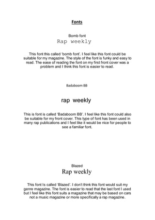
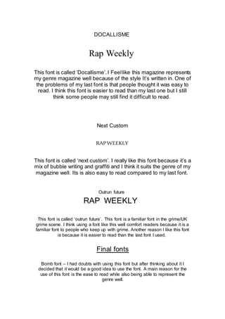
Fonts
Bomb font
Rap weekly
This font this called ‘bomb font’. I feel like this font could be
suitable for my magazine. The style of the font is funky and easy to
read. The ease of reading the font on my first front cover was a
problem and I think this font is easier to read.
Badaboom BB
rap weekly
This is font is called ‘Badaboom BB’. I feel like this font could also
be suitable for my front cover. This type of font has been used in
many rap publications and I feel like it would be nice for people to
see a familiar font.
Blazed
Rap weekly
This font Is called ‘Blazed’. I don’t think this font would suit my
genre magazine. The font is easier to read that the last font I used
but I feel like this font suits a magazine that may be based on cars
not a music magazine or more specifically a rap magazine.
DOCALLISME
Rap Weekly
This font is called ‘Docallisme’.I Feellike this magazine represents
my genre magazine well because of the style It’s written in. One of
the problems of my last font is that people thought it was easy to
read. I think this font is easier to read than my last one but I still
think some people may still find it difficult to read.
Next Custom
RAPWEEKLY
This font is called ‘next custom’. I really like this font because it’s a
mix of bubble writing and graffiti and I think it suits the genre of my
magazine well. Its is also easy to read compared to my last font.
Outrun future
RAP WEEKLY
This font is called ‘outrun future’. This font is a familiar font in the grime/UK
grime scene. I think using a font like this well comfort readers because it is a
familiar font to people who keep up with grime. Another reason I like this font
is because it is easier to read than the last font I used.
Final fonts
Bomb font – I had doubts with using this font but after thinking about it I
decided that it would be a good idea to use the font. A main reason for the
use of this font is the ease to read while also being able to represent the
genre well.
Badaboom font – I have chosen to use this font because it is a well-used font
within grime videos. Many artists have used it has their subtitles font within
their music videos so I thought it would be good for my audience to see a
familiar font.
Next custom font – I have chosen to use this font for my magazine because it
is similar to my last masthead font but is easier it read.
Outrun future font – I have chosen to use this font in my magazine for a
similar reason as to why I chose that badaboom font. It is a well known within
rap artists videos and it is a nice effect to have to make the audience feel like
the magazine is something they’d like to read.

Fonts 

  • 1.
    Fonts Bomb font Rap weekly Thisfont this called ‘bomb font’. I feel like this font could be suitable for my magazine. The style of the font is funky and easy to read. The ease of reading the font on my first front cover was a problem and I think this font is easier to read. Badaboom BB rap weekly This is font is called ‘Badaboom BB’. I feel like this font could also be suitable for my front cover. This type of font has been used in many rap publications and I feel like it would be nice for people to see a familiar font. Blazed Rap weekly This font Is called ‘Blazed’. I don’t think this font would suit my genre magazine. The font is easier to read that the last font I used but I feel like this font suits a magazine that may be based on cars not a music magazine or more specifically a rap magazine.
  • 2.
    DOCALLISME Rap Weekly This fontis called ‘Docallisme’.I Feellike this magazine represents my genre magazine well because of the style It’s written in. One of the problems of my last font is that people thought it was easy to read. I think this font is easier to read than my last one but I still think some people may still find it difficult to read. Next Custom RAPWEEKLY This font is called ‘next custom’. I really like this font because it’s a mix of bubble writing and graffiti and I think it suits the genre of my magazine well. Its is also easy to read compared to my last font. Outrun future RAP WEEKLY This font is called ‘outrun future’. This font is a familiar font in the grime/UK grime scene. I think using a font like this well comfort readers because it is a familiar font to people who keep up with grime. Another reason I like this font is because it is easier to read than the last font I used. Final fonts Bomb font – I had doubts with using this font but after thinking about it I decided that it would be a good idea to use the font. A main reason for the use of this font is the ease to read while also being able to represent the genre well.
  • 3.
    Badaboom font –I have chosen to use this font because it is a well-used font within grime videos. Many artists have used it has their subtitles font within their music videos so I thought it would be good for my audience to see a familiar font. Next custom font – I have chosen to use this font for my magazine because it is similar to my last masthead font but is easier it read. Outrun future font – I have chosen to use this font in my magazine for a similar reason as to why I chose that badaboom font. It is a well known within rap artists videos and it is a nice effect to have to make the audience feel like the magazine is something they’d like to read.