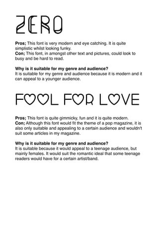
Fonts 

Pros; I like this font because it is very fun and creative. It has
character and it would stand out well to me on/in a magazine.
Cons; This font could appear to much on a page especially if there is
a lot of other features going on around it because it has a lot of detail
and quite busy.
Why is it appropriate for my genre and audience?
I think this font would really work well with the genre of my magazine.
It is a very funky and interesting font, and it would suit a pop
magazine because they are bright, bold and fun. It would work well
with my audience as they range from teenagers upwards and I think it
is fun for this age group.
Pros; This font is good because it has interest to it, it stands out but
it is not too fussy to take the focus off of other features.
Cons; This font may not interest people as much as other ones
because it doesn't have a lot of character to it. You could also lose
focus on it if their is a lot of other things going on within the page.
Why is it appropriate for my genre and audience?
This font is appropriate for my genre and audience because it is quite
basic but still has some character to it, and the style of my magazine
will be bold and bright. Although, it isn't as bold as I would like it.
Pros; I like this font because it is very simple yet it stands out. It is a
very thin font, but it stands out because of the effects of each letter.
Cons; Although being a thin font is a pro, it can also be a con
because it can take the focus away from the text, and people still
want to be interested in the text as well as pictures.
Why is it appropriate for my genre and audience?
It is appropriate for my genre and audience because my audience
do not want a font that is to overpowering, they want it to be a good
even range of text and pictures. It is also suitable for my genre
because pop magazines focus of a lot of pictures and colours most
of the time.
Pros; This font is really good because it is very bold and stands out,
yet it is simple, there is not to much going on with it that would take
over from other things.
Cons; It may not be suitable to use this font for writing an interview
on a DPS as it may be too bold.
Why is it suitable for my genre and audience?
It is suitable for my genre because the font is bold, and with colour it
will really stand out. It is a fun font for the audience and is different
from other genres fonts.
Pros; This font is very modern and eye catching. It is quite
simplistic whilst looking funky.
Con; This font, in amongst other text and pictures, could look to
busy and be hard to read.
Why is it suitable for my genre and audience?
It is suitable for my genre and audience because it is modern and it
can appeal to a younger audience.
Pros; This font is quite gimmicky, fun and it is quite modern.
Con; Although this font would fit the theme of a pop magazine, it is
also only suitable and appealing to a certain audience and wouldn't
suit some articles in my magazine.
Why is it suitable for my genre and audience?
It is suitable because it would appeal to a teenage audience, but
mainly females. It would suit the romantic ideal that some teenage
readers would have for a certain artist/band.

Fonts media copy 2

  • 1.
    Fonts 
 Pros; Ilike this font because it is very fun and creative. It has character and it would stand out well to me on/in a magazine. Cons; This font could appear to much on a page especially if there is a lot of other features going on around it because it has a lot of detail and quite busy. Why is it appropriate for my genre and audience? I think this font would really work well with the genre of my magazine. It is a very funky and interesting font, and it would suit a pop magazine because they are bright, bold and fun. It would work well with my audience as they range from teenagers upwards and I think it is fun for this age group. Pros; This font is good because it has interest to it, it stands out but it is not too fussy to take the focus off of other features. Cons; This font may not interest people as much as other ones because it doesn't have a lot of character to it. You could also lose focus on it if their is a lot of other things going on within the page. Why is it appropriate for my genre and audience? This font is appropriate for my genre and audience because it is quite basic but still has some character to it, and the style of my magazine will be bold and bright. Although, it isn't as bold as I would like it.
  • 2.
    Pros; I likethis font because it is very simple yet it stands out. It is a very thin font, but it stands out because of the effects of each letter. Cons; Although being a thin font is a pro, it can also be a con because it can take the focus away from the text, and people still want to be interested in the text as well as pictures. Why is it appropriate for my genre and audience? It is appropriate for my genre and audience because my audience do not want a font that is to overpowering, they want it to be a good even range of text and pictures. It is also suitable for my genre because pop magazines focus of a lot of pictures and colours most of the time. Pros; This font is really good because it is very bold and stands out, yet it is simple, there is not to much going on with it that would take over from other things. Cons; It may not be suitable to use this font for writing an interview on a DPS as it may be too bold. Why is it suitable for my genre and audience? It is suitable for my genre because the font is bold, and with colour it will really stand out. It is a fun font for the audience and is different from other genres fonts.
  • 3.
    Pros; This fontis very modern and eye catching. It is quite simplistic whilst looking funky. Con; This font, in amongst other text and pictures, could look to busy and be hard to read. Why is it suitable for my genre and audience? It is suitable for my genre and audience because it is modern and it can appeal to a younger audience. Pros; This font is quite gimmicky, fun and it is quite modern. Con; Although this font would fit the theme of a pop magazine, it is also only suitable and appealing to a certain audience and wouldn't suit some articles in my magazine. Why is it suitable for my genre and audience? It is suitable because it would appeal to a teenage audience, but mainly females. It would suit the romantic ideal that some teenage readers would have for a certain artist/band.