
Recommended
More Related Content
Viewers also liked
Viewers also liked (20)
Similar to Neon Dance Magazine Font Analysis
Similar to Neon Dance Magazine Font Analysis (20)
More from GregLatham96
More from GregLatham96 (20)
Neon Dance Magazine Font Analysis
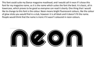
- 1. This font could suite my Dance magazine masthead, and I would call it neon if I chose this font for my magazine name, as it is the name which suites the font the best. It is basic, all in lowercase, which proves to be good as everyone can read it clearly. One thing that I would like to change to this font is the colour. Neon means bright fluorescent colours, like the colour of glow sticks you would find in a club, however it is all black and it doesn’t fit the name. People would think that the name is ironic if it wasn’t coloured in neon colours.
- 2. I feel this font is a good font style for my Dance magazine masthead. I like this font because it looks like each letter has been ‘mixed’. The letters look distorted and I feel it would be a good font to use but, like the past font, I would probably give this font colour. This font connotes the ultra modern theme the my magazine is supposed to create, which is great. I believe this font will appeal to Dance music fans, as Dance magazines tend to use fonts such as this one.
- 3. In my opinion this is the best font I have analysed out of the first 3. This font suits the name, as you can imagine this font flashing yellow as it looks like the circles each letter is made up of are light bulbs. Like the other fonts, I would appreciate this font more if it was in the colour yellow rather than black. This masthead does have the connotation of Dance music. There are many bright flashes at a Dance artists gig, and if this masthead was flashing, I think it would almost replicate a club or a Dance gig.
- 4. This would be a decent font to use because it looks quite futuristic and suites the name I have chose. If I were to choose this font, I would like the others colour it in. I like the fact that this font is distorted and it looks quite similar to the font I used for mixed. This font connotes technology and I have asked someone what the think it connotes to them and they said the matrix, which is good as I want my Masthead to look futuristic.