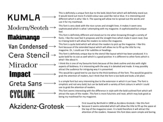
The document discusses several fonts being considered for use in a magazine masthead and other headings. It provides opinions on each font's boldness, uniqueness, ability to attract readers, and suitability for filling space. The fonts are assessed based on qualities like extended layout, sleek outlines, straight lines, thickness, sophistication, and differences from other fonts that make them stand out visually.