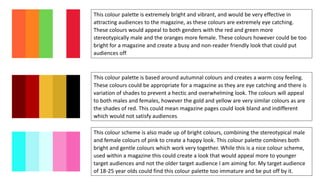
10 COLOUR PALETTES
This colour palette is made up of mainly pastel colours, with some darker shades of the
middle blue and darker orange added in to help create the balance. This colour palette
compliments and work together well and could be used to attract both genders by the
use of the orang and blues. I personally really like this cover palette as I believe there is a
good balance, the colours are mature shades and the colours are also bright enough to
attract attention however are not overwhelming.
This colour palette uses brighter colours to create a more vibrant look; this could appeal
to males more however the use of the red shade and the oranges will also make this
attractable to females. The colours are bright and would attract audience’s attention
within a magazine however they could sometimes clash and create a look that is too busy
and overpowering. I like this palette for the ability to appeal to both genders, however
this would have to be used carefully to prevent a messy look.
This colour palette is made up of much darker colours, with less light colours in the mix.
The use of the darks blues will help to attract male audience while the purple and light
blues will appeal to a female audience. Due to the darkness of the colours this scheme
would not look chaotic in a magazine, however they could be too dark to be noticeable
and create a negative mood around the magazine rather than positive.
This colour palette is very in-depth and uses shades of blues to greens and browns to
purple. This colour palette creates a very neutral look and calm feel, which would be an
appropriate feel for magazine. However, these colours lean more to appealing to a male
audience and I would want my magazine to be for both genders. These colours may also
be a little too dull for a magazine and not attract enough attention from audiences.
Overall I would happily use some colours from this palette for the calm mood this creates
however I would not use the palette as a whole.
This colour palette is more stereotypically male due to it being made up by blues and
greens however the shades of the light greens and blue can also be used to attract
females. The colours would stand out and also not be too bombarding within a
magazine. This colour palette conveys an aqua feel, with a calm cool mood which would
be more appropriate for a nature magazine than a music magazine.
This colour palette is another colour palette that can appeal to both genders due to the
mix of colours used. Within this colour palette is the classy combination of black and
white which is frequently used within magazines for the professional look the colours
provide. I personally really like this colour palette and think it would work well for an
indie/alternative music magazine as the colours would attract males and females, the
pink allows for a pop of colour that would be noticeable but not overpowering and the
sleek combination of black and white would work well.
This colour palette is extremely bright and vibrant, and would be very effective in
attracting audiences to the magazine, as these colours are extremely eye catching.
These colours would appeal to both genders with the red and green more
stereotypically male and the oranges more female. These colours however could be too
bright for a magazine and create a busy and non-reader friendly look that could put
audiences off.
This colour palette is based around autumnal colours and creates a warm cosy feeling.
These colours could be appropriate for a magazine as they are eye catching and there is
variation of shades to prevent a hectic and overwhelming look. The colours will appeal
to both males and females, however the gold and yellow are very similar colours as are
the shades of red. This could mean magazine pages could look bland and indifferent
which would not satisfy audiences.
This colour scheme is also made up of bright colours, combining the stereotypical male
and female colours of pink to create a happy look. This colour palette combines both
bright and gentle colours which work very together. While this is a nice colour scheme,
used within a magazine this could create a look that would appeal more to younger
target audiences and not the older target audience I am aiming for. My target audience
of 18-25 year olds could find this colour palette too immature and be put off by it.
This monochrome colour palette is very popular within magazines as it creates a
sleek and professional look, that is appealing to both genders. Paired together to
create a contrast, black and white can be very eye-catching while the shades of grey
can be used to balance out this contrast. Normally magazines would use another
colour such as red or any of the shades of red or blue above, to add this colour to
attract audiences and prevent a boring look. I would use a shade of another colour
above to do this.

10 colour palettes

  • 1.
  • 2.
    This colour paletteis made up of mainly pastel colours, with some darker shades of the middle blue and darker orange added in to help create the balance. This colour palette compliments and work together well and could be used to attract both genders by the use of the orang and blues. I personally really like this cover palette as I believe there is a good balance, the colours are mature shades and the colours are also bright enough to attract attention however are not overwhelming. This colour palette uses brighter colours to create a more vibrant look; this could appeal to males more however the use of the red shade and the oranges will also make this attractable to females. The colours are bright and would attract audience’s attention within a magazine however they could sometimes clash and create a look that is too busy and overpowering. I like this palette for the ability to appeal to both genders, however this would have to be used carefully to prevent a messy look. This colour palette is made up of much darker colours, with less light colours in the mix. The use of the darks blues will help to attract male audience while the purple and light blues will appeal to a female audience. Due to the darkness of the colours this scheme would not look chaotic in a magazine, however they could be too dark to be noticeable and create a negative mood around the magazine rather than positive.
  • 3.
    This colour paletteis very in-depth and uses shades of blues to greens and browns to purple. This colour palette creates a very neutral look and calm feel, which would be an appropriate feel for magazine. However, these colours lean more to appealing to a male audience and I would want my magazine to be for both genders. These colours may also be a little too dull for a magazine and not attract enough attention from audiences. Overall I would happily use some colours from this palette for the calm mood this creates however I would not use the palette as a whole. This colour palette is more stereotypically male due to it being made up by blues and greens however the shades of the light greens and blue can also be used to attract females. The colours would stand out and also not be too bombarding within a magazine. This colour palette conveys an aqua feel, with a calm cool mood which would be more appropriate for a nature magazine than a music magazine. This colour palette is another colour palette that can appeal to both genders due to the mix of colours used. Within this colour palette is the classy combination of black and white which is frequently used within magazines for the professional look the colours provide. I personally really like this colour palette and think it would work well for an indie/alternative music magazine as the colours would attract males and females, the pink allows for a pop of colour that would be noticeable but not overpowering and the sleek combination of black and white would work well.
  • 4.
    This colour paletteis extremely bright and vibrant, and would be very effective in attracting audiences to the magazine, as these colours are extremely eye catching. These colours would appeal to both genders with the red and green more stereotypically male and the oranges more female. These colours however could be too bright for a magazine and create a busy and non-reader friendly look that could put audiences off. This colour palette is based around autumnal colours and creates a warm cosy feeling. These colours could be appropriate for a magazine as they are eye catching and there is variation of shades to prevent a hectic and overwhelming look. The colours will appeal to both males and females, however the gold and yellow are very similar colours as are the shades of red. This could mean magazine pages could look bland and indifferent which would not satisfy audiences. This colour scheme is also made up of bright colours, combining the stereotypical male and female colours of pink to create a happy look. This colour palette combines both bright and gentle colours which work very together. While this is a nice colour scheme, used within a magazine this could create a look that would appeal more to younger target audiences and not the older target audience I am aiming for. My target audience of 18-25 year olds could find this colour palette too immature and be put off by it.
  • 5.
    This monochrome colourpalette is very popular within magazines as it creates a sleek and professional look, that is appealing to both genders. Paired together to create a contrast, black and white can be very eye-catching while the shades of grey can be used to balance out this contrast. Normally magazines would use another colour such as red or any of the shades of red or blue above, to add this colour to attract audiences and prevent a boring look. I would use a shade of another colour above to do this.