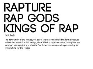
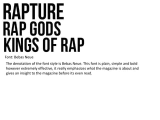
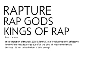
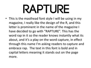
Masthead Fonts
Zeyan Mirza
Candidate Number: 1178
Centre Number: 64135
My masthead ideas are similar too…
I believe my font styles are similar to these
as they all have in common the boldness of
the font style all letters are capitals which is
also the same as my choices, and the colour
of the text is simple, something I will look to
do when I make my Masthead.
Font: Code
The denotation of the font style is code, the reason I picked this font is because
its bold but also has a slick design, the R which is repeated twice throughout the
name of my magazine and also the first letter has a unique design meaning its
eye catching for the reader
Font: Bebas Neue
The denotation of the font style is Bebas Neue. This font is plain, simple and bold
however extremely effective, it really emphasizes what the magazine is about and
gives an insight to the magazine before its even read.
The denotation of this font style is larimar. This font is simple yet effeactive
however the least favourite out of all the ones I have selected this is
because I do not think the font is bold enough.
Font: Larimar
• This is the masthead font style I will be using in my
magazine, I really like the design of the R, and this
letter is prominent in the name of the magazine I
have decided to go with “RAPTURE”. This has the
word rap in it so the reader knows instantly what its
about, and it’s a play on the word capture, in effect
through this name I'm asking readers to capture and
embrace rap. The text in this font is bold and in
capital letters meaning it stands out on the page
more.

Masthead Font Styles

  • 1.
    Masthead Fonts Zeyan Mirza CandidateNumber: 1178 Centre Number: 64135
  • 2.
    My masthead ideasare similar too… I believe my font styles are similar to these as they all have in common the boldness of the font style all letters are capitals which is also the same as my choices, and the colour of the text is simple, something I will look to do when I make my Masthead.
  • 3.
    Font: Code The denotationof the font style is code, the reason I picked this font is because its bold but also has a slick design, the R which is repeated twice throughout the name of my magazine and also the first letter has a unique design meaning its eye catching for the reader
  • 4.
    Font: Bebas Neue Thedenotation of the font style is Bebas Neue. This font is plain, simple and bold however extremely effective, it really emphasizes what the magazine is about and gives an insight to the magazine before its even read.
  • 5.
    The denotation ofthis font style is larimar. This font is simple yet effeactive however the least favourite out of all the ones I have selected this is because I do not think the font is bold enough. Font: Larimar
  • 6.
    • This isthe masthead font style I will be using in my magazine, I really like the design of the R, and this letter is prominent in the name of the magazine I have decided to go with “RAPTURE”. This has the word rap in it so the reader knows instantly what its about, and it’s a play on the word capture, in effect through this name I'm asking readers to capture and embrace rap. The text in this font is bold and in capital letters meaning it stands out on the page more.