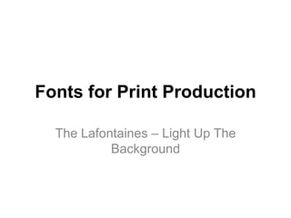
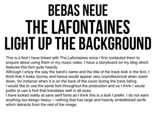
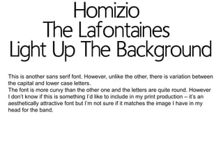
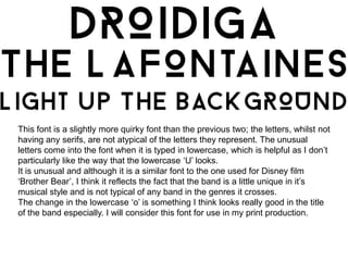
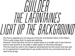
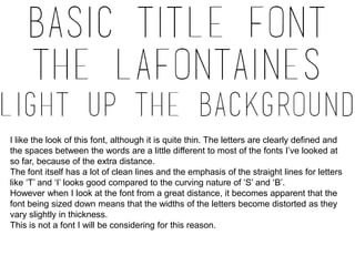
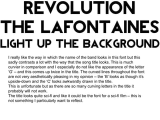
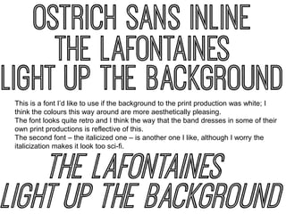
This document discusses different font options for a band's print production. It evaluates several sans serif fonts on criteria like readability at small sizes, consistency between uppercase and lowercase letters, uniqueness, and whether they match the aesthetic envisioned for the band. In the end, the author likes one font for its retro look but worries another option appears too sci-fi due to its italicization. Overall, the document analyzes fonts' suitability for the band's materials based on visual style, readability, and consistency across elements.


![5G Explained! A High Level Overview [Introduction]](https://cdn.slidesharecdn.com/ss_thumbnails/5gexplainedahighleveloverview-260119165306-cc137a3e-thumbnail.jpg?width=640&height=640&fit=bounds)


