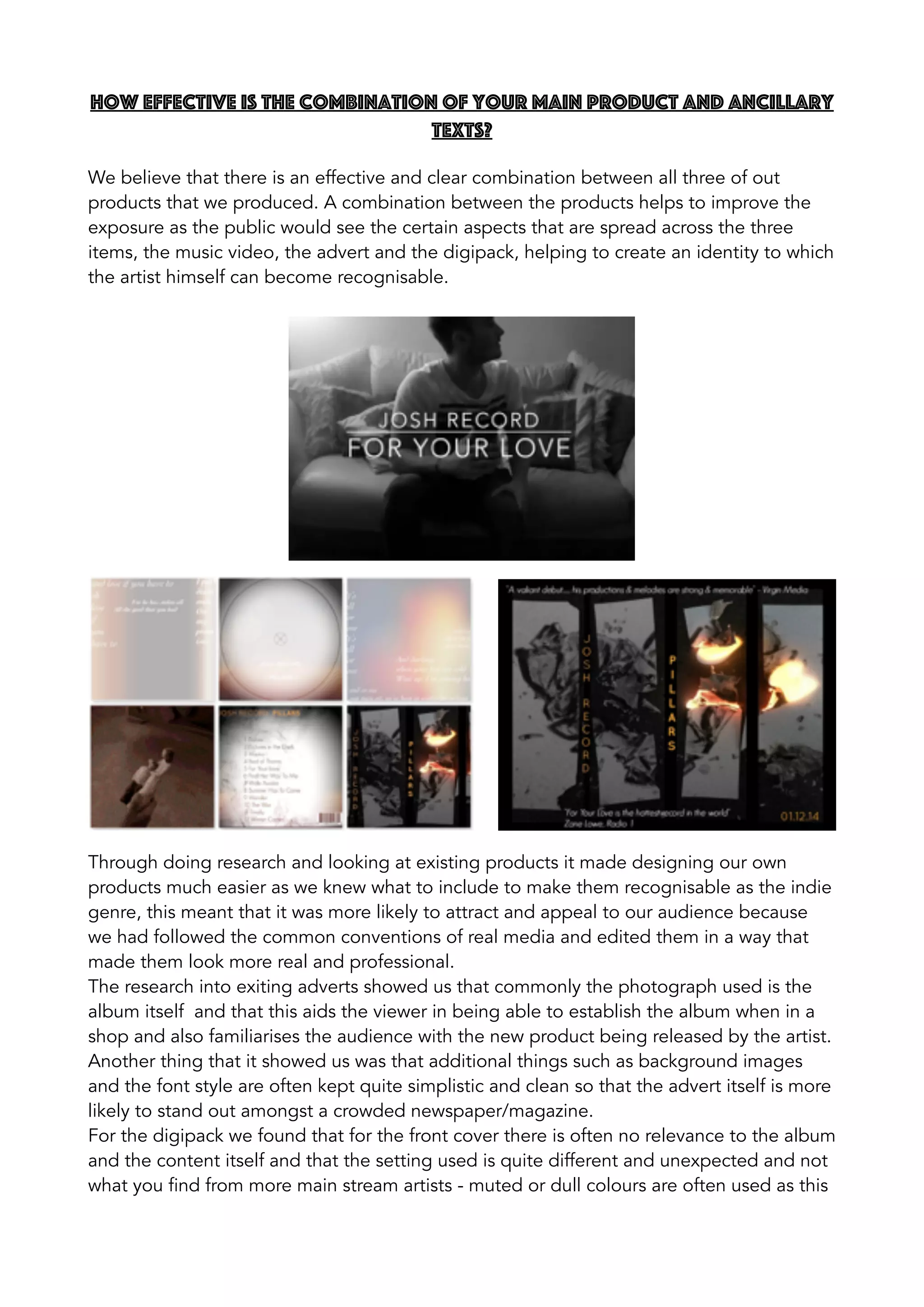
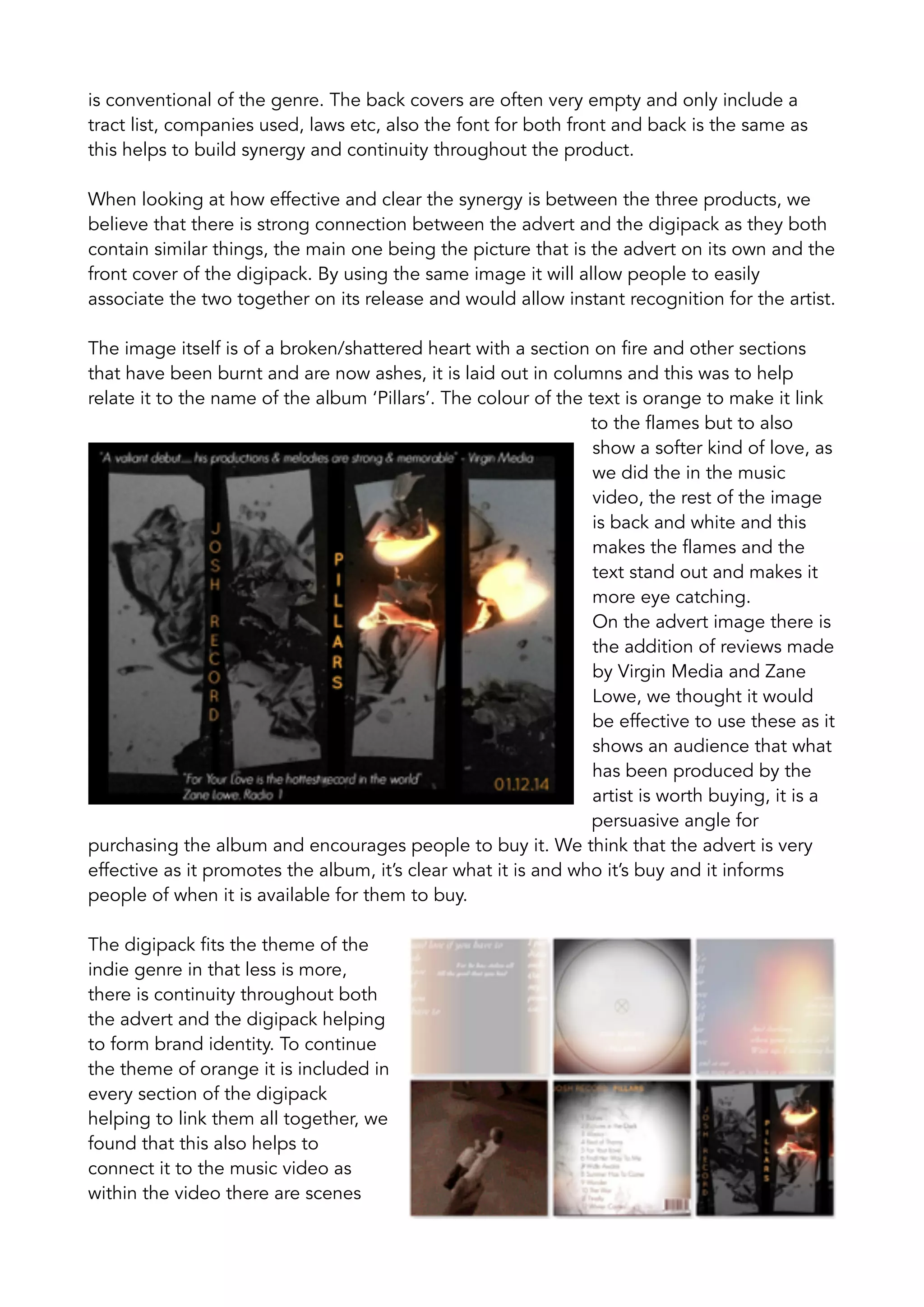
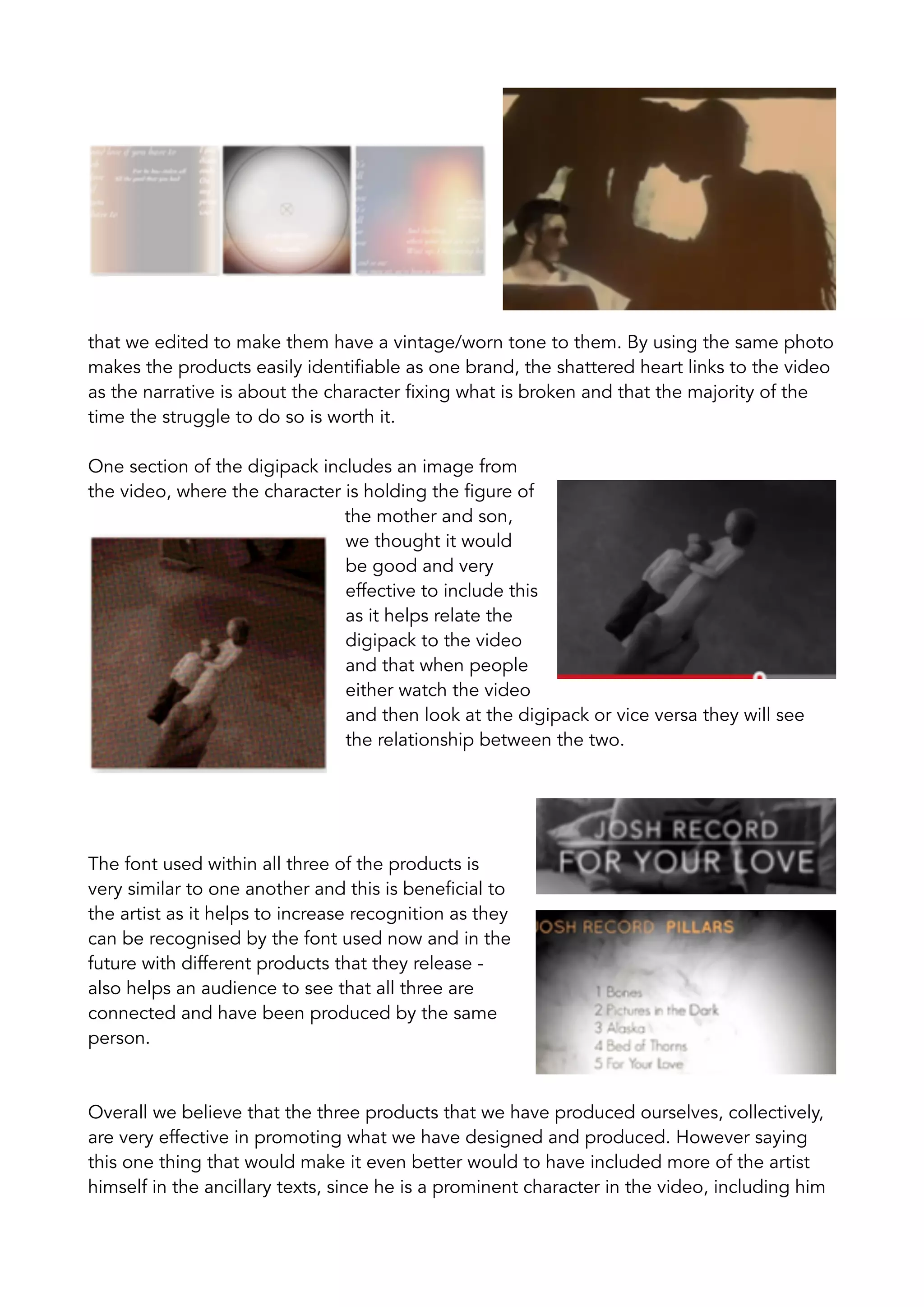
How effective is the combination of your main product and ancillary
texts?
We believe that there is an effective and clear combination between all three of out
products that we produced. A combination between the products helps to improve the
exposure as the public would see the certain aspects that are spread across the three
items, the music video, the advert and the digipack, helping to create an identity to which
the artist himself can become recognisable.
Through doing research and looking at existing products it made designing our own
products much easier as we knew what to include to make them recognisable as the indie
genre, this meant that it was more likely to attract and appeal to our audience because
we had followed the common conventions of real media and edited them in a way that
made them look more real and professional.
The research into exiting adverts showed us that commonly the photograph used is the
album itself and that this aids the viewer in being able to establish the album when in a
shop and also familiarises the audience with the new product being released by the artist.
Another thing that it showed us was that additional things such as background images
and the font style are often kept quite simplistic and clean so that the advert itself is more
likely to stand out amongst a crowded newspaper/magazine.
For the digipack we found that for the front cover there is often no relevance to the album
and the content itself and that the setting used is quite different and unexpected and not
what you find from more main stream artists - muted or dull colours are often used as this
is conventional of the genre. The back covers are often very empty and only include a
tract list, companies used, laws etc, also the font for both front and back is the same as
this helps to build synergy and continuity throughout the product.
When looking at how effective and clear the synergy is between the three products, we
believe that there is strong connection between the advert and the digipack as they both
contain similar things, the main one being the picture that is the advert on its own and the
front cover of the digipack. By using the same image it will allow people to easily
associate the two together on its release and would allow instant recognition for the artist.
The image itself is of a broken/shattered heart with a section on fire and other sections
that have been burnt and are now ashes, it is laid out in columns and this was to help
relate it to the name of the album ‘Pillars’. The colour of the text is orange to make it link
to the flames but to also
show a softer kind of love, as
we did the in the music
video, the rest of the image
is back and white and this
makes the flames and the
text stand out and makes it
more eye catching.
On the advert image there is
the addition of reviews made
by Virgin Media and Zane
Lowe, we thought it would
be effective to use these as it
shows an audience that what
has been produced by the
artist is worth buying, it is a
persuasive angle for
purchasing the album and encourages people to buy it. We think that the advert is very
effective as it promotes the album, it’s clear what it is and who it’s buy and it informs
people of when it is available for them to buy.
The digipack fits the theme of the
indie genre in that less is more,
there is continuity throughout both
the advert and the digipack helping
to form brand identity. To continue
the theme of orange it is included in
every section of the digipack
helping to link them all together, we
found that this also helps to
connect it to the music video as
within the video there are scenes
that we edited to make them have a vintage/worn tone to them. By using the same photo
makes the products easily identifiable as one brand, the shattered heart links to the video
as the narrative is about the character fixing what is broken and that the majority of the
time the struggle to do so is worth it.
One section of the digipack includes an image from
the video, where the character is holding the figure of
the mother and son,
we thought it would
be good and very
effective to include this
as it helps relate the
digipack to the video
and that when people
either watch the video
and then look at the digipack or vice versa they will see
the relationship between the two.
The font used within all three of the products is
very similar to one another and this is beneficial to
the artist as it helps to increase recognition as they
can be recognised by the font used now and in the
future with different products that they release -
also helps an audience to see that all three are
connected and have been produced by the same
person.
Overall we believe that the three products that we have produced ourselves, collectively,
are very effective in promoting what we have designed and produced. However saying
this one thing that would make it even better would to have included more of the artist
himself in the ancillary texts, since he is a prominent character in the video, including him
in the other products would have made him even more identifiable and would increase
his recognition massively - despite this though we still think that what we have created
serves its purpose well and suits the genre that we chose in the beginning.

Evaluation - Question 2

  • 1.
    How effective isthe combination of your main product and ancillary texts? We believe that there is an effective and clear combination between all three of out products that we produced. A combination between the products helps to improve the exposure as the public would see the certain aspects that are spread across the three items, the music video, the advert and the digipack, helping to create an identity to which the artist himself can become recognisable. Through doing research and looking at existing products it made designing our own products much easier as we knew what to include to make them recognisable as the indie genre, this meant that it was more likely to attract and appeal to our audience because we had followed the common conventions of real media and edited them in a way that made them look more real and professional. The research into exiting adverts showed us that commonly the photograph used is the album itself and that this aids the viewer in being able to establish the album when in a shop and also familiarises the audience with the new product being released by the artist. Another thing that it showed us was that additional things such as background images and the font style are often kept quite simplistic and clean so that the advert itself is more likely to stand out amongst a crowded newspaper/magazine. For the digipack we found that for the front cover there is often no relevance to the album and the content itself and that the setting used is quite different and unexpected and not what you find from more main stream artists - muted or dull colours are often used as this
  • 2.
    is conventional ofthe genre. The back covers are often very empty and only include a tract list, companies used, laws etc, also the font for both front and back is the same as this helps to build synergy and continuity throughout the product. When looking at how effective and clear the synergy is between the three products, we believe that there is strong connection between the advert and the digipack as they both contain similar things, the main one being the picture that is the advert on its own and the front cover of the digipack. By using the same image it will allow people to easily associate the two together on its release and would allow instant recognition for the artist. The image itself is of a broken/shattered heart with a section on fire and other sections that have been burnt and are now ashes, it is laid out in columns and this was to help relate it to the name of the album ‘Pillars’. The colour of the text is orange to make it link to the flames but to also show a softer kind of love, as we did the in the music video, the rest of the image is back and white and this makes the flames and the text stand out and makes it more eye catching. On the advert image there is the addition of reviews made by Virgin Media and Zane Lowe, we thought it would be effective to use these as it shows an audience that what has been produced by the artist is worth buying, it is a persuasive angle for purchasing the album and encourages people to buy it. We think that the advert is very effective as it promotes the album, it’s clear what it is and who it’s buy and it informs people of when it is available for them to buy. The digipack fits the theme of the indie genre in that less is more, there is continuity throughout both the advert and the digipack helping to form brand identity. To continue the theme of orange it is included in every section of the digipack helping to link them all together, we found that this also helps to connect it to the music video as within the video there are scenes
  • 3.
    that we editedto make them have a vintage/worn tone to them. By using the same photo makes the products easily identifiable as one brand, the shattered heart links to the video as the narrative is about the character fixing what is broken and that the majority of the time the struggle to do so is worth it. One section of the digipack includes an image from the video, where the character is holding the figure of the mother and son, we thought it would be good and very effective to include this as it helps relate the digipack to the video and that when people either watch the video and then look at the digipack or vice versa they will see the relationship between the two. The font used within all three of the products is very similar to one another and this is beneficial to the artist as it helps to increase recognition as they can be recognised by the font used now and in the future with different products that they release - also helps an audience to see that all three are connected and have been produced by the same person. Overall we believe that the three products that we have produced ourselves, collectively, are very effective in promoting what we have designed and produced. However saying this one thing that would make it even better would to have included more of the artist himself in the ancillary texts, since he is a prominent character in the video, including him
  • 4.
    in the otherproducts would have made him even more identifiable and would increase his recognition massively - despite this though we still think that what we have created serves its purpose well and suits the genre that we chose in the beginning.