
Recommended
Recommended
More Related Content
What's hot
What's hot (20)
Similar to Question 2 eval
Similar to Question 2 eval (20)
Recently uploaded
Recently uploaded (20)
Question 2 eval
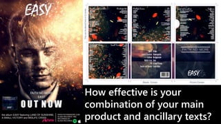
- 1. How effective is your combination of your main product and ancillary texts?
- 2. IMAGES The similarities between the digipak and magazine advertisement lie primarily in the comparison of imagery. Both use a similar colour scheme and this was to keep both relevant to one another, I chose to use a dark purple shadow and orange highlight scheme. These colours being complementary are visually interesting and grabbing to a viewer. I chose to use the ash/fire themed imagery in both productions to link to the self destructive theme of the song and the tone of my music video, the fires destruction of the artist connotes danger around him, which helps correlate with the star image conveyed to the audience. This also carries into the background used in the digipak. To match with the music video’s style I used very similar lighting techniques when photographing the artist for the magazine advertisement. The Rembrandt lighting coupled with the use of backlighting creates a striking and dramatic looking image that assists in connoting the tone of the song, album and music video successfully. The use of the fire imagery also adds to this. The top right artificial light that I added in post blends well with the lighting of the original photograph.
- 3. FONT The font of the title was initially a challenge, I wanted a contrast between the imagery of the poster itself and the title of the album/song font style. Implementing this I opting for a drawn style font combined with it falling apart into birds, a peaceful connotation coupled with the name. I also applied a stereoscopic effect to the title, making it seem distorted, implying to the audience that this “easy” is somehow ironic. “OUT NOW”, I used this at the bottom in such a large and bold font to emphasise the urgency of the product displayed, it even outweighs the band name and song name just above it in terms of scale and coverage of the advertisement. It is also in an area of the image where there is a strong black background, this also contrasts with the white lettering to make it immediate to the audience. The lettering just below the “OUT NOW” gives the viewer the less important information, detailing the other songs listed and the record company. This is so small as to bring emphasis to the rest of the titling, the song names along this information however are capitalised so that even in the small information shown, the song names and products are still taking importance in selling to the audience. In my digipak, I listed the songs in a italics and written style of font, this would connote to the audience a “homemade” style of song and product which would appeal to the anti corporate elements of rock music and indie. Also listed under this is the song lyrics which are often seen in other digipaks of the same genre, for example “White Blood Cells” by the White Stripes.
- 4. EDITING For the main image, a photograph of the artist I wanted to make them seem as if they were being “burned away”, relating to the themes of the song and music video. For this I used a photo editing software called Adobe Photoshop. In this I layered up 3d generated embers and used an eraser tool with a custom particle brush to get the disintegration effect seen in the image. In Photoshop is also where I applied the colour grade to create a colour contrast to make the shadows and low key lighting for defined. The ancilliary task involved sectioning off a large texture background that I created using the same assets, as from the magazine advertisement to keep the theming and the visuals similar in style, into the individual sides of the digipak template that I found online.