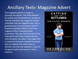
Q2: How effective is the
combination of your main product
and ancillary texts?
My 3 products are made up of my main product, my
video and the ancillary products which is my album
digipak and magazine advert. Clear correlations had
to be shown with all of my products. This helps give
them an identity and therefore gives it a
professional presence making the audience
appreciate the products as one more. This makes
sense as if someone only saw the magazine advert
then they would know what to look for in the
album because of the design stylistically, the
colours, the font and the images will spark the
audiences memory for when they see that album in
the future.
Main product- Video
My music video was for the song ‘Business’ by
Catfish and The Bottlemen. This belonging to the
indie genre with the codes and conventions that
make the video up; I decided to follow the
majority of these with challenging some to add
variety. With this my video mostly consisted of
performance shots blended with a realistic and
relatable narrative, the mise en scene follows this
costumes, props and locations also being realistic
to match.
Ancillary Texts- Digipak
My digipak also has huge resemblances to real life examples
digipak’s from the indie genre. This is because it looks the best, I
decided to stay with the realistic and relatable clothing as this
parallels the video. Clear link like mentioned before is necessary
to establish an identity for the album. The main theme of the
digipak is black and white, this can be interpreted as how all the
lyrics in the video link to the simplest of things in life like love in
business in particular.
Ancillary Texts- Magazine Advert
This magazine advert is made to
promote the album ‘The Filthy Rebirth’
by Catfish and The Bottlemen. Similar to
real life examples the magazine heavily
resembles how the digipak looks, this is
good because its promoting it and if it
looked completely different then the
magazine then it would be false
promotion. This also directly links to the
indie genre and more importantly my
other product, my video. Once again this
is important because I wanted to ensure
that my digipak and video have an
identity, one that the audience is able to
recognise easily and remain in there
memory.
Links
There is a multitude of obvious and more discrete links across my main
product and the two ancillary products. The main theme goes through
all three product. Firstly the more obvious ones such as the artist, who
is present in all 3 of the products, this makes sense as he is the only
performer so this is the best way represent and sell the artist to the
audience, to show what he looks like with a whole range of emotions,
shown on the digipak with a photo of Caden being on every section
except the disk. This directly links to how Caden is in the video
expressing several emotions throughout the song. For example when
the lyrics are more meaningful and slower Cadens facial expression is
representative of sadder emotions. Caden also represents throughout
all 3 products how relatable the song and lyrics are, Cadens clothing is
casual and appeals directly to the target audience as something that
they would wear which makes them interested in all 3 products.
Another obvious link across my digipak and magazine
advert is the font used for the text and the colours used on
both; as both my digipak and magazine advert uses the
black background with the white text to contrast showing a
clear link between both. Also the text only appears in the
form of the album title and artists name on front of the
digipak. The extra information on the magazine advert
looks very similar and blends well as the font is the same.
Another point is that Caden’s clothing in the digipak and
magazine advert directly parallel what the characters are
wearing in the music video which directly links the two. The
casual wear can not only be seen on Caden within the video
but on other characters like Niall and Lucy during the
narrative element of the video.
Other more subtle links include how the artists’ arms are crossed within the digipak
and the magazine advert, coupled with the line “I wanna make it my business” from
my song is symbolic of the artists’ seriousness in the matter and narrative element of
my music video.
All of this together helps build an identity for the brand as they all work of each other,
the video is for the single supporting the album/digipak then the magazine advert is
promote the album and single. If these didn’t have direct links that even the audience
couldn’t make reference to then it wouldn’t work. For example if the magazine advert
looked completely different from the digipak and an audience member only saw the
magazine advert, they wouldn’t have a visual trigger of the memory for future
reference when coming across the album. Because all of mine are black and white
then the audience will know what to look out for, creating an identity for the products.
The way the digipak and magazine advert is designed also helps the band build its own
identity. For example, the aesthetic throughout both consists of a bold black and
white, the font of both the band and artist. This helps when reading about the band, if
the logo comes up it will be in that font, keeping an identity. Everything about the
model and the special effects also help develop a brand identity. The outline of the
artist, which is featured on every section of the digipak and magazine advert, is a
feature that is unique to this album. When the audience think about this album they
will think back to this unique trait. These features make the brand be recognisable for
all audiences in future encounters.

Evaluation 2018 q2

  • 1.
    Q2: How effectiveis the combination of your main product and ancillary texts?
  • 2.
    My 3 productsare made up of my main product, my video and the ancillary products which is my album digipak and magazine advert. Clear correlations had to be shown with all of my products. This helps give them an identity and therefore gives it a professional presence making the audience appreciate the products as one more. This makes sense as if someone only saw the magazine advert then they would know what to look for in the album because of the design stylistically, the colours, the font and the images will spark the audiences memory for when they see that album in the future.
  • 3.
    Main product- Video Mymusic video was for the song ‘Business’ by Catfish and The Bottlemen. This belonging to the indie genre with the codes and conventions that make the video up; I decided to follow the majority of these with challenging some to add variety. With this my video mostly consisted of performance shots blended with a realistic and relatable narrative, the mise en scene follows this costumes, props and locations also being realistic to match.
  • 4.
    Ancillary Texts- Digipak Mydigipak also has huge resemblances to real life examples digipak’s from the indie genre. This is because it looks the best, I decided to stay with the realistic and relatable clothing as this parallels the video. Clear link like mentioned before is necessary to establish an identity for the album. The main theme of the digipak is black and white, this can be interpreted as how all the lyrics in the video link to the simplest of things in life like love in business in particular.
  • 5.
    Ancillary Texts- MagazineAdvert This magazine advert is made to promote the album ‘The Filthy Rebirth’ by Catfish and The Bottlemen. Similar to real life examples the magazine heavily resembles how the digipak looks, this is good because its promoting it and if it looked completely different then the magazine then it would be false promotion. This also directly links to the indie genre and more importantly my other product, my video. Once again this is important because I wanted to ensure that my digipak and video have an identity, one that the audience is able to recognise easily and remain in there memory.
  • 6.
    Links There is amultitude of obvious and more discrete links across my main product and the two ancillary products. The main theme goes through all three product. Firstly the more obvious ones such as the artist, who is present in all 3 of the products, this makes sense as he is the only performer so this is the best way represent and sell the artist to the audience, to show what he looks like with a whole range of emotions, shown on the digipak with a photo of Caden being on every section except the disk. This directly links to how Caden is in the video expressing several emotions throughout the song. For example when the lyrics are more meaningful and slower Cadens facial expression is representative of sadder emotions. Caden also represents throughout all 3 products how relatable the song and lyrics are, Cadens clothing is casual and appeals directly to the target audience as something that they would wear which makes them interested in all 3 products.
  • 7.
    Another obvious linkacross my digipak and magazine advert is the font used for the text and the colours used on both; as both my digipak and magazine advert uses the black background with the white text to contrast showing a clear link between both. Also the text only appears in the form of the album title and artists name on front of the digipak. The extra information on the magazine advert looks very similar and blends well as the font is the same. Another point is that Caden’s clothing in the digipak and magazine advert directly parallel what the characters are wearing in the music video which directly links the two. The casual wear can not only be seen on Caden within the video but on other characters like Niall and Lucy during the narrative element of the video.
  • 8.
    Other more subtlelinks include how the artists’ arms are crossed within the digipak and the magazine advert, coupled with the line “I wanna make it my business” from my song is symbolic of the artists’ seriousness in the matter and narrative element of my music video. All of this together helps build an identity for the brand as they all work of each other, the video is for the single supporting the album/digipak then the magazine advert is promote the album and single. If these didn’t have direct links that even the audience couldn’t make reference to then it wouldn’t work. For example if the magazine advert looked completely different from the digipak and an audience member only saw the magazine advert, they wouldn’t have a visual trigger of the memory for future reference when coming across the album. Because all of mine are black and white then the audience will know what to look out for, creating an identity for the products. The way the digipak and magazine advert is designed also helps the band build its own identity. For example, the aesthetic throughout both consists of a bold black and white, the font of both the band and artist. This helps when reading about the band, if the logo comes up it will be in that font, keeping an identity. Everything about the model and the special effects also help develop a brand identity. The outline of the artist, which is featured on every section of the digipak and magazine advert, is a feature that is unique to this album. When the audience think about this album they will think back to this unique trait. These features make the brand be recognisable for all audiences in future encounters.