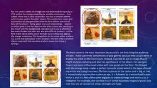
The document discusses the effectiveness of combining a music video, digipak, and website for a pop music production. It describes how each ancillary text conforms to pop genre conventions while adding original elements. The music video features two artists and conveys codes and conventions. The six-panel digipak maintains a consistent theme and links the artists' social media. The website provides information about the artists and links to their social profiles, maintaining synergy between the music video and digipak. All elements were researched and applied codes and conventions appropriately to create an effective combination of ancillary texts.
Macroeconomics- Movie Location
This will be used as part of your Personal Professional Portfolio once graded.
Objective:
Prepare a presentation or a paper using research, basic comparative analysis, data organization and application of economic information. You will make an informed assessment of an economic climate outside of the United States to accomplish an entertainment industry objective.
Francesca Gottschalk - How can education support child empowerment.pptxEduSkills OECD
Francesca Gottschalk from the OECD’s Centre for Educational Research and Innovation presents at the Ask an Expert Webinar: How can education support child empowerment?
Introduction to AI for Nonprofits with Tapp NetworkTechSoup
Dive into the world of AI! Experts Jon Hill and Tareq Monaur will guide you through AI's role in enhancing nonprofit websites and basic marketing strategies, making it easy to understand and apply.
The Roman Empire A Historical Colossus.pdfkaushalkr1407
The Roman Empire, a vast and enduring power, stands as one of history's most remarkable civilizations, leaving an indelible imprint on the world. It emerged from the Roman Republic, transitioning into an imperial powerhouse under the leadership of Augustus Caesar in 27 BCE. This transformation marked the beginning of an era defined by unprecedented territorial expansion, architectural marvels, and profound cultural influence.
The empire's roots lie in the city of Rome, founded, according to legend, by Romulus in 753 BCE. Over centuries, Rome evolved from a small settlement to a formidable republic, characterized by a complex political system with elected officials and checks on power. However, internal strife, class conflicts, and military ambitions paved the way for the end of the Republic. Julius Caesar’s dictatorship and subsequent assassination in 44 BCE created a power vacuum, leading to a civil war. Octavian, later Augustus, emerged victorious, heralding the Roman Empire’s birth.
Under Augustus, the empire experienced the Pax Romana, a 200-year period of relative peace and stability. Augustus reformed the military, established efficient administrative systems, and initiated grand construction projects. The empire's borders expanded, encompassing territories from Britain to Egypt and from Spain to the Euphrates. Roman legions, renowned for their discipline and engineering prowess, secured and maintained these vast territories, building roads, fortifications, and cities that facilitated control and integration.
The Roman Empire’s society was hierarchical, with a rigid class system. At the top were the patricians, wealthy elites who held significant political power. Below them were the plebeians, free citizens with limited political influence, and the vast numbers of slaves who formed the backbone of the economy. The family unit was central, governed by the paterfamilias, the male head who held absolute authority.
Culturally, the Romans were eclectic, absorbing and adapting elements from the civilizations they encountered, particularly the Greeks. Roman art, literature, and philosophy reflected this synthesis, creating a rich cultural tapestry. Latin, the Roman language, became the lingua franca of the Western world, influencing numerous modern languages.
Roman architecture and engineering achievements were monumental. They perfected the arch, vault, and dome, constructing enduring structures like the Colosseum, Pantheon, and aqueducts. These engineering marvels not only showcased Roman ingenuity but also served practical purposes, from public entertainment to water supply.
How to Make a Field invisible in Odoo 17Celine George
It is possible to hide or invisible some fields in odoo. Commonly using “invisible” attribute in the field definition to invisible the fields. This slide will show how to make a field invisible in odoo 17.
Palestine last event orientationfvgnh .pptxRaedMohamed3
An EFL lesson about the current events in Palestine. It is intended to be for intermediate students who wish to increase their listening skills through a short lesson in power point.
Welcome to TechSoup New Member Orientation and Q&A (May 2024).pdfTechSoup
In this webinar you will learn how your organization can access TechSoup's wide variety of product discount and donation programs. From hardware to software, we'll give you a tour of the tools available to help your nonprofit with productivity, collaboration, financial management, donor tracking, security, and more.
Model Attribute Check Company Auto PropertyCeline George
In Odoo, the multi-company feature allows you to manage multiple companies within a single Odoo database instance. Each company can have its own configurations while still sharing common resources such as products, customers, and suppliers.
Operation “Blue Star” is the only event in the history of Independent India where the state went into war with its own people. Even after about 40 years it is not clear if it was culmination of states anger over people of the region, a political game of power or start of dictatorial chapter in the democratic setup.
The people of Punjab felt alienated from main stream due to denial of their just demands during a long democratic struggle since independence. As it happen all over the word, it led to militant struggle with great loss of lives of military, police and civilian personnel. Killing of Indira Gandhi and massacre of innocent Sikhs in Delhi and other India cities was also associated with this movement.
Acetabularia Information For Class 9 .docxvaibhavrinwa19
Acetabularia acetabulum is a single-celled green alga that in its vegetative state is morphologically differentiated into a basal rhizoid and an axially elongated stalk, which bears whorls of branching hairs. The single diploid nucleus resides in the rhizoid.
1. 2.HOW EFFECTIVE IS THE
COMBINATION OF YOUR MAIN
PRODUCT AND ANCILLARY
TEXTS?
2. TASK
• First of all, for our production we had to create a music video for a pop genre which I believe was
successful as it conveyed to many codes and conventions but also has forms of originality. The video
consists of two artists.
• We also had to create a digipak using 6 panels. We conformed to codes and conventions as we
maintained a constant theme.
• Furthermore, we had to create a website that also has synergy between the music video and digipak. It
conforms to the codes and conventions of pop as it offers the audience a lot of information about the
artists. Furthermore, we linked the social media sites on the website to make the audience more aware
of how they can follow and support them.
• Through researching different real media texts I was able to use my knowledge and understanding to
apply these codes and conventions and thus create my products.
3. For the left panel I conformed to the codes and conventions of pop
digipaks as there are credits of who helped produced the album
along with the social media. This is a significant factor to place in
digipaks as not only does it identify who helped but promotes
them as well. One way I subverted conventions was by having the
social media logos on the bottom left. I did this because I wanted
the audience to know exactly what platforms the artists are on so
they can follow them and thus become more popular, especially
because of the fact that in modern society now, social media has
become a ubiquitous platform which makes it more likely to gain a
following. To conform to the dawn theme I used an image I took of
clouds near the sunset and had one of the artists placed at the
centre to make them stand out. I conformed to the codes by using
an Arial font in bold for the credits. I kept to the ‘Z’ pattern shape
as this is a method to attract the audiences eye.
For the CD I wanted it to be simple and to have the ‘AGAPE’ logo. The
CD conforms to codes and conventions as it has an image that is iconic
to the artists as it is also seen in the music video and website. I decided
to use this picture because I believe it effectively creates an
understanding of the sunset theme and stands out as it is in the centre.
For the agape font I copied it from my other digipak and warped the
text to make it fit along the bottom of the CD. I also spaced it to 65pt to
make it more easy to read and appealing to the eye. The font is iconic of
the band as it is on almost every single album cover and on their
merchandise.
4. For this cover I added an orange box and decreased the opacity to
25% so that the orange visual theme could be continuous. I then
added a font that is clear to read but also has a romantic theme
which is also used in the other covers. This conforms to codes and
conventions of pop genres because the font reflects the overall
tone of the album – being about love and relationships. I added
an outer glow to the font because the black colour was blending in
too much with the background. I decided not to use a white font
because it looked too plain and was also difficult to read. I put the
font at the top of all the layers to make sure it stood out against
the orange undertone. This image links to the music video as there
is a scene that takes place in this location. The font links to another
album cover with the soundtrack which shows that there is
synergy.
The front cover is the most important because it is the first thing the audience
will see. I have subverted conventions of pop genres because they usually tend to
display the artist on the front cover. Instead, I wanted to put an image that is
bright and eye capturing and also has significance to the album. For example,
flowers are seen in the music video with rose petals on the floor. The flowers
with the orange tone creates a perfect romantic mood which is the type of music
my artists are trying to convey. The font is placed in the centre and is big so that
it immediately captures the audiences eye. It is followed by a white floral border
which is also in a few of the other digipaks to create synergy and also acts as a
metaphor. For example, the fact that it is in white illustrates images of purity and
that they are all connected shows strength and hope.
5. This picture was simply adjusted with an orange colour overlay
with the opacity put down to 25% to continue the orange
theme that is run throughout the other digipaks. I added a
separate image of the second artist to balance out the left
cover who is just the male artist. She is surrounded by
significant objects that can be seen in the music video or
website. For example, the fairy lights are featured in both
which creates gratification for the audience because of the
repeated images they see which will make them more
familiarised with the meaning and understand the purpose of
the objects. This album cover has synergy with the music
video because there is a part in the song where the
performance uses the same angle along with the fairy lights.
This can also be seen in one scene in the narrative.
The soundtrack album conforms to the conventions of pop as the titles are
placed at the centre which makes them stand out. They are aligned at the centre
which makes each title stand out more because of the length of their words. The
names of the titles also conform to codes and conventions as they all have
themes and meaning of love. I also added a barcode to make the digipak more
realistic. Also I added the Atlantic Records label along with credits for Sony who
helped distribute this. I also added the copyright logo which adds on to it being
realistic as a lot of artists use this so that people cannot use their music without
their permission. The soundtrack album cover holds special significance in the
music video as this is where the two actors walk of together at the very end.
7. HOME PAGE
The home page has the same background as the
album cover. The flowers with the orange tone create
a vintage, cool tone. This picture creates synergy
from the music video as there are scenes with rose
petals that are on the floor. The page has orange
banners where the titles fit into. This also creates
synergy with the album cover as all the images have
a orange layer to create that sunset tone.
On the gallery page I decided to put a clear image of
the candles lit. This dark yet bright image make the
images from the gallery stand out even more. We used
images of visuals that were also seen in the video so
the audience would know that these images represent
their song ‘Dusk till Dawn’. The top bars are easy to
use and are not hidden anywhere which makes it
simple for the audience to look for what page they
want.
GALLERY PAGE
8. TOUR PAGE
For the tour page I used an image of one of the artists
holding the fairy lights. I had to edit this image on photoshop
by lowering the saturation because the bright lights
interfered with the tour dates information. I made the time
and dates italic as they looked more professional like this and
also made the options orange to keep in theme with the
other ancillary products. This links to the video because
there are narrative and performance scenes with the artist
surrounded by fairy lights. It is also seen on the website’s
‘Shop page’.
For the shop page I wanted to keep the
background nice and simple so the audience
wouldn’t get too distracted and enjoy looking
at the merchandise instead. I created the
agape jumper and had the iconic font of the
logo that is also on the digipak, along with a
floral border that is also present in the digipak.
SHOP PAGE
9. VIDEO PAGE
For the background we used the same
images as the tours but zoomed out
more. The lights surrounding the video
add onto the metaphor of there being
hope all around.
For the about page I added to pictures of the artist. The
fact that they look more casual and different that to
the music video makes it more realistic when reading
the information about their personal lives. I used the
images that were featured in the time lapse in the
video and also the CD cover for the digipak because I
though these images would nicely reflect the small
pictures of the artists. Furthermore, I divided the page
into two to make the information about them more
easy to read by also adding an orange box.
ABOUT PAGE
10. ABOUT
Continuing from the previous page there is a picture of
Tima playing the guitar in school. This builds up realism
of the artists background and connects with the
audience as it makes them seem more authentic and
passionate about music. Furthermore, the fact that they
developed their music interests in school can inspire
other teens who my target audience is. The orange
colour is present in all the images. The fact that Tima’s
face is identified in all 3 products clearly create a global
image of her.
11. FURTHER ANALYSIS OF HOW THEY ALL LINK
• The digipak links to the music video as there are repeated images of light which can be seen in the
sunset and the bright orange tones. These images are featured in the music video with the fairy lights,
candles and sparklers. Furthermore, the fact that there are repeated locations like The lights with the
soundtrack on creates gratification for the audience as they’ve seen this before in the music video.
• The digipak also links to the website through the use of repeated images and having the same shade of
an orange tone run throughout all the pages. For example, this can be seen in the headings each page.
The website links to my music video as it uses the same images and captures both the artist.
• In conclusion, I believe there is synergy among all the products and am pleased with this. However, if
there was one thing I could change, I would like to have more pictures of the male artist on the website.