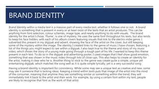
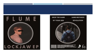
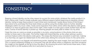
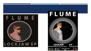
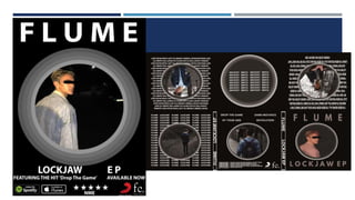
EVALUATION QUESTION TWO
HOW EFFECTIVE IS THE COMBINATION OF YOUR MAIN PRODUCT AND ANCILLARY TEXTS?
BRAND IDENTITY
Brand Identity within a media text is a massive part of every media text, whether it follows one or not. A brand
identity is something that is present in every or at least most of the texts that an artist produces. This can be
anything from font selection, colour schemes, image type, and nearly anything to do with visuals. The brand
identity for the artist I chose, ‘Flume’, is one of mystery. He uses the same font throughout his texts, but also tends
to keep his face hidden, with each of his album covers featuring visuals that link to the electro-indie genre. I
subverted this present in my digipak and advert, showing the face of the artist on the cover, but still keeping
some of the mystery within the image. The identity I created links to the genre of music I have chosen, featuring a
lot of the things you might expect to see within a digipak. I also kept true to the theme and story of my music
video, which shows the story of a young male going through a tough part of his life. I wanted to keep this theme
present in each text. To do so in the digipak and advertising poster, I used images that I feel show good emotion,
something that was shown in the music video through lots of close-ups. This also helps to create an identity for
the artist, making it clear who he is. Another thing to stick to the genre was create quite a simple, unique yet
entertaining digipak, which matches the song well as it is quite simple lyrically, yet is a very successful song.
Having a brand identity is important for consistency. While some may see a unique text as creative and new, some
may see it someone that is lacking ideas. Keeping a trend within texts puts that image of the artist into the mind
of the consumer, meaning that anytime they see something similar or something within the trend, they will
immediately link it back to the artist and their work. For example, by using a certain font within my text, people
are likely to recognise that font as the work of that artist.
CONSISTENCY
Keeping a brand identity can be a key reason to success for some artists, whatever the media product it is
that is being sold. I had to closely evaluate many different aspects before beginning to develop a brand
identity, trying to keep these present in each three texts I produced. I spoke about some of the things I
have done to try and keep the three texts linked, as well as using the ancillary texts to further develop
ideologies within my music video. I took some inspiration from other artists within the electro-indie genre,
making it so that my genre was clear at first sight. I then made it so that upon a brief, further look into the
work, a sense of brand identity is picked up, meaning people are easily able to relate it to my artist.
I kept the mise-en-scene as simple as possible in my texts, using locations in the photos that are very
similar to those seen in the video. This further helps with brand identity, as the urban setting is quite a
common feature within the electro-indie genre. This keeps the themes very consistent in each text, making
it so that they can again be related back to the other texts, letting the consumer know it’s the same artist.
I used consistency in my digipak and advertising poster, keeping the same images, font and colours in each.
This is a good marketing strategy as a consumer may see the advert within a magazine, and then recognise
the image on the digipak as the go to buy the album. By showing the artist’s face across these texts, it also
helps to drill in to the audience who he is and what his music is.
EFFECTIVENESSWhen selling an album, each text is important but none more than the digipak. The aesthetic of a digipak can
massively impact how successful the collection of texts are as a whole. I feel as though I have created a digipak
that will massively help with the sells of this album. The identity that has been created in each of the texts helps to
link back to the album, with the colours, themes, images and people featured within the texts having a
significance to the artist and the way they are represented. For example, the images all show the artist, who is
used within the music video, helping to create an identity for the artist and leave the consumer knowing who he is
as well as what work he has.
To get the full effectiveness out of my images, I edited them in photoshop before using them. I went into the
adjustments tab and played with each and every detail of the image, making them a much better quality than
original. This helped the image not only look better, but helped in showing off the artist in a clear way that also
leaves some mystery, creating enigma codes that the audience will want to find out about. This also means that
the texts conform to Goodwin’s theory, saying that media institutions require texts to have close-ups and clear
imaging of the artist to create their identity.
I kept the advertising poster the same as the digipak, meaning that the wider reading of the advert may help to
draw in a much wider audience who will easily recognise the album cover. The images are the same, though
slightly modified to match the size of the poster. The genre is also quite clear from a glance as it features many of
the common conventions expected within the electro-indie genre. This helps to show the artist identity to a much
wider audience, as well as advertise the album through the reviews placed on the advert, as well as the mention
about the ‘hit single’
EFFECTIVENESS AND CONCLUSION
In conclusion, I believe that I have created three texts that brilliantly combine together to help create a
good brand identity for the artist, leaving people well aware of who’s work this is and what genre it is in.
This will not only help with the sales of this album, but help to generate sales of the artists back catalogue.
People will see the texts and recognise the identity within them, sparking nostalgia of the artist’s old songs,
or maybe even bringing in new fans who further explore into the artist’s previous work. The combination of
features spread throughout the text also help to show the genre, meaning people are able to recognise
what genre this music falls within, maybe even making them listen to the artist if they are a fan of the genre.
The effectiveness of keeping each of the texts linked generally helps with the artists identity, which is a key
part in the success of an artist and their music. I feel that I have set about mixing my ancillary texts with my
music video to a good extent that leaves a large impression within the mind of the mind of the consumer.

Evaluation Question Two

  • 1.
    EVALUATION QUESTION TWO HOWEFFECTIVE IS THE COMBINATION OF YOUR MAIN PRODUCT AND ANCILLARY TEXTS?
  • 2.
    BRAND IDENTITY Brand Identitywithin a media text is a massive part of every media text, whether it follows one or not. A brand identity is something that is present in every or at least most of the texts that an artist produces. This can be anything from font selection, colour schemes, image type, and nearly anything to do with visuals. The brand identity for the artist I chose, ‘Flume’, is one of mystery. He uses the same font throughout his texts, but also tends to keep his face hidden, with each of his album covers featuring visuals that link to the electro-indie genre. I subverted this present in my digipak and advert, showing the face of the artist on the cover, but still keeping some of the mystery within the image. The identity I created links to the genre of music I have chosen, featuring a lot of the things you might expect to see within a digipak. I also kept true to the theme and story of my music video, which shows the story of a young male going through a tough part of his life. I wanted to keep this theme present in each text. To do so in the digipak and advertising poster, I used images that I feel show good emotion, something that was shown in the music video through lots of close-ups. This also helps to create an identity for the artist, making it clear who he is. Another thing to stick to the genre was create quite a simple, unique yet entertaining digipak, which matches the song well as it is quite simple lyrically, yet is a very successful song. Having a brand identity is important for consistency. While some may see a unique text as creative and new, some may see it someone that is lacking ideas. Keeping a trend within texts puts that image of the artist into the mind of the consumer, meaning that anytime they see something similar or something within the trend, they will immediately link it back to the artist and their work. For example, by using a certain font within my text, people are likely to recognise that font as the work of that artist.
  • 4.
    CONSISTENCY Keeping a brandidentity can be a key reason to success for some artists, whatever the media product it is that is being sold. I had to closely evaluate many different aspects before beginning to develop a brand identity, trying to keep these present in each three texts I produced. I spoke about some of the things I have done to try and keep the three texts linked, as well as using the ancillary texts to further develop ideologies within my music video. I took some inspiration from other artists within the electro-indie genre, making it so that my genre was clear at first sight. I then made it so that upon a brief, further look into the work, a sense of brand identity is picked up, meaning people are easily able to relate it to my artist. I kept the mise-en-scene as simple as possible in my texts, using locations in the photos that are very similar to those seen in the video. This further helps with brand identity, as the urban setting is quite a common feature within the electro-indie genre. This keeps the themes very consistent in each text, making it so that they can again be related back to the other texts, letting the consumer know it’s the same artist. I used consistency in my digipak and advertising poster, keeping the same images, font and colours in each. This is a good marketing strategy as a consumer may see the advert within a magazine, and then recognise the image on the digipak as the go to buy the album. By showing the artist’s face across these texts, it also helps to drill in to the audience who he is and what his music is.
  • 6.
    EFFECTIVENESSWhen selling analbum, each text is important but none more than the digipak. The aesthetic of a digipak can massively impact how successful the collection of texts are as a whole. I feel as though I have created a digipak that will massively help with the sells of this album. The identity that has been created in each of the texts helps to link back to the album, with the colours, themes, images and people featured within the texts having a significance to the artist and the way they are represented. For example, the images all show the artist, who is used within the music video, helping to create an identity for the artist and leave the consumer knowing who he is as well as what work he has. To get the full effectiveness out of my images, I edited them in photoshop before using them. I went into the adjustments tab and played with each and every detail of the image, making them a much better quality than original. This helped the image not only look better, but helped in showing off the artist in a clear way that also leaves some mystery, creating enigma codes that the audience will want to find out about. This also means that the texts conform to Goodwin’s theory, saying that media institutions require texts to have close-ups and clear imaging of the artist to create their identity. I kept the advertising poster the same as the digipak, meaning that the wider reading of the advert may help to draw in a much wider audience who will easily recognise the album cover. The images are the same, though slightly modified to match the size of the poster. The genre is also quite clear from a glance as it features many of the common conventions expected within the electro-indie genre. This helps to show the artist identity to a much wider audience, as well as advertise the album through the reviews placed on the advert, as well as the mention about the ‘hit single’
  • 8.
    EFFECTIVENESS AND CONCLUSION Inconclusion, I believe that I have created three texts that brilliantly combine together to help create a good brand identity for the artist, leaving people well aware of who’s work this is and what genre it is in. This will not only help with the sales of this album, but help to generate sales of the artists back catalogue. People will see the texts and recognise the identity within them, sparking nostalgia of the artist’s old songs, or maybe even bringing in new fans who further explore into the artist’s previous work. The combination of features spread throughout the text also help to show the genre, meaning people are able to recognise what genre this music falls within, maybe even making them listen to the artist if they are a fan of the genre. The effectiveness of keeping each of the texts linked generally helps with the artists identity, which is a key part in the success of an artist and their music. I feel that I have set about mixing my ancillary texts with my music video to a good extent that leaves a large impression within the mind of the mind of the consumer.