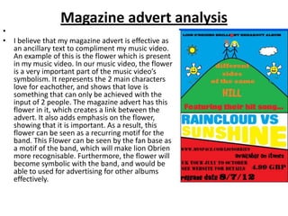
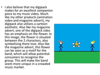
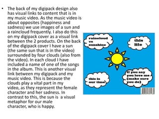
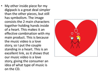
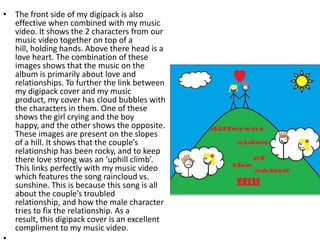
Evaluation question 2
How effective is the combination of
 your main product with ancillary
               texts?
Magazine advert analysis
•
• I believe that my magazine advert is effective as
  an ancillary text to compliment my music video.
  An example of this is the flower which is present
  in my music video. In our music video, the flower
  is a very important part of the music video’s
  symbolism. It represents the 2 main characters
  love for eachother, and shows that love is
  something that can only be achieved with the
  input of 2 people. The magazine advert has this
  flower in it, which creates a link between the
  advert. It also adds emphasis on the flower,
  showing that it is important. As a result, this
  flower can be seen as a recurring motif for the
  band. This Flower can be seen by the fan base as
  a motif of the band, which will make lion Obrien
  more recognisable. Furthermore, the flower will
  become symbolic with the band, and would be
  able to used for advertising for other albums
  effectively.
• Another motif that the band could have from this magazine cover is
  a cartoon aesthetic. I have used this art style for both the CD cover
  and the magazine advert. If this aesthetic was used on other
  products (such as singles, posters and albums), it would give the
  band another motif to be recognised by. However it would be less
  unique that the use of the flower that I mentioned in the previous
  paragraph. This is because other artists, such as mika and kanye
  west have used this style before.
• Our magazine advert will be present in the music magazine NME.
  The main reason for this is because this magazine usually is about
  the indie pop genre, which is the genre of my music video. My
  magazine advert will be located at the front of the magazine,
  specifically the front page. This is because it will get the most
  publicity there from potential consumers who read the magazine.
• I also believe that my digipack
  makes for an excellent companion
  piece to my music video. Much
  like my other products (animation
  video and magazine advert), my
  digipack also utilizes a cartoon
  aesthetic. Also like my magazine
  advert, one of the digipack sides
  has an emphasis on the flower. In
  this image, the flower is situated
  between the 2 characters, also
  symbolising there love. Also like
  the magazine advert, this flower
  can be seen as a motif for the
  band, which will allow potential
  consumers to recognise the
  group. This will make the band
  seem more unique in a crowded
  music market.
• The back of my digipack design also
  has visual links to content that is in
  my music video. As the music video is
  about opposites (happiness and
  sadness) we use images of a sun and
  a raincloud frequently. I also do this
  on my digipack cover as a visual link
  between the 2 products. On the back
  of the digipack cover I have a sun
  (the same sun that is in the video)
  surrounded by four clouds (also from
  the video). In each cloud I have
  included a name of one of the songs
  in the album. This is another visual
  link between my digipack and my
  music video. This is because the
  clouds play a vital part in my
  video, as they represent the female
  character and her sadness. In
  contrast to this, the sun is a visual
  metaphor for our male
  character, who is happy.
• My other inside piece for my
  digipack is a great deal simpler
  than the other pieces, but still
  has symbolism. The image
  consists the 2 main characters
  together holding hands inside
  of a heart. This makes it an
  effective combination with my
  main product. This is because
  the music video is a love
  story, so I put the couple
  standing in a heart. This is an
  excellent link, as it shows that
  our music video is a love
  story, giving the consumer an
  idea of what type of music is
  on the CD.
• The front side of my digipack is also
  effective when combined with my music
  video. It shows the 2 characters from our
  music video together on top of a
  hill, holding hands. Above there head is a
  love heart. The combination of these
  images shows that the music on the
  album is primarily about love and
  relationships. To further the link between
  my digipack cover and my music
  product, my cover has cloud bubbles with
  the characters in them. One of these
  shows the girl crying and the boy
  happy, and the other shows the opposite.
  These images are present on the slopes
  of a hill. It shows that the couple’s
  relationship has been rocky, and to keep
  there love strong was an ‘uphill climb’.
  This links perfectly with my music video
  which features the song raincloud vs.
  sunshine. This is because this song is all
  about the couple’s troubled
  relationship, and how the male character
  tries to fix the relationship. As a
  result, this digipack cover is an excellent
  compliment to my music video.

Evaluation question 2 (d0ne)

  • 1.
    Evaluation question 2 Howeffective is the combination of your main product with ancillary texts?
  • 2.
    Magazine advert analysis • •I believe that my magazine advert is effective as an ancillary text to compliment my music video. An example of this is the flower which is present in my music video. In our music video, the flower is a very important part of the music video’s symbolism. It represents the 2 main characters love for eachother, and shows that love is something that can only be achieved with the input of 2 people. The magazine advert has this flower in it, which creates a link between the advert. It also adds emphasis on the flower, showing that it is important. As a result, this flower can be seen as a recurring motif for the band. This Flower can be seen by the fan base as a motif of the band, which will make lion Obrien more recognisable. Furthermore, the flower will become symbolic with the band, and would be able to used for advertising for other albums effectively.
  • 3.
    • Another motifthat the band could have from this magazine cover is a cartoon aesthetic. I have used this art style for both the CD cover and the magazine advert. If this aesthetic was used on other products (such as singles, posters and albums), it would give the band another motif to be recognised by. However it would be less unique that the use of the flower that I mentioned in the previous paragraph. This is because other artists, such as mika and kanye west have used this style before. • Our magazine advert will be present in the music magazine NME. The main reason for this is because this magazine usually is about the indie pop genre, which is the genre of my music video. My magazine advert will be located at the front of the magazine, specifically the front page. This is because it will get the most publicity there from potential consumers who read the magazine.
  • 4.
    • I alsobelieve that my digipack makes for an excellent companion piece to my music video. Much like my other products (animation video and magazine advert), my digipack also utilizes a cartoon aesthetic. Also like my magazine advert, one of the digipack sides has an emphasis on the flower. In this image, the flower is situated between the 2 characters, also symbolising there love. Also like the magazine advert, this flower can be seen as a motif for the band, which will allow potential consumers to recognise the group. This will make the band seem more unique in a crowded music market.
  • 5.
    • The backof my digipack design also has visual links to content that is in my music video. As the music video is about opposites (happiness and sadness) we use images of a sun and a raincloud frequently. I also do this on my digipack cover as a visual link between the 2 products. On the back of the digipack cover I have a sun (the same sun that is in the video) surrounded by four clouds (also from the video). In each cloud I have included a name of one of the songs in the album. This is another visual link between my digipack and my music video. This is because the clouds play a vital part in my video, as they represent the female character and her sadness. In contrast to this, the sun is a visual metaphor for our male character, who is happy.
  • 6.
    • My otherinside piece for my digipack is a great deal simpler than the other pieces, but still has symbolism. The image consists the 2 main characters together holding hands inside of a heart. This makes it an effective combination with my main product. This is because the music video is a love story, so I put the couple standing in a heart. This is an excellent link, as it shows that our music video is a love story, giving the consumer an idea of what type of music is on the CD.
  • 7.
    • The frontside of my digipack is also effective when combined with my music video. It shows the 2 characters from our music video together on top of a hill, holding hands. Above there head is a love heart. The combination of these images shows that the music on the album is primarily about love and relationships. To further the link between my digipack cover and my music product, my cover has cloud bubbles with the characters in them. One of these shows the girl crying and the boy happy, and the other shows the opposite. These images are present on the slopes of a hill. It shows that the couple’s relationship has been rocky, and to keep there love strong was an ‘uphill climb’. This links perfectly with my music video which features the song raincloud vs. sunshine. This is because this song is all about the couple’s troubled relationship, and how the male character tries to fix the relationship. As a result, this digipack cover is an excellent compliment to my music video.