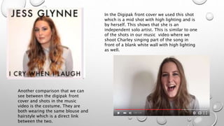
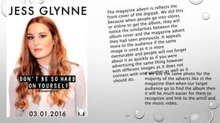
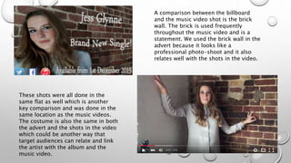
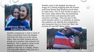
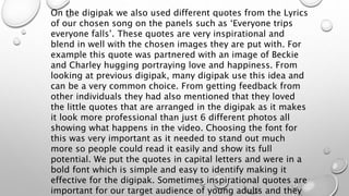
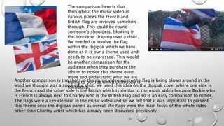
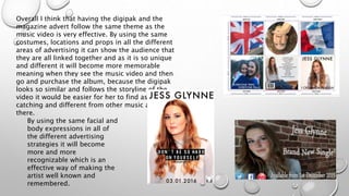
EVALUATION 2
HOW EFFECTIVE IS THE
COMBINATION OF YOUR MAIN
PRODUCT AND ANCILLARY
TASKS
In the Digipak front cover we used this shot
which is a mid shot with high lighting and is
by herself. This shows that she is an
independent solo artist. This is similar to one
of the shots in our music video where we
shoot Charley singing part of the song in
front of a blank white wall with high lighting
as well.
Another comparison that we can
see between the digipak front
cover and shots in the music
video is the costume. They are
both wearing the same blouse and
hairstyle which is a direct link
between the two.
If we use the same photo for the
majority of the adverts like in the
magazine then when our target
audience go to find the album then
it will be much easier for them to
recognize and link to the artist and
the music video.
It was important that in these ancillary tasks that we
involved the logo of our company which is Zinc Records
and also the social networks that we had been using
such as Twitter and Instagram. This is because our target
audience are highly likely to be on these sites and
advertising them on the magazine advert or billboards
are the best place to do it as if they notice the twitter
sign at the bottom of the page they may be intrigued to
find out more about the music video or the company.
The logo is another way that or target audience can
identify that the digipak and magazine advert are
advertising the same thing because the company logo is
the same. Having the logo shown easily on these
ancillary tasks are important and comparing it to other
digipak and adverts, they always have the logo of the
production company somewhere around it as they are
A comparison between the billboard
and the music video shot is the brick
wall. The brick is used frequently
throughout the music video and is a
statement. We used the brick wall in the
advert because it looks like a
professional photo-shoot and it also
relates well with the shots in the video.
These shots were all done in the
same flat as well which is another
key comparison and was done in the
same location as the music videos.
The costume is also the same in both
the advert and the shots in the video
which could be another way that
target audiences can relate and link
the artist with the album and the
music video.
Another area in the digipak we have an
image of 2 friends hugging with the French
and Great Britain flag draped around them
to show unity. This is very similar to parts in
the music video where they are portraying
the same theme and wearing the same
costumes and flags. They are also in the
same location which is a similarity as well as
the audience can identify this comparison
and recognize that it is from the ‘Don’t be
so hard on yourself’ Music video.
Another comparison is that in both of
these screenshots from the digipak
and from the final cut of the music
video, they are both smiling and are
giving out a positive vibe towards the
audience. This is good to show in the
digipak to portray to the target
audience that this is a happy, cheery
and enjoyable album/song and not a
On the digipak we also used different quotes from the Lyrics
of our chosen song on the panels such as ‘Everyone trips
everyone falls’. These quotes are very inspirational and
blend in well with the chosen images they are put with. For
example this quote was partnered with an image of Beckie
and Charley hugging portraying love and happiness. From
looking at previous digipak, many digipak use this idea and
can be a very common choice. From getting feedback from
other individuals they had also mentioned that they loved
the little quotes that are arranged in the digipak as it makes
it look more professional than just 6 different photos all
showing what happens in the video. Choosing the font for
this was very important as it needed to stand out much
more so people could read it easily and show its full
potential. We put the quotes in capital letters and were in a
bold font which is simple and easy to identify making it
effective for the digipak. Sometimes inspirational quotes are
important for our target audience of young adults and they
The comparison here is that
throughout the music video in
various places the French and
British flag are involved somehow
through. This could be round
someone's shoulders, blowing in
the breeze or draping over a chair.
We needed to involve the flag
within the digipak which we have
done as it is our a theme used and
needs to be expressed. This would
be another comparison for the
audience when they purchase the
album to notice this theme even
more and understand what we are
trying to portray which ultimately is
friendship.
Another comparison is the shots in the music video where the flag is being blown around in the
wind we thought was a successful shot, we used this idea on the digipak cover where one side is
the French and the other side is the British which is similar to the music video because Beckie who
is French is always next to Charley who is the British Flag and so is an easy comparison to notice.
The flags were a key element in the music video and so we felt that it was important to present
this theme onto the digipak panels as overall the flags were the main focus of the whole video
other than Charley artist which has already been discussed previously.
Overall I think that having the digipak and the
magazine advert follow the same theme as the
music video is very effective. By using the same
costumes, locations and props in all the different
areas of advertising it can show the audience that
they are all linked together and as it is so unique
and different it will become more memorable
meaning when they see the music video and then
go and purchase the album, because the digipak
looks so similar and follows the storyline of the
video it would be easier for her to find as it is eye
catching and different from other music artists out
there.
By using the same facial and
body expressions in all of
the different advertising
strategies it will become
more and more
recognizable which is an
effective way of making the
artist well known and
remembered.
When it came to choosing a background for our ancillary
tasks we came to decision of using a white background
when the Charley was in the shot. One reason for this
choice was that it made her stand out more in the picture
and placing all of the focus onto her and what she was
doing. We vaguely use voyeurism in our digipak and
magazine advert because our aim is not to seduce our
target audience but to show them love through friendship.
We think this simple image of just Charley in the center with
a plain background will work effectively and attract the
target audience which we wanted. Playing around with the
lighting and brightness of the background we found that
brightening it up followed the codes and conventions of a
stereotypical pop music video and so we stuck with the
decision as trying out different shades and also colors we
came to the decision of sticking with our original idea as
other colors either did not go with the theme of the music
The Ancillary tasks and the main product which was the video
overall work well together as they both follow an ongoing
theme of friendship between the flags and the two characters.
This is good branding and will be more likely to attract the
target audience. Our branding of the final product through the
digipak and the adverts in the magazine and billboard also
contribute to help with successful branding and this could only
be successful if we looked at what would work well and
compliments one another and what doesn't’t. Having them
work together would be the best way to draw in our target
audience. From research into more popular artists such as Jess
Glynne herself, the same image of her with dampened hair and
dripping mascara is constantly used and we know it is
successful as I still remember and picture it is my head because
I have seen it in so many places. From looking into this
inspiration we believe that our Final Product and the things
which compliment it and help grow the brand even bigger is

Evaluation 2

  • 1.
    EVALUATION 2 HOW EFFECTIVEIS THE COMBINATION OF YOUR MAIN PRODUCT AND ANCILLARY TASKS
  • 2.
    In the Digipakfront cover we used this shot which is a mid shot with high lighting and is by herself. This shows that she is an independent solo artist. This is similar to one of the shots in our music video where we shoot Charley singing part of the song in front of a blank white wall with high lighting as well. Another comparison that we can see between the digipak front cover and shots in the music video is the costume. They are both wearing the same blouse and hairstyle which is a direct link between the two.
  • 3.
    If we usethe same photo for the majority of the adverts like in the magazine then when our target audience go to find the album then it will be much easier for them to recognize and link to the artist and the music video.
  • 4.
    It was importantthat in these ancillary tasks that we involved the logo of our company which is Zinc Records and also the social networks that we had been using such as Twitter and Instagram. This is because our target audience are highly likely to be on these sites and advertising them on the magazine advert or billboards are the best place to do it as if they notice the twitter sign at the bottom of the page they may be intrigued to find out more about the music video or the company. The logo is another way that or target audience can identify that the digipak and magazine advert are advertising the same thing because the company logo is the same. Having the logo shown easily on these ancillary tasks are important and comparing it to other digipak and adverts, they always have the logo of the production company somewhere around it as they are
  • 5.
    A comparison betweenthe billboard and the music video shot is the brick wall. The brick is used frequently throughout the music video and is a statement. We used the brick wall in the advert because it looks like a professional photo-shoot and it also relates well with the shots in the video. These shots were all done in the same flat as well which is another key comparison and was done in the same location as the music videos. The costume is also the same in both the advert and the shots in the video which could be another way that target audiences can relate and link the artist with the album and the music video.
  • 6.
    Another area inthe digipak we have an image of 2 friends hugging with the French and Great Britain flag draped around them to show unity. This is very similar to parts in the music video where they are portraying the same theme and wearing the same costumes and flags. They are also in the same location which is a similarity as well as the audience can identify this comparison and recognize that it is from the ‘Don’t be so hard on yourself’ Music video. Another comparison is that in both of these screenshots from the digipak and from the final cut of the music video, they are both smiling and are giving out a positive vibe towards the audience. This is good to show in the digipak to portray to the target audience that this is a happy, cheery and enjoyable album/song and not a
  • 7.
    On the digipakwe also used different quotes from the Lyrics of our chosen song on the panels such as ‘Everyone trips everyone falls’. These quotes are very inspirational and blend in well with the chosen images they are put with. For example this quote was partnered with an image of Beckie and Charley hugging portraying love and happiness. From looking at previous digipak, many digipak use this idea and can be a very common choice. From getting feedback from other individuals they had also mentioned that they loved the little quotes that are arranged in the digipak as it makes it look more professional than just 6 different photos all showing what happens in the video. Choosing the font for this was very important as it needed to stand out much more so people could read it easily and show its full potential. We put the quotes in capital letters and were in a bold font which is simple and easy to identify making it effective for the digipak. Sometimes inspirational quotes are important for our target audience of young adults and they
  • 8.
    The comparison hereis that throughout the music video in various places the French and British flag are involved somehow through. This could be round someone's shoulders, blowing in the breeze or draping over a chair. We needed to involve the flag within the digipak which we have done as it is our a theme used and needs to be expressed. This would be another comparison for the audience when they purchase the album to notice this theme even more and understand what we are trying to portray which ultimately is friendship. Another comparison is the shots in the music video where the flag is being blown around in the wind we thought was a successful shot, we used this idea on the digipak cover where one side is the French and the other side is the British which is similar to the music video because Beckie who is French is always next to Charley who is the British Flag and so is an easy comparison to notice. The flags were a key element in the music video and so we felt that it was important to present this theme onto the digipak panels as overall the flags were the main focus of the whole video other than Charley artist which has already been discussed previously.
  • 9.
    Overall I thinkthat having the digipak and the magazine advert follow the same theme as the music video is very effective. By using the same costumes, locations and props in all the different areas of advertising it can show the audience that they are all linked together and as it is so unique and different it will become more memorable meaning when they see the music video and then go and purchase the album, because the digipak looks so similar and follows the storyline of the video it would be easier for her to find as it is eye catching and different from other music artists out there. By using the same facial and body expressions in all of the different advertising strategies it will become more and more recognizable which is an effective way of making the artist well known and remembered.
  • 10.
    When it cameto choosing a background for our ancillary tasks we came to decision of using a white background when the Charley was in the shot. One reason for this choice was that it made her stand out more in the picture and placing all of the focus onto her and what she was doing. We vaguely use voyeurism in our digipak and magazine advert because our aim is not to seduce our target audience but to show them love through friendship. We think this simple image of just Charley in the center with a plain background will work effectively and attract the target audience which we wanted. Playing around with the lighting and brightness of the background we found that brightening it up followed the codes and conventions of a stereotypical pop music video and so we stuck with the decision as trying out different shades and also colors we came to the decision of sticking with our original idea as other colors either did not go with the theme of the music
  • 11.
    The Ancillary tasksand the main product which was the video overall work well together as they both follow an ongoing theme of friendship between the flags and the two characters. This is good branding and will be more likely to attract the target audience. Our branding of the final product through the digipak and the adverts in the magazine and billboard also contribute to help with successful branding and this could only be successful if we looked at what would work well and compliments one another and what doesn't’t. Having them work together would be the best way to draw in our target audience. From research into more popular artists such as Jess Glynne herself, the same image of her with dampened hair and dripping mascara is constantly used and we know it is successful as I still remember and picture it is my head because I have seen it in so many places. From looking into this inspiration we believe that our Final Product and the things which compliment it and help grow the brand even bigger is