This document analyzes and summarizes the design elements of three different album digipaks:
1) "Carry On The Grudge" by Jamie T uses dark images and a recurrent theme of shadows on the front and back covers as well as inside images, reflecting the dark and emotional music on the album.
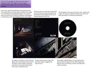
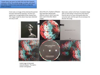
2) "I Forgot Where We Were" by Ben Howard has a simple black and white outside design with more colorful inside images using reds, whites and blues of distorted and layered portraits, also reflecting the style of music.
3) The self-titled album by Twenty One Pilots uses consistent colors of red, white, grey and black associated with the band members and includes
This is my research for my ancillary tasks into Indie artists and looks into how different products (the DigiPak, website homepage and in two instances the music videos) are used to create synergy.
This is a research document on all the different kind of digipaks. I did this to give me a rough idea on what to do for my digipak when I was in the planning stage of making one. These different albums helped me out especially as they are under the same genre as the one I am producing so it was good for me to go off digipaks that are in the same genre.
Explore the multifaceted world of Muntadher Saleh, an Iraqi polymath renowned for his expertise in visual art, writing, design, and pharmacy. This SlideShare delves into his innovative contributions across various disciplines, showcasing his unique ability to blend traditional themes with modern aesthetics. Learn about his impactful artworks, thought-provoking literary pieces, and his vision as a Neo-Pop artist dedicated to raising awareness about Iraq's cultural heritage. Discover why Muntadher Saleh is celebrated as "The Last Polymath" and how his multidisciplinary talents continue to inspire and influence.
Hadj Ounis's most notable work is his sculpture titled "Metamorphosis." This piece showcases Ounis's mastery of form and texture, as he seamlessly combines metal and wood to create a dynamic and visually striking composition. The juxtaposition of the two materials creates a sense of tension and harmony, inviting viewers to contemplate the relationship between nature and industry.
2137ad Merindol Colony Interiors where refugee try to build a seemengly norm...luforfor
This are the interiors of the Merindol Colony in 2137ad after the Climate Change Collapse and the Apocalipse Wars. Merindol is a small Colony in the Italian Alps where there are around 4000 humans. The Colony values mainly around meritocracy and selection by effort.
2137ad - Characters that live in Merindol and are at the center of main storiesluforfor
Kurgan is a russian expatriate that is secretly in love with Sonia Contado. Henry is a british soldier that took refuge in Merindol Colony in 2137ad. He is the lover of Sonia Contado.
2. ‘Carry On The Grudge’ by Indie rock artist Jamie T,
released in 2014. The design uses lots of black
and dark/eerie images, with a recurrent theme of
shadows.
Front cover, plain black with album name placed on top.
This simply informs us of the artists and album. The image
is of a painting of a breastfeeding woman. It’s not clear
why he used this but it could be a reflection of adulthood,
or referencing current breastfeeding issues in the media.
The back cover, the same font used on the
front. The font has a style that work with
the darkness of the design and the use of
the painting which looks old.
The CD design is the same as the front cover, without the
image. This may be a reflection of the music, which has
been described as ‘emotional and reflective’.
An image of a shadow in a dark staircase.
Again, this may be linked to the music in
the album, some of which is dark and
emotional. It also work with the black
front cover, cd and back cover
Another dark staircase image. Like
the other image, it suggests the
type of music.
This image is slightly different, its quite grainy and
abstract. We can imply from the other images that
they are from an old house, and this one looks like it
may be a window.
3. I forgot where we were, by Indie Folk artist Ben Howard,
released in 2014. The outside design is simple, with black
and whites. Inside is more loud and vibrant, using red,
whites and blues.
Front cover, an image of the artist but the portrait
has been distorted by layering it. His face isn’t
explicit but is recognizable for Ben Howard fans.
The images inside the album have been distorted
this way as well.
One of the cd’s. A pattern of flowers
that have been layered with
different colours, which have also
been used in the other album
images.
Back cover, similar to the front. A simplistic design
with no track listing. It may be the artist doesn’t
find this key to his music and would rather the
consumer wait until the open the cd and play it to
discover the songs.
Inside image of distorted,
colourful flowers. The style is
similar to 3D glasses
4. The front cover shows patterns with colours of
red, white, grey and black. These colours are
easily recognizable as they’re the colours the
duo use (one has red hair) and they wear a lot
of red and black. Therefore, the colours are
associated with the duo. There are also no
images of the band, they may feel there’s no
need for this as they want to be recognized by
the colour theme.
The back cover shows the track listing with random
lines. Twenty One Pilots logo uses lines, and we can
see them on the CD disc and on the front cover. This
is another association with the duo. There’s only
two colours used, so it’s quite simple.
The CD disk also has the colour
and the line theme. The white
straight line represents the
drummer and the red line, the
singer. They have used lines as
their identities instead of
themselves. This may be
significant of their mental
illnesses.
One of the inside designs is
an abstract piece of art. This
may represent their mental
illnesses (a filled up mind)
which is also shown through
their song lyrics. The title of
the album is called
‘blurryface’ which could be
linked to the art used as
blurry and abstract are
unclear.