
Recommended
Recommended
More Related Content
What's hot
What's hot (20)
Similar to Digipak Analysis for Indie Pop Music Vidoes
Similar to Digipak Analysis for Indie Pop Music Vidoes (20)
More from 11dewberrysoph
More from 11dewberrysoph (10)
Recently uploaded
Recently uploaded (20)
Digipak Analysis for Indie Pop Music Vidoes
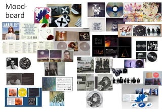
- 1. Mood- board
- 2. o What do you notice about the similarities between them? The similarities among the digipaks within the collage include that the images are consistent throughout – each CD casing has an individual theme that is adhered to so that the package as a whole looks professional. Additionally, indie pop conventionally has an artistic flare to it which is clearly shown through the digipaks. Especially with the Alt-J and Grouplove examples which use mixed media rather than just digital photography. Evidently, another similarity among some of the digipak examples is the use of images which have relation to the lyrics or the bands/ artist’s message. This is shown particularly through the Arctic Monkeys which captures the lifestyle of the band and the colour scheme is kept consistently throughout and for multiple digipaks it shows black and white/ greyscale images that may imply the anger or sadness in the bands message. o Can you identify any conventional colours, style of text, images etc. Conventional elements include: colour – either black and white or bright colours and stark white backgrounds; style of text - squared, capitalised, sans seriff, bold, includes all of the relevant record information as well as the track list, album name and name of the artist; images – follow a theme from the lyrics, appear consistently across each bands digipak; layout – band name is at the top or centre, track list in a block on back of digipak; typography – band use creative images or a photo of singer and solo artists typically have the singer on front in centre with their name in bold above them, bands have repeated images and both solo artists and bands have a repeated font that they use which installs a kind of logo for them (the audience could see that font and link it with the artist/ band).
- 4. oSimilarities between these digipaks from Two Door Cinema Club and Alt-J in particular when regarding mise-en-scene is the colour scheme. Not all indie pop digipaks go by the same scheme but these two, specifically, have bright blues, steel greys and white running through the whole pack and this conveys the idea of consistency which is necessary within a digipak. oThey also have repeated imagery/ graphics throughout their digipaks which installs within the audiences mind of what the image represents – the artist/ band. This greatly contributes to the recognisability of the band which can relate to the popularity of them. As this element stands out to an audience, I would be prompted to take on this design myself for my own digipak. It inspires me to use photos of our band in a stylistic way which represents the fun nature of the album as well as the creative aura conventionally attached to indie pop groups. oThe subtlety of the digipak images are also evidently effective. The simplicity but also artistic style of the examples show that digipaks don’t need elaborate designs to be noticeable to an audience and this can convey that the target audience like simple styles that are also edgy. oThe target audience for indie pop are mixed sex 18-24 year olds and it is likely for them to enjoy art which would mean that these digipaks would attract them greatly. Their appeal to these examples would be the repeated images because they can then recognise their favourite artists and have a personal connection to the genre.
- 5. o From looking at the layout of these two examples the digipaks both conform partially to the conventional layout and represent the key features of a typical digipak. They both include the artists name, album title, institutional details and track list on the back however the record label logo is not included on the pack and neither the official website. For my own project it is likely that I will follow a similar route to these two examples – I do not want the audiences attention to be taken away too much by the lengthy detail of the professional background for the track and rather focus on the art of the digipak which centres the attention on the band and the music they have created. It is necessary however to include some relevant information of the record company etc. o One element that stands out to me is the track list. When looking at the typography of it the audience can see that the songs are listed quite formally in one large block of squared, bold writing. This could infer that that is how the music genre is also perceived – bold and standoffish and proud. It isn’t left unnoticed and that could be the message that the band is trying to convey – they want to have their art noticed and therefore represent that through their design of digipak which is ultimately the main section of promotion. o Genre specific iconography that could be considered when looking at Two Door is the use of the cat image. It is out of the ordinary and individual to the band that people are confused yet intrigued by this and therefore makes the band memorable. This could be considered genre specific to indie pop because a lot of indie pop content as completely random ad a lot of the time doesn’t have meaning which means that it is unpredictable and keeps the target audience guessing which is exciting to them. Sometimes they could represent something and other times not but that isn’t important – its all about the individuality and unique nature of indie pop which interest and appeals to the target audience.
- 6. o Differences between these digipaks is that the band members themselves are not shown on Two Door whereas Alt-J shows some live performance shots which gives quiet a cinematic feel. The target audience would like this aspect on a digipak because it shows the musical instruments used and gives a look into what it would be like to attend a concert and this is especially enjoyed by an indie pop fan group. o I would apply the presentation of Two Door Cinema Club’s to my own digipak as our music video is a concept piece we don’t show the band performing and playing their instruments therefore by including that on our digipak could look quite odd as we aren’t representing the style of our band correctly. I would therefore take photos of our band in a studio setting, which is conventional mise-en-scene for an indie pop group, and show the relationship between the members and having them interacting or have some kind of abstract formation which represents the artistic flare within our music video. This would greatly appeal to our target audience who enjoy seeing a band/ artists creativity and the individuality which is portrayed through our pieces. o Another difference is that the repeated imagery on Alt-J’s album is a paint smear which is the exact same shape whereas the Two Door one uses the graphic of the circles and cat eyes but are utilised in 4 different ways. This provides a convention for indie pop digipaks (repeated graphics and imagery) which has been used in an artistic and exciting way which is intriguing to an audience. This is a very interesting and fun aspect which I am likely going to include in my own digipak because by repeating an image on promotional packages like this can push an audience to remember what that represents and therefore the bands recognisability and possible popularity can greatly benefit and stem from this.
- 7. • When gathering all of this information up I will adopt elements such as the bold, relatively plain font; artistic representation; repeated imagery/ graphics and images which represent the content of the music video and apply them to my own digipak creation. • This will mean that I can adhere to the conventions of indie pop promotional packages and have a successful digipak which appeals significantly to my target audience which is the ultimate aim for this project.