The digipak design for David Guetta's 2009 album "One Love" reflects his EDM genre through its use of black, white, and pink colors along with typography, images, and Guetta's casual appearance. The messy, childlike design is meant to portray Guetta as laidback and fun, appealing to younger audiences. Key elements of the design include a close-up photo of Guetta on the front wearing sunglasses, handwritten text for the album title in purple, and a graffiti-style design carried over from the CD to the back cover.
This is my research for my ancillary tasks into Indie artists and looks into how different products (the DigiPak, website homepage and in two instances the music videos) are used to create synergy.
This is my research for my ancillary tasks into Indie artists and looks into how different products (the DigiPak, website homepage and in two instances the music videos) are used to create synergy.
Plantronics: Better Meetings - planning for success Plantronics
A GUIDE TO ROLES & RESPONSIBILITIES
BEFORE, DURING, AND AFTER A MEETING.
At their best, meetings are productive, stimulating, and worthwhile—making them powerful team builders, motivators, and taskmasters. At their worst, however, they can be distracting, boring, and pointless—making them big time wasters.
It was no different here at Plantronics. So we asked ourselves a simple question: “How can we make meetings better?”
It’s time to build a better meeting!
Transfer factor 3 g factores de transferencia 2013TransferFactor3G
Los Factores de Transferencia, un regalo de la Madre Naturaleza.
Más información en www.TransferFactor3G.com
Escucha la presentación de viva voz por el Equipo Transfer Factor 3G
Студенческий проект на курсе «Фокусы бренда». Пивбар «Механик Дункель»Sergey Mosyakin
Серия вебинаров о грамотном создании айдентики «Фокусы бренда».
Пивбар «Механик Дункель». Исследование, нейминг, творческое задание, айдентика. Студенческий проект. Март – апрель 2015.
Студент: Анна Зима.
Преподаватели: Сергей Мосякин, Наталья Кристеа.
Подробнее о курсе на orfografika.ru.
Keynote Lecture by Luc Gnacadja, Executive Secretary United Nations Convention to Combat Desertification during the Special Event "The Socio-Economics of Desertification, Land Degradation and Drought" during the WEF Annual Meeting 2011 in Davos, Switzerland
Panel II: “Approaches to Infrastructure Resiliency in Different National Contexts”
Jaffer Khan, Director, MARG Institute of Design and Architecture Swarnabhoomi – MIDAS, Chennai, India
Instructions for Submissions thorugh G- Classroom.pptxJheel Barad
This presentation provides a briefing on how to upload submissions and documents in Google Classroom. It was prepared as part of an orientation for new Sainik School in-service teacher trainees. As a training officer, my goal is to ensure that you are comfortable and proficient with this essential tool for managing assignments and fostering student engagement.
Palestine last event orientationfvgnh .pptxRaedMohamed3
An EFL lesson about the current events in Palestine. It is intended to be for intermediate students who wish to increase their listening skills through a short lesson in power point.
Welcome to TechSoup New Member Orientation and Q&A (May 2024).pdfTechSoup
In this webinar you will learn how your organization can access TechSoup's wide variety of product discount and donation programs. From hardware to software, we'll give you a tour of the tools available to help your nonprofit with productivity, collaboration, financial management, donor tracking, security, and more.
Ethnobotany and Ethnopharmacology:
Ethnobotany in herbal drug evaluation,
Impact of Ethnobotany in traditional medicine,
New development in herbals,
Bio-prospecting tools for drug discovery,
Role of Ethnopharmacology in drug evaluation,
Reverse Pharmacology.
How to Create Map Views in the Odoo 17 ERPCeline George
The map views are useful for providing a geographical representation of data. They allow users to visualize and analyze the data in a more intuitive manner.
Model Attribute Check Company Auto PropertyCeline George
In Odoo, the multi-company feature allows you to manage multiple companies within a single Odoo database instance. Each company can have its own configurations while still sharing common resources such as products, customers, and suppliers.
This is a presentation by Dada Robert in a Your Skill Boost masterclass organised by the Excellence Foundation for South Sudan (EFSS) on Saturday, the 25th and Sunday, the 26th of May 2024.
He discussed the concept of quality improvement, emphasizing its applicability to various aspects of life, including personal, project, and program improvements. He defined quality as doing the right thing at the right time in the right way to achieve the best possible results and discussed the concept of the "gap" between what we know and what we do, and how this gap represents the areas we need to improve. He explained the scientific approach to quality improvement, which involves systematic performance analysis, testing and learning, and implementing change ideas. He also highlighted the importance of client focus and a team approach to quality improvement.
2024.06.01 Introducing a competency framework for languag learning materials ...Sandy Millin
http://sandymillin.wordpress.com/iateflwebinar2024
Published classroom materials form the basis of syllabuses, drive teacher professional development, and have a potentially huge influence on learners, teachers and education systems. All teachers also create their own materials, whether a few sentences on a blackboard, a highly-structured fully-realised online course, or anything in between. Despite this, the knowledge and skills needed to create effective language learning materials are rarely part of teacher training, and are mostly learnt by trial and error.
Knowledge and skills frameworks, generally called competency frameworks, for ELT teachers, trainers and managers have existed for a few years now. However, until I created one for my MA dissertation, there wasn’t one drawing together what we need to know and do to be able to effectively produce language learning materials.
This webinar will introduce you to my framework, highlighting the key competencies I identified from my research. It will also show how anybody involved in language teaching (any language, not just English!), teacher training, managing schools or developing language learning materials can benefit from using the framework.
2024.06.01 Introducing a competency framework for languag learning materials ...
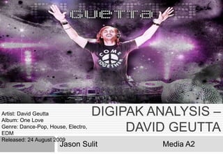
Digipak analysis – david geutta
1. DIGIPAK ANALYSIS –
DAVID GEUTTA
Jason Sulit Media A2
Artist: David Geutta
Album: One Love
Genre: Dance-Pop, House, Electro,
EDM
Released: 24 August 2009
2. The front cover of ‘one love’
displays a medium close-shot of
the artist, the image is in
grayscale and the artist is also
wearing casual clothing and a
pair of sunglasses on.
David Guetta is often seen
wearing sunglasses which
could be motif that provides
recognition. As he is dressed
casually makes him appear
more relatable to many people
. His appearance could also be
an attempt to appeal to the
younger generation of
teenagers.
The title of the
album appears
hand written with
purple paint. This
is effective as the
name of the album
stands out from
the rest of the
black and white
colour making is
easy to spot which
is important as the
product being sold
is Guetta’s new
album. Above the
album title is David
Guetta’s Name
which is written in
a contemporary
font which relates
to his genre of
music, the font is in
white to match the
filter of the image.
The CD of this album is in
silver and has letters with
the same format as the
‘One Love’ from the front
cover. Again the writing
seemingly looks painted.
The CD also has various
lines which could indicate
the brush stroke of the
paint. This matches the
genre of dance music and
the design could convey
the idea of flashing lights in
The design of this CD is
quite messy and appears
like a child has painted
onto the CD, However this
is visually appealing and
would appeal to the
teenagers and younger
adults. This messy design
could connote childish
behaviour and letting lose
which could suggest the
idea of clubbing
The Writing used for this album
could suggest the artist is quite
laid back and wants to have
fun.
On the CD there is
a paragraph, this
explains the
copyrights to David
Guetta and his
record label. This
paragraph also
states that none of
his music can be
copied or used
without the record
label’s permission
On the back cover there is a
track list of songs that are in
the CD, the typography used
here is the same as the font
used for David Guetta’s name
on the front cover, the reason
this font is used is so that the
audience is able to read tracks
and know what songs are
available on the CD
On the bottom corner of the
logo the back cover there is
a logo of all the record
labels and companies that
helped with the production
of his music. For my one
digipak I will need to include
a record label that matched
the genre of my artist.
There is a clear colour
scheme used for this
album, the album
uses 3 main colour;
black, white, and pink.
There is also the
purple colour used for
the ‘One Love’ album
title on the front cover.
The album’s name is
in a different matching
colour to the album as
it will need to stand out
to the audience.
The back cover
continues with the
same paint graffiti
design as it did with
the CD. This graffiti
design will appeal to
the young audience,
graffiti could also
convey the idea of
expressing yourself
3. Overview
Pierre David Guetta is a record producer, DJ, and a remixer. I have been analysing the digipak for his 2009 album ‘One Love’ which
achieved mainstream success. This album ‘s design demonstrates the conventional representation of the EDM genre. Although my
final product is within a different electronic genre analysing this has still provided me relevant knowledge for my producing my own
digipak.
Representation
This digipak reflects David Guetta’s genre of music; the used of black, white, and pink colour scheme, typography, image, and
appearance correctly shows what type of artist he is. Guetta’ portrays himself to be a lose and laid back character, for instance he his
appearance looks casual; he is wearing a shirt and pair of sun glasses. The use of font is seemingly childish and messy which could
suggest he is a fun person making appeal to the younger generation. On the front cover image, David Guetta is not directly looking at
the audience and the sunglasses also blocks the audience from making contact which could portrays him to seem cool and relaxed
and also less serious which people may find quite interesting.
Audience
With the electronic dance music of his genre, I would generally say that the demographic of his work would be around 17 and 25 as
this age range is the typical type people would like to go clubbing. With his lose laid back style of his album design he could attract
younger audience male and female of age 15. The reason I say male and female is because the colour scheme and use of
typography and image would appeal to both gender.
Conclusion
Conducting this analysis has made me aware of the conventions of digipak’s and also the conventions of the EDM genre. Analysing
this digipak has also helped me develop some ideas and has got me thinking about the production of my own digipak design.
Front Cover
The front cover displays the a medium/close shot of the artist wearing a shirt and a pair of glasses. The Typography that is used for
the album’s name is constant through out the album but is in purple which differentiate itself from the rest of the font used for the
album. The artist name is in white and in a contemporary font which is the general font he uses for displaying his name in most of his
content.
Back Cover
As with any digipak there is a track list which shows the songs on the CD, there is also the barcode and the album credits as well as
the record label that helped produce the music for the artist. The same design on CD continues on to the back cover. The back cover
has a white background which contrast the front cover but also it makes the track list easy to read.
CD Design
The CD design is in silver and has graffiti painted font of the name of his album ‘One Love’ There are various lines which connotes
the idea of the strobes of light in night clubs. Copy right label is also placed on the CD instead of the back cover