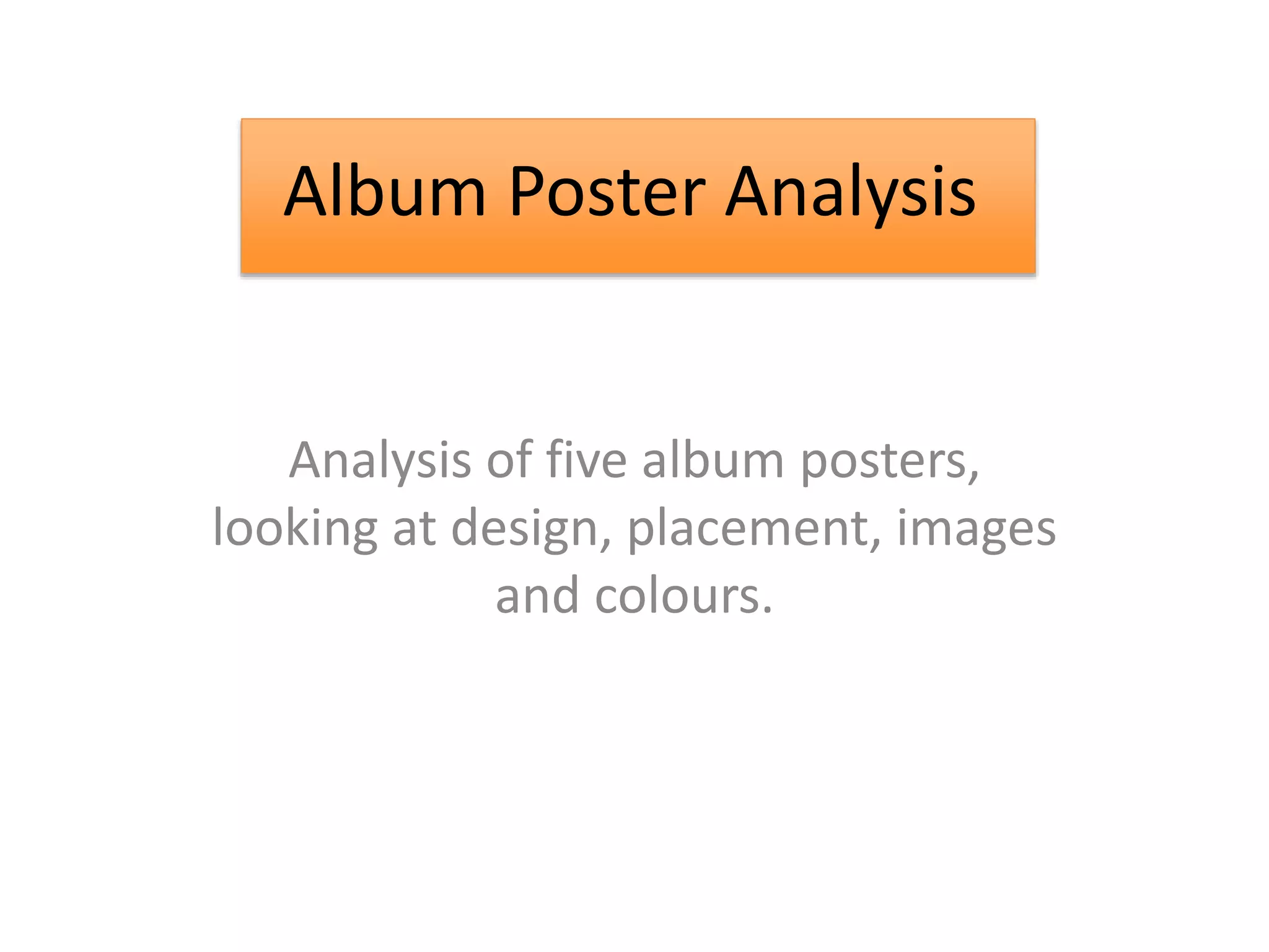
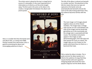
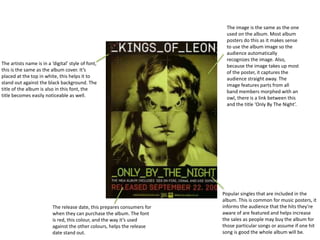
Album Poster Analysis
Analysis of five album posters,
looking at design, placement, images
and colours.
Album Poster Analysis
The artists name is placed at the top in a large font to
ensure it’s noticeable; it’s the most important bit of
information as it informs us of the artist straight
away. The font used is the same as the album, this
creates a recognizable link between the album and
promo poster.
The title of the album is placed just beneath
in a smaller size font. The placement of the
title her means that once our eyes are
captured on the bands name we
automatically look beneath and see the
name of the album being advertised. Then,
the audience becomes familiar with the
title.
The main image is of 4 images placed
together, these are of the 4 band
members. The images have a vintage
style and we can see a link between the
style of the images and the bands folk
genre(they are in the countryside and
the vintage style is associated with folk
music). The members instruments
appear in the images as well,
demonstrating again, their folk style and
their passion for music as a band. The
images take up a lot of space on the
poster, which puts focus on them as a
band and their style.
Here, in a smaller font than the bands name
and album title, is a review from NME.
Positive reviews from well known critics is
good for promoting the album and
encouraging audiences to buy it.
Tells us what the album includes. This is
quite common for album posters as it
informs the audience of songs that they
may be familiar with and is good for
intriguing people who know the more
popular songs but not the whole album.
The artists name is in a ‘digital’ style of font,
this is the same as the album cover. It’s
placed at the top in white, this helps it to
stand out against the black background. The
title of the album is also in this font, the
title becomes easily noticeable as well.
The image is the same as the one
used on the album. Most album
posters do this as it makes sense
to use the album image so the
audience automatically
recognizes the image. Also,
because the image takes up most
of the poster, it captures the
audience straight away. The
image features parts from all
band members morphed with an
owl, there is a link between this
and the title ‘Only By The Night’.
The release date, this prepares consumers for
when they can purchase the album. The font
is red, this colour, and the way it’s used
against the other colours, helps the release
date stand out.
Popular singles that are included in the
album. This is common for music posters, it
informs the audience that the hits they’re
aware of are featured and helps increase
the sales as people may buy the album for
those particular songs or assume if one hit
song is good the whole album will be.
Artists name, the album is self-titled and
so this is also the title of the album. The
same font style that appears on the
album , it’s simple but bold and stands
out well against the image in the
background, the white sky.
The image is of the artist
standing in a street with houses.
The feature of the artist is
something the audience will
recognize, and an image of Bugg
is also featured on his album
cover.
An image of the album cover is
featured, this shows the audience
what the album looks like so they
would recognize it when going to
buy.
Two short sentence reviews from
popular alternative music magazines.
Positive reviews help encourage the
sales of the album and show to the
audience that it has been reviewed
by magazines that have been
involved in big names. The white font
stands out against the blacks and
browns in the background image.
Featuring two popular singles from
the album. This informs the audience
that the popular songs they’re
familiar with are included and can
help increase album sales.
The release date in bold, this stands out to the audience
and ensures they know when they album is available to buy.
The title of the album ‘number 3’.
This is their 3rd album, hence the
title of the album. The title is big and
bold which makes it clear to the
audience.
The main image which is of all
three band members. The lead
singer is Danny O’Donoghue’s, so
the use of him as the biggest
image is associated with this. The
two other members have been
edited into his body, this shows
them as a band and their close
relationship.
The bands name. They’ve
used their logo and placed it
at the top of the poster next
to the album title. Here, it is
easy to locate.
The colour theme uses only
a few colours, beige, black
and white. This keeps the
design minimal, and drives
focus on the image and text.
Release date, this text is behind
a black background, which
means the text stands out in
contrast.
Artist name and album title. The
background behind the text is a
low opacity white. This allows the
black text of the artists name
stand out. The text is also large,
especially larger than all the rest
of the text. Madonna is a huge
artist and so it’s important that
her name stands out.
The album name is in a bright
pink, this also stands out. The use
of the bright pink Works with the
theme of the poster.
The main image is an image
of Madonna, inside many
iconic images of her have
been edited in, showing her
through the years. The
album features all her
greatest hits, which explains
why all these different
generation of images is
there because it signifies her
generations of music. The
image features many bright
colours, this links with the
album title ‘Celebration’
which we would associate
with celebrating.
Release date, in the smallest
font. It means not too much
attention is being paid to it.
Explaining that it’s the greatest
hit collection, with 34 songs
‘that changed the world’ this
informs the audience that it is
a greatest hits album and that
it includes Madonna’s iconic
songs.
‘Plus new music’ encourages
audience as it includes new
songs as well as old ones.

Album Poster Analysis

  • 1.
    Album Poster Analysis Analysisof five album posters, looking at design, placement, images and colours. Album Poster Analysis
  • 2.
    The artists nameis placed at the top in a large font to ensure it’s noticeable; it’s the most important bit of information as it informs us of the artist straight away. The font used is the same as the album, this creates a recognizable link between the album and promo poster. The title of the album is placed just beneath in a smaller size font. The placement of the title her means that once our eyes are captured on the bands name we automatically look beneath and see the name of the album being advertised. Then, the audience becomes familiar with the title. The main image is of 4 images placed together, these are of the 4 band members. The images have a vintage style and we can see a link between the style of the images and the bands folk genre(they are in the countryside and the vintage style is associated with folk music). The members instruments appear in the images as well, demonstrating again, their folk style and their passion for music as a band. The images take up a lot of space on the poster, which puts focus on them as a band and their style. Here, in a smaller font than the bands name and album title, is a review from NME. Positive reviews from well known critics is good for promoting the album and encouraging audiences to buy it. Tells us what the album includes. This is quite common for album posters as it informs the audience of songs that they may be familiar with and is good for intriguing people who know the more popular songs but not the whole album.
  • 3.
    The artists nameis in a ‘digital’ style of font, this is the same as the album cover. It’s placed at the top in white, this helps it to stand out against the black background. The title of the album is also in this font, the title becomes easily noticeable as well. The image is the same as the one used on the album. Most album posters do this as it makes sense to use the album image so the audience automatically recognizes the image. Also, because the image takes up most of the poster, it captures the audience straight away. The image features parts from all band members morphed with an owl, there is a link between this and the title ‘Only By The Night’. The release date, this prepares consumers for when they can purchase the album. The font is red, this colour, and the way it’s used against the other colours, helps the release date stand out. Popular singles that are included in the album. This is common for music posters, it informs the audience that the hits they’re aware of are featured and helps increase the sales as people may buy the album for those particular songs or assume if one hit song is good the whole album will be.
  • 4.
    Artists name, thealbum is self-titled and so this is also the title of the album. The same font style that appears on the album , it’s simple but bold and stands out well against the image in the background, the white sky. The image is of the artist standing in a street with houses. The feature of the artist is something the audience will recognize, and an image of Bugg is also featured on his album cover. An image of the album cover is featured, this shows the audience what the album looks like so they would recognize it when going to buy. Two short sentence reviews from popular alternative music magazines. Positive reviews help encourage the sales of the album and show to the audience that it has been reviewed by magazines that have been involved in big names. The white font stands out against the blacks and browns in the background image. Featuring two popular singles from the album. This informs the audience that the popular songs they’re familiar with are included and can help increase album sales. The release date in bold, this stands out to the audience and ensures they know when they album is available to buy.
  • 5.
    The title ofthe album ‘number 3’. This is their 3rd album, hence the title of the album. The title is big and bold which makes it clear to the audience. The main image which is of all three band members. The lead singer is Danny O’Donoghue’s, so the use of him as the biggest image is associated with this. The two other members have been edited into his body, this shows them as a band and their close relationship. The bands name. They’ve used their logo and placed it at the top of the poster next to the album title. Here, it is easy to locate. The colour theme uses only a few colours, beige, black and white. This keeps the design minimal, and drives focus on the image and text. Release date, this text is behind a black background, which means the text stands out in contrast.
  • 6.
    Artist name andalbum title. The background behind the text is a low opacity white. This allows the black text of the artists name stand out. The text is also large, especially larger than all the rest of the text. Madonna is a huge artist and so it’s important that her name stands out. The album name is in a bright pink, this also stands out. The use of the bright pink Works with the theme of the poster. The main image is an image of Madonna, inside many iconic images of her have been edited in, showing her through the years. The album features all her greatest hits, which explains why all these different generation of images is there because it signifies her generations of music. The image features many bright colours, this links with the album title ‘Celebration’ which we would associate with celebrating. Release date, in the smallest font. It means not too much attention is being paid to it. Explaining that it’s the greatest hit collection, with 34 songs ‘that changed the world’ this informs the audience that it is a greatest hits album and that it includes Madonna’s iconic songs. ‘Plus new music’ encourages audience as it includes new songs as well as old ones.