Digipak and Poster
Analysis
What are the codes and conventions for a
’Digipak’ and ‘Release Poster’?
Album
• Usually a photo of the artist on the front of the
album.
• You would see that there is a track list provided (so
that people can skip to the song that they want)
• Title of the album and name of the artist.
• When you open the album you would have a space
for the CD and behind that you would usually have
a image (the image tends not to be a image of the
artist but graphics)
• You also get a little icon that says where else the
music is available such as iTunes and Google Play
Store.
• Sometimes there could be a record labels logo.
Poster
• Main picture of the artist or graphics that is seen
on the album.
• Usually the poster is in the portrait orientation.
• The albums name on poster.
• The artists name.
• Record companies logo.
• reviews (quotes)
• Ratings
• Where else the album will be available (iTunes and
Google Play Store)
Album covers
LANA DEL RAY
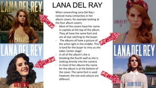
When researching Lana Del Ray I
noticed many similarities in her
album covers, for example looking at
the four album covers:
- Most of the covers have her name
in capitals at the top of the album.
They all have the same font and
are all eye catching to the buyer.
- The albums all have a picture of
the artist right in the middle. This
is hard for the buyer to miss as she
takes ’center stage’.
- In all of the album's she is
breaking the fourth wall as she is
looking directly into the camera.
- In most of her albums the name
for the album is at the bottom of
the cover. The same font is used
however, the size and colours are
different.
CHRIS BROWN
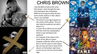
I also decided to look at the artist
Chris Brown. Even thought the two
artist belong to two completely
different music genres they do have
some similar aspects in their album
covers. For example:
- The Artist is once again placed on
the center of the album. This can
also help the audience see who’s
album it is.
- In some of his album we can see
that the artist has used graphics
which is eye catching to the
audience.
- For majority of the albums the
name of the album is given
however unlike the other artist the
font is not the same in each album.
- We can also see that in most of the
albums in the bottom right hand
corner we can see the record labels
logo.
DISCLOSURE
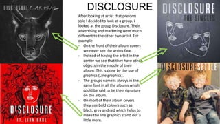
After looking at artist that preform
solo I decided to look at a group. I
looked at the group Disclosure. Their
advertising and marketing were much
different to the other two artist. For
example:
- On the front of their album covers
we never see the artists face.
- Instead of having the artist in the
center we see that they have other
objects in the middle of their
album. This is done by the use of
graphics (Line graphics).
- The groups name is always in the
same font in all the albums which
could be said to be their signature
on the album.
- On most of their album covers
they use bold colours such as
black, grey and red which helps to
make the line graphics stand out a
little more.
DRAKE
Lastly I looked at the artist Drake.
This artist belongs to the genre of
music as Chris Brown, however has a
different approach to how he sets
his album. For example:
- Unlike other artist from the R n B
genre the artist drake tends not
to have real live pictures of
himself, he uses animate pictures
of himself.
- Most of his albums use dark and
dull colours which suggest that
his music is dark and mysterious.
- Drake is not like other artist
where he feels the need to have
his name on the cover of an
album. He only has the name of
the album on there.
- Like Chris Brown in the bottom
right hand corner we can see the
record label's logo.
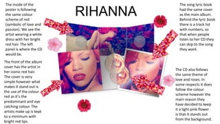
The song lyric book
had the same cover
as the main album.
Behind the lyric book
there is a track list
with numbers, so
that when people
listen to her CD they
can skip to the song
they want.
The front of the album
cover has the artist in
her iconic red hair.
The cover is very
simple however what
makes it stand out is
the use of the colour
red as it’s the
predominant and eye
catching colour. The
artists make up is kept
to a minimum with
bright red lips.
The inside of the
poster is following
the same colour
scheme of red
(symbolic of love and
passion). We see the
artist wearing a white
dress with her bright
red hair. The left
panel is where the CD
would be.
The CD also follows
the same theme of
love and roses. In
some respects it does
follow the colour
scheme however the
main reason they
have decided to keep
it a light pink flower
is that it stands out
from the background.
RIHANNA
Release Posters
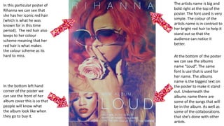
The artists name is big and
bold right at the top of the
poster. The font used is very
simple. The colour of the
artists name is in contrast to
her bright red hair to help it
stand out so that the
audience can notice it
better.
At the bottom of the poster
we can see the albums
name “Loud”. The same
font is use that is used for
her name. The albums
name is the biggest text on
the poster to make it stand
out. Underneath the
albums name there are
some of the songs that will
be in the album. As well as
some of the collaborations
that she’s done with other
artists.
In this particular poster of
Rihanna we can see that
she has her iconic red hair
(which is what he was
known for in this time
period). The red hair also
keeps to her colour
scheme meaning that her
red hair is what makes
the colour scheme as its
hard to miss.
In the bottom left hand
corner of the poster we
can see the front of her
album cover this is so that
people will know what
the album look like when
they go to buy it.
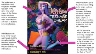
The artists name is in a
fun font which is fitting
to her target audience
as it appeals to
teenagers. Following
the artists name we
can see the albums
name which is in a
plain font however the
text is in white to make
it stand out from the
dark background
We can also see a
image of the artist. She
is wearing a two piece
swim suit in pastel
colours. Looking closely
at the picture we can
see that the artist is not
in the center of the
poster she is slightly on
the side which follows
the ‘Rule of Thirds’.
The background of
the poster is very
busy but is made to
look dark at the
same time which
makes all the shades
of pink stand out
more. It also helps to
make he artist stand
out more so that she
is more noticeable.
In the bottom left
hand corner we can
see the date that the
new album will be
released. Also some
of her new songs
that will be featuring
in the album.

Digipak and Release Poster Analysis

  • 1.
  • 2.
    What are thecodes and conventions for a ’Digipak’ and ‘Release Poster’? Album • Usually a photo of the artist on the front of the album. • You would see that there is a track list provided (so that people can skip to the song that they want) • Title of the album and name of the artist. • When you open the album you would have a space for the CD and behind that you would usually have a image (the image tends not to be a image of the artist but graphics) • You also get a little icon that says where else the music is available such as iTunes and Google Play Store. • Sometimes there could be a record labels logo. Poster • Main picture of the artist or graphics that is seen on the album. • Usually the poster is in the portrait orientation. • The albums name on poster. • The artists name. • Record companies logo. • reviews (quotes) • Ratings • Where else the album will be available (iTunes and Google Play Store)
  • 3.
  • 4.
    LANA DEL RAY Whenresearching Lana Del Ray I noticed many similarities in her album covers, for example looking at the four album covers: - Most of the covers have her name in capitals at the top of the album. They all have the same font and are all eye catching to the buyer. - The albums all have a picture of the artist right in the middle. This is hard for the buyer to miss as she takes ’center stage’. - In all of the album's she is breaking the fourth wall as she is looking directly into the camera. - In most of her albums the name for the album is at the bottom of the cover. The same font is used however, the size and colours are different.
  • 5.
    CHRIS BROWN I alsodecided to look at the artist Chris Brown. Even thought the two artist belong to two completely different music genres they do have some similar aspects in their album covers. For example: - The Artist is once again placed on the center of the album. This can also help the audience see who’s album it is. - In some of his album we can see that the artist has used graphics which is eye catching to the audience. - For majority of the albums the name of the album is given however unlike the other artist the font is not the same in each album. - We can also see that in most of the albums in the bottom right hand corner we can see the record labels logo.
  • 6.
    DISCLOSURE After looking atartist that preform solo I decided to look at a group. I looked at the group Disclosure. Their advertising and marketing were much different to the other two artist. For example: - On the front of their album covers we never see the artists face. - Instead of having the artist in the center we see that they have other objects in the middle of their album. This is done by the use of graphics (Line graphics). - The groups name is always in the same font in all the albums which could be said to be their signature on the album. - On most of their album covers they use bold colours such as black, grey and red which helps to make the line graphics stand out a little more.
  • 7.
    DRAKE Lastly I lookedat the artist Drake. This artist belongs to the genre of music as Chris Brown, however has a different approach to how he sets his album. For example: - Unlike other artist from the R n B genre the artist drake tends not to have real live pictures of himself, he uses animate pictures of himself. - Most of his albums use dark and dull colours which suggest that his music is dark and mysterious. - Drake is not like other artist where he feels the need to have his name on the cover of an album. He only has the name of the album on there. - Like Chris Brown in the bottom right hand corner we can see the record label's logo.
  • 8.
    The song lyricbook had the same cover as the main album. Behind the lyric book there is a track list with numbers, so that when people listen to her CD they can skip to the song they want. The front of the album cover has the artist in her iconic red hair. The cover is very simple however what makes it stand out is the use of the colour red as it’s the predominant and eye catching colour. The artists make up is kept to a minimum with bright red lips. The inside of the poster is following the same colour scheme of red (symbolic of love and passion). We see the artist wearing a white dress with her bright red hair. The left panel is where the CD would be. The CD also follows the same theme of love and roses. In some respects it does follow the colour scheme however the main reason they have decided to keep it a light pink flower is that it stands out from the background. RIHANNA
  • 9.
  • 10.
    The artists nameis big and bold right at the top of the poster. The font used is very simple. The colour of the artists name is in contrast to her bright red hair to help it stand out so that the audience can notice it better. At the bottom of the poster we can see the albums name “Loud”. The same font is use that is used for her name. The albums name is the biggest text on the poster to make it stand out. Underneath the albums name there are some of the songs that will be in the album. As well as some of the collaborations that she’s done with other artists. In this particular poster of Rihanna we can see that she has her iconic red hair (which is what he was known for in this time period). The red hair also keeps to her colour scheme meaning that her red hair is what makes the colour scheme as its hard to miss. In the bottom left hand corner of the poster we can see the front of her album cover this is so that people will know what the album look like when they go to buy it.
  • 11.
    The artists nameis in a fun font which is fitting to her target audience as it appeals to teenagers. Following the artists name we can see the albums name which is in a plain font however the text is in white to make it stand out from the dark background We can also see a image of the artist. She is wearing a two piece swim suit in pastel colours. Looking closely at the picture we can see that the artist is not in the center of the poster she is slightly on the side which follows the ‘Rule of Thirds’. The background of the poster is very busy but is made to look dark at the same time which makes all the shades of pink stand out more. It also helps to make he artist stand out more so that she is more noticeable. In the bottom left hand corner we can see the date that the new album will be released. Also some of her new songs that will be featuring in the album.