Download to read offline


The document analyzes and compares the packaging (digi packs) of albums from different genres: Green Day's rock album "Bullet in a Bible", Sum 41's punk album "Underclass Hero", and pop artist Shayne Ward's self-titled debut album. Key similarities across genres include prominently displaying the band/artist name and album title on the front cover, including track listings and production details on the back cover, and maintaining consistent color schemes throughout. Differences are also noted, such as Shayne Ward's album having plain interior packaging compared to the other albums showcasing band members and maintaining a live concert atmosphere. Overall conventions are observed but packaging is tailored to each genre's style and intended audience.


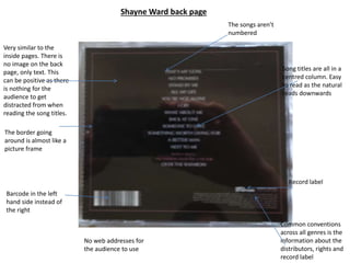
![Digipaks[1]](https://cdn.slidesharecdn.com/ss_thumbnails/digipaks1-110207044144-phpapp02-thumbnail.jpg?width=640&height=640&fit=bounds)


