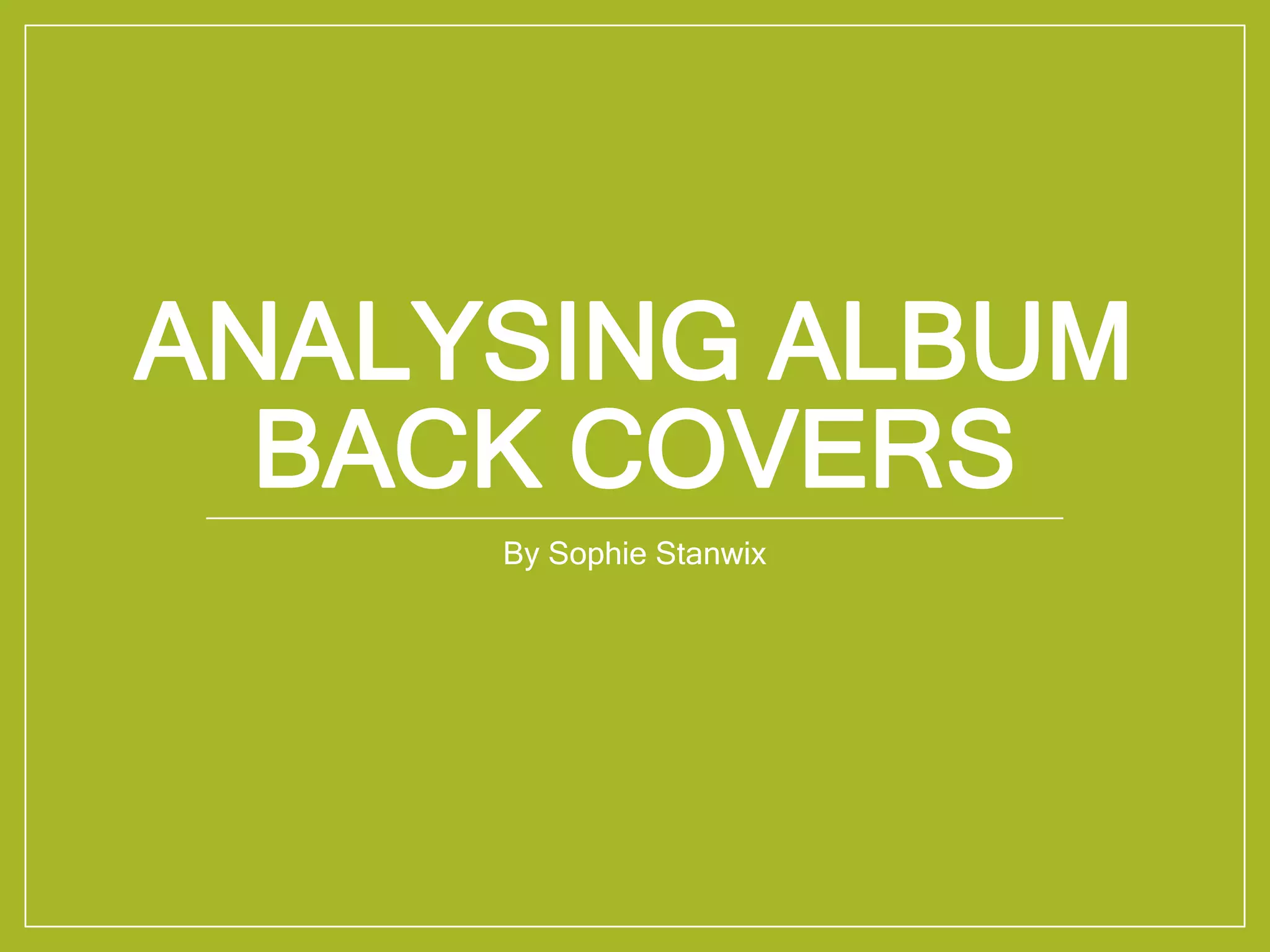
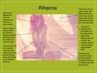
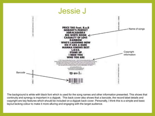
ANALYSING ALBUM
BACK COVERS
By Sophie Stanwix
Rihanna
She has no
interaction
with the
audience as
there is no
eye contact.
There isn’t much
colour used, the
bold vibrant red
colour has is a lot
more paler which
indicates her soft
but very girly side.
We are able to
easily define
this album’s
target audience
(females) from
the artist and
colours used.
It shows the use
of a medium
close up shot
used as we can
see her whole
body compared
to an extreme
close up.
The baby tint
covers her body
and face which
connotes that she
is hiding away her
true colours.
The list of
songs which
are written on
the right hand
side of the
back cover are
in dark, red
capitals and as
a result boldly
emphasises
them.
Jessie J
The background is white with black font which is used for the song names and other information presented. This shows that
continuity and synergy is important in a digipak. This back cover also shows that a barcode, the record label details and
copyright are key features which should be included on a digipak back cover. Personally, I think this is a simple and basic
layout lacking colour to make it more alluring and engaging with the target audience.
Name of songs
Copyright
information
Barcode
Jessie J continued…
The image used for the back cover of this digipak is directly in the centre of the page. The font used for the name of the
songs is black and bold which contrasts really well with the white because it makes it easy to read. The image is positioned
well using the rule of thirds. However, one thing I noticed about this digipak from comparing it to the previous one is that it
does not have any copyright information or even a barcode which is an imperative convention placed on the majority, if not
all album back covers.
Image of artist
Clear black font in capital
letters used to make it
more visible to the target
audience

Analysing existing album back covers

  • 1.
  • 2.
    Rihanna She has no interaction withthe audience as there is no eye contact. There isn’t much colour used, the bold vibrant red colour has is a lot more paler which indicates her soft but very girly side. We are able to easily define this album’s target audience (females) from the artist and colours used. It shows the use of a medium close up shot used as we can see her whole body compared to an extreme close up. The baby tint covers her body and face which connotes that she is hiding away her true colours. The list of songs which are written on the right hand side of the back cover are in dark, red capitals and as a result boldly emphasises them.
  • 3.
    Jessie J The backgroundis white with black font which is used for the song names and other information presented. This shows that continuity and synergy is important in a digipak. This back cover also shows that a barcode, the record label details and copyright are key features which should be included on a digipak back cover. Personally, I think this is a simple and basic layout lacking colour to make it more alluring and engaging with the target audience. Name of songs Copyright information Barcode
  • 4.
    Jessie J continued… Theimage used for the back cover of this digipak is directly in the centre of the page. The font used for the name of the songs is black and bold which contrasts really well with the white because it makes it easy to read. The image is positioned well using the rule of thirds. However, one thing I noticed about this digipak from comparing it to the previous one is that it does not have any copyright information or even a barcode which is an imperative convention placed on the majority, if not all album back covers. Image of artist Clear black font in capital letters used to make it more visible to the target audience