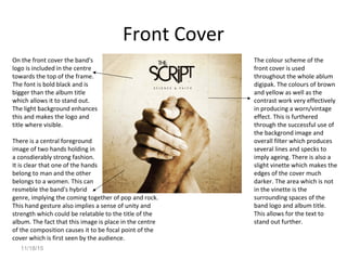
Digipak Analysis
By Josh Manley
Arctic Monkeys – Humbug
Front Cover
Here a label is included on top of the album cover in order
to warn potential buyers about the content of the album.
The font here is black very bold in order to allow it to
stand out and be noticed and therefore affectively
warning the audience.
The background image of
the front cover is very
effective in reinforcing the
fact that Arctic Monkeys are
an Indie/Alternative band.
The overall mise-en- scene is
the main aspect which
creates this effect. The
costumes of the four
subjects can be considered
to be retro Indie clothing,
wearing denim jackets,
hoodies and also having long
haircuts. The colour scheme
used once again reinforces
the retro mood as it seems
relatively dark and dingy due
to the choice of location and
lighting. Also the image
seems faded which makes it
look aged and more dated.
The bands name is placed
here, near the centre of the
frame. Bold black font is used
in order to allow it to stand
out and make it clear who the
artists are. The contrast
between the black text and
white area in which it is placed
also allows it to stand out
clearly. The font is
considerably messy and
misaligned which contributes
to the retro feel.
Here the names of the album is
included through the use of a
sticker instead of actually being
included on the album colour
itself. The size of the word
‘Humbug’ is much larger than
the other text on the sticker
which allows it to stand out
and clearly illustrate the name
of the album. Also the colour of
the sticker is gold which has
connotations of wealth and
treasure.
Back Cover
Towards the bottom of the
back cover the track listing is
included. The text is black
and also is the same font as
the album title which
provides a sense of
consistency across the
album. Also these stand out
due to the use of the light
background.
The typography of the band name is very effective as it always allows it to stand out. There
Is a sense of coherence when talking about the rest of the text included on the album cover.
This allows the band’s name to stand out very effectively due to the font, size and colour of
the text. The font is very erratic
and uneven which once again
portrays their genre and style
very effectively. Also the size of
the text is much larger than the
rest of the font which makes it
the focal point of the back
cover. The colour of the text
isn’t bright and vibrant, instead
it is a dark shade of red, once
again contributing to the genre.
This album cover conforms to the conventional information
included on the back cover of a digipak. Here the record
company’s logo and the band website as well as where the
album was manufactured is included.
On the side of the digipak
simple black text is used
to show the name of the
band and album title.
This album cover is
slightly different from
most as it doesn’t
contain an image on the
back cover. However I
feel that this is effective
as it allows the text to be
the focal point of the
cover.
CV
This CD has been designed to seem as if
the letters ‘A’ and ‘M’ are burnt across the
surface of pie. The two letters are the
initials of the band. This contributes to
the dark colour scheme of the album
colour, the fact that the initials are burnt
implies a sense of rebellion which is often
associated with indie/alternative bands. It
is relatively unconventional due to the
fact that the band’s full name isn’t
included on the CD.
Oasis – Time Flies
Front Cover
In contrast with the Arctic
Monkeys digipak, the Band’s
name and logo is included in
the top left corner of the front
cover alike a lot of their album
cover. Instead the title of the
album is included in the centre
of the cover. The band logo is
part of the brand identity as
they use this logo on most, if
not all of their album covers.
Due to this, connections can
be made with the audience as
they will instantly recognize
the logo, also connections can
be made between their other
works. Both of these texts are
black and bold which allow
them to stand out from the
The background image of
the front cover is a photo
of a crowd which is
assumed to be at one of
their concerts. It is taken
from the band’s
perspective which provides
a more personal tone to
the album. This photo
depicts the extensive size
of Oasis’ audience,
portraying the great
interest they have. This
can relate to the title of
the album in relation to
the success of the band. It
could suggest how quickly
in which they have
progressed from being a
little band to a worldwide
band.
light background of a sky. The title of the album is in all capitals which also
allows it to stand out further. The fact that the text is placed in the sky
relates to the title being ‘Time Flies’.
The majority of the front cover is considerable light and vibrant and natural. It
Is also slightly unsaturated which implies a retro theme which is often associated
with indie/alternative bands. This also implies the time period in which is was taken,
Perhaps on 35m film
Back Cover
The side panel includes
Basic information such as the
album title, band logo and
record label logo
In comparison to the album front cover, the back cover consists of a very different.
Unlike the front cover where the chaotic experience of a concert is shown, the back
Cover illustrates the aftermath of a concert where litter covers the whole ground. Also
This image is much darker and dingy than the front cover and not as aesthetically
Pleasing.
Similarly to most album covers,
It contains the conventional
Information that is
Stereotypically found on the
back cover of the album. Here
a barcode, copyright notice, the
band’s website details and also
the record label’s name and
logo. Also there are no
photographs of the band on
this album cover which is
relatively different from most
album covers. Instead they
present what the band
experience and causes, which
could also suggest the success
and size of the band.
The track listings is included
Conventionally on the back
cover where they are placed
rather chaotically. This can
perhaps relate to the
background image being
very reckless and polluted.
The text is white as well as
being all in capitals which
allows it to stand out from
the dark background very
well. Also the different
tracks named can vary in
size which can allow for the
larger sized fonts to be seen
easier.
CD
These Cd’s have the band’s name and also the album title on them in the same fonts.
This gains a connection with the front cover and provides consistency throughout.
These CD’s also include the record label’s name and logo as well as the copyright details
which are encrypted around the circumference of the CD. The CD is a pastel pink which
will grab audience’s attention. Furthermore, it also allows the font to stand out very
effectively as it contrasts with the black bold text.
11/18/15
The Script - Science on Faith
11/18/15
Front Cover
On the front cover the band's
logo is included in the centre
towards the top of the frame.
The font is bold black and is
bigger than the album title
which allows it to stand out.
The light background enhances
this and makes the logo and
title where visible.
There is a central foreground
image of two hands holding in
a consdierably strong fashion.
It is clear that one of the hands
belong to man and the other
belongs to a women. This can
resmeble the band's hybrid
genre, implying the coming together of pop and rock.
This hand gesture also implies a sense of unity and
strength which could be relatable to the title of the
album. The fact that this image is place in the centre
of the composition causes it to be focal point of the
cover which is first seen by the audience.
The colour scheme of the
front cover is used
throughout the whole ablum
digipak. The colours of brown
and yellow as well as the
contrast work very effectively
in producing a worn/vintage
effect. This is furthered
through the successful use of
the backgrond image and
overall filter which produces
several lines and specks to
imply ageing. There is also a
slight vinette which makes the
edges of the cover much
darker. The area which is not
in the vinette is the
surrounding spaces of the
band logo and album title.
This allows for the text to
stand out further.
11/18/15
Back Cover
A sense of continuity is
gained through the fact
In each corner of the
back cover,
conventional
information is placed.
This includes the band
website, record label
logo, barcode and also
the copyright notice.
This still adds to the
colour scheme of the
digipak due to the fact
that it is black and in
the same font as the
rest of the texts.
that once again the main central image is of two different hands together.
However this time the hands are placed together touching palms. This gesture
contains connotations of praying which is very relavent to the title of the album.
The continuity is also due to the same colour scheme and background being used
which further the vintage, worn look. This contrast provides a gritty feel which
acompanies the brown colour tone; implying connotations of religion, once again
realting to the album title.
In the top right hand
corner of the back cover a
track listing is inluded.
Here they are order
numerically from 1-10
which once again
confroms to the
conventions of the back
cover of digipaks. Once
again the same black font
is used which is slightly
bigger than the other text
included on the back
cover which allows the
track listing to stand out
more.
On the spine of the
digipak the band name
and title of the album is
include. It remains
consistent as the same
font is use however the
band name is in bold
which allows it to be more
visible
11/18/15
CD
The disk of the digipak is also very
intriguing as it is different to the
rest of the digipak. Instead of hands
being used as the main image a very
parculiar symbol is used. It looks as
if it is glowing through its orange
colour which stands out from the
dark background. This could
perhaps have connotations of a
religious symbol, once again relating
to the title of the album. This CD is
quite unique and different to the
other CDs in which I have analysed
as it also includes the track listing
around the circumference of the
disk. It is ordered numerically as
well as being in orange text and in
the same font as the rest of the
digipak, showing consistency.

Ancillary task - media - Josh Manley

  • 1.
  • 2.
  • 3.
    Front Cover Here alabel is included on top of the album cover in order to warn potential buyers about the content of the album. The font here is black very bold in order to allow it to stand out and be noticed and therefore affectively warning the audience. The background image of the front cover is very effective in reinforcing the fact that Arctic Monkeys are an Indie/Alternative band. The overall mise-en- scene is the main aspect which creates this effect. The costumes of the four subjects can be considered to be retro Indie clothing, wearing denim jackets, hoodies and also having long haircuts. The colour scheme used once again reinforces the retro mood as it seems relatively dark and dingy due to the choice of location and lighting. Also the image seems faded which makes it look aged and more dated. The bands name is placed here, near the centre of the frame. Bold black font is used in order to allow it to stand out and make it clear who the artists are. The contrast between the black text and white area in which it is placed also allows it to stand out clearly. The font is considerably messy and misaligned which contributes to the retro feel. Here the names of the album is included through the use of a sticker instead of actually being included on the album colour itself. The size of the word ‘Humbug’ is much larger than the other text on the sticker which allows it to stand out and clearly illustrate the name of the album. Also the colour of the sticker is gold which has connotations of wealth and treasure.
  • 4.
    Back Cover Towards thebottom of the back cover the track listing is included. The text is black and also is the same font as the album title which provides a sense of consistency across the album. Also these stand out due to the use of the light background. The typography of the band name is very effective as it always allows it to stand out. There Is a sense of coherence when talking about the rest of the text included on the album cover. This allows the band’s name to stand out very effectively due to the font, size and colour of the text. The font is very erratic and uneven which once again portrays their genre and style very effectively. Also the size of the text is much larger than the rest of the font which makes it the focal point of the back cover. The colour of the text isn’t bright and vibrant, instead it is a dark shade of red, once again contributing to the genre. This album cover conforms to the conventional information included on the back cover of a digipak. Here the record company’s logo and the band website as well as where the album was manufactured is included. On the side of the digipak simple black text is used to show the name of the band and album title. This album cover is slightly different from most as it doesn’t contain an image on the back cover. However I feel that this is effective as it allows the text to be the focal point of the cover.
  • 5.
    CV This CD hasbeen designed to seem as if the letters ‘A’ and ‘M’ are burnt across the surface of pie. The two letters are the initials of the band. This contributes to the dark colour scheme of the album colour, the fact that the initials are burnt implies a sense of rebellion which is often associated with indie/alternative bands. It is relatively unconventional due to the fact that the band’s full name isn’t included on the CD.
  • 6.
  • 7.
    Front Cover In contrastwith the Arctic Monkeys digipak, the Band’s name and logo is included in the top left corner of the front cover alike a lot of their album cover. Instead the title of the album is included in the centre of the cover. The band logo is part of the brand identity as they use this logo on most, if not all of their album covers. Due to this, connections can be made with the audience as they will instantly recognize the logo, also connections can be made between their other works. Both of these texts are black and bold which allow them to stand out from the The background image of the front cover is a photo of a crowd which is assumed to be at one of their concerts. It is taken from the band’s perspective which provides a more personal tone to the album. This photo depicts the extensive size of Oasis’ audience, portraying the great interest they have. This can relate to the title of the album in relation to the success of the band. It could suggest how quickly in which they have progressed from being a little band to a worldwide band. light background of a sky. The title of the album is in all capitals which also allows it to stand out further. The fact that the text is placed in the sky relates to the title being ‘Time Flies’. The majority of the front cover is considerable light and vibrant and natural. It Is also slightly unsaturated which implies a retro theme which is often associated with indie/alternative bands. This also implies the time period in which is was taken, Perhaps on 35m film
  • 8.
    Back Cover The sidepanel includes Basic information such as the album title, band logo and record label logo In comparison to the album front cover, the back cover consists of a very different. Unlike the front cover where the chaotic experience of a concert is shown, the back Cover illustrates the aftermath of a concert where litter covers the whole ground. Also This image is much darker and dingy than the front cover and not as aesthetically Pleasing. Similarly to most album covers, It contains the conventional Information that is Stereotypically found on the back cover of the album. Here a barcode, copyright notice, the band’s website details and also the record label’s name and logo. Also there are no photographs of the band on this album cover which is relatively different from most album covers. Instead they present what the band experience and causes, which could also suggest the success and size of the band. The track listings is included Conventionally on the back cover where they are placed rather chaotically. This can perhaps relate to the background image being very reckless and polluted. The text is white as well as being all in capitals which allows it to stand out from the dark background very well. Also the different tracks named can vary in size which can allow for the larger sized fonts to be seen easier.
  • 9.
    CD These Cd’s havethe band’s name and also the album title on them in the same fonts. This gains a connection with the front cover and provides consistency throughout. These CD’s also include the record label’s name and logo as well as the copyright details which are encrypted around the circumference of the CD. The CD is a pastel pink which will grab audience’s attention. Furthermore, it also allows the font to stand out very effectively as it contrasts with the black bold text.
  • 10.
    11/18/15 The Script -Science on Faith
  • 11.
    11/18/15 Front Cover On thefront cover the band's logo is included in the centre towards the top of the frame. The font is bold black and is bigger than the album title which allows it to stand out. The light background enhances this and makes the logo and title where visible. There is a central foreground image of two hands holding in a consdierably strong fashion. It is clear that one of the hands belong to man and the other belongs to a women. This can resmeble the band's hybrid genre, implying the coming together of pop and rock. This hand gesture also implies a sense of unity and strength which could be relatable to the title of the album. The fact that this image is place in the centre of the composition causes it to be focal point of the cover which is first seen by the audience. The colour scheme of the front cover is used throughout the whole ablum digipak. The colours of brown and yellow as well as the contrast work very effectively in producing a worn/vintage effect. This is furthered through the successful use of the backgrond image and overall filter which produces several lines and specks to imply ageing. There is also a slight vinette which makes the edges of the cover much darker. The area which is not in the vinette is the surrounding spaces of the band logo and album title. This allows for the text to stand out further.
  • 12.
    11/18/15 Back Cover A senseof continuity is gained through the fact In each corner of the back cover, conventional information is placed. This includes the band website, record label logo, barcode and also the copyright notice. This still adds to the colour scheme of the digipak due to the fact that it is black and in the same font as the rest of the texts. that once again the main central image is of two different hands together. However this time the hands are placed together touching palms. This gesture contains connotations of praying which is very relavent to the title of the album. The continuity is also due to the same colour scheme and background being used which further the vintage, worn look. This contrast provides a gritty feel which acompanies the brown colour tone; implying connotations of religion, once again realting to the album title. In the top right hand corner of the back cover a track listing is inluded. Here they are order numerically from 1-10 which once again confroms to the conventions of the back cover of digipaks. Once again the same black font is used which is slightly bigger than the other text included on the back cover which allows the track listing to stand out more. On the spine of the digipak the band name and title of the album is include. It remains consistent as the same font is use however the band name is in bold which allows it to be more visible
  • 13.
    11/18/15 CD The disk ofthe digipak is also very intriguing as it is different to the rest of the digipak. Instead of hands being used as the main image a very parculiar symbol is used. It looks as if it is glowing through its orange colour which stands out from the dark background. This could perhaps have connotations of a religious symbol, once again relating to the title of the album. This CD is quite unique and different to the other CDs in which I have analysed as it also includes the track listing around the circumference of the disk. It is ordered numerically as well as being in orange text and in the same font as the rest of the digipak, showing consistency.