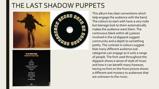
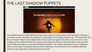
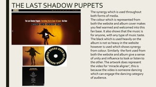
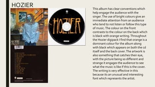
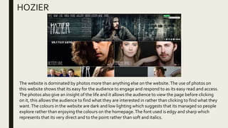
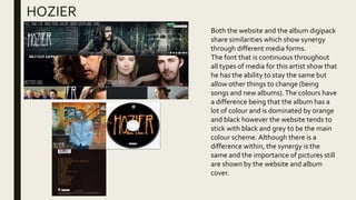
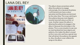
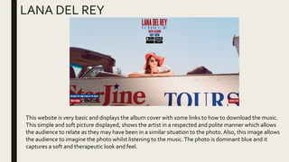
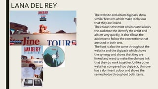
ANCILLARYTASK
TARA RENDELL
THE LAST SHADOW PUPPETS
This album has clear conventions which
help engage the audience with the band.
The colours to start with have a very indie
but teenage look to them automatically
makes the audience want them.The
continuous black within all 3 pieces
involved in the cd digipack suggest
community and a depth to something
pretty.The contrast in colours suggest
that many different audience sub-
categories can engage as it suits a range
of people.The font used throughout the
digipack shows a sense of style of music
and how it can benefit many however,
having no font on the front picture shows
a different and mystery to audiences that
are unknown to the music.
THE LAST SHADOW PUPPETS
The website shows very little detail and makes the audience intrigued about what the page is offering. It
has a basic format and allows the audience to really search to the ability that they can.The simple links that
first are shown in black in the middle of the screen stands out against the yellow and red which is in the
background this makes the links more obvious and makes the audience interested about what is on the
social media and what the music like and explore the band.The range of photos that are on a slideshow
when you first open the website show a variety of behaviours from the band which will allow different
audience sub-categories to relate and become a fan of.
THE LAST SHADOW PUPPETS
The synergy which is used throughout
both forms of media.
The colour which is represented from
both the website and album cover makes
you feel warmed and welcomed into this
fan base. It also shows that the music is
for anyone, with any type of music taste.
The black which is used heavily on the
album is not so heavy in the website
however is used which shows synergy
from colour. Similarly the font used from
both the website and album give a sense
of unity and influence to look or listen to
the other.The artwork does represent
the video for ‘miracle aligner’, this is
because the video is someone dancing
which can engage the dancing category
of audience.
HOZIER This album has clear conventions which
help engage the audience with the
singer.The use of bright colours give an
immediate attention from an audience
who tend to not listen or follow this type
of music.The colour on the front
contrasts to the colour on the back which
is black with orange writing.Throughout
the Hozier digipack I find that orange is a
dominant colour for the album along
with black which appears on both the cd
itself and the back cover.The artwork is
also something that catches their eye,
with the picture being so different and
strange it engages the audience to see
what the music is like if this is the cover.
The writing is very effective in this
because its an unusual and interesting
font which represents the artist.
HOZIER
The website is dominated by photos more than anything else on the website.The use of photos on
this website shows that its easy for the audience to engage and respond to as its easy read and access.
The photos also give an insight of the life and it allows the audience to view the page before clicking
on it, this allows the audience to find what they are interested in rather than clicking to find what they
want.The colours in the website are dark and low lighting which suggests that its managed so people
explore rather than enjoying the colours on the homepage.The font used is edgy and sharp which
represents that its very direct and to the point rather than soft and italics.
HOZIER
Both the website and the album digipack
share similarities which show synergy
through different media forms.
The font that is continuous throughout
all types of media for this artist show that
he has the ability to stay the same but
allow other things to change (being
songs and new albums).The colours have
a difference being that the album has a
lot of colour and is dominated by orange
and black however the website tends to
stick with black and grey to be the main
colour scheme. Although there is a
difference within, the synergy is the
same and the importance of pictures still
are shown by the website and album
cover.
LANA DEL REY
This album shows conventions which
allow the audience to engage
unknowingly, this is because the photos
in all three pictures have a colour
saturation and the photos are dominant
by the colour blue.This is eye catching to
the audience because most digipack
recently have dull colours as their cd
cover. Another reason this album is
allowing the audience to engage in the
album is because the artist plays in the
photos.This is a rare situation to see now
as most bands/artists have objects and
patterns, this makes the album unusual
as this is very retro and has a special view
that will attract the audience she appeals
to. Also, the album cover reflects the
songs on the album.
LANA DEL REY
This website is very basic and displays the album cover with some links to how to download the music.
This simple and soft picture displayed, shows the artist in a respected and polite manner which allows
the audience to relate as they may have been in a similar situation to the photo.Also, this image allows
the audience to imagine the photo whilst listening to the music.The photo is dominant blue and it
captures a soft and therapeutic look and feel.
LANA DEL REY
The website and album digipack show
similar features which make it obvious
that they are linked.
The colour is the most obvious and allows
the audience the identify the artist and
album very quickly, it also allows the
audience to follow the conventions that
are used in both sets.
The font is also the same throughout the
website and the digipack which shows
the synergy and shows that they are
linked and want to make the obvious link
that they do work together. Unlike other
websites compared too digipack, this one
has a dominant colour and shows the
same photos throughout both items.

Ancillary Task Research - Tara Rendell

  • 1.
  • 2.
    THE LAST SHADOWPUPPETS This album has clear conventions which help engage the audience with the band. The colours to start with have a very indie but teenage look to them automatically makes the audience want them.The continuous black within all 3 pieces involved in the cd digipack suggest community and a depth to something pretty.The contrast in colours suggest that many different audience sub- categories can engage as it suits a range of people.The font used throughout the digipack shows a sense of style of music and how it can benefit many however, having no font on the front picture shows a different and mystery to audiences that are unknown to the music.
  • 3.
    THE LAST SHADOWPUPPETS The website shows very little detail and makes the audience intrigued about what the page is offering. It has a basic format and allows the audience to really search to the ability that they can.The simple links that first are shown in black in the middle of the screen stands out against the yellow and red which is in the background this makes the links more obvious and makes the audience interested about what is on the social media and what the music like and explore the band.The range of photos that are on a slideshow when you first open the website show a variety of behaviours from the band which will allow different audience sub-categories to relate and become a fan of.
  • 4.
    THE LAST SHADOWPUPPETS The synergy which is used throughout both forms of media. The colour which is represented from both the website and album cover makes you feel warmed and welcomed into this fan base. It also shows that the music is for anyone, with any type of music taste. The black which is used heavily on the album is not so heavy in the website however is used which shows synergy from colour. Similarly the font used from both the website and album give a sense of unity and influence to look or listen to the other.The artwork does represent the video for ‘miracle aligner’, this is because the video is someone dancing which can engage the dancing category of audience.
  • 5.
    HOZIER This albumhas clear conventions which help engage the audience with the singer.The use of bright colours give an immediate attention from an audience who tend to not listen or follow this type of music.The colour on the front contrasts to the colour on the back which is black with orange writing.Throughout the Hozier digipack I find that orange is a dominant colour for the album along with black which appears on both the cd itself and the back cover.The artwork is also something that catches their eye, with the picture being so different and strange it engages the audience to see what the music is like if this is the cover. The writing is very effective in this because its an unusual and interesting font which represents the artist.
  • 6.
    HOZIER The website isdominated by photos more than anything else on the website.The use of photos on this website shows that its easy for the audience to engage and respond to as its easy read and access. The photos also give an insight of the life and it allows the audience to view the page before clicking on it, this allows the audience to find what they are interested in rather than clicking to find what they want.The colours in the website are dark and low lighting which suggests that its managed so people explore rather than enjoying the colours on the homepage.The font used is edgy and sharp which represents that its very direct and to the point rather than soft and italics.
  • 7.
    HOZIER Both the websiteand the album digipack share similarities which show synergy through different media forms. The font that is continuous throughout all types of media for this artist show that he has the ability to stay the same but allow other things to change (being songs and new albums).The colours have a difference being that the album has a lot of colour and is dominated by orange and black however the website tends to stick with black and grey to be the main colour scheme. Although there is a difference within, the synergy is the same and the importance of pictures still are shown by the website and album cover.
  • 8.
    LANA DEL REY Thisalbum shows conventions which allow the audience to engage unknowingly, this is because the photos in all three pictures have a colour saturation and the photos are dominant by the colour blue.This is eye catching to the audience because most digipack recently have dull colours as their cd cover. Another reason this album is allowing the audience to engage in the album is because the artist plays in the photos.This is a rare situation to see now as most bands/artists have objects and patterns, this makes the album unusual as this is very retro and has a special view that will attract the audience she appeals to. Also, the album cover reflects the songs on the album.
  • 9.
    LANA DEL REY Thiswebsite is very basic and displays the album cover with some links to how to download the music. This simple and soft picture displayed, shows the artist in a respected and polite manner which allows the audience to relate as they may have been in a similar situation to the photo.Also, this image allows the audience to imagine the photo whilst listening to the music.The photo is dominant blue and it captures a soft and therapeutic look and feel.
  • 10.
    LANA DEL REY Thewebsite and album digipack show similar features which make it obvious that they are linked. The colour is the most obvious and allows the audience the identify the artist and album very quickly, it also allows the audience to follow the conventions that are used in both sets. The font is also the same throughout the website and the digipack which shows the synergy and shows that they are linked and want to make the obvious link that they do work together. Unlike other websites compared too digipack, this one has a dominant colour and shows the same photos throughout both items.