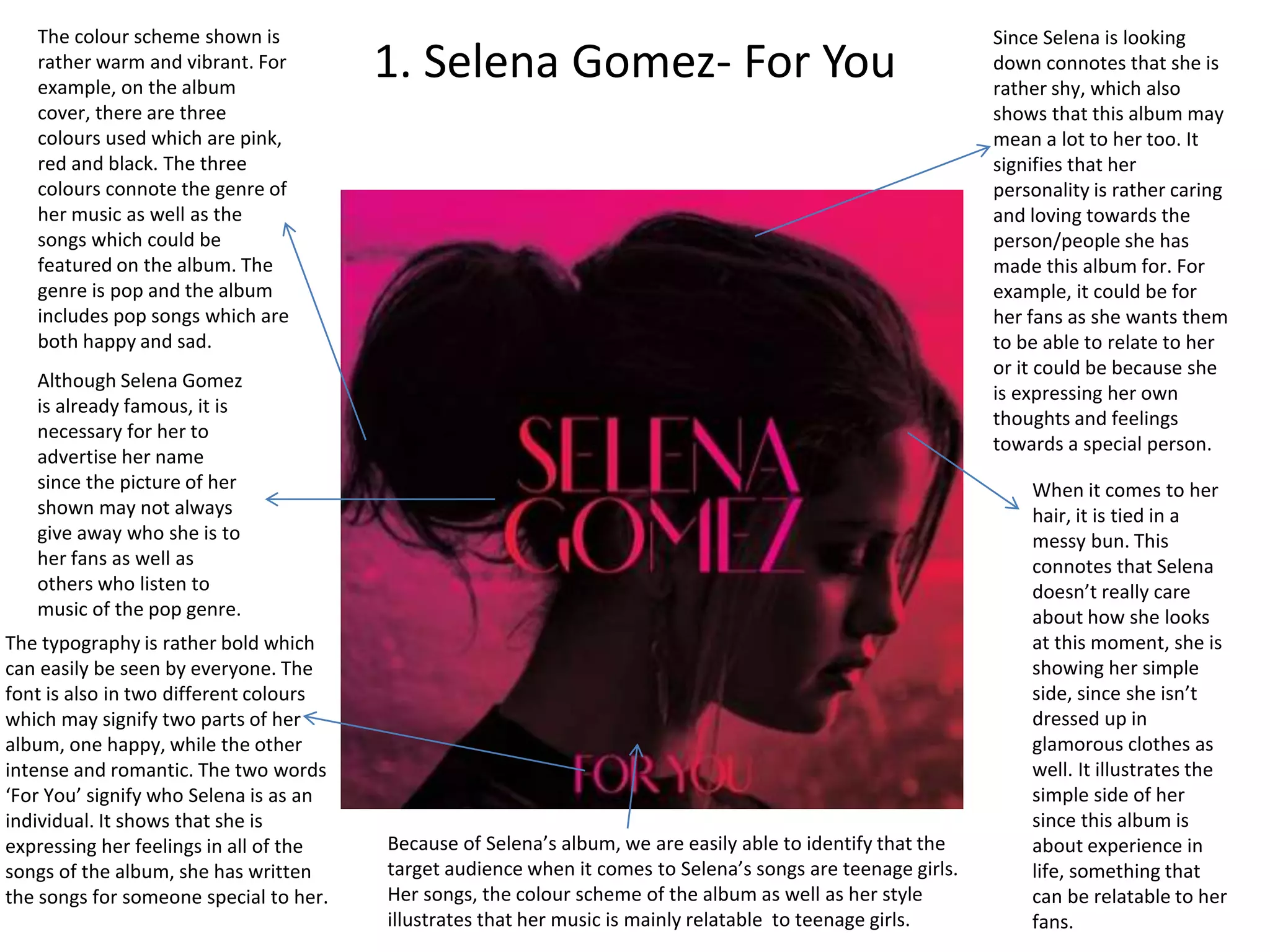
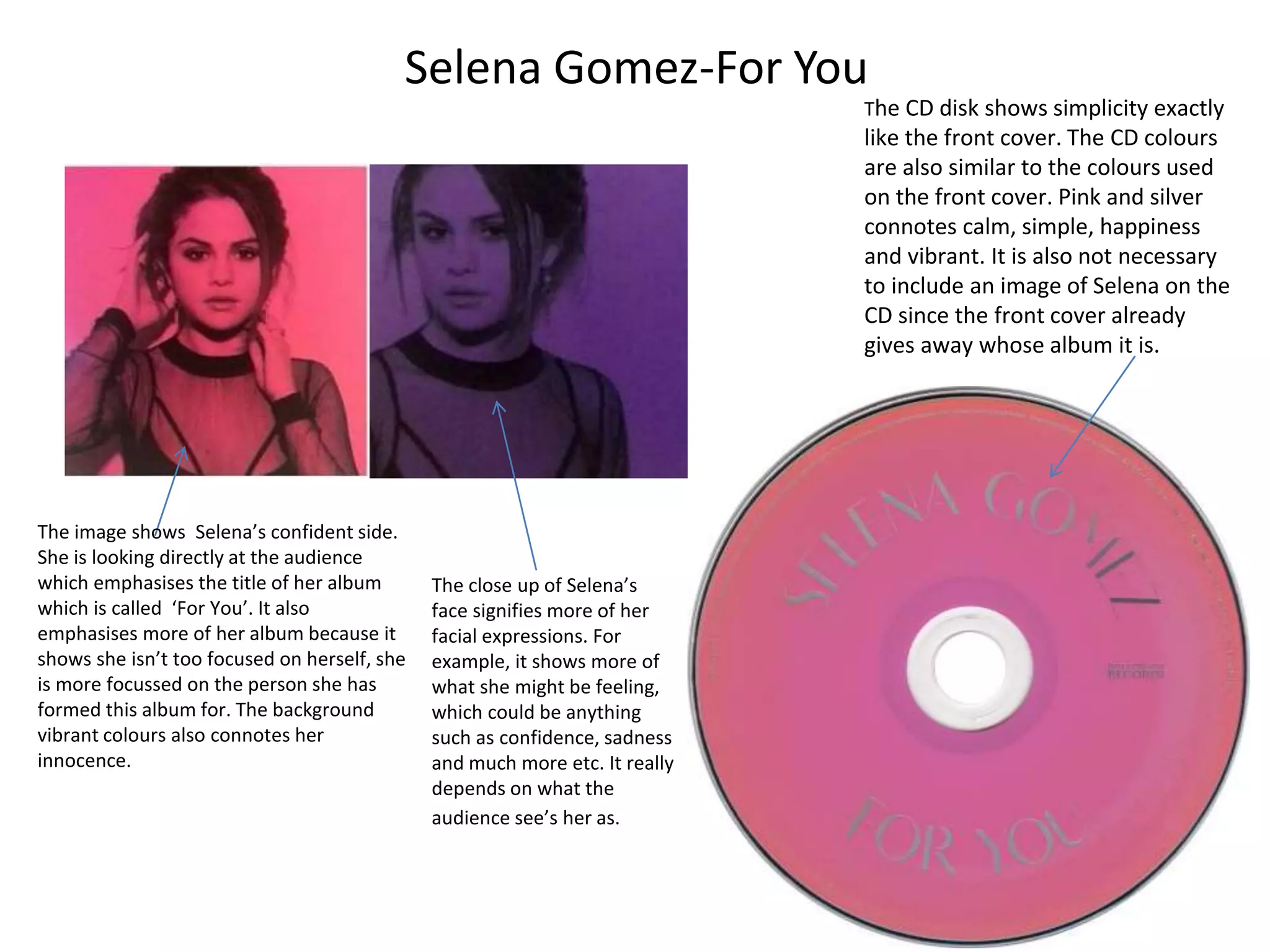
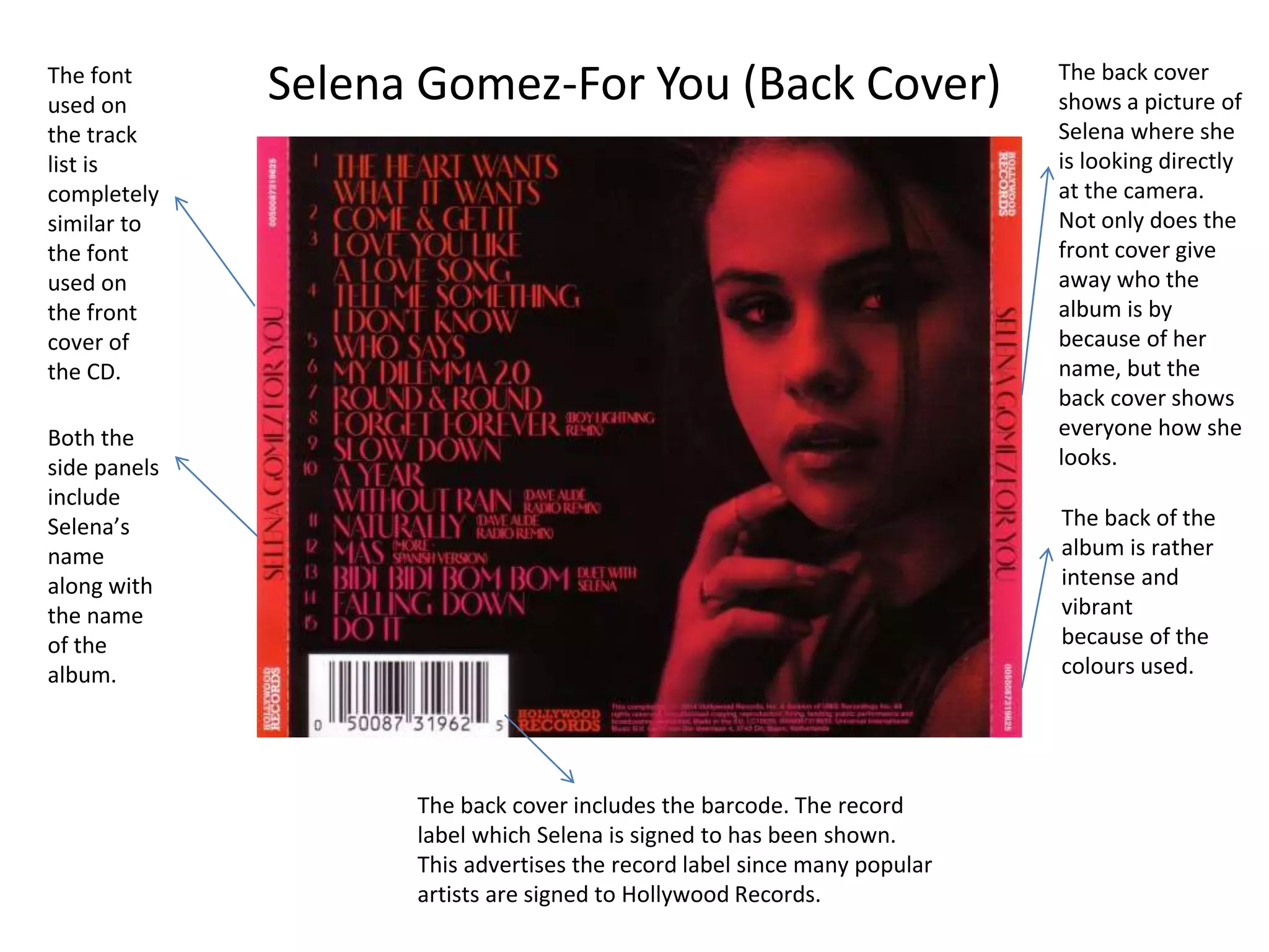
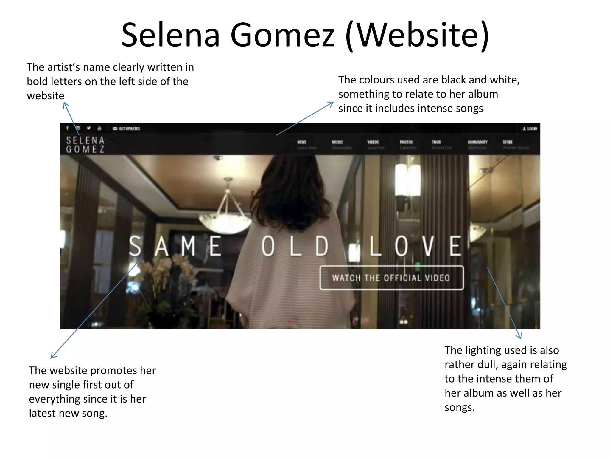
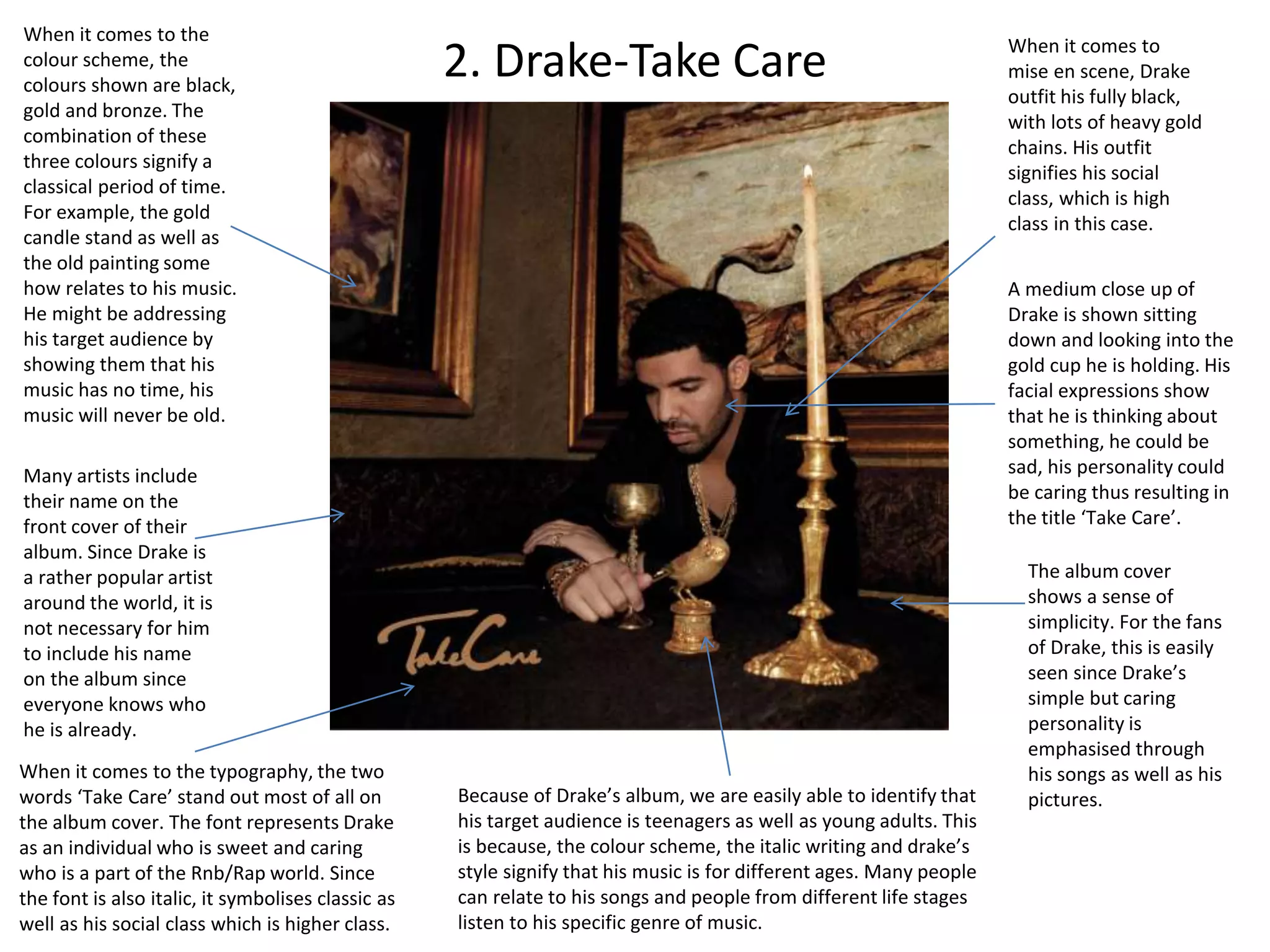
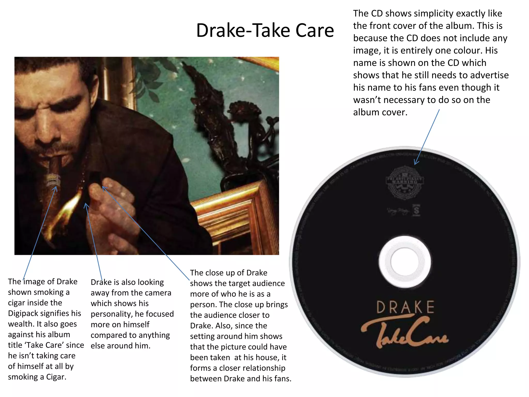
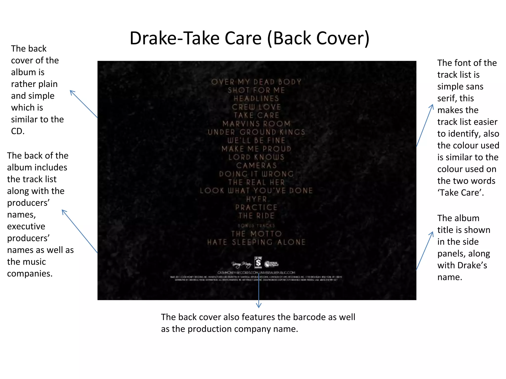
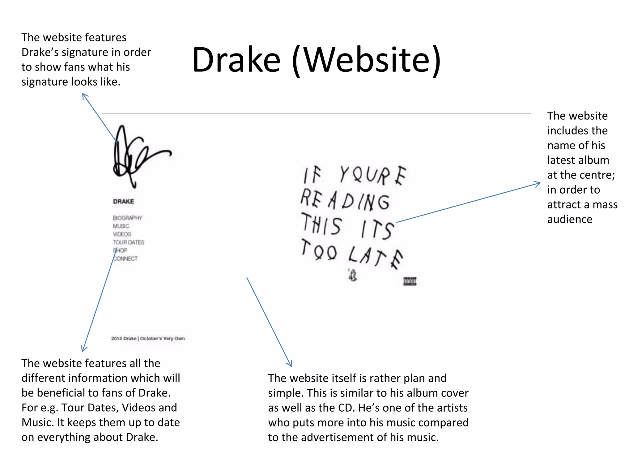
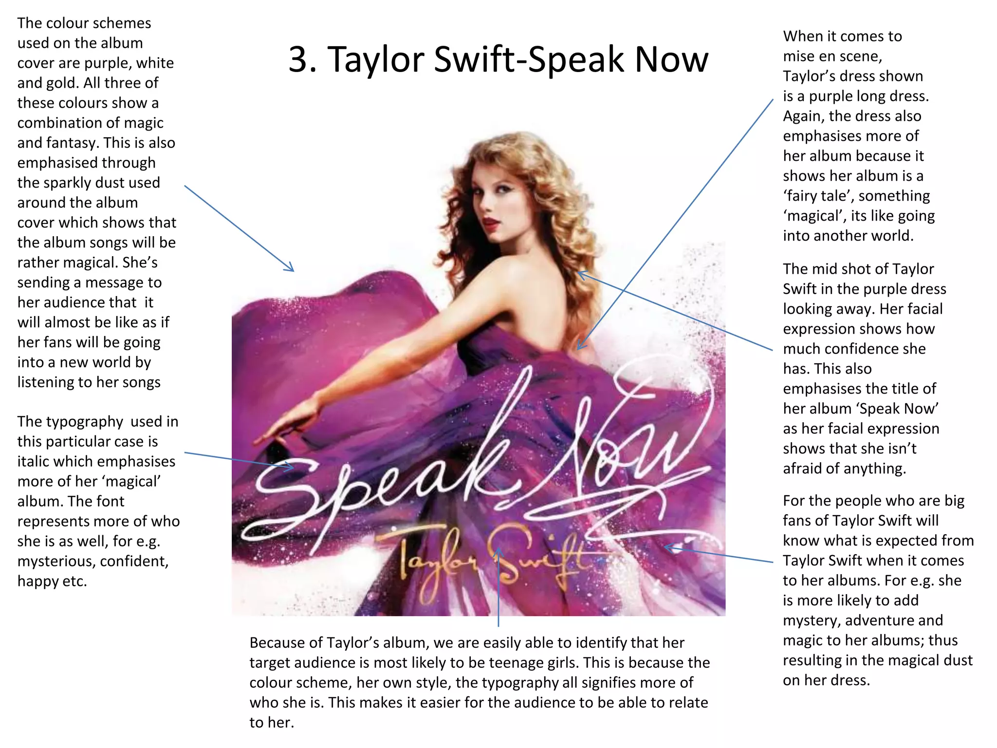
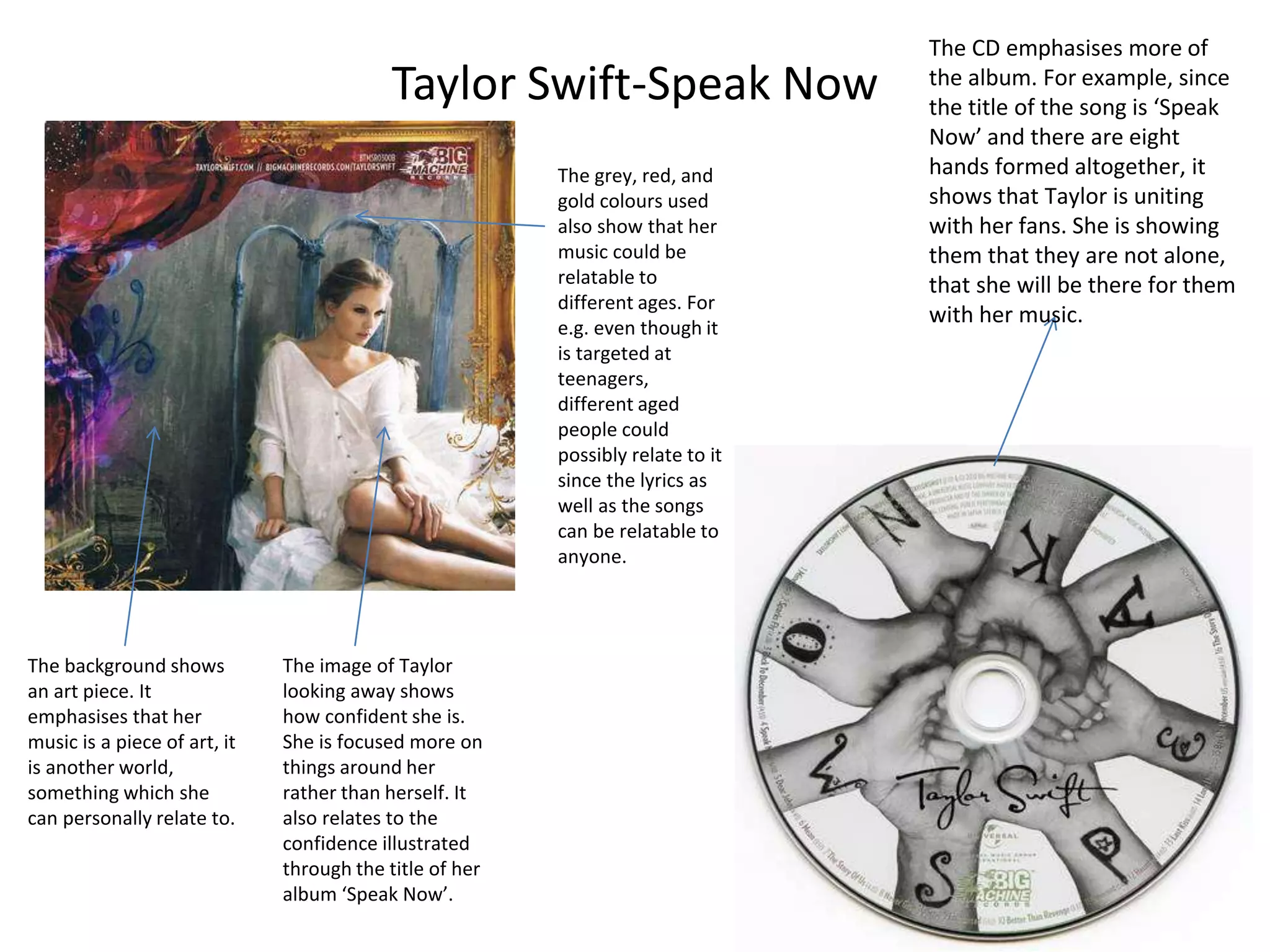
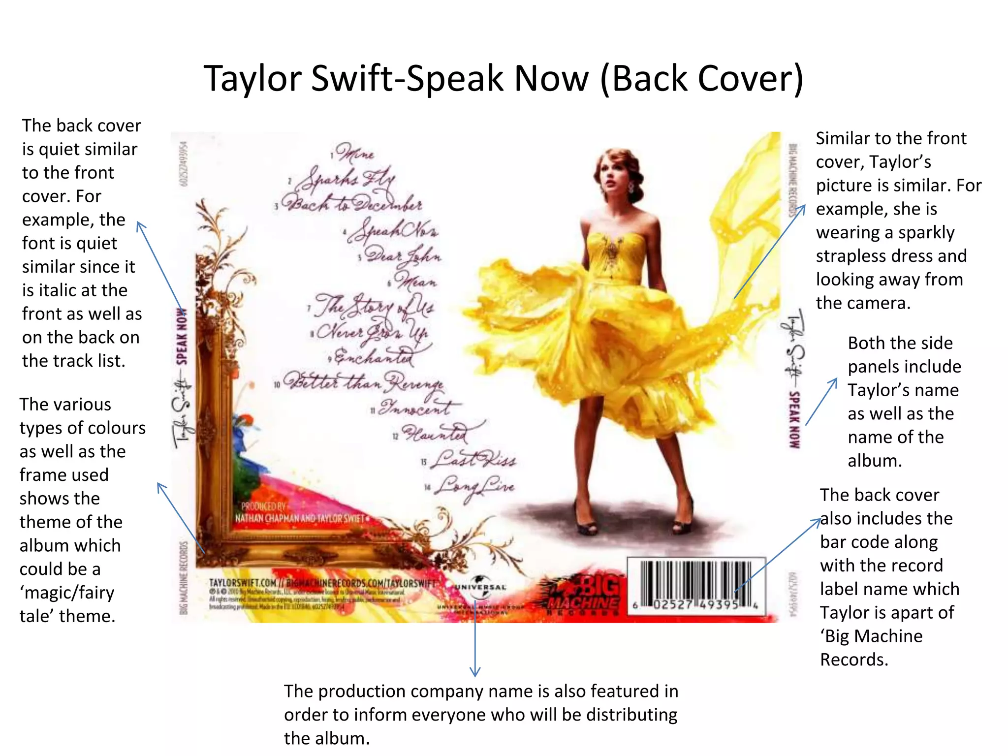
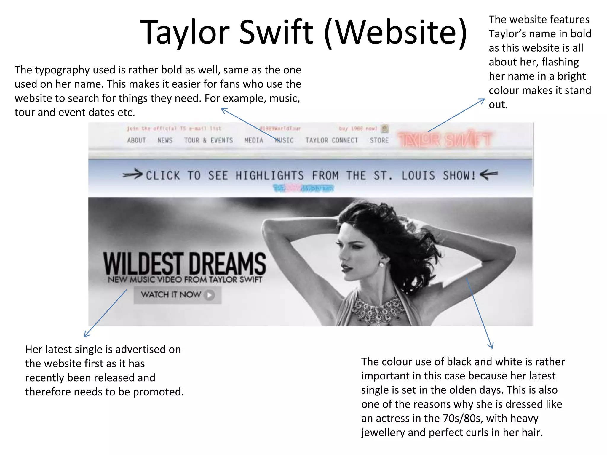
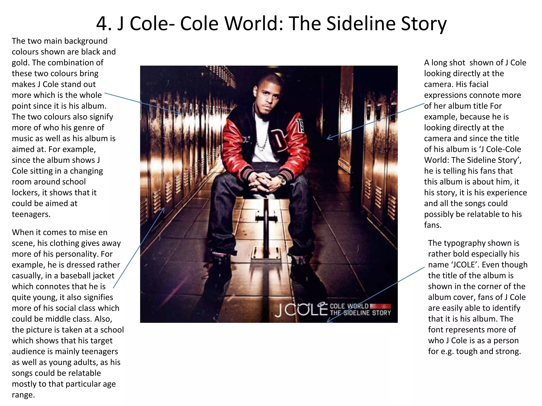
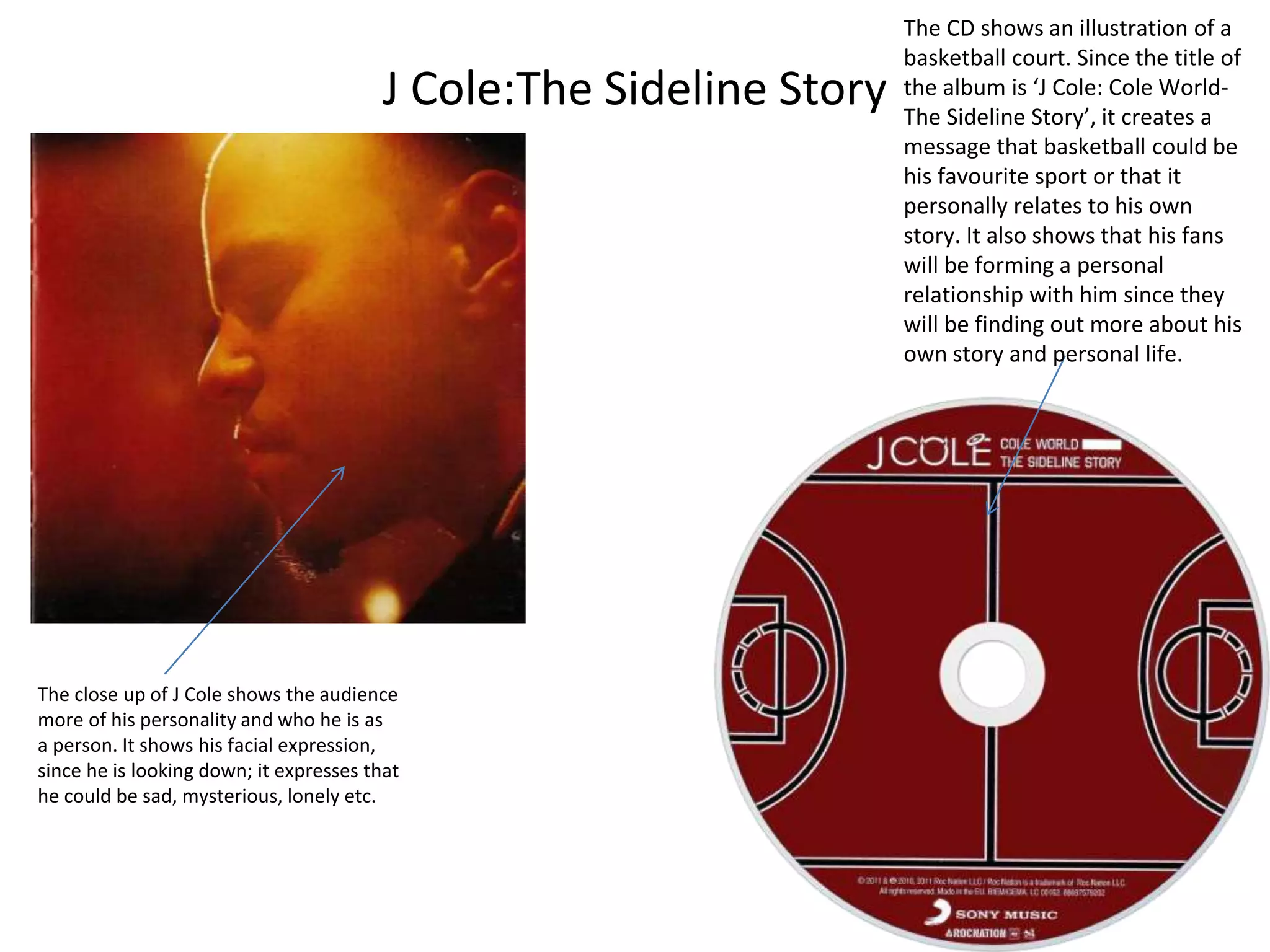
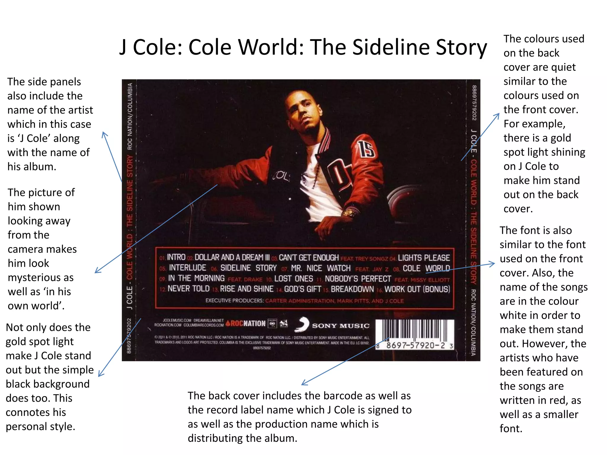
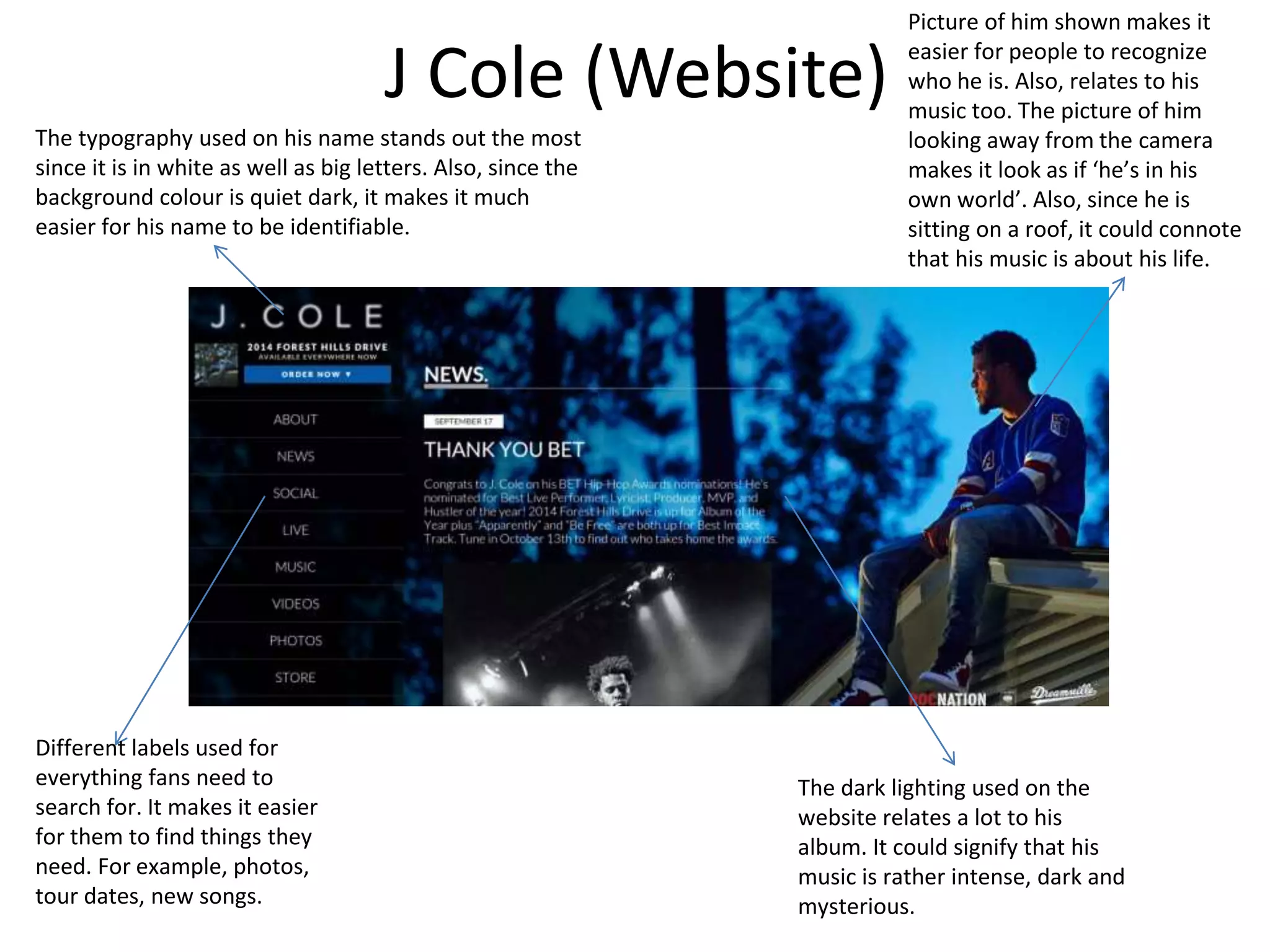
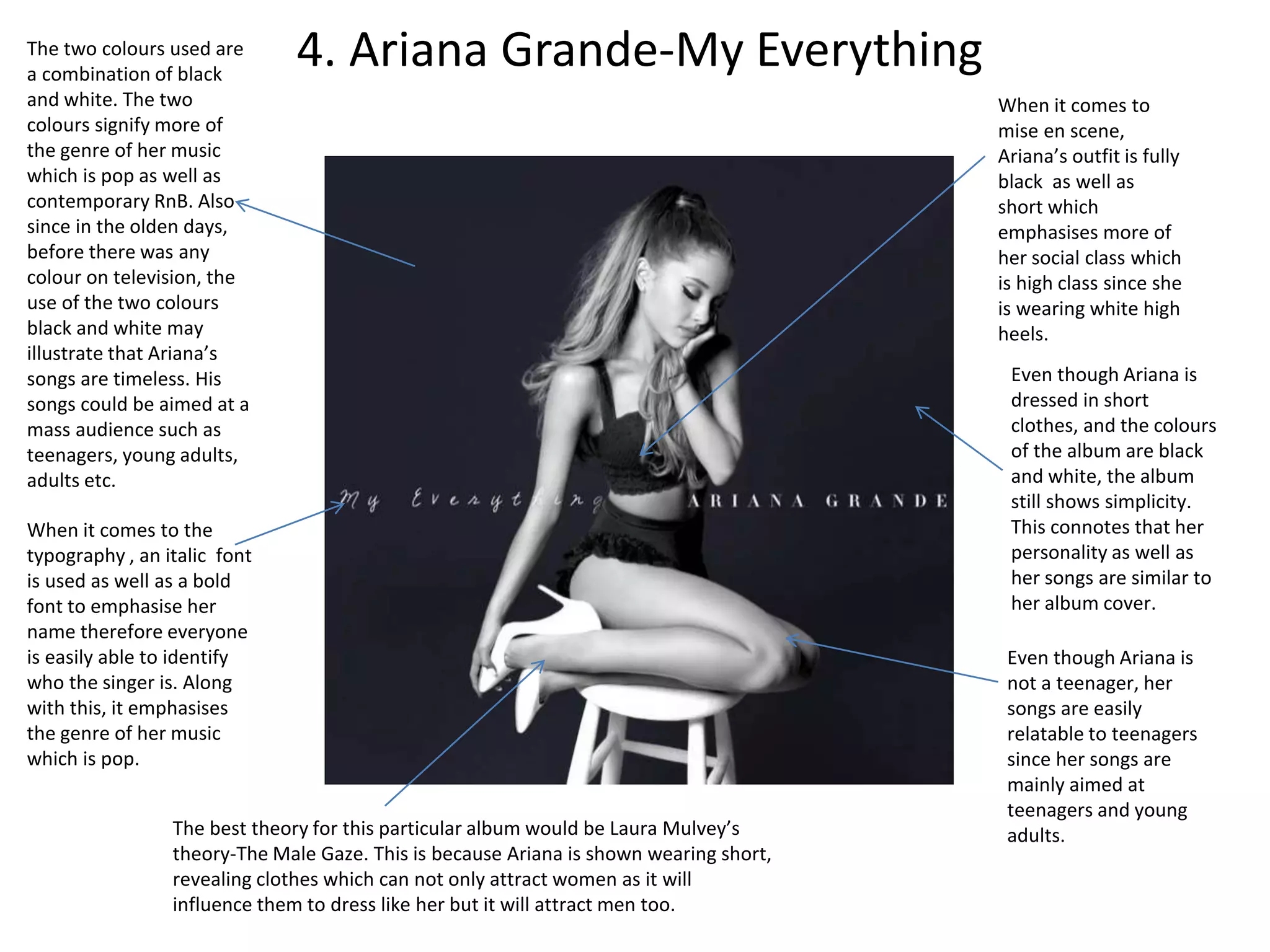
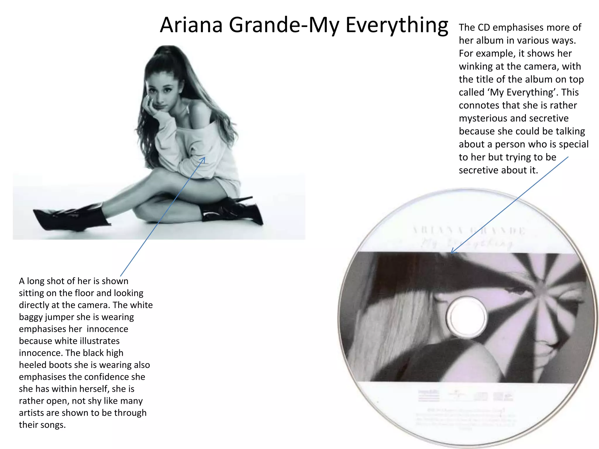
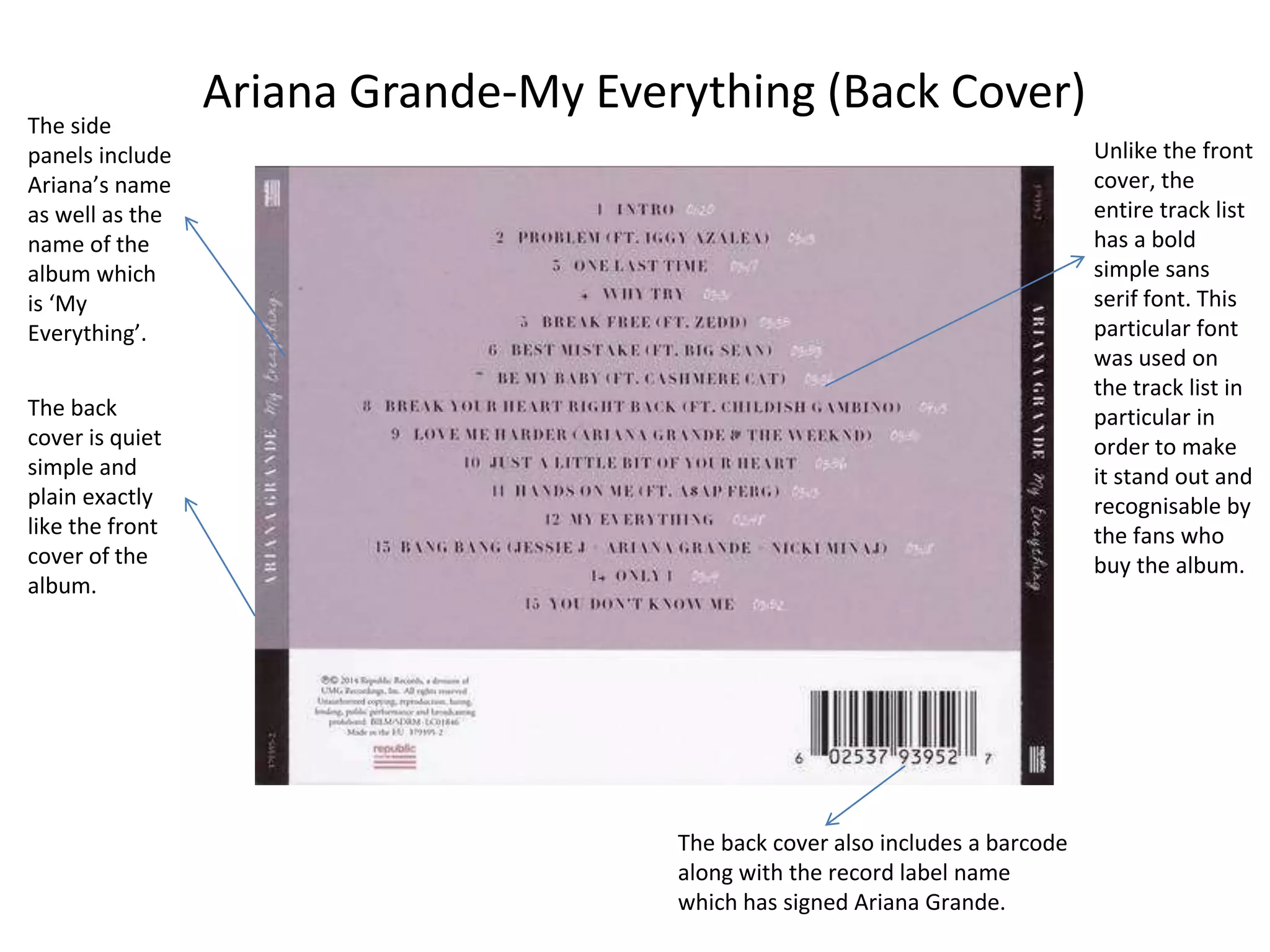
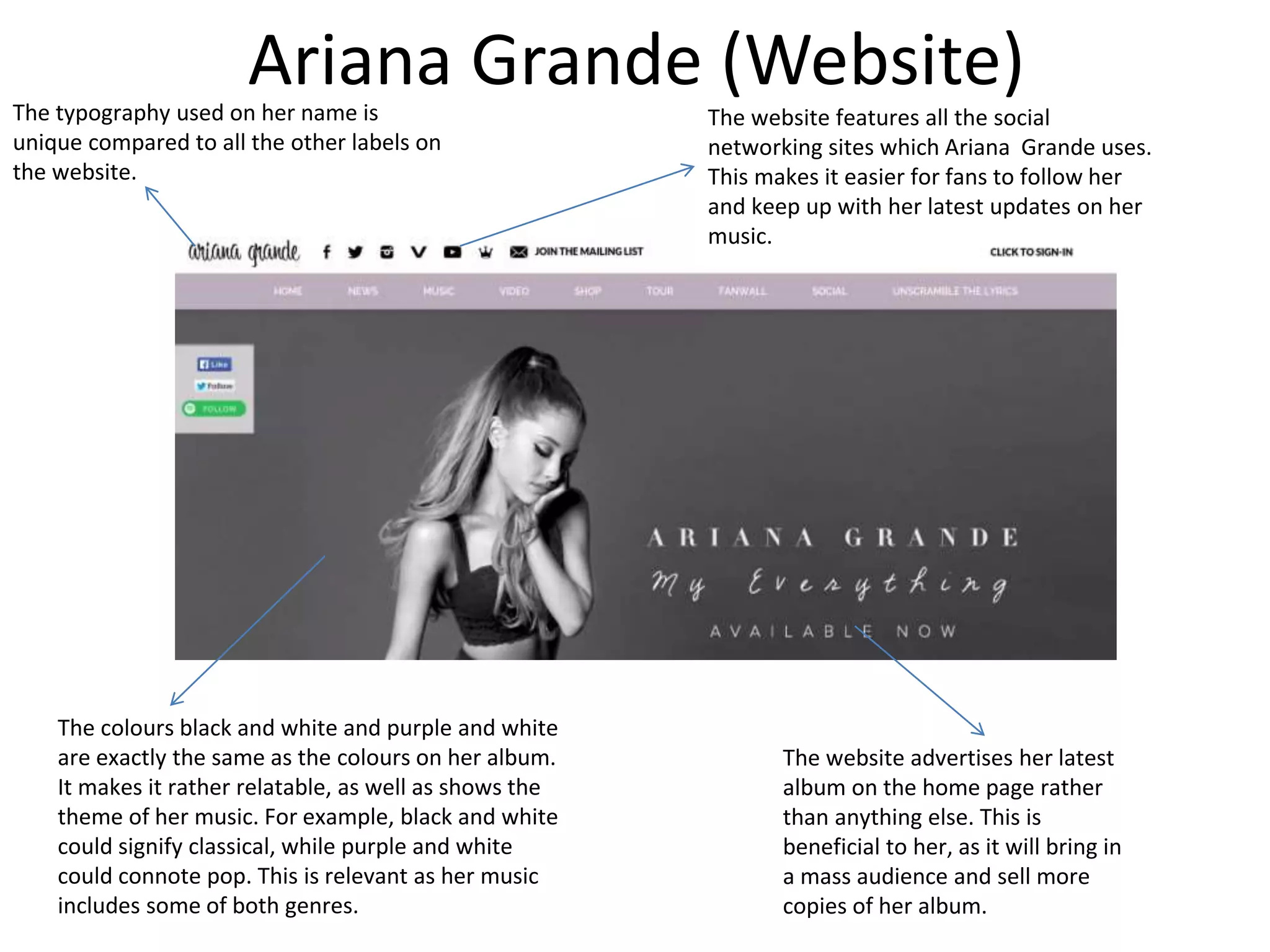
2. 1. Selena Gomez- For You
Since Selena is looking
down connotes that she is
rather shy, which also
shows that this album may
mean a lot to her too. It
signifies that her
personality is rather caring
and loving towards the
person/people she has
made this album for. For
example, it could be for
her fans as she wants them
to be able to relate to her
or it could be because she
is expressing her own
thoughts and feelings
towards a special person.
When it comes to her
hair, it is tied in a
messy bun. This
connotes that Selena
doesn’t really care
about how she looks
at this moment, she is
showing her simple
side, since she isn’t
dressed up in
glamorous clothes as
well. It illustrates the
simple side of her
since this album is
about experience in
life, something that
can be relatable to her
fans.
The colour scheme shown is
rather warm and vibrant. For
example, on the album
cover, there are three
colours used which are pink,
red and black. The three
colours connote the genre of
her music as well as the
songs which could be
featured on the album. The
genre is pop and the album
includes pop songs which are
both happy and sad.
Although Selena Gomez
is already famous, it is
necessary for her to
advertise her name
since the picture of her
shown may not always
give away who she is to
her fans as well as
others who listen to
music of the pop genre.
The typography is rather bold which
can easily be seen by everyone. The
font is also in two different colours
which may signify two parts of her
album, one happy, while the other
intense and romantic. The two words
‘For You’ signify who Selena is as an
individual. It shows that she is
expressing her feelings in all of the
songs of the album, she has written
the songs for someone special to her.
Because of Selena’s album, we are easily able to identify that the
target audience when it comes to Selena’s songs are teenage girls.
Her songs, the colour scheme of the album as well as her style
illustrates that her music is mainly relatable to teenage girls.
3. Selena Gomez-For You
The CD disk shows simplicity exactly
like the front cover. The CD colours
are also similar to the colours used
on the front cover. Pink and silver
connotes calm, simple, happiness
and vibrant. It is also not necessary
to include an image of Selena on the
CD since the front cover already
gives away whose album it is.
The image shows Selena’s confident side.
She is looking directly at the audience
which emphasises the title of her album
which is called ‘For You’. It also
emphasises more of her album because it
shows she isn’t too focused on herself, she
is more focussed on the person she has
formed this album for. The background
vibrant colours also connotes her
innocence.
The close up of Selena’s
face signifies more of her
facial expressions. For
example, it shows more of
what she might be feeling,
which could be anything
such as confidence, sadness
and much more etc. It really
depends on what the
audience see’s her as.
4. Selena Gomez-For You (Back Cover)The font
used on
the track
list is
completely
similar to
the font
used on
the front
cover of
the CD.
The back cover
shows a picture of
Selena where she
is looking directly
at the camera.
Not only does the
front cover give
away who the
album is by
because of her
name, but the
back cover shows
everyone how she
looks.
Both the
side panels
include
Selena’s
name
along with
the name
of the
album.
The back cover includes the barcode. The record
label which Selena is signed to has been shown.
This advertises the record label since many popular
artists are signed to Hollywood Records.
The back of the
album is rather
intense and
vibrant
because of the
colours used.
5. Selena Gomez (Website)
The artist’s name clearly written in
bold letters on the left side of the
website
The website promotes her
new single first out of
everything since it is her
latest new song.
The colours used are black and white,
something to relate to her album
since it includes intense songs
The lighting used is also
rather dull, again relating
to the intense them of
her album as well as her
songs.
6. 2. Drake-Take Care
Many artists include
their name on the
front cover of their
album. Since Drake is
a rather popular artist
around the world, it is
not necessary for him
to include his name
on the album since
everyone knows who
he is already.
When it comes to the
colour scheme, the
colours shown are black,
gold and bronze. The
combination of these
three colours signify a
classical period of time.
For example, the gold
candle stand as well as
the old painting some
how relates to his music.
He might be addressing
his target audience by
showing them that his
music has no time, his
music will never be old.
A medium close up of
Drake is shown sitting
down and looking into the
gold cup he is holding. His
facial expressions show
that he is thinking about
something, he could be
sad, his personality could
be caring thus resulting in
the title ‘Take Care’.
When it comes to
mise en scene, Drake
outfit his fully black,
with lots of heavy gold
chains. His outfit
signifies his social
class, which is high
class in this case.
When it comes to the typography, the two
words ‘Take Care’ stand out most of all on
the album cover. The font represents Drake
as an individual who is sweet and caring
who is a part of the Rnb/Rap world. Since
the font is also italic, it symbolises classic as
well as his social class which is higher class.
The album cover
shows a sense of
simplicity. For the fans
of Drake, this is easily
seen since Drake’s
simple but caring
personality is
emphasised through
his songs as well as his
pictures.Because of Drake’s album, we are easily able to identify that
his target audience is teenagers as well as young adults. This
is because, the colour scheme, the italic writing and drake’s
style signify that his music is for different ages. Many people
can relate to his songs and people from different life stages
listen to his specific genre of music.
7. Drake-Take Care
The CD shows simplicity exactly like
the front cover of the album. This is
because the CD does not include any
image, it is entirely one colour. His
name is shown on the CD which
shows that he still needs to advertise
his name to his fans even though it
wasn’t necessary to do so on the
album cover.
The image of Drake
shown smoking a
cigar inside the
Digipack signifies his
wealth. It also goes
against his album
title ‘Take Care’ since
he isn’t taking care
of himself at all by
smoking a Cigar.
Drake is also looking
away from the camera
which shows his
personality, he focused
more on himself
compared to anything
else around him.
The close up of Drake
shows the target audience
more of who he is as a
person. The close up brings
the audience closer to
Drake. Also, since the
setting around him shows
that the picture could have
been taken at his house, it
forms a closer relationship
between Drake and his fans.
8. Drake-Take Care (Back Cover)The back
cover of the
album is
rather plain
and simple
which is
similar to the
CD.
The back of the
album includes
the track list
along with the
producers’
names,
executive
producers’
names as well as
the music
companies.
The font of the
track list is
simple sans
serif, this
makes the
track list easier
to identify, also
the colour used
is similar to the
colour used on
the two words
‘Take Care’.
The album
title is shown
in the side
panels, along
with Drake’s
name.
The back cover also features the barcode as well
as the production company name.
9. Drake (Website)
The website features
Drake’s signature in order
to show fans what his
signature looks like.
The website itself is rather plan and
simple. This is similar to his album cover
as well as the CD. He’s one of the artists
who puts more into his music compared
to the advertisement of his music.
The website
includes the
name of his
latest album
at the centre;
in order to
attract a mass
audience
The website features all the
different information which will
be beneficial to fans of Drake.
For e.g. Tour Dates, Videos and
Music. It keeps them up to date
on everything about Drake.
10. 3. Taylor Swift-Speak Now
The colour schemes
used on the album
cover are purple, white
and gold. All three of
these colours show a
combination of magic
and fantasy. This is also
emphasised through
the sparkly dust used
around the album
cover which shows that
the album songs will be
rather magical. She’s
sending a message to
her audience that it
will almost be like as if
her fans will be going
into a new world by
listening to her songs
The typography used in
this particular case is
italic which emphasises
more of her ‘magical’
album. The font
represents more of who
she is as well, for e.g.
mysterious, confident,
happy etc.
When it comes to
mise en scene,
Taylor’s dress shown
is a purple long dress.
Again, the dress also
emphasises more of
her album because it
shows her album is a
‘fairy tale’, something
‘magical’, its like going
into another world.
The mid shot of Taylor
Swift in the purple dress
looking away. Her facial
expression shows how
much confidence she
has. This also
emphasises the title of
her album ‘Speak Now’
as her facial expression
shows that she isn’t
afraid of anything.
For the people who are big
fans of Taylor Swift will
know what is expected from
Taylor Swift when it comes
to her albums. For e.g. she
is more likely to add
mystery, adventure and
magic to her albums; thus
resulting in the magical dust
on her dress.
Because of Taylor’s album, we are easily able to identify that her
target audience is most likely to be teenage girls. This is because the
colour scheme, her own style, the typography all signifies more of
who she is. This makes it easier for the audience to be able to relate
to her.
11. Taylor Swift-Speak Now
The CD emphasises more of
the album. For example, since
the title of the song is ‘Speak
Now’ and there are eight
hands formed altogether, it
shows that Taylor is uniting
with her fans. She is showing
them that they are not alone,
that she will be there for them
with her music.
The image of Taylor
looking away shows
how confident she is.
She is focused more on
things around her
rather than herself. It
also relates to the
confidence illustrated
through the title of her
album ‘Speak Now’.
The background shows
an art piece. It
emphasises that her
music is a piece of art, it
is another world,
something which she
can personally relate to.
The grey, red, and
gold colours used
also show that her
music could be
relatable to
different ages. For
e.g. even though it
is targeted at
teenagers,
different aged
people could
possibly relate to it
since the lyrics as
well as the songs
can be relatable to
anyone.
12. Taylor Swift-Speak Now (Back Cover)
The back cover
is quiet similar
to the front
cover. For
example, the
font is quiet
similar since it
is italic at the
front as well as
on the back on
the track list.
Similar to the front
cover, Taylor’s
picture is similar. For
example, she is
wearing a sparkly
strapless dress and
looking away from
the camera.
Both the side
panels include
Taylor’s name
as well as the
name of the
album.
The various
types of colours
as well as the
frame used
shows the
theme of the
album which
could be a
‘magic/fairy
tale’ theme.
The back cover
also includes the
bar code along
with the record
label name which
Taylor is apart of
‘Big Machine
Records.
The production company name is also featured in
order to inform everyone who will be distributing
the album.
13. Taylor Swift (Website)
The website features
Taylor’s name in bold
as this website is all
about her, flashing
her name in a bright
colour makes it stand
out.
Her latest single is advertised on
the website first as it has
recently been released and
therefore needs to be promoted.
The colour use of black and white is rather
important in this case because her latest
single is set in the olden days. This is also
one of the reasons why she is dressed like
an actress in the 70s/80s, with heavy
jewellery and perfect curls in her hair.
The typography used is rather bold as well, same as the one
used on her name. This makes it easier for fans who use the
website to search for things they need. For example, music,
tour and event dates etc.
14. 4. J Cole- Cole World: The Sideline Story
The two main background
colours shown are black and
gold. The combination of
these two colours bring
makes J Cole stand out
more which is the whole
point since it is his album.
The two colours also signify
more of who his genre of
music as well as his album is
aimed at. For example,
since the album shows J
Cole sitting in a changing
room around school
lockers, it shows that it
could be aimed at
teenagers.
The typography shown is
rather bold especially his
name ‘JCOLE’. Even though
the title of the album is
shown in the corner of the
album cover, fans of J Cole
are easily able to identify
that it is his album. The
font represents more of
who J Cole is as a person
for e.g. tough and strong.
When it comes to mise en
scene, his clothing gives away
more of his personality. For
example, he is dressed rather
casually, in a baseball jacket
which connotes that he is
quite young, it also signifies
more of his social class which
could be middle class. Also,
the picture is taken at a school
which shows that his target
audience is mainly teenagers
as well as young adults, as his
songs could be relatable
mostly to that particular age
range.
A long shot shown of J Cole
looking directly at the
camera. His facial
expressions connote more
of her album title For
example, because he is
looking directly at the
camera and since the title
of his album is ‘J Cole-Cole
World: The Sideline Story’,
he is telling his fans that
this album is about him, it
his story, it is his experience
and all the songs could
possibly be relatable to his
fans.
15. J Cole:The Sideline Story
The CD shows an illustration of a
basketball court. Since the title of
the album is ‘J Cole: Cole World-
The Sideline Story’, it creates a
message that basketball could be
his favourite sport or that it
personally relates to his own
story. It also shows that his fans
will be forming a personal
relationship with him since they
will be finding out more about his
own story and personal life.
The close up of J Cole shows the audience
more of his personality and who he is as
a person. It shows his facial expression,
since he is looking down; it expresses that
he could be sad, mysterious, lonely etc.
16. J Cole: Cole World: The Sideline Story The colours used
on the back
cover are quiet
similar to the
colours used on
the front cover.
For example,
there is a gold
spot light shining
on J Cole to
make him stand
out on the back
cover.
The font is also
similar to the font
used on the front
cover. Also, the
name of the songs
are in the colour
white in order to
make them stand
out. However, the
artists who have
been featured on
the songs are
written in red, as
well as a smaller
font.
The side panels
also include the
name of the artist
which in this case
is ‘J Cole’ along
with the name of
his album.
The picture of
him shown
looking away
from the
camera makes
him look
mysterious as
well as ‘in his
own world’.
The back cover includes the barcode as well as
the record label name which J Cole is signed to
as well as the production name which is
distributing the album.
Not only does the
gold spot light
make J Cole stand
out but the simple
black background
does too. This
connotes his
personal style.
17. J Cole (Website)
The typography used on his name stands out the most
since it is in white as well as big letters. Also, since the
background colour is quiet dark, it makes it much
easier for his name to be identifiable.
Picture of him shown makes it
easier for people to recognize
who he is. Also, relates to his
music too. The picture of him
looking away from the camera
makes it look as if ‘he’s in his
own world’. Also, since he is
sitting on a roof, it could connote
that his music is about his life.
Different labels used for
everything fans need to
search for. It makes it easier
for them to find things they
need. For example, photos,
tour dates, new songs.
The dark lighting used on the
website relates a lot to his
album. It could signify that his
music is rather intense, dark and
mysterious.
18. 4. Ariana Grande-My EverythingThe two colours used are
a combination of black
and white. The two
colours signify more of
the genre of her music
which is pop as well as
contemporary RnB. Also
since in the olden days,
before there was any
colour on television, the
use of the two colours
black and white may
illustrate that Ariana’s
songs are timeless. His
songs could be aimed at a
mass audience such as
teenagers, young adults,
adults etc.
When it comes to the
typography , an italic font
is used as well as a bold
font to emphasise her
name therefore everyone
is easily able to identify
who the singer is. Along
with this, it emphasises
the genre of her music
which is pop.
When it comes to
mise en scene,
Ariana’s outfit is fully
black as well as
short which
emphasises more of
her social class which
is high class since she
is wearing white high
heels.
Even though Ariana is
dressed in short
clothes, and the colours
of the album are black
and white, the album
still shows simplicity.
This connotes that her
personality as well as
her songs are similar to
her album cover.
Even though Ariana is
not a teenager, her
songs are easily
relatable to teenagers
since her songs are
mainly aimed at
teenagers and young
adults.The best theory for this particular album would be Laura Mulvey’s
theory-The Male Gaze. This is because Ariana is shown wearing short,
revealing clothes which can not only attract women as it will
influence them to dress like her but it will attract men too.
19. Ariana Grande-My Everything The CD emphasises more of
her album in various ways.
For example, it shows her
winking at the camera, with
the title of the album on top
called ‘My Everything’. This
connotes that she is rather
mysterious and secretive
because she could be talking
about a person who is special
to her but trying to be
secretive about it.
A long shot of her is shown
sitting on the floor and looking
directly at the camera. The white
baggy jumper she is wearing
emphasises her innocence
because white illustrates
innocence. The black high
heeled boots she is wearing also
emphasises the confidence she
she has within herself, she is
rather open, not shy like many
artists are shown to be through
their songs.
20. Ariana Grande-My Everything (Back Cover)
The side
panels include
Ariana’s name
as well as the
name of the
album which
is ‘My
Everything’.
The back
cover is quiet
simple and
plain exactly
like the front
cover of the
album.
Unlike the front
cover, the
entire track list
has a bold
simple sans
serif font. This
particular font
was used on
the track list in
particular in
order to make
it stand out and
recognisable by
the fans who
buy the album.
The back cover also includes a barcode
along with the record label name
which has signed Ariana Grande.
21. Ariana Grande (Website)The typography used on her name is
unique compared to all the other labels on
the website.
The website advertises her latest
album on the home page rather
than anything else. This is
beneficial to her, as it will bring in
a mass audience and sell more
copies of her album.
The colours black and white and purple and white
are exactly the same as the colours on her album.
It makes it rather relatable, as well as shows the
theme of her music. For example, black and white
could signify classical, while purple and white
could connote pop. This is relevant as her music
includes some of both genres.
The website features all the social
networking sites which Ariana Grande uses.
This makes it easier for fans to follow her
and keep up with her latest updates on her
music.