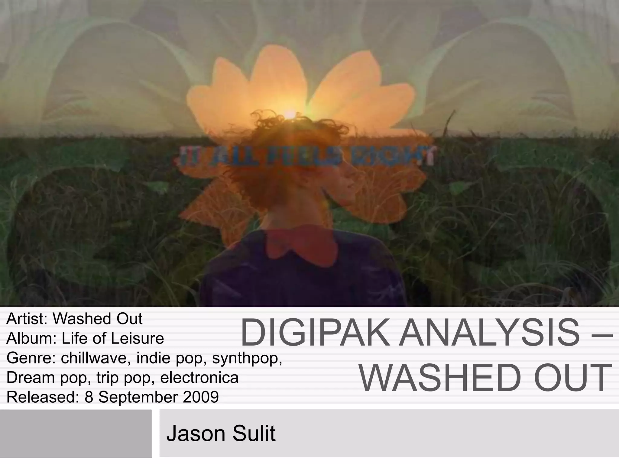
DIGIPAK ANALYSIS –
WASHED OUT
Jason Sulit
Artist: Washed Out
Album: Life of Leisure
Genre: chillwave, indie pop, synthpop,
Dream pop, trip pop, electronica
Released: 8 September 2009
The typography used for the front
cover’s text; the album title and the
artist’s name is simple and in white
which stands out from the image. The
artist’s name is in bold and has a
larger font size compared to the
album’s title. From analysing digipak’s
I have also noticed that the artist’s
name is always above the album title,
it also in larger bolder font which
could be draw the audiences attention
to the album.
This digipak
design is very
simple, on the
front cover the
image that is
present is a
picture of a
woman in the sea,
this woman has no
relation with the
artist. This is very
typical for
chillwave artists to
not feature
themselves on
media content like
digipak’s and
magazine advert
but instead use a
representative of
the band or an
artwork
The back cover
contains the track
list, the record
label logo, copy
right, description
and barcode. The
text continues the
same typography
in white colour to
stand out with the
image
The image used for the front
cover references the album title
and also the name of the artist.
For instance the picture shows
a woman swimming in a beach
which could denote her being in
a holiday or spending her
leisure time swimming in the
shore. This image also
reference the artist’s name
“Washed Out”, the image of
woman swimming symbolises
Chillwave artists
tend to use dreamy
colours such as the
filter used for this
album cover. The
reason this is a
common convention
is due to the fact
that chillwave music
is quite dreamy and
relaxed. The pink
filter used for this
image sets the tone
and also creates a
washed out effect
connoting the
The album front
cover also shows a
quote from Rolling
Stones and also
Pitchfork, the quote
is used to persuade
the audience and
also describes the
type of music on
the album to see if
it is the type of
songs the reader
The picture
below is the
image used
for the CD,
this is not the
actual CD as it
was not
available for
download.
However I will
analyse the
imagery used
The image used on the CD does not
feature the artist instead two women
which could refer to the target market of
the artist. Using these to people could
also make the image more relatable to
the audience. The two young women are
swimming in the shore enjoying there
leisure time which many of the younger
audience could relate. The fact that
chillwave is played in the beach
demonstrates the artist has taken
consideration what the audience likes in
a chillwave design.
The CD image is the same as
the back cover image. The
back cover is a cropped
version of the CD image, it
shows the back shot of the
woman which illustrates the
back of the album. This is
very simple but effective . The
artists seems to have used
literal elements to describe
the artist’s album
representing the artist to be a
The artist
continues
the pink
filter
theme
througho
ut the
digipak to
create the
dreamy
summerti
me theme
Overview
Ernest Greene also known by his stage name Washed Out is an American singer-songwriter and record producer.
Washed Out is known for producing music within the chillwave and electronica genre. He music can also be considered
part of the dream pop, synthpop, trip pop, and indie pop genre. I have been analysing his digipak design for his album ‘Life
of Leisure’ released in 2009, and was rated by Pitchfork Media a 8/10.
Representation
As I have noted before, chillwave artist do not typically feature themselves in media content. As you are unable to view the
artist you get a feel of what type of music the artist plays and also a brief idea of the artist’s personality. For example the
scenery is a beach, the chillwave genre is well know for being beach music, music is also part of a person’s leisure time.
We also get the idea that the artist is straight forward; he uses literal elements to describe the relation between the digipak
design and the album title and artist name.
Audience
From the digipak design we get the idea that the audience could be mainly female due to the fact the artist uses a woman
to represent his album, from the image used we also get the idea that the demographic would be late teens to young
adults. Typically I would say that the audience people who enjoy summer and like spend time in beaches due to the burnt
skin and tan lines of the women. The artist may also be attempting to attract the male audience by creating a way of
voyeurism i.e. women in a bikini “chilling” in the beach.
Front Cover
The front cover is a picture of a woman swimming in the shore, the image is filtered in a pink colour to complement the
time of day which may be dawn, it also reflects the summer time aura which is typical with most chillwave imagery. The
used of the white font stands out from the background and contributes to the washed out element of the digipak which
reflects the artist’s name.
Back Cover
The back cover is an image of the back of the woman, this digipak demonstrates many literal elements for instance the
picture has strong relations to the name of the album also the filtered washed effect used for the back and front cover also
relates to the name of the artist. The back cover is quite limited in content and the track list of the songs is limited
suggesting it is there debut album.
CD Design
As this is only the image used for the CD there is very limited things to analyse, however from the image there is a clear
relation to the back cover and the CD image, the back cover is essentially a cropped version of the image used for this CD
design. The CD maintains the washed out pink filter element of the digipak and has clear relation to the genre of chillwave.
Conclusion
Conducting this analysis made me aware of the type of image used for chillwave digipaks it also help me acknowledge a
different chillwave digipak design. From the other chillwave digipak that I have analyzed there are similarities with this

Digipak analysis – Washed Out

  • 1.
    DIGIPAK ANALYSIS – WASHEDOUT Jason Sulit Artist: Washed Out Album: Life of Leisure Genre: chillwave, indie pop, synthpop, Dream pop, trip pop, electronica Released: 8 September 2009
  • 2.
    The typography usedfor the front cover’s text; the album title and the artist’s name is simple and in white which stands out from the image. The artist’s name is in bold and has a larger font size compared to the album’s title. From analysing digipak’s I have also noticed that the artist’s name is always above the album title, it also in larger bolder font which could be draw the audiences attention to the album. This digipak design is very simple, on the front cover the image that is present is a picture of a woman in the sea, this woman has no relation with the artist. This is very typical for chillwave artists to not feature themselves on media content like digipak’s and magazine advert but instead use a representative of the band or an artwork The back cover contains the track list, the record label logo, copy right, description and barcode. The text continues the same typography in white colour to stand out with the image The image used for the front cover references the album title and also the name of the artist. For instance the picture shows a woman swimming in a beach which could denote her being in a holiday or spending her leisure time swimming in the shore. This image also reference the artist’s name “Washed Out”, the image of woman swimming symbolises Chillwave artists tend to use dreamy colours such as the filter used for this album cover. The reason this is a common convention is due to the fact that chillwave music is quite dreamy and relaxed. The pink filter used for this image sets the tone and also creates a washed out effect connoting the The album front cover also shows a quote from Rolling Stones and also Pitchfork, the quote is used to persuade the audience and also describes the type of music on the album to see if it is the type of songs the reader The picture below is the image used for the CD, this is not the actual CD as it was not available for download. However I will analyse the imagery used The image used on the CD does not feature the artist instead two women which could refer to the target market of the artist. Using these to people could also make the image more relatable to the audience. The two young women are swimming in the shore enjoying there leisure time which many of the younger audience could relate. The fact that chillwave is played in the beach demonstrates the artist has taken consideration what the audience likes in a chillwave design. The CD image is the same as the back cover image. The back cover is a cropped version of the CD image, it shows the back shot of the woman which illustrates the back of the album. This is very simple but effective . The artists seems to have used literal elements to describe the artist’s album representing the artist to be a The artist continues the pink filter theme througho ut the digipak to create the dreamy summerti me theme
  • 3.
    Overview Ernest Greene alsoknown by his stage name Washed Out is an American singer-songwriter and record producer. Washed Out is known for producing music within the chillwave and electronica genre. He music can also be considered part of the dream pop, synthpop, trip pop, and indie pop genre. I have been analysing his digipak design for his album ‘Life of Leisure’ released in 2009, and was rated by Pitchfork Media a 8/10. Representation As I have noted before, chillwave artist do not typically feature themselves in media content. As you are unable to view the artist you get a feel of what type of music the artist plays and also a brief idea of the artist’s personality. For example the scenery is a beach, the chillwave genre is well know for being beach music, music is also part of a person’s leisure time. We also get the idea that the artist is straight forward; he uses literal elements to describe the relation between the digipak design and the album title and artist name. Audience From the digipak design we get the idea that the audience could be mainly female due to the fact the artist uses a woman to represent his album, from the image used we also get the idea that the demographic would be late teens to young adults. Typically I would say that the audience people who enjoy summer and like spend time in beaches due to the burnt skin and tan lines of the women. The artist may also be attempting to attract the male audience by creating a way of voyeurism i.e. women in a bikini “chilling” in the beach. Front Cover The front cover is a picture of a woman swimming in the shore, the image is filtered in a pink colour to complement the time of day which may be dawn, it also reflects the summer time aura which is typical with most chillwave imagery. The used of the white font stands out from the background and contributes to the washed out element of the digipak which reflects the artist’s name. Back Cover The back cover is an image of the back of the woman, this digipak demonstrates many literal elements for instance the picture has strong relations to the name of the album also the filtered washed effect used for the back and front cover also relates to the name of the artist. The back cover is quite limited in content and the track list of the songs is limited suggesting it is there debut album. CD Design As this is only the image used for the CD there is very limited things to analyse, however from the image there is a clear relation to the back cover and the CD image, the back cover is essentially a cropped version of the image used for this CD design. The CD maintains the washed out pink filter element of the digipak and has clear relation to the genre of chillwave. Conclusion Conducting this analysis made me aware of the type of image used for chillwave digipaks it also help me acknowledge a different chillwave digipak design. From the other chillwave digipak that I have analyzed there are similarities with this