Digipaks 
Michael Linfoot
The cover of the album/ Digipak shows very similar visuals 
to that seen in their music videos. A dark, gritty look. The 
lead singer Dan in running [1], this is a continuation of what 
is happening in the music video as well. The themes of the 
songs and the themes presented on the album are the 
same. This makes it easily recognisable on the shelf, but 
also in digital stores such as iTunes and Amazon Music 
where the majority of albums are purchased. 
The font used on the album is the font [2] of the band which 
is used over all their material which again adds to the 
recognisably and brand identity of the band. The logo used 
by the band, △, [3] is included within the font and used as 
the A. The way the picture have been shot gives it a very 
cinematic feel with the vignette created by the headlines 
makes it feel like the the night is closing in on him and he is 
trying to escape (the running). Along with the name of the 
album “B△D BLOOD” and the name of the band 
“B△STILLE”. There is also credits of the album on the front, 
[4] this is unusual as they are normally on the back or on the 
inside of the album. There is also the record labels logo and 
the bands logo. [5] [6]. 
The back is a similar story with the same font and vignette, 
giving the feeling of closing in darkness. The picture is 
looking behind the perspective of the shot on the front of the 
album to the car that is providing the light. There is a list of 
track names with times, a barcode, label logo, bands 
website and copyright information. 
The lighting in the photo is very warm so it’s very yellow. 
This is reminiscent of old car headlights. The rest of the 
picture is dark. On top of this is white test. This is so you can 
read in against the dark background. 
1 
2 
3 
4 
5 6
This is a very simple album cover. There are no words on it as such. Name of the album is made up of the 
waveforms [1] “AM” This is also kind of a left titled album as the band is called Arctic Monkeys. The colour 
scheme is even simpler. Black background with white graphics. This makes it easily recognisable but 
unfortunately it’s not as eye catching as other albums so could be overlooked on a shelf. This was probably not a 
problem for them as the vast majority of sales would of been online. Where other marketing tactics are used to 
sell an album. 
The back cover is quite simple again. It has the bands logo on, a track list, label logo, copyright information, 
barcode and websites. The graphics are a continuation of those from the front. Although the wave from has 
stopped, like you have reached the end of the album and the music has stopped. The colour scheme is the 
same, back and white. Even the barcode is in the right colours.
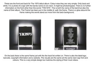
These are the front and back for The 1975 debut album. Colour wise they are very simple. Only back and 
white. It is a photo of a sign with the bands name on ion neon. It might be photoshopped. There is no further 
information on the front other than the words “THE1975”. This is both the name of the band but also the 
name of their album. The Frame has been put in the middle of, well, the frame. There is a glow abound the 
frame making the words stand out more from the back background. 
On the back there is the same frame just with the the track list written on. There is also the label logo, 
barcode, copyright information and a website. The visuals are the same wit the same neon sign font and 
colours. This is a very simple design but matches the styling of their must videos.
Conclusion: 
From this extremely fun task I’ve learn that the common design themes than run though the Digipacks™ are 
that the design on them are very simple but effective and the styling on them matches what is show in the 
adverts and matches the themes and visuals shown in the music videos. They feature very similar colour. 
The all use a consistent font thought-out except for the copyright info.

Task 14- Digipacks™

  • 1.
  • 2.
    The cover ofthe album/ Digipak shows very similar visuals to that seen in their music videos. A dark, gritty look. The lead singer Dan in running [1], this is a continuation of what is happening in the music video as well. The themes of the songs and the themes presented on the album are the same. This makes it easily recognisable on the shelf, but also in digital stores such as iTunes and Amazon Music where the majority of albums are purchased. The font used on the album is the font [2] of the band which is used over all their material which again adds to the recognisably and brand identity of the band. The logo used by the band, △, [3] is included within the font and used as the A. The way the picture have been shot gives it a very cinematic feel with the vignette created by the headlines makes it feel like the the night is closing in on him and he is trying to escape (the running). Along with the name of the album “B△D BLOOD” and the name of the band “B△STILLE”. There is also credits of the album on the front, [4] this is unusual as they are normally on the back or on the inside of the album. There is also the record labels logo and the bands logo. [5] [6]. The back is a similar story with the same font and vignette, giving the feeling of closing in darkness. The picture is looking behind the perspective of the shot on the front of the album to the car that is providing the light. There is a list of track names with times, a barcode, label logo, bands website and copyright information. The lighting in the photo is very warm so it’s very yellow. This is reminiscent of old car headlights. The rest of the picture is dark. On top of this is white test. This is so you can read in against the dark background. 1 2 3 4 5 6
  • 3.
    This is avery simple album cover. There are no words on it as such. Name of the album is made up of the waveforms [1] “AM” This is also kind of a left titled album as the band is called Arctic Monkeys. The colour scheme is even simpler. Black background with white graphics. This makes it easily recognisable but unfortunately it’s not as eye catching as other albums so could be overlooked on a shelf. This was probably not a problem for them as the vast majority of sales would of been online. Where other marketing tactics are used to sell an album. The back cover is quite simple again. It has the bands logo on, a track list, label logo, copyright information, barcode and websites. The graphics are a continuation of those from the front. Although the wave from has stopped, like you have reached the end of the album and the music has stopped. The colour scheme is the same, back and white. Even the barcode is in the right colours.
  • 4.
    These are thefront and back for The 1975 debut album. Colour wise they are very simple. Only back and white. It is a photo of a sign with the bands name on ion neon. It might be photoshopped. There is no further information on the front other than the words “THE1975”. This is both the name of the band but also the name of their album. The Frame has been put in the middle of, well, the frame. There is a glow abound the frame making the words stand out more from the back background. On the back there is the same frame just with the the track list written on. There is also the label logo, barcode, copyright information and a website. The visuals are the same wit the same neon sign font and colours. This is a very simple design but matches the styling of their must videos.
  • 5.
    Conclusion: From thisextremely fun task I’ve learn that the common design themes than run though the Digipacks™ are that the design on them are very simple but effective and the styling on them matches what is show in the adverts and matches the themes and visuals shown in the music videos. They feature very similar colour. The all use a consistent font thought-out except for the copyright info.