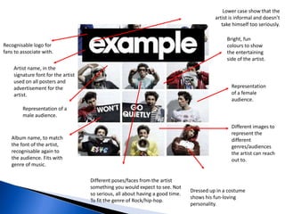
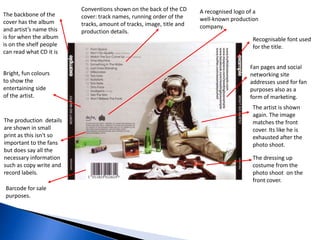
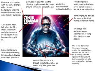
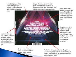
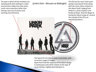
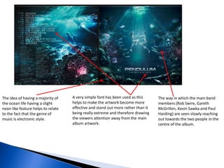
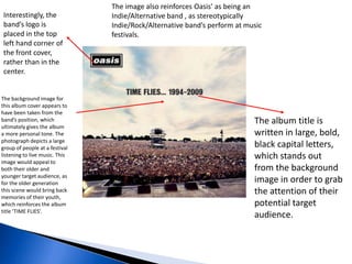
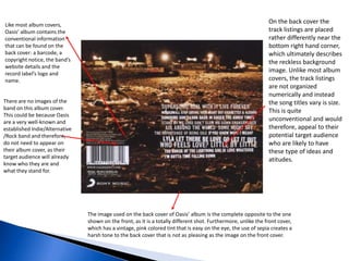
Call Girls Chirag Delhi Delhi WhatsApp Number 9711199171
Â
Cd Covers Analysis
1.
2. Artist name, in the
signature font for the artist
used on all posters and
advertisement for the
artist.
Recognisable logo for
fans to associate with.
Album name, to match
the font of the artist,
recognisable again to
the audience. Fits with
genre of music.
Different images to
represent the
different
genres/audiences
the artist can reach
out to.
Representation
of a female
audience.
Representation of a
male audience.
Bright, fun
colours to show
the entertaining
side of the artist.
Different poses/faces from the artist
something you would expect to see. Not
so serious, all about having a good time.
To fit the genre of Rock/hip-hop.
Lower case show that the
artist is informal and doesnât
take himself too seriously.
Dressed up in a costume
shows his fun-loving
personality.
3. The backbone of the
cover has the album
and artistâs name this
is for when the album
is on the shelf people
can read what CD it is
Bright, fun colours
to show the
entertaining side
of the artist.
Fan pages and social
networking site
addresses used for fan
purposes also as a
form of marketing.
Recognisable font used
for the title.
The dressing up
costume from the
photo shoot on the
front cover.
The artist is shown
again. The image
matches the front
cover. Its like he is
exhausted after the
photo shoot.
The production details
are shown in small
print as this isn't so
important to the fans
but does say all the
necessary information
such as copy write and
record labels.
Conventions shown on the back of the CD
cover: track names, running order of the
tracks, amount of tracks, image, title and
production details.
A recognised logo of a
well-known production
company.
Barcode for sale
purposes.
4. Far background dark to
focus on artist, their
name and album name
Bright light around
Tinie Tempah making
him stand out. Gives a
unrealistic approach.
Use of CGI (Computer
Generated Imagery)
to give the special effects
of the cover like the city
he is âholdingâ and the
space style background.
Both unrealistic but sells
as it is very effect and eye
catching
His name is in capitals
with the same triangle
effect as the
background showing
conventions and sharp
edge like city buildings
Motionless
expression for
serious RnB effect.
Dark glasses could be used to
highlight brightness of the things
around him and is a sign of a star
âDisc-overyâ helps
link what the CD is
inside the album
and also the name
of his album; It has
been well thought
of.
Eye to Eye with
Audience as we
assume he is looking
directly at us under
glasses
We can feel part of it as
though he is holding all of us
in this âcityâ like generated
image.
Tinie being main
feature and sells album
cover better because
we are attracted to him
5. Song titles are all in
capitals and again
have the same
approach of sharp
triangular points as
the front cover, which
could indicate a
building type
structure.
Same background effect
and matching colour
scheme just without Tinie
who is replaced by song
titles
Backbone is simple
with just the name of
artist and album.
Same colour scheme
as throughout but
âDisc-overyâ here is in
pink.
Same bright effect
around the important
parts of the CD with
the same Graphical
unrealistic pink glow
effect and space like
feel.
Small print to indicate
institutions other details
related to the product.
The back is simple but effective. No pictures
just a running colour theme as all we need to
know is the song titles. All main selling points
are on the front cover
We get the same conventions of
genre shown here through use of
darker colouring, bold sharp fonts and
the use of unrealistic special effects.
6. (Linkin Park - Minutes to Midnight)
The CD has the main Linkin park
symbol covering the front along
with the same colour scheme as
the album itself, ranging from
white to a series of greyâs and
finally to blacks. Also the desgn of
having the album songs all around
the outside of the CD is an
interesting feature.
The layout for the album cover is very basic, with
no serious usage of images .
Apart from that the majority of the album design
is mainly grey scale which relates to the type of
music having a slightly dark feeling to it.
The way in which all the members are
standing with dark clothing in a dark
environment makes the cover seem
much more masculine rather than
having a vast use of colours and
seeming more feminine.
7. The idea of having a majority of
the ocean life having a slight
neon like feature helps to relate
to the fact that the genre of
music is electronic style.
A very simple font has been used as this
helps to make the artwork become more
effective and stand out more rather than it
being really extreme and therefore drawing
the viewers attention away from the main
album artwork.
The way in which the main band
members (Rob Swire, Gareth
McGrillen, Kevin Sawka and Paul
Harding) are seen slowly reaching
out towards the two people in the
centre of the album.
8. Interestingly, the
bandâs logo is
placed in the top
left hand corner of
the front cover,
rather than in the
center.
The album title is
written in large, bold,
black capital letters,
which stands out
from the background
image in order to grab
the attention of their
potential target
audience.
The background image for
this album cover appears to
have been taken from the
bandâs position, which
ultimately gives the album
a more personal tone. The
photograph depicts a large
group of people at a festival
listening to live music. This
image would appeal to
both their older and
younger target audience, as
for the older generation
this scene would bring back
memories of their youth,
which reinforces the album
title âTIME FLIESâ.
The image also reinforces Oasisâ as being an
Indie/Alternative band , as stereotypically
Indie/Rock/Alternative bandâs perform at music
festivals.
9. On the back cover the
track listings are placed
rather differently near the
bottom right hand corner,
which ultimately describes
the reckless background
image. Unlike most album
covers, the track listings
are not organized
numerically and instead
the song titles vary is size.
This is quite
unconventional and would
therefore, appeal to their
potential target audience
who are likely to have
these type of ideas and
atitudes.
Like most album covers,
Oasisâ album contains the
conventional information
that can be found on the
back cover: a barcode, a
copyright notice, the bandâs
website details and the
record labelâs logo and
name.
There are no images of the
band on this album cover.
This could be because Oasis
are a very well-known and
established Indie/Alternative
/Rock band and therefore,
do not need to appear on
their album cover, as their
target audience will already
know who they are and
what they stand for.
The image used on the back cover of Oasisâ album is the complete opposite to the one
shown on the front, as it is a totally different shot. Furthermore, unlike the front cover,
which has a vintage, pink colored tint that is easy on the eye, the use of sepia creates a
harsh tone to the back cover that is not as pleasing as the image on the front cover.