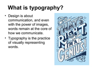
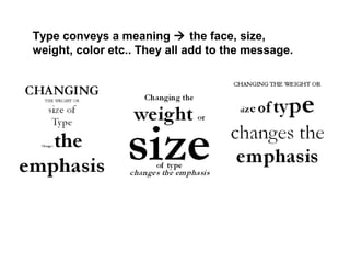
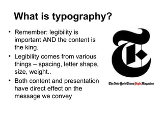
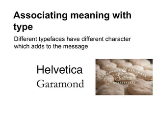
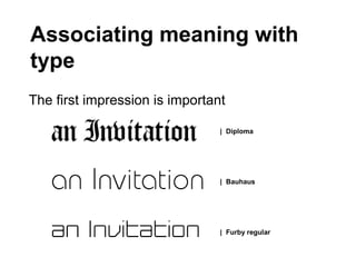
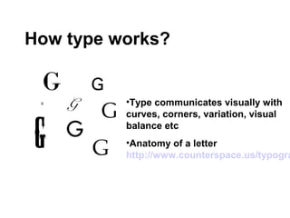
The Design Universal Principles
Typography
What is typography?
• Design is about
  communication, and even
  with the power of images,
  words remain at the core of
  how we communicate.
• Typography is the practice
  of visually representing
  words.
Type conveys a meaning  the face, size,
weight, color etc.. They all add to the message.
What is typography?
• Remember: legibility is
  important AND the content is
  the king.
• Legibility comes from various
  things – spacing, letter shape,
  size, weight..
• Both content and presentation
  have direct effect on the
  message we convey
Associating meaning with
type
Different typefaces have different character
which adds to the message
Associating meaning with
type
The first impression is important

                                | Diploma


                                | Bauhaus


                                | Furby regular
How type works?


          •Type communicates visually with
          curves, corners, variation, visual
          balance etc
          •Anatomy of a letter
          http://www.counterspace.us/typogra
How type works?
• Typefaces come in variety of styles;
  Old-style, Transitional, Modern,
  Egyptian/slab-serif, Sans-serif
• Sans-serifs can be further classified realist,
  geometric & humanist faces
Serif & sans-serif?

• This is text written with a serif
  typeface
• This is text written with a
  serif typeface
Serif & sans-serif?
• serif : A stroke added usually to the
  beginning or the end of a letter
• sans: ”without”
A small glossary of
typographic terms

                 Letterspacing
                   unnevenly spaced letters
           can disrupt our ability to
           distiguish words
A small glossary of
typographic terms

                                      Line-height (leading)
                                         can have great impact on
                                legibility of text passages.


Sami Niemelä | sn@neocite.com
A small glossary of
  typographic terms
           Line length
         The main issue for the reader is the disruption
of having to go from the end of one line to the
beginning of the next. When lines are too long this can
be quite difficult because of the sheer distance the eye
has to travel. On the other hand,
if lines are set
extremely short,
the reader will
have to switch
lines much more often.
  Sami Niemelä | sn@neocite.com
A small glossary of
  typographic terms
           X-height
           Has a great impact on legibility:


           Both typefaces are set on the exact same size
but
           the readability varies greatly
  Sami Niemelä | sn@neocite.com
Good typography on web
 design
• The biggest problem for good online
  typography is the screen resolution


 Sami Niemelä | sn@neocite.com
Rule of Thirds!
• Don’t place anything directly in center!
• No bull’s eye!
Your First Assignment…
• 2. Going to any of the website address' listed on
  class website, find 1 example of a logo design that
  you find visually appealing and uses:
• A. Size
• B. Weight (light vs. dark)
• C. Form (shapes)
• D. Rule of Thirds (don’t center!)
• E. Direction
• F. Color
                                        Form, Color,
                                        Weight
• Choose examples that       Color or Direction
  you could possibly
  show your
  PERSONALITY in
  Font style and your
  Logo Design
                               Rule of Thirds


• 2. Save example in
  folder on your desktop
  computer. Label file for
  each item listed in A-F.
Color           Direction   Form


Rule of Thirds    Size       Weight

Day01 design final

  • 1.
    The Design UniversalPrinciples Typography
  • 2.
    What is typography? •Design is about communication, and even with the power of images, words remain at the core of how we communicate. • Typography is the practice of visually representing words.
  • 3.
    Type conveys ameaning  the face, size, weight, color etc.. They all add to the message.
  • 4.
    What is typography? •Remember: legibility is important AND the content is the king. • Legibility comes from various things – spacing, letter shape, size, weight.. • Both content and presentation have direct effect on the message we convey
  • 5.
    Associating meaning with type Differenttypefaces have different character which adds to the message
  • 6.
    Associating meaning with type Thefirst impression is important | Diploma | Bauhaus | Furby regular
  • 7.
    How type works? •Type communicates visually with curves, corners, variation, visual balance etc •Anatomy of a letter http://www.counterspace.us/typogra
  • 8.
    How type works? •Typefaces come in variety of styles; Old-style, Transitional, Modern, Egyptian/slab-serif, Sans-serif • Sans-serifs can be further classified realist, geometric & humanist faces
  • 9.
    Serif & sans-serif? •This is text written with a serif typeface • This is text written with a serif typeface
  • 10.
    Serif & sans-serif? •serif : A stroke added usually to the beginning or the end of a letter • sans: ”without”
  • 11.
    A small glossaryof typographic terms Letterspacing unnevenly spaced letters can disrupt our ability to distiguish words
  • 12.
    A small glossaryof typographic terms Line-height (leading) can have great impact on legibility of text passages. Sami Niemelä | sn@neocite.com
  • 13.
    A small glossaryof typographic terms Line length The main issue for the reader is the disruption of having to go from the end of one line to the beginning of the next. When lines are too long this can be quite difficult because of the sheer distance the eye has to travel. On the other hand, if lines are set extremely short, the reader will have to switch lines much more often. Sami Niemelä | sn@neocite.com
  • 14.
    A small glossaryof typographic terms X-height Has a great impact on legibility: Both typefaces are set on the exact same size but the readability varies greatly Sami Niemelä | sn@neocite.com
  • 15.
    Good typography onweb design • The biggest problem for good online typography is the screen resolution Sami Niemelä | sn@neocite.com
  • 16.
    Rule of Thirds! •Don’t place anything directly in center! • No bull’s eye!
  • 17.
    Your First Assignment… •2. Going to any of the website address' listed on class website, find 1 example of a logo design that you find visually appealing and uses: • A. Size • B. Weight (light vs. dark) • C. Form (shapes) • D. Rule of Thirds (don’t center!) • E. Direction • F. Color Form, Color, Weight
  • 18.
    • Choose examplesthat Color or Direction you could possibly show your PERSONALITY in Font style and your Logo Design Rule of Thirds • 2. Save example in folder on your desktop computer. Label file for each item listed in A-F.
  • 19.
    Color Direction Form Rule of Thirds Size Weight