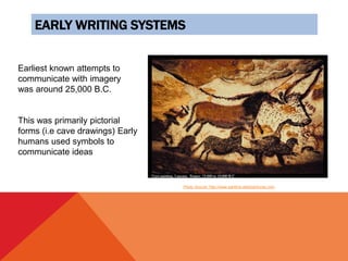
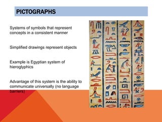
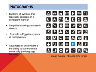
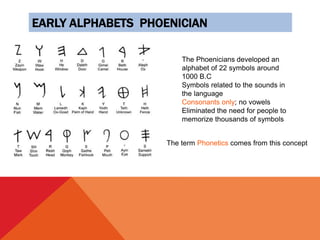
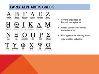
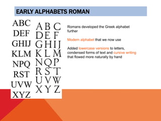
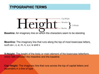
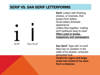
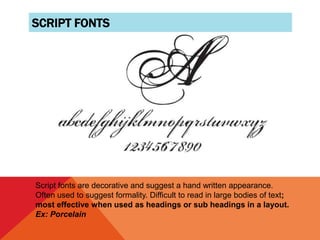
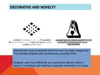
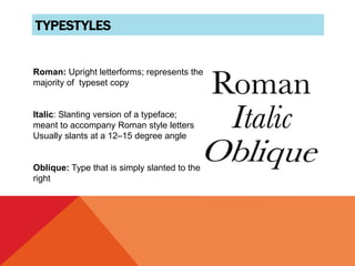
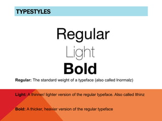
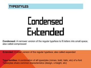
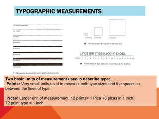
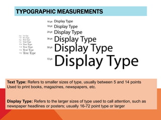
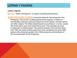
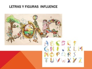
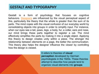
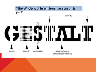
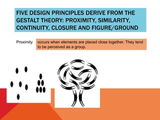
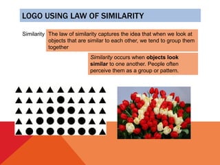
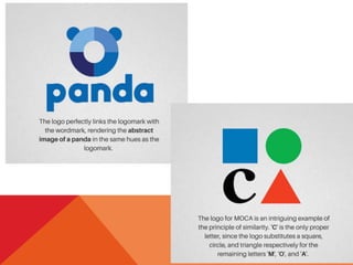
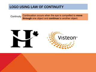
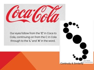
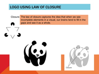
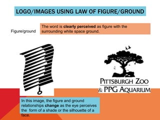
UNDERSTANDING TYPOGRAPHY
A brief history of written and
printed communication, the
function of typography in
graphic design and the
essential typographic
terminology.
EARLY WRITING SYSTEMS
Photo Source: http://www.sanford-artedventures.com
Earliest known attempts to
communicate with imagery
was around 25,000 B.C.
This was primarily pictorial
forms (i.e cave drawings) Early
humans used symbols to
communicate ideas
PICTOGRAPHS
Systems of symbols that represent
concepts in a consistent manner
Simplified drawings represent objects
Example is Egyptian system of
hieroglyphics
Advantage of this system is the ability to
communicate universally (no language
barriers)
PICTOGRAPHS
• Systems of symbols that
represent concepts in a
consistent manner
• Simplified drawings represent
objects
• Example is Egyptian system
of hieroglyphics
• Advantage of this system is
the ability to communicate
universally (no language
barriers)
Image Source: http://bit.ly/bHhnx3
EARLY ALPHABETS PHOENICIAN
The Phoenicians developed an
alphabet of 22 symbols around
1000 B.C
Symbols related to the sounds in
the language
Consonants only; no vowels
Eliminated the need for people to
memorize thousands of symbols
The term Phonetics comes from this concept
EARLY ALPHABETS GREEK
• Greeks expanded on
Phoenician alphabet
• Added vowels and named
each character
• First system for reading left to
right and top to bottom
EARLY ALPHABETS ROMAN
Romans developed the Greek alphabet
further
Modern alphabet that we now use
Added lowercase versions to letters,
condensed forms of text and cursive writing
that flowed more naturally by hand
WRITING DURING THE DARK AGES
Books were hand-produced for hundreds
of years
Primarily religious (illuminated
manuscripts)
Due to the painstaking effort (often years)
to create a single volume, books were
considered very valuable treasures
Photo Source: http://bit.ly/bQJRH6
INVENTION OF THE PRINTING PRESS
• German metal carver Johannes Gutenberg,
invented the printing press in mid 15th
century
• Letters carved onto a small metal plate,
punch
• Letters arranged to form blocks of text.
Molten metal poured over the top to make a
mold
• Used to print books in larger quantities than
had previously been possible
• This invention changed the world, allowing
rapid production and distribution of printed
ideas
• The Bible was first complete book ever
WHAT ROLE DOES TYPOGRAPHY
PLAY IN GRAPHIC DESIGN?
Helps clarify a message that the designer
sends to an audience
The properly selected font has a huge
impact on getting a message across to an
intended audience
A poorly chosen font or bad typographic
layout can detract from or even block the
message all together
Poor typography will prevent a reader from
connecting with a design, and at worst may
make your message illegible!
Typography can provide an element of
expression to accompany a message
A carefully crafted typography increases
emotional impact of a message much more
than just plain type by itself, adding
another dimension to a message
A well-conceived typographic composition
allows the designer to connect with the
reader
Letters and numbers can be arranged in a
clever way that strengthens the message
Of course, some of the most innovative
and creative typography breaks all of the
established rules!
Typeface: Refers to the upper and lowercase letters and numbers of a specific design/ font.
Examples: Helvetica, Times, etc.
Characters: The individual letters, numbers and punctuation used when setting type
Uppercase: The capital letters of the alphabet
Lowercase: The small letters of the alphabet
Typographic Terms
TYPOGRAPHIC TERMS
Baseline: An imaginary line on which the characters seem to be standing
Meanline: The imaginary line that runs along the top of most lowercase letters,
such as i, c, e, m, n, u,v, w and x
X-Height: The height of the body or main element of the lowercase letterform,
which falls between the meanline and the baseline
Cap Height: The imaginary line that runs across the top of capital letters and
ascenders in a line of type
SERIF VS. SAN SERIF LETTERFORMS
Serif: Letters with finishing
strokes, or brackets, that
project from letters
Gives letters finishedz
appearance
Letters flow together, making
serif typefaces easy to read
Often used in books,
magazines and newspapers
San Serif: Type with no serif
Also has no variation in the
width of its strokes; computer
generated look
Useful for signs and large-
scale text meant to be seen
from a distance
SCRIPT FONTS
Script fonts are decorative and suggest a hand written appearance.
Often used to suggest formality. Difficult to read in large bodies of text;
most effective when used as headings or sub headings in a layout.
Ex: Porcelain
DECORATIVE AND NOVELTY
General term used to describe fonts that can’t be easily categorized.
This includes dingbats and contemporary specialty fonts.
Dingbats used most effectively as a decorative element within a
layout or a heading/ sub heading to separate information on a page.
TYPESTYLES
Roman: Upright letterforms; represents the
majority of typeset copy
Italic: Slanting version of a typeface;
meant to accompany Roman style letters
Usually slants at a 12–15 degree angle
Oblique: Type that is simply slanted to the
right
TYPESTYLES
Regular: The standard weight of a typeface (also called lnormalz)
Light: A thinner/ lighter version of the regular typeface. Also called lthinz
Bold: A thicker, heavier version of the regular typeface
TYPESTYLES
Condensed: A narrower version of the regular typeface to fit letters into small space;
also called compressed
Extended: A wider version of the regular typeface; also called expanded
Type families: A combination of all typestyles (roman, bold, italic, etc) of a font
Typestyles share common characteristics (design, x-height, etc)
TYPOGRAPHIC MEASUREMENTS
Two basic units of measurement used to describe type:
Points: Very small units used to measure both type sizes and the spaces in
between the lines of type.
Picas: Larger unit of measurement. 12 points= 1 Pica (6 picas in 1 inch)
72 point type = 1 inch
TYPOGRAPHIC MEASUREMENTS
Text Type: Refers to smaller sizes of type, usually between 5 and 14 points
Used to print books, magazines, newspapers, etc.
Display Type: Refers to the larger sizes of type used to call attention, such as
newspaper headlines or posters; usually 16-72 point type or larger
LETRAS Y FIGURAS
Letras y figuras
(Spanish, "letters and figures"), is a genre of painting pioneered by
José Honorato Lozano during the Spanish colonial period in the
Philippines. The art form is distinguished by the depiction of letters of
the alphabet using the contoured shapes of human figures, animals, plants,
and other objects. The letters depicted spell out a phrase or a name, usually
that of the patron who commissioned the work. The paintings are done
in watercolor on Manila paper. The earliest example of this art form dates
from 1845; the latest existing specimens were completed during the latter
portion of the American period in the 1930s during the administration of
the Commonwealth of the Philippines.
LETRAS Y FIGURAS INFLUENCE
GESTALT AND TYPOGRAPHY
Gestalt is a form of psychology that focuses on cognitive
behaviors. Designers are influenced by the visual perceptual aspect of
this, particularly the theory that the whole is greater than the sum of its
parts. The mind copes with the visual confusion of our everyday world by
consolidating objects into groups in order to simplify input. For instance,
when our eyes see a tail, paws, legs, a body, fur, a collar, ears and nose,
our mind brings these parts together to register a cat. The mind
effectively simplifies the parts by making it into a single object. Applying
this theory to design creates unity within a piece. The stronger the
relationship between elements on a page, the better the communication.
This theory also helps the designer influence the viewer by controlling
how the design is viewed.
It refers to theories of visual
perception developed by German
psychologists in the 1920s. These theories
attempt to describe how people tend to
organize visual elements into groups
“The Whole is different from the sum of its
part”
FIVE DESIGN PRINCIPLES DERIVE FROM THE
GESTALT THEORY: PROXIMITY, SIMILARITY,
CONTINUITY, CLOSURE AND FIGURE/GROUND
Proximity occurs when elements are placed close together. They tend
to be perceived as a group.
LOGO USING LAW OF PROXIMITY
LOGO USING LAW OF SIMILARITY
Similarity The law of similarity captures the idea that when we look at
objects that are similar to each other, we tend to group them
together
Similarity occurs when objects look
similar to one another. People often
perceive them as a group or pattern.
LOGO USING LAW OF CONTINUITY
Continuity Continuation occurs when the eye is compelled to move
through one object and continue to another object.
Continuity & Similarity
LOGO USING LAW OF CLOSURE
Closure The law of closure captures the idea that when we see
incomplete elements in a visual, our brains tend to fill in the
gaps and see it as a whole.
LOGO/IMAGES USING LAW OF FIGURE/GROUND
Figure/ground
The word is clearly perceived as figure with the
surrounding white space ground.
In this image, the figure and ground
relationships change as the eye perceives
the form of a shade or the silhouette of a
face.
TYPO.pptx
TYPO.pptx

TYPO.pptx

  • 2.
    UNDERSTANDING TYPOGRAPHY A briefhistory of written and printed communication, the function of typography in graphic design and the essential typographic terminology.
  • 3.
    EARLY WRITING SYSTEMS PhotoSource: http://www.sanford-artedventures.com Earliest known attempts to communicate with imagery was around 25,000 B.C. This was primarily pictorial forms (i.e cave drawings) Early humans used symbols to communicate ideas
  • 4.
    PICTOGRAPHS Systems of symbolsthat represent concepts in a consistent manner Simplified drawings represent objects Example is Egyptian system of hieroglyphics Advantage of this system is the ability to communicate universally (no language barriers)
  • 5.
    PICTOGRAPHS • Systems ofsymbols that represent concepts in a consistent manner • Simplified drawings represent objects • Example is Egyptian system of hieroglyphics • Advantage of this system is the ability to communicate universally (no language barriers) Image Source: http://bit.ly/bHhnx3
  • 6.
    EARLY ALPHABETS PHOENICIAN ThePhoenicians developed an alphabet of 22 symbols around 1000 B.C Symbols related to the sounds in the language Consonants only; no vowels Eliminated the need for people to memorize thousands of symbols The term Phonetics comes from this concept
  • 7.
    EARLY ALPHABETS GREEK •Greeks expanded on Phoenician alphabet • Added vowels and named each character • First system for reading left to right and top to bottom
  • 8.
    EARLY ALPHABETS ROMAN Romansdeveloped the Greek alphabet further Modern alphabet that we now use Added lowercase versions to letters, condensed forms of text and cursive writing that flowed more naturally by hand
  • 9.
    WRITING DURING THEDARK AGES Books were hand-produced for hundreds of years Primarily religious (illuminated manuscripts) Due to the painstaking effort (often years) to create a single volume, books were considered very valuable treasures Photo Source: http://bit.ly/bQJRH6
  • 10.
    INVENTION OF THEPRINTING PRESS • German metal carver Johannes Gutenberg, invented the printing press in mid 15th century • Letters carved onto a small metal plate, punch • Letters arranged to form blocks of text. Molten metal poured over the top to make a mold • Used to print books in larger quantities than had previously been possible • This invention changed the world, allowing rapid production and distribution of printed ideas • The Bible was first complete book ever
  • 11.
    WHAT ROLE DOESTYPOGRAPHY PLAY IN GRAPHIC DESIGN? Helps clarify a message that the designer sends to an audience The properly selected font has a huge impact on getting a message across to an intended audience A poorly chosen font or bad typographic layout can detract from or even block the message all together
  • 12.
    Poor typography willprevent a reader from connecting with a design, and at worst may make your message illegible!
  • 13.
    Typography can providean element of expression to accompany a message A carefully crafted typography increases emotional impact of a message much more than just plain type by itself, adding another dimension to a message A well-conceived typographic composition allows the designer to connect with the reader
  • 14.
    Letters and numberscan be arranged in a clever way that strengthens the message
  • 15.
    Of course, someof the most innovative and creative typography breaks all of the established rules!
  • 16.
    Typeface: Refers tothe upper and lowercase letters and numbers of a specific design/ font. Examples: Helvetica, Times, etc. Characters: The individual letters, numbers and punctuation used when setting type Uppercase: The capital letters of the alphabet Lowercase: The small letters of the alphabet Typographic Terms
  • 17.
    TYPOGRAPHIC TERMS Baseline: Animaginary line on which the characters seem to be standing Meanline: The imaginary line that runs along the top of most lowercase letters, such as i, c, e, m, n, u,v, w and x X-Height: The height of the body or main element of the lowercase letterform, which falls between the meanline and the baseline Cap Height: The imaginary line that runs across the top of capital letters and ascenders in a line of type
  • 18.
    SERIF VS. SANSERIF LETTERFORMS Serif: Letters with finishing strokes, or brackets, that project from letters Gives letters finishedz appearance Letters flow together, making serif typefaces easy to read Often used in books, magazines and newspapers San Serif: Type with no serif Also has no variation in the width of its strokes; computer generated look Useful for signs and large- scale text meant to be seen from a distance
  • 19.
    SCRIPT FONTS Script fontsare decorative and suggest a hand written appearance. Often used to suggest formality. Difficult to read in large bodies of text; most effective when used as headings or sub headings in a layout. Ex: Porcelain
  • 20.
    DECORATIVE AND NOVELTY Generalterm used to describe fonts that can’t be easily categorized. This includes dingbats and contemporary specialty fonts. Dingbats used most effectively as a decorative element within a layout or a heading/ sub heading to separate information on a page.
  • 21.
    TYPESTYLES Roman: Upright letterforms;represents the majority of typeset copy Italic: Slanting version of a typeface; meant to accompany Roman style letters Usually slants at a 12–15 degree angle Oblique: Type that is simply slanted to the right
  • 22.
    TYPESTYLES Regular: The standardweight of a typeface (also called lnormalz) Light: A thinner/ lighter version of the regular typeface. Also called lthinz Bold: A thicker, heavier version of the regular typeface
  • 23.
    TYPESTYLES Condensed: A narrowerversion of the regular typeface to fit letters into small space; also called compressed Extended: A wider version of the regular typeface; also called expanded Type families: A combination of all typestyles (roman, bold, italic, etc) of a font Typestyles share common characteristics (design, x-height, etc)
  • 24.
    TYPOGRAPHIC MEASUREMENTS Two basicunits of measurement used to describe type: Points: Very small units used to measure both type sizes and the spaces in between the lines of type. Picas: Larger unit of measurement. 12 points= 1 Pica (6 picas in 1 inch) 72 point type = 1 inch
  • 25.
    TYPOGRAPHIC MEASUREMENTS Text Type:Refers to smaller sizes of type, usually between 5 and 14 points Used to print books, magazines, newspapers, etc. Display Type: Refers to the larger sizes of type used to call attention, such as newspaper headlines or posters; usually 16-72 point type or larger
  • 26.
    LETRAS Y FIGURAS Letrasy figuras (Spanish, "letters and figures"), is a genre of painting pioneered by José Honorato Lozano during the Spanish colonial period in the Philippines. The art form is distinguished by the depiction of letters of the alphabet using the contoured shapes of human figures, animals, plants, and other objects. The letters depicted spell out a phrase or a name, usually that of the patron who commissioned the work. The paintings are done in watercolor on Manila paper. The earliest example of this art form dates from 1845; the latest existing specimens were completed during the latter portion of the American period in the 1930s during the administration of the Commonwealth of the Philippines.
  • 28.
  • 29.
    GESTALT AND TYPOGRAPHY Gestaltis a form of psychology that focuses on cognitive behaviors. Designers are influenced by the visual perceptual aspect of this, particularly the theory that the whole is greater than the sum of its parts. The mind copes with the visual confusion of our everyday world by consolidating objects into groups in order to simplify input. For instance, when our eyes see a tail, paws, legs, a body, fur, a collar, ears and nose, our mind brings these parts together to register a cat. The mind effectively simplifies the parts by making it into a single object. Applying this theory to design creates unity within a piece. The stronger the relationship between elements on a page, the better the communication. This theory also helps the designer influence the viewer by controlling how the design is viewed. It refers to theories of visual perception developed by German psychologists in the 1920s. These theories attempt to describe how people tend to organize visual elements into groups
  • 30.
    “The Whole isdifferent from the sum of its part”
  • 31.
    FIVE DESIGN PRINCIPLESDERIVE FROM THE GESTALT THEORY: PROXIMITY, SIMILARITY, CONTINUITY, CLOSURE AND FIGURE/GROUND Proximity occurs when elements are placed close together. They tend to be perceived as a group.
  • 32.
    LOGO USING LAWOF PROXIMITY
  • 33.
    LOGO USING LAWOF SIMILARITY Similarity The law of similarity captures the idea that when we look at objects that are similar to each other, we tend to group them together Similarity occurs when objects look similar to one another. People often perceive them as a group or pattern.
  • 35.
    LOGO USING LAWOF CONTINUITY Continuity Continuation occurs when the eye is compelled to move through one object and continue to another object.
  • 36.
  • 37.
    LOGO USING LAWOF CLOSURE Closure The law of closure captures the idea that when we see incomplete elements in a visual, our brains tend to fill in the gaps and see it as a whole.
  • 39.
    LOGO/IMAGES USING LAWOF FIGURE/GROUND Figure/ground The word is clearly perceived as figure with the surrounding white space ground. In this image, the figure and ground relationships change as the eye perceives the form of a shade or the silhouette of a face.