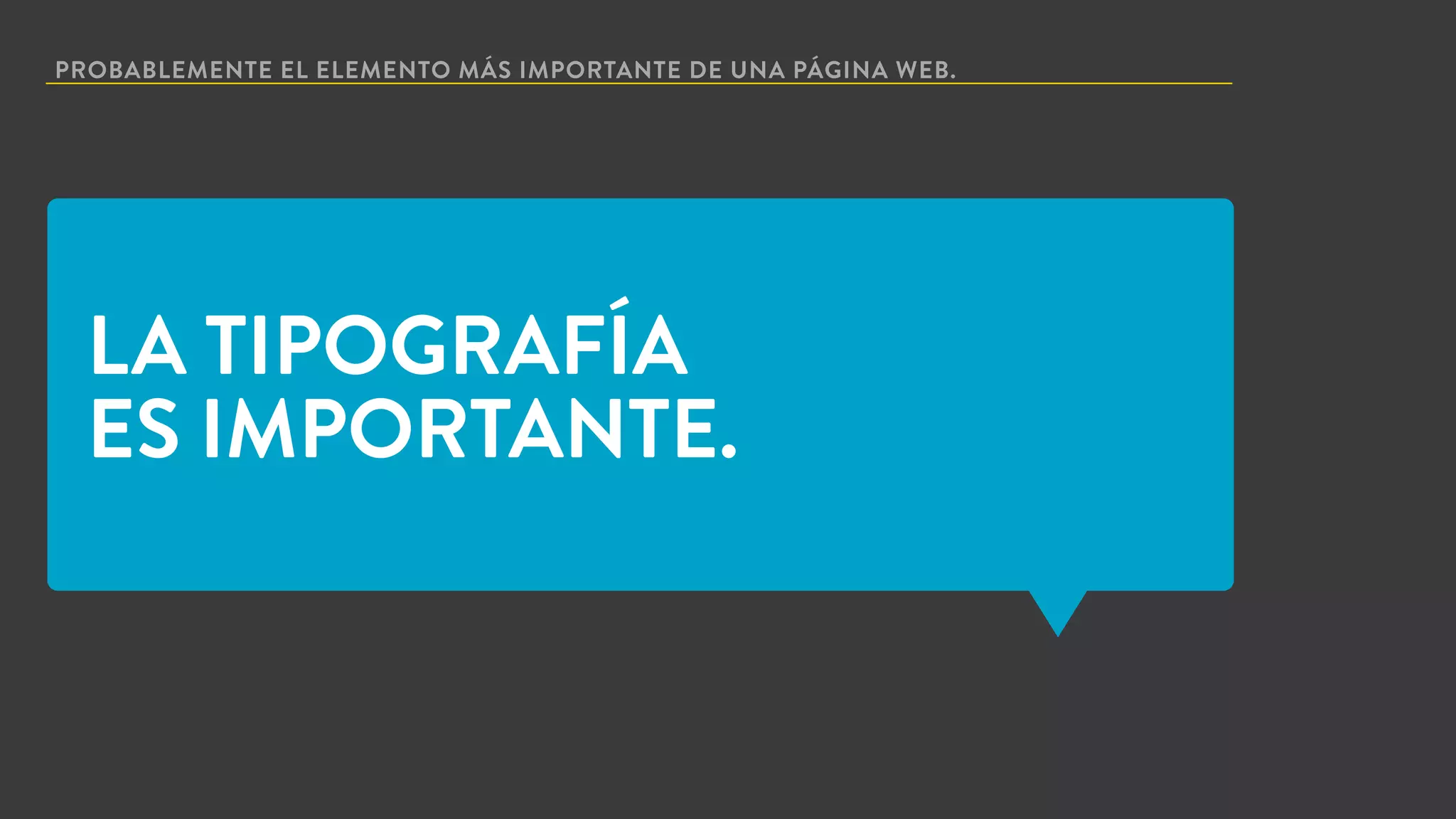
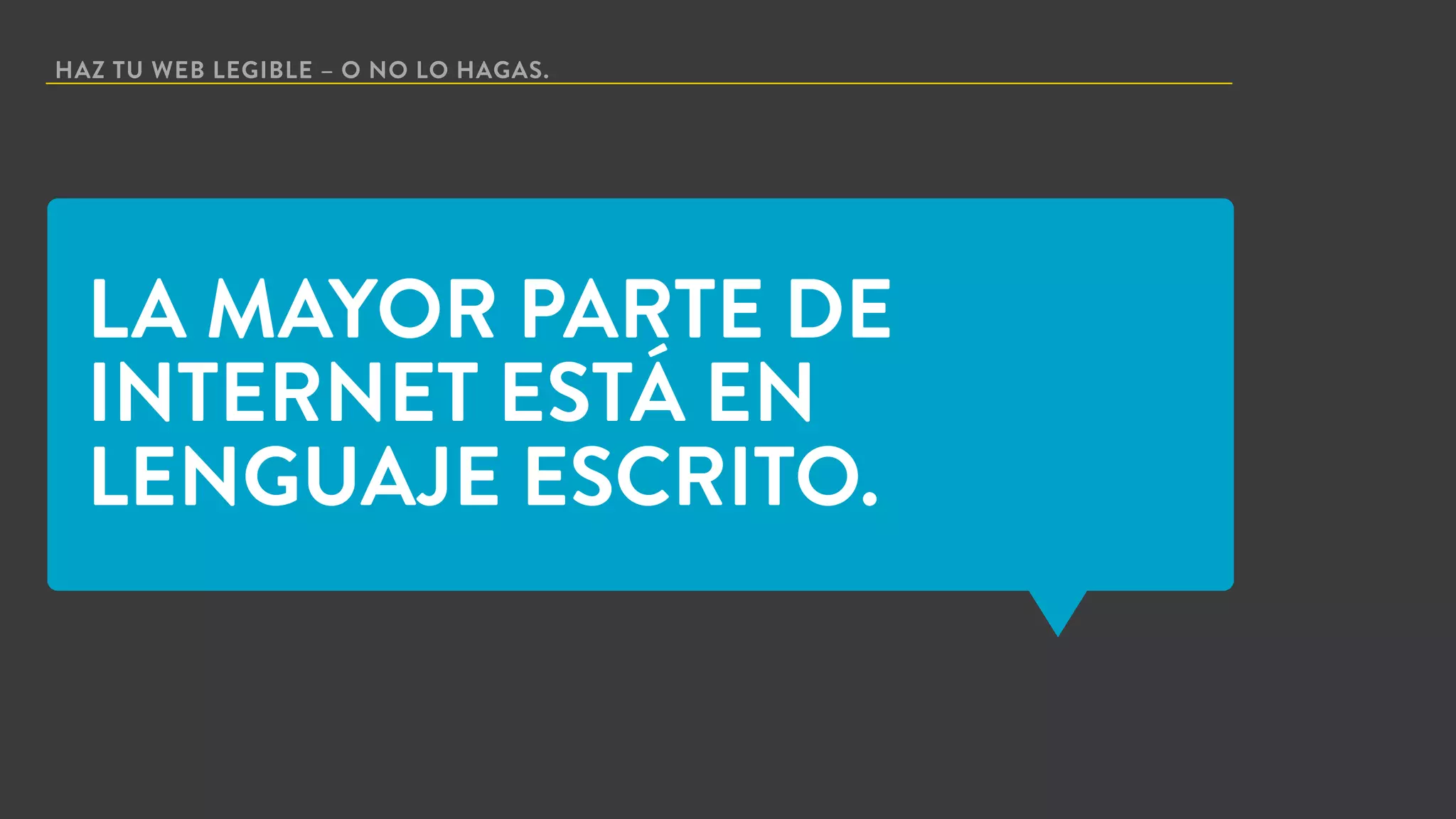
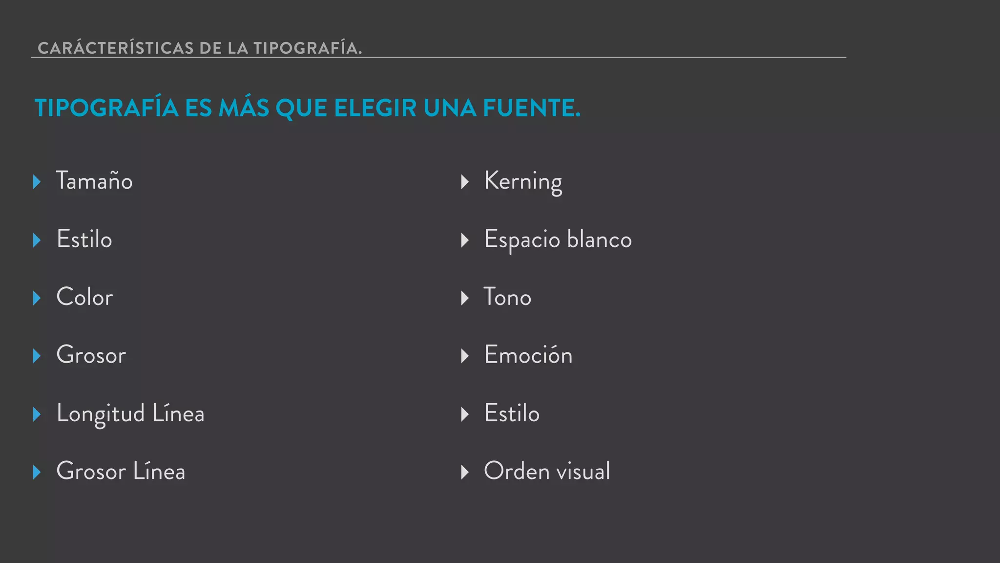
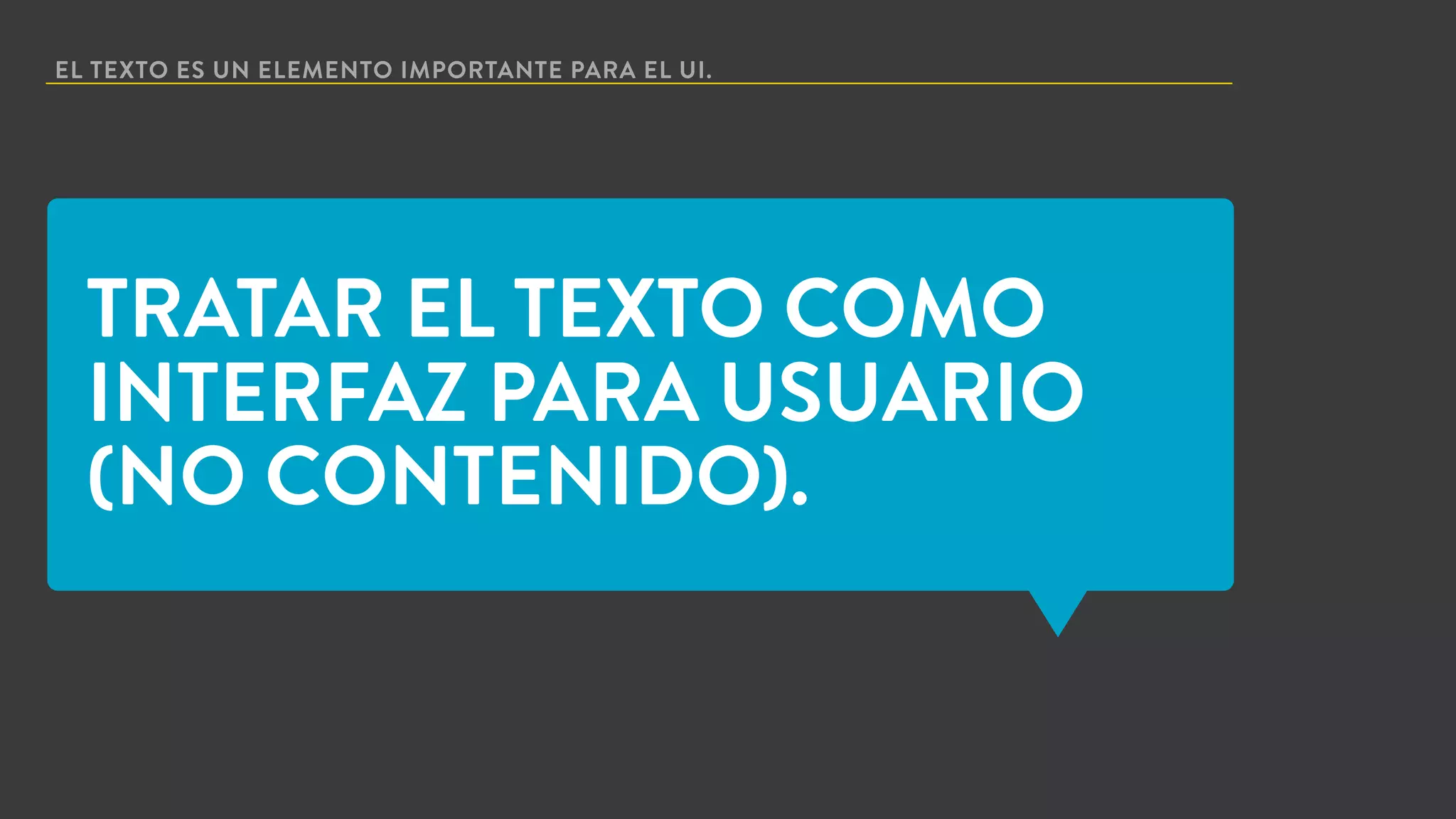
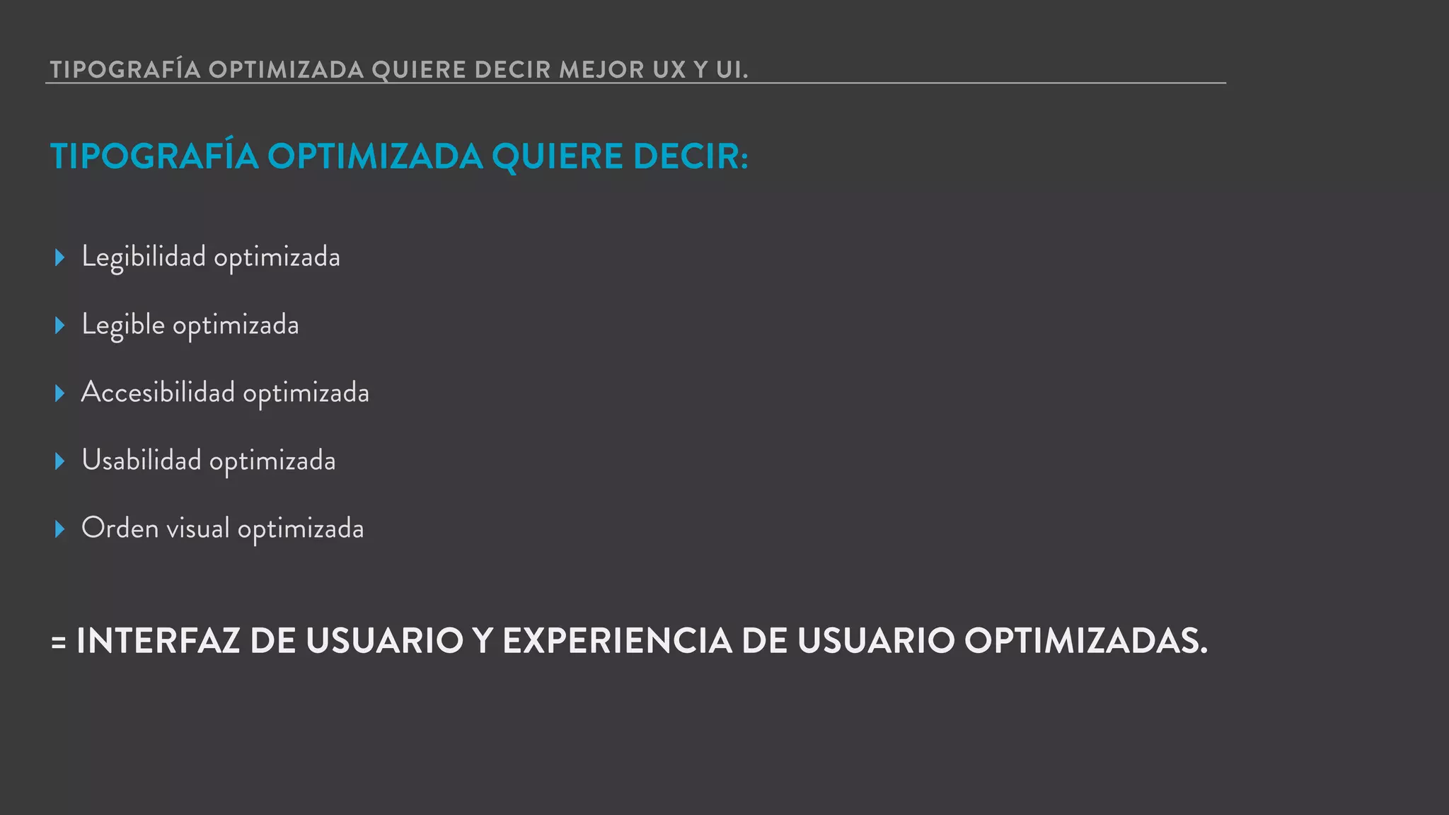
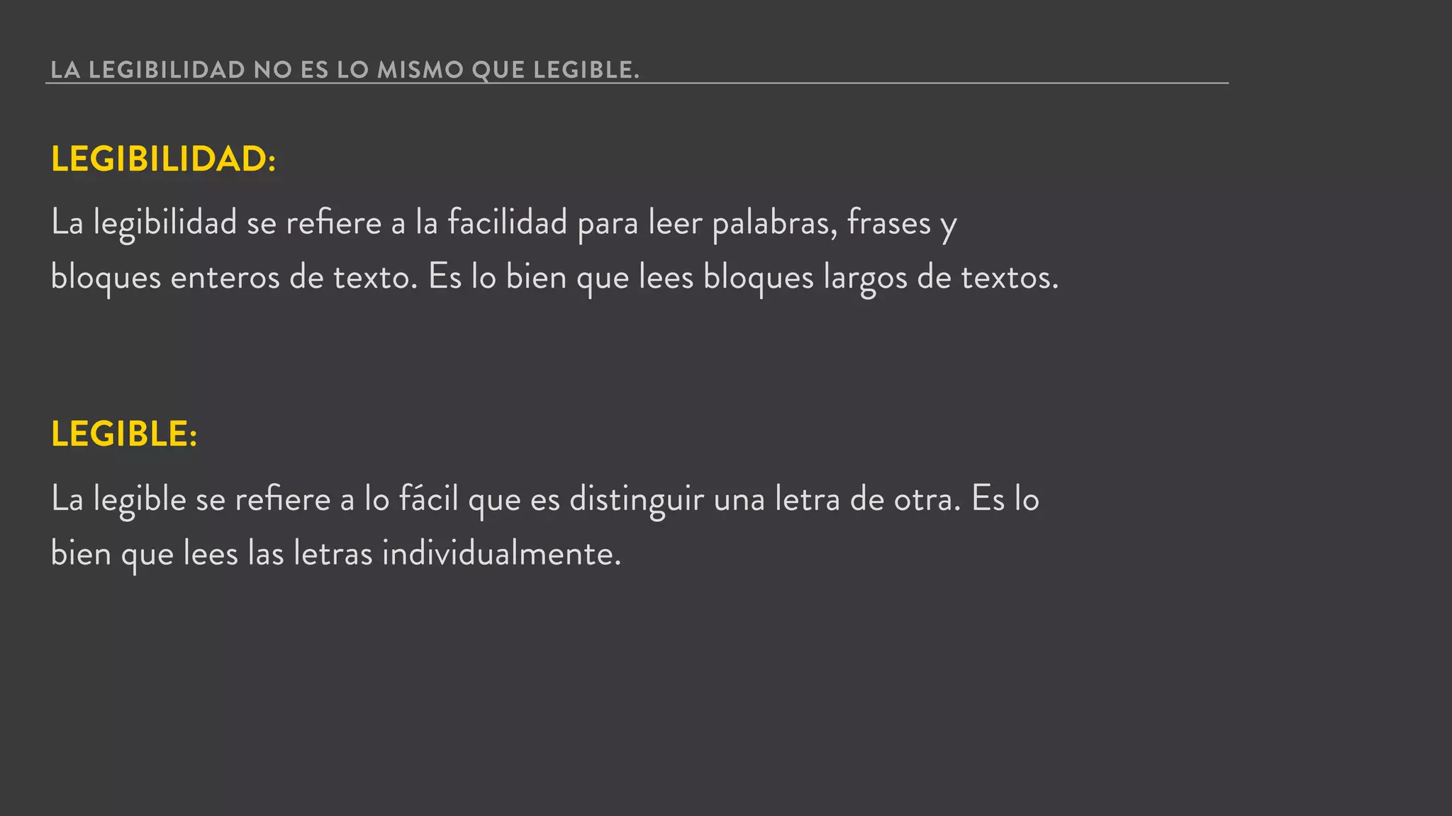
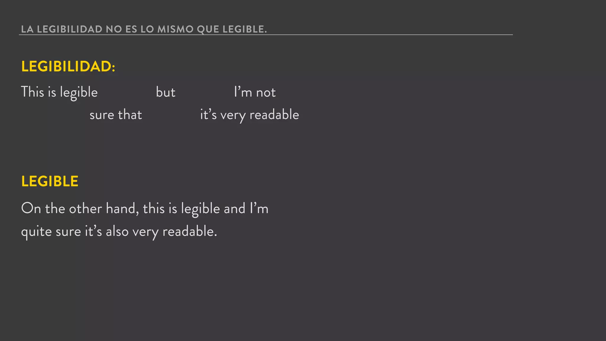
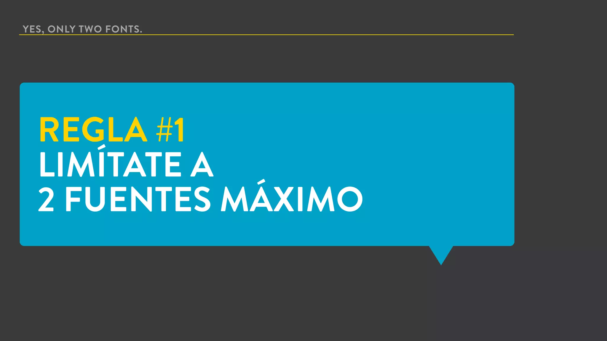
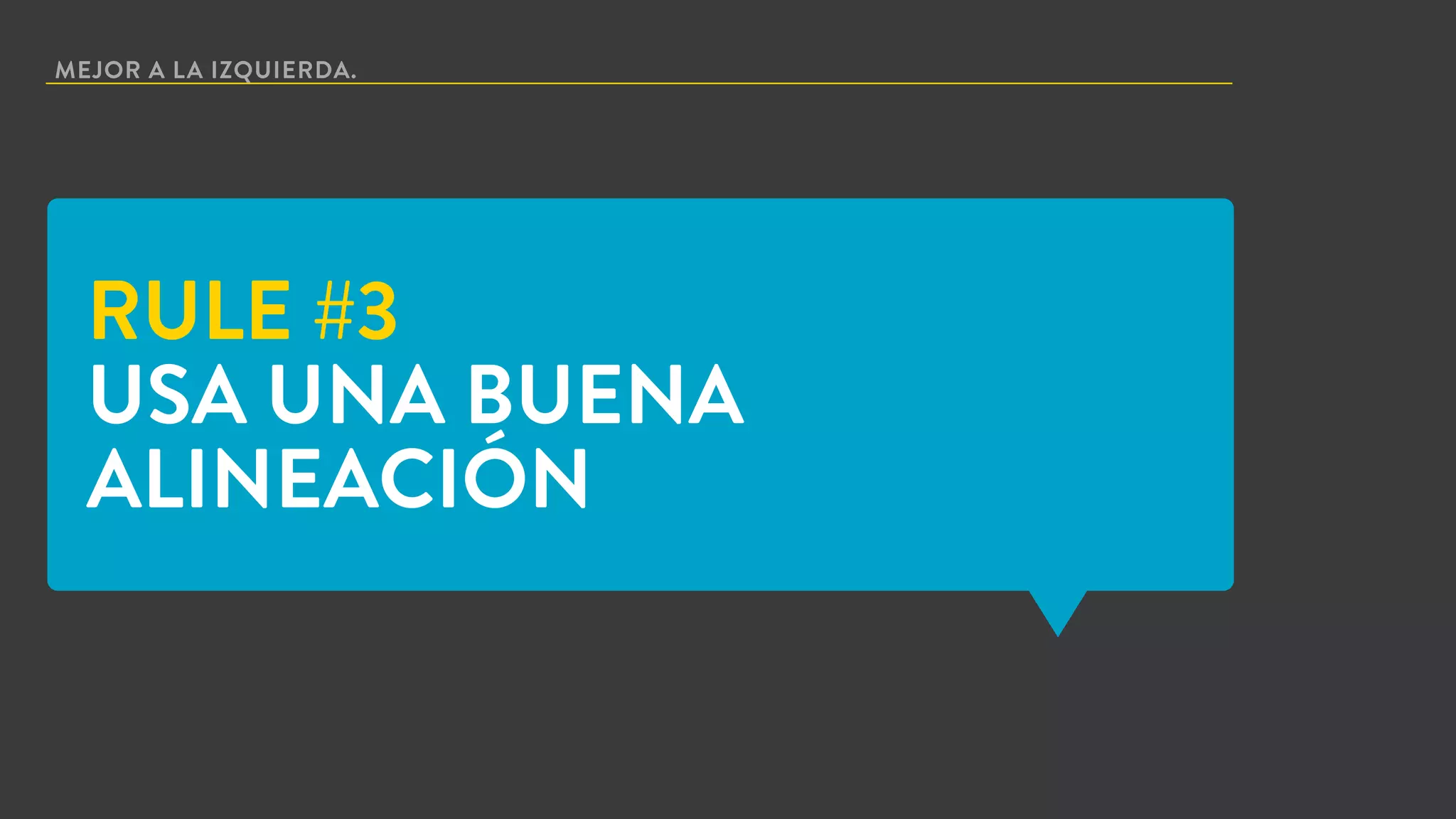
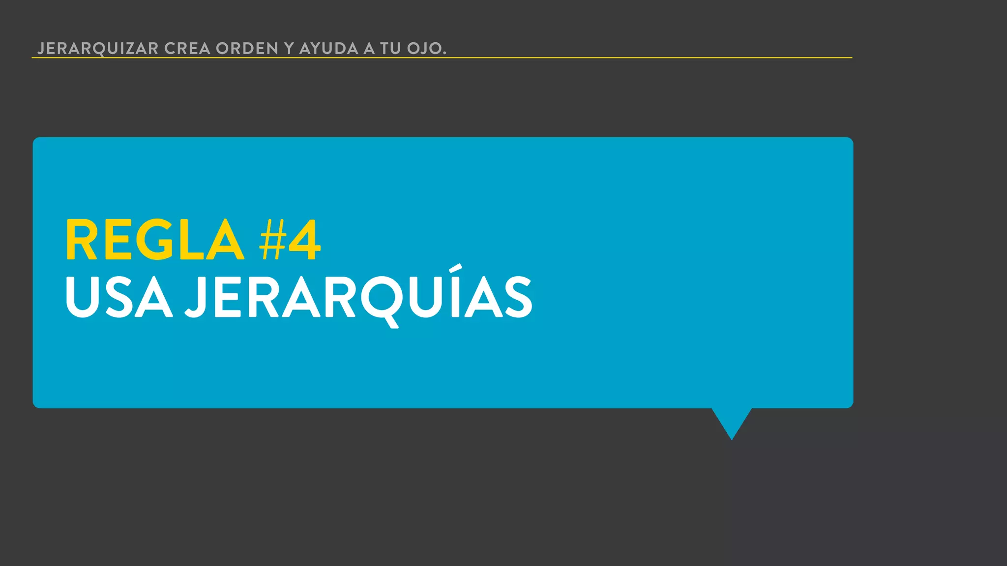
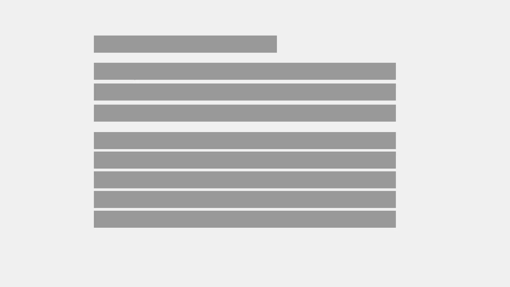
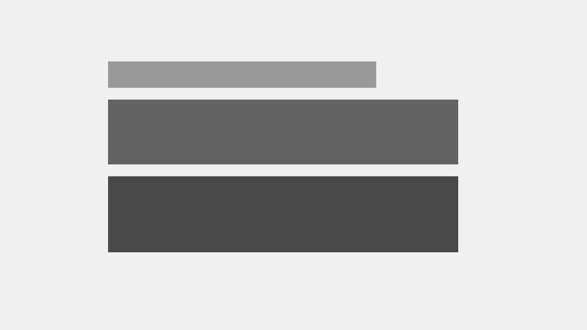
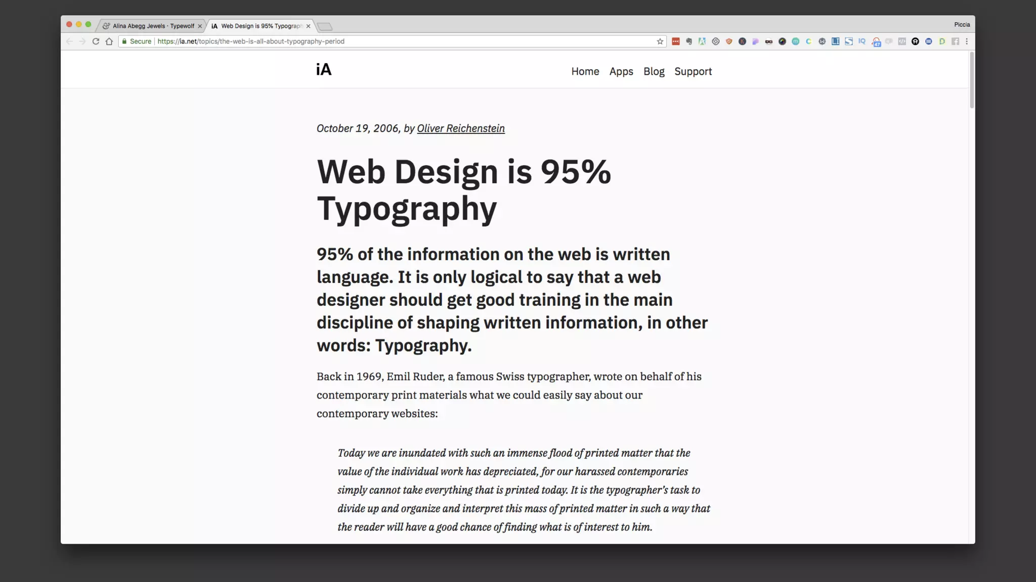
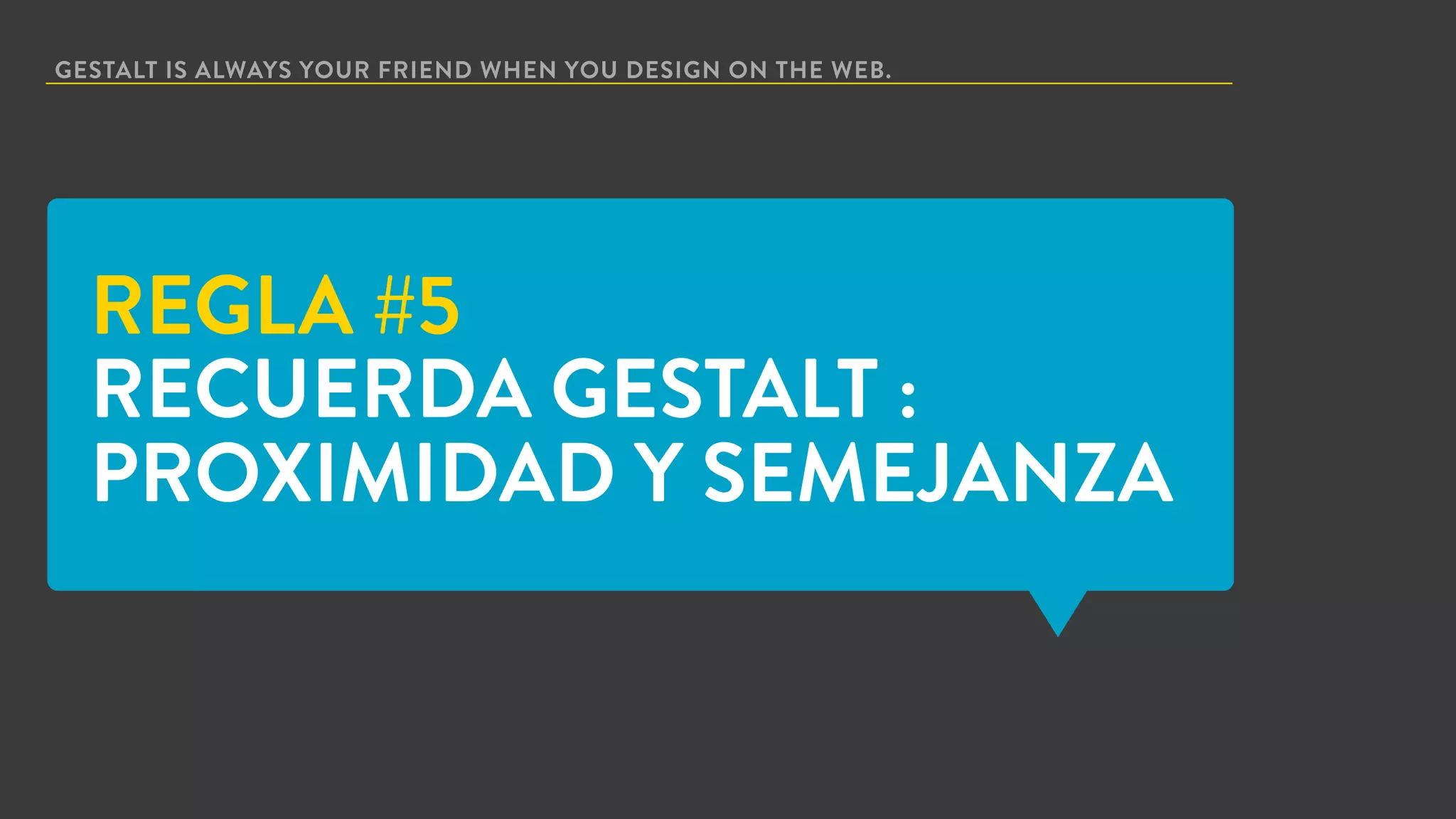
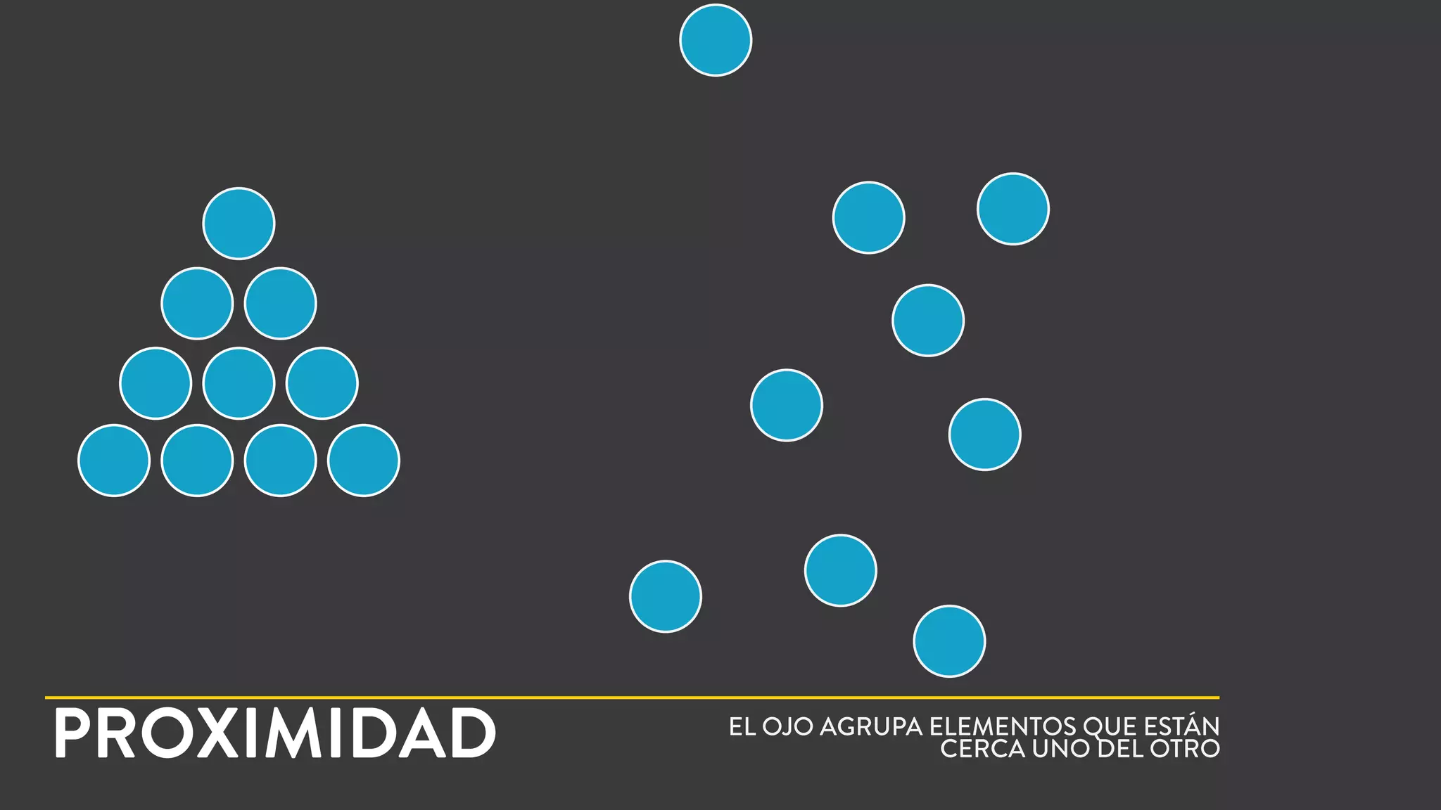
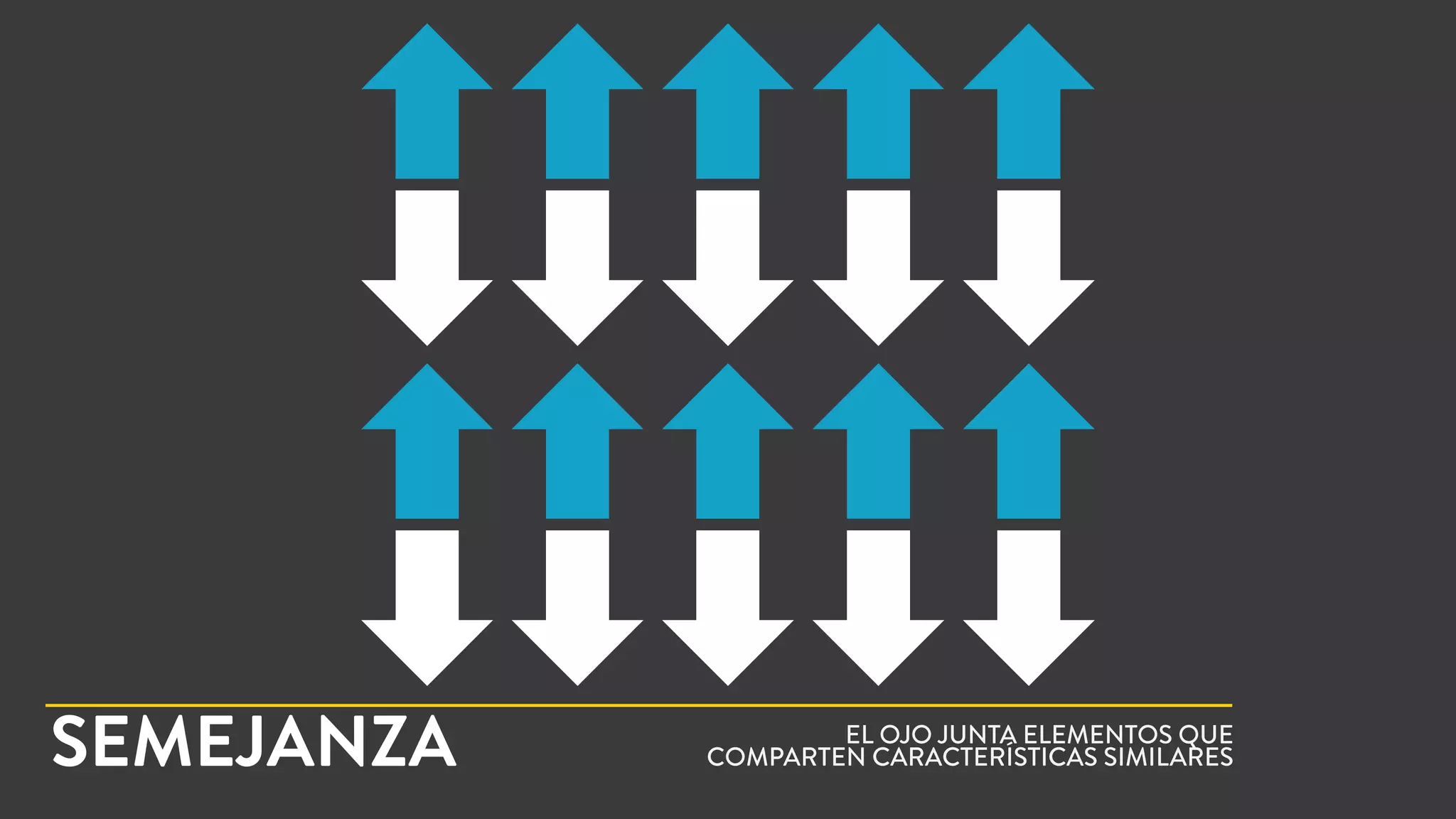
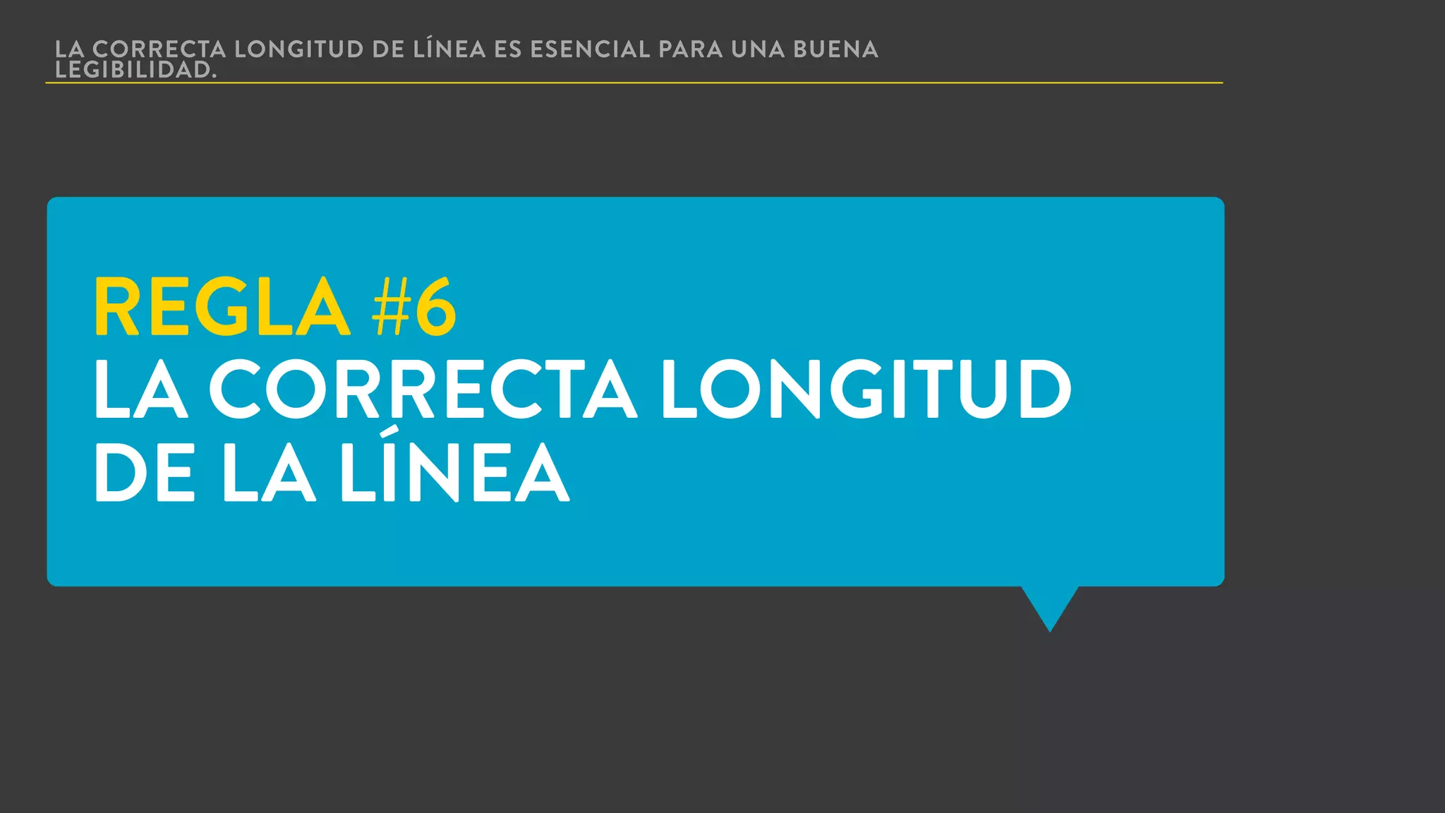
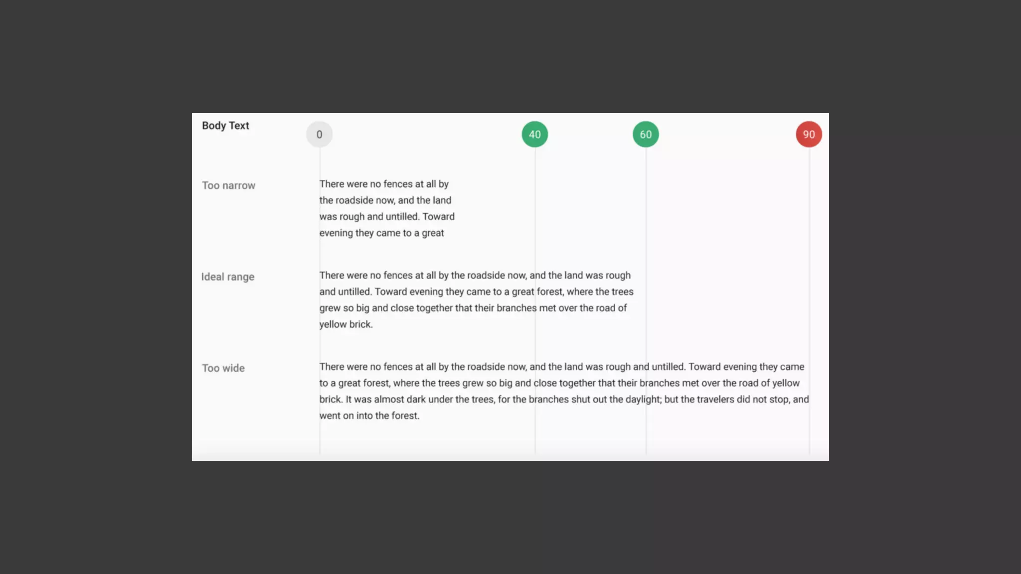
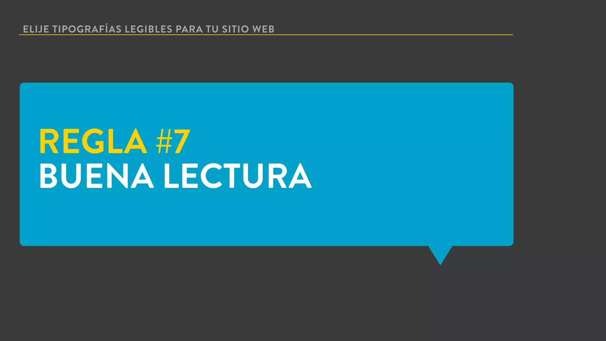
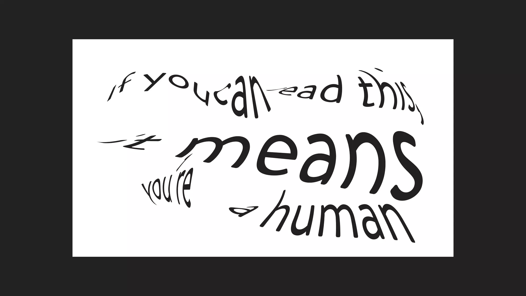
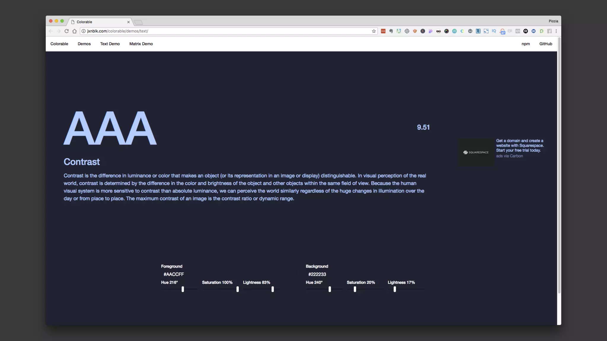
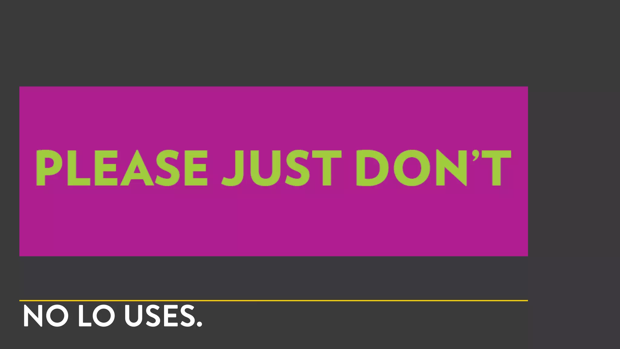
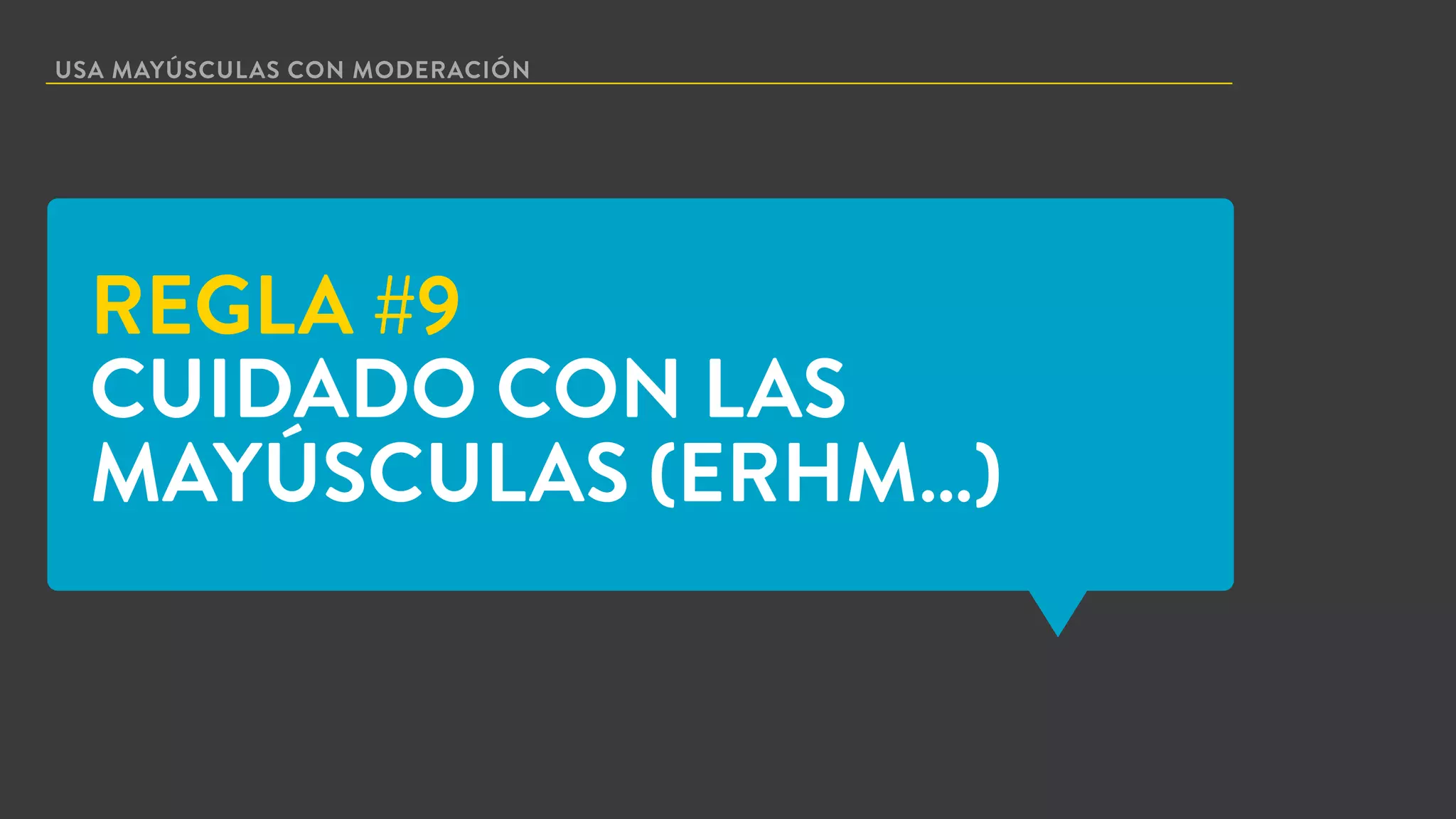
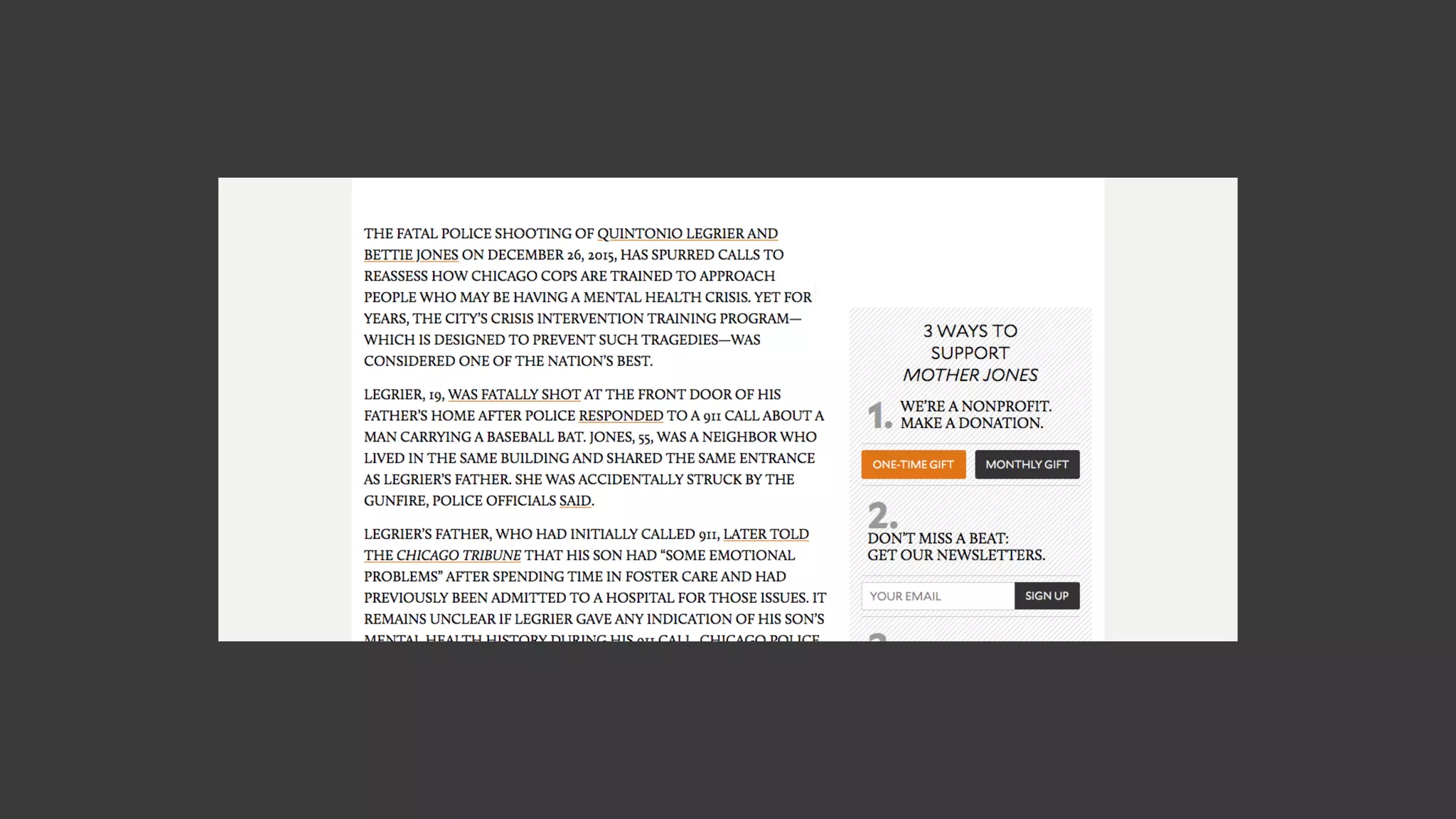
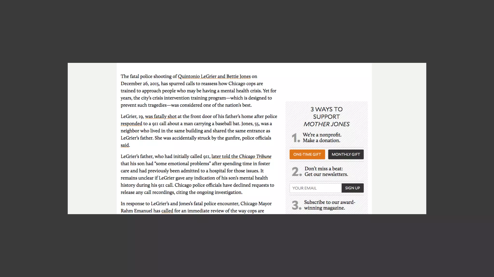
This document provides 10 rules for optimizing typography on webpages. The rules are: 1) Limit fonts to a maximum of 2. 2) Use font weights, sizes and styles instead of multiple fonts. 3) Use good alignment. 4) Use hierarchies. 5) Remember Gestalt principles of proximity and similarity. 6) Use the correct line length. 7) Choose legible fonts. 8) Use good contrast. 9) Use capital letters sparingly. 10) Avoid animations unless necessary. Following these rules will help create flawless typography and improve the user experience on websites.
More info, please visit punkl.com
Creating a presentation from scratch can be quite labour-intensive. Starting with a presentation template from Punkl is beneficial. It saves time, provides good visual design and means that you can primarily spend your time and attention on the content of your presentation.
Punkl Presentation Templates save you time, as they're a whole lot quicker than trying to design a deck from scratch. Also, starting with a template means that you can primarily spend your time and attention on the content of your presentation, while the visual style is already designed to be engaging.
Typically, the only elements that are changed while working with a presentation template are colors, typography, copy and any visual assets such as photos for example.
Technical Specification:
100 presentation slides in total.
50 unique and editable presentation slides design.
2 options of color themes variation.
16:9 HD widescreen slide format (1920 x 1080 pixels).
Image placeholder with slide master.
No need Adobe Photoshop or any other image editor.
Fully editable text.
Icons variation are included.
RGB color mode.
Drag and drop image to screen mockups.
Additional Note:
Photos in the preview are not included.
Vector Shape Illustrations are included.
Fonts used are not included, they could be dowloaded from the links on the Documentation File.
Prohibited Usage of Items:
Items Incorporated Into End-Products Cannot be Extracted or Used Separately
You cannot allow items incorporated into end-products to be extracted or used separately from the end-product, **including the vector illustrations and any other vector shapes**.
Enjoy and have a great day! :)
Usage:
Advertising Presentation, Architecture Presentation, Activity Presentation, Brand Guidelines Presentation, Business Presentation, Church Presentation, Cool Presentation, Creative Presentation, Education Presentation, Event Presentation, Finance Presentation, Keynote Presentation, Listing Presentation, Marketing Presentation, Medical Presentation, Pitch Deck Presentation, Product Presentation, Professional Presentation, Sales Presentation, Simple Presentation, Technology Presentation, Programs Presentation, Personal Presentation, Fashion Presentation, Promo Presentation, Shop Presentation, Boutique Presentation, Outlet Presentation, etc.
Design for non-designers: five visual principles to guide youDavid Hall
Are you depressed about your design skills? Panic attacks over that presentation? Looking down the abyss of artistic failure? Well, it’s not that bad. All you need are a few basic principles to help you through.
Copywriting - Art of Advertising WritingAkram Badr
Want to write your first selling copy? Go through this guide to understand what's copywriting and how to enhance your skills writing for advertising.
Connect with me via Linkedin: eg.linkedin.com/in/AkramBadrCreative
Thanks for supporting. Share for the maximum benefit!
Know what are the important points that make a graphic design effective.
KADIWA
Buwanang Pulong
INC
Iglesia Ni Cristo
Graphic Design Seminar
Graphic Design Workshop
Fundamentals of Graphic Design
Layout
Poster Layouts
Layout and Design
Basics of Graphic Design
What is Graphic Design
Graphic design courses
How to be a graphic designer
Graphic Design Principles
How To Select The Right Colours And Fonts For Your Website?NHANCE Digital
NHANCE Digital offers comprehensive SEO services in Manchester and employs the best industry practices that will put your website on top of the SERPs. Contact us to learn more!
Typography is one of the most essential elements in graphic design. It can be used to convey a message and even affect how people perceive your business’s brand.
If you want to create an eye-catching logo that stands out from the crowd, it’s important that you learn about typography and its various types so that you can choose the right typeface for your logo design project.
In this article we’ll explain what typography is and why it’s important in logo design before getting into some examples of each type so that you’ll have an idea of which one might work best for your brand!
Why is typography important in logo design?
Typography is the art and technique of arranging type. It’s used to create a visual identity for a brand, website or logo.
A good example of typography in logo design is when you look at Nike’s “swoosh” logo.
The entire shape of their famous logo was inspired by an athletic shoe called the “Nike Air Kix” but they didn’t just copy it exactly—they made subtle changes that made it unique from other brands’ logos at the time with “Nike” written across them (which would have been extremely easy for competitors to do).
What are the different types of typography?
There are many different types of typography that can be used in logo design. We’ll cover these below, but first let’s discuss the basics:
Serif fonts have small endings on the ends of their strokes (think “a” in “apple”). Serifs were popular in print until the mid-20th century and still tend to be used today by newspapers and other publications.
Sans serif fonts do not have any decorative flourishes at all—they’re simply plain drawings without any decoration or flourish whatsoever. The most famous sans serif font is Helvetica, which has been around since 1957 (and we love it). This typeface was designed by Max Miedinger as part of an advertising campaign for Swiss watchmaker Breitling; however, Helvetica isn’t just restricted to this typeface either! There are several other variations available online if you’d like something more customized than what comes with your standard computer monitor screen font selection system.
1. Serif
Serifs are small strokes at the ends of letters, and they’re used to make text easier to read. They can also be found in print and digital media, like logos or magazines. The most common serif font is Times New Roman, which was created in 1857 by William Morris as part of his production company’s printing press equipment.
2. Sans Serif
Sans serif fonts are easier to read on screen than serif fonts. They’re often used for body text and titles, headings, and headlines.
The most common sans serif typeface is Helvetica Neue—the same one that’s been around since 1957!
3. Cursive
Cursive is a type of script that uses some combination of straight lines and curves to create an elegant, friendly look. The letters are generally small and delicate, with many letters having little or no vertical space between them.
Cursive is a type of script that uses some
“Words are pale shadows of forgotten names. As names have power, words have power. Words can light fires in the minds of men. Words can wring tears from the hardest hearts.”
― Patrick Rothfuss
If that's true, wouldn't our designers also wish to light fires in the minds and wring tears from the hardest hearts? They sure would!
#inspiration #designinspirations #graphicdesign
Steps to designing your portfolio when you're new to designNavdeep Raj
I was invited to be a guest lecturer for Northwestern University's Medill School of Journalism graduate students spending their fall semester at Northwestern's San Francisco campus.
My lecture was around Web & Communication Design, and part of the hands-on activity involved students applying these fundamentals to designing their first portfolio.
While there are a ton of web services like Wix & Squarespace that let you start with pre-created templates and customize them, might still help dissect and understand the various considerations that go into designing a portfolio. I figured the extended community of early designers & non-designers might benefit from it.
When Words Matter: Writing About Type / TypeCon 2016SallyKerrigan1
What do you need to emphasize when you're writing about a typeface? How do you avoid platitudes, but still establish a broad appeal? Who's reading this stuff, anyway? Typeface marketing has come a long way from the days when it was sold alongside brass rules in hardcover catalogs. It must have been nice not to worry about fitting sales pitches into 140 characters, or fighting for attention in a Facebook news feed — but, here we are. And in truth, there's good reason to be excited about being here.
If there's one thing you can count on, it's that good writing sticks in people's minds, no matter the medium. And with the right message, you might accomplish even more than publicity; you just might inspire more people to make typography a part of their lives.
Presentación de SEO Avanzado para WordPress por David Calabuig del meetup de WordPress Valencia.
SEO Avanzado:
· Introducción
· ¿Qué es el SEO?
· ¿Por que SEO?
· Factores del SEO para WordPress
· Plugins para SEO
· Casos reales de SEO
· Migraciones de web
· Mejora del CTR
· Eliminación de Thin Content
· Keywords en meta.tags
· Indexación bloqueada por robots
· Enlazado interno
· Preguntas
Optimiza tu WordPress para móviles en media hora con AMPFernando Serer
Durante la media hora de la sesión aprenderemos qué es el proyecto AMP, en qué nos puede beneficiar, si es una tecnología que tendríamos que implementar en nuestra web y sobre todo, aprenderemos a adaptar nuestro WordPress para que sirva correctamente el contenido en este formato.
Pondremos en marcha los plugins necesarios para implementar esta tecnología y aprenderemos cómo realizar pequeños cambios para adaptar la representación gráfica a la imagen de nuestra web.
PHP Frameworks: I want to break free (IPC Berlin 2024)Ralf Eggert
In this presentation, we examine the challenges and limitations of relying too heavily on PHP frameworks in web development. We discuss the history of PHP and its frameworks to understand how this dependence has evolved. The focus will be on providing concrete tips and strategies to reduce reliance on these frameworks, based on real-world examples and practical considerations. The goal is to equip developers with the skills and knowledge to create more flexible and future-proof web applications. We'll explore the importance of maintaining autonomy in a rapidly changing tech landscape and how to make informed decisions in PHP development.
This talk is aimed at encouraging a more independent approach to using PHP frameworks, moving towards a more flexible and future-proof approach to PHP development.
Accelerate your Kubernetes clusters with Varnish CachingThijs Feryn
A presentation about the usage and availability of Varnish on Kubernetes. This talk explores the capabilities of Varnish caching and shows how to use the Varnish Helm chart to deploy it to Kubernetes.
This presentation was delivered at K8SUG Singapore. See https://feryn.eu/presentations/accelerate-your-kubernetes-clusters-with-varnish-caching-k8sug-singapore-28-2024 for more details.
UiPath Test Automation using UiPath Test Suite series, part 4DianaGray10
Welcome to UiPath Test Automation using UiPath Test Suite series part 4. In this session, we will cover Test Manager overview along with SAP heatmap.
The UiPath Test Manager overview with SAP heatmap webinar offers a concise yet comprehensive exploration of the role of a Test Manager within SAP environments, coupled with the utilization of heatmaps for effective testing strategies.
Participants will gain insights into the responsibilities, challenges, and best practices associated with test management in SAP projects. Additionally, the webinar delves into the significance of heatmaps as a visual aid for identifying testing priorities, areas of risk, and resource allocation within SAP landscapes. Through this session, attendees can expect to enhance their understanding of test management principles while learning practical approaches to optimize testing processes in SAP environments using heatmap visualization techniques
What will you get from this session?
1. Insights into SAP testing best practices
2. Heatmap utilization for testing
3. Optimization of testing processes
4. Demo
Topics covered:
Execution from the test manager
Orchestrator execution result
Defect reporting
SAP heatmap example with demo
Speaker:
Deepak Rai, Automation Practice Lead, Boundaryless Group and UiPath MVP
Alt. GDG Cloud Southlake #33: Boule & Rebala: Effective AppSec in SDLC using ...James Anderson
Effective Application Security in Software Delivery lifecycle using Deployment Firewall and DBOM
The modern software delivery process (or the CI/CD process) includes many tools, distributed teams, open-source code, and cloud platforms. Constant focus on speed to release software to market, along with the traditional slow and manual security checks has caused gaps in continuous security as an important piece in the software supply chain. Today organizations feel more susceptible to external and internal cyber threats due to the vast attack surface in their applications supply chain and the lack of end-to-end governance and risk management.
The software team must secure its software delivery process to avoid vulnerability and security breaches. This needs to be achieved with existing tool chains and without extensive rework of the delivery processes. This talk will present strategies and techniques for providing visibility into the true risk of the existing vulnerabilities, preventing the introduction of security issues in the software, resolving vulnerabilities in production environments quickly, and capturing the deployment bill of materials (DBOM).
Speakers:
Bob Boule
Robert Boule is a technology enthusiast with PASSION for technology and making things work along with a knack for helping others understand how things work. He comes with around 20 years of solution engineering experience in application security, software continuous delivery, and SaaS platforms. He is known for his dynamic presentations in CI/CD and application security integrated in software delivery lifecycle.
Gopinath Rebala
Gopinath Rebala is the CTO of OpsMx, where he has overall responsibility for the machine learning and data processing architectures for Secure Software Delivery. Gopi also has a strong connection with our customers, leading design and architecture for strategic implementations. Gopi is a frequent speaker and well-known leader in continuous delivery and integrating security into software delivery.
A tale of scale & speed: How the US Navy is enabling software delivery from l...sonjaschweigert1
Rapid and secure feature delivery is a goal across every application team and every branch of the DoD. The Navy’s DevSecOps platform, Party Barge, has achieved:
- Reduction in onboarding time from 5 weeks to 1 day
- Improved developer experience and productivity through actionable findings and reduction of false positives
- Maintenance of superior security standards and inherent policy enforcement with Authorization to Operate (ATO)
Development teams can ship efficiently and ensure applications are cyber ready for Navy Authorizing Officials (AOs). In this webinar, Sigma Defense and Anchore will give attendees a look behind the scenes and demo secure pipeline automation and security artifacts that speed up application ATO and time to production.
We will cover:
- How to remove silos in DevSecOps
- How to build efficient development pipeline roles and component templates
- How to deliver security artifacts that matter for ATO’s (SBOMs, vulnerability reports, and policy evidence)
- How to streamline operations with automated policy checks on container images
Smart TV Buyer Insights Survey 2024 by 91mobiles.pdf91mobiles
91mobiles recently conducted a Smart TV Buyer Insights Survey in which we asked over 3,000 respondents about the TV they own, aspects they look at on a new TV, and their TV buying preferences.
Le nuove frontiere dell'AI nell'RPA con UiPath Autopilot™UiPathCommunity
In questo evento online gratuito, organizzato dalla Community Italiana di UiPath, potrai esplorare le nuove funzionalità di Autopilot, il tool che integra l'Intelligenza Artificiale nei processi di sviluppo e utilizzo delle Automazioni.
📕 Vedremo insieme alcuni esempi dell'utilizzo di Autopilot in diversi tool della Suite UiPath:
Autopilot per Studio Web
Autopilot per Studio
Autopilot per Apps
Clipboard AI
GenAI applicata alla Document Understanding
👨🏫👨💻 Speakers:
Stefano Negro, UiPath MVPx3, RPA Tech Lead @ BSP Consultant
Flavio Martinelli, UiPath MVP 2023, Technical Account Manager @UiPath
Andrei Tasca, RPA Solutions Team Lead @NTT Data
Elevating Tactical DDD Patterns Through Object CalisthenicsDorra BARTAGUIZ
After immersing yourself in the blue book and its red counterpart, attending DDD-focused conferences, and applying tactical patterns, you're left with a crucial question: How do I ensure my design is effective? Tactical patterns within Domain-Driven Design (DDD) serve as guiding principles for creating clear and manageable domain models. However, achieving success with these patterns requires additional guidance. Interestingly, we've observed that a set of constraints initially designed for training purposes remarkably aligns with effective pattern implementation, offering a more ‘mechanical’ approach. Let's explore together how Object Calisthenics can elevate the design of your tactical DDD patterns, offering concrete help for those venturing into DDD for the first time!
Why You Should Replace Windows 11 with Nitrux Linux 3.5.0 for enhanced perfor...SOFTTECHHUB
The choice of an operating system plays a pivotal role in shaping our computing experience. For decades, Microsoft's Windows has dominated the market, offering a familiar and widely adopted platform for personal and professional use. However, as technological advancements continue to push the boundaries of innovation, alternative operating systems have emerged, challenging the status quo and offering users a fresh perspective on computing.
One such alternative that has garnered significant attention and acclaim is Nitrux Linux 3.5.0, a sleek, powerful, and user-friendly Linux distribution that promises to redefine the way we interact with our devices. With its focus on performance, security, and customization, Nitrux Linux presents a compelling case for those seeking to break free from the constraints of proprietary software and embrace the freedom and flexibility of open-source computing.
SAP Sapphire 2024 - ASUG301 building better apps with SAP Fiori.pdfPeter Spielvogel
Building better applications for business users with SAP Fiori.
• What is SAP Fiori and why it matters to you
• How a better user experience drives measurable business benefits
• How to get started with SAP Fiori today
• How SAP Fiori elements accelerates application development
• How SAP Build Code includes SAP Fiori tools and other generative artificial intelligence capabilities
• How SAP Fiori paves the way for using AI in SAP apps
zkStudyClub - Reef: Fast Succinct Non-Interactive Zero-Knowledge Regex ProofsAlex Pruden
This paper presents Reef, a system for generating publicly verifiable succinct non-interactive zero-knowledge proofs that a committed document matches or does not match a regular expression. We describe applications such as proving the strength of passwords, the provenance of email despite redactions, the validity of oblivious DNS queries, and the existence of mutations in DNA. Reef supports the Perl Compatible Regular Expression syntax, including wildcards, alternation, ranges, capture groups, Kleene star, negations, and lookarounds. Reef introduces a new type of automata, Skipping Alternating Finite Automata (SAFA), that skips irrelevant parts of a document when producing proofs without undermining soundness, and instantiates SAFA with a lookup argument. Our experimental evaluation confirms that Reef can generate proofs for documents with 32M characters; the proofs are small and cheap to verify (under a second).
Paper: https://eprint.iacr.org/2023/1886
Securing your Kubernetes cluster_ a step-by-step guide to success !KatiaHIMEUR1
Today, after several years of existence, an extremely active community and an ultra-dynamic ecosystem, Kubernetes has established itself as the de facto standard in container orchestration. Thanks to a wide range of managed services, it has never been so easy to set up a ready-to-use Kubernetes cluster.
However, this ease of use means that the subject of security in Kubernetes is often left for later, or even neglected. This exposes companies to significant risks.
In this talk, I'll show you step-by-step how to secure your Kubernetes cluster for greater peace of mind and reliability.
GraphRAG is All You need? LLM & Knowledge GraphGuy Korland
Guy Korland, CEO and Co-founder of FalkorDB, will review two articles on the integration of language models with knowledge graphs.
1. Unifying Large Language Models and Knowledge Graphs: A Roadmap.
https://arxiv.org/abs/2306.08302
2. Microsoft Research's GraphRAG paper and a review paper on various uses of knowledge graphs:
https://www.microsoft.com/en-us/research/blog/graphrag-unlocking-llm-discovery-on-narrative-private-data/
3. HAZ TU WEB LEGIBLE – O NO LO HAGAS.
LA MAYOR PARTE DE
INTERNET ESTÁ EN
LENGUAJE ESCRITO.
4. LA TIPOGRAFÍA ES COMO EL TEXTO APARECE – NO SÓLO LAS FUENTES QUE USAS
¿QUÉ ES LA TIPOGRAFÍA?
5. CARÁCTERÍSTICAS DE LA TIPOGRAFÍA.
TIPOGRAFÍA ES MÁS QUE ELEGIR UNA FUENTE.
▸ Tamaño
▸ Estilo
▸ Color
▸ Grosor
▸ Longitud Línea
▸ Grosor Línea
▸ Kerning
▸ Espacio blanco
▸ Tono
▸ Emoción
▸ Estilo
▸ Orden visual
6. EL TEXTO ES UN ELEMENTO IMPORTANTE PARA EL UI.
TRATAR EL TEXTO COMO
INTERFAZ PARA USUARIO
(NO CONTENIDO).
7. TIPOGRAFÍA OPTIMIZADA QUIERE DECIR MEJOR UX Y UI.
TIPOGRAFÍA OPTIMIZADA QUIERE DECIR:
▸ Legibilidad optimizada
▸ Legible optimizada
▸ Accesibilidad optimizada
▸ Usabilidad optimizada
▸ Orden visual optimizada
= INTERFAZ DE USUARIO Y EXPERIENCIA DE USUARIO OPTIMIZADAS.
8. LA LEGIBILIDAD NO ES LO MISMO QUE LEGIBLE.
LEGIBILIDAD:
La legibilidad se refiere a la facilidad para leer palabras, frases y
bloques enteros de texto. Es lo bien que lees bloques largos de textos.
LEGIBLE:
La legible se refiere a lo fácil que es distinguir una letra de otra. Es lo
bien que lees las letras individualmente.
9. LA LEGIBILIDAD NO ES LO MISMO QUE LEGIBLE.
This is legible but I’m not
LEGIBLE
On the other hand, this is legible and I’m
quite sure it’s also very readable.
sure that it’s very readable
LEGIBILIDAD:
10. LA LEGIBILIDAD NO ES LO MISMO QUE LEGIBLE.
This is legible but I’m not
LEGIBLE
On the other hand, this
might be readable but
truly not so legible.
sure that it’s very readable
LEGIBILIDAD
11. EMPEZAR CON EL PIE DERECHO.
MÁS COSAS ESENCIALES
SOBRE LA TIPOGRAFÍA
12. SIMPLE, DE VERDAD.
TIPOGRAFÍA – O FONT FAMILY:
Un tipo de letra es una colección de caracteres que comparten las mismas
características de diseño distintas. Un tipo de letra es un conjunto de fuentes.
FUENTE:
Los medios físicos de producción tipográfica: metal, película litográfica o código
de computadora. Cada fuente de un tipo de letra tiene un peso, estilo,
condensación, anchura, inclinación, cursiva, ornamentación y diseño o fundición
específico. (y antiguamente tamaño, en fuentes de metal.) (fuente: Wikipedia).
16. SERIF VS SANS SERIF – CON ‘GRACIAS’ O SIN
SERIF
Una tipo serif tiene pequeñas líneas cruzadas en
los extremos de los diferentes trazos, mientras que
una tipo sans serif no los tiene.
SANS SERIF
Una tipo serif tiene pequeñas líneas cruzadas en los
extremos de los diferentes trazos, mientras que una tipo
sans serif no los tiene.
17. COMO SIEMPRE – MUCHO MÁS QUE UNA ELECCIÓN DE ESTILO.
UNA TIPO EXPRESA
ESTILO, EMOCIÓN,
TONO DE VOZ.
21. SIGUE ESTA 10 REGLAS, Y LO HARÁS CORRECTAMENTE.
10 REGLAS BÁSICAS
PARA OPTIMIZAR TU
EXPERIENCIA TIPOGRÁFICA
22. YES, ONLY TWO FONTS.
REGLA #1
LIMÍTATE A
2 FUENTES MÁXIMO
23.
24.
25.
26.
27.
28. EN SERIO – UNA FUENTE ES SUFICIENTE.
REGLA #2
USA PESOS, TAMAÑO
& ESTILO INSTEAD
29.
30.
31.
32.
33.
34. MEJOR A LA IZQUIERDA.
RULE #3
USA UNA BUENA
ALINEACIÓN
35.
36.
37. Right now, you may feel like a fraud. Other coaches are having all of the success, and you have their social media posts
to prove it.
They are the ones on fire. You are in limbo. That's what it feels like anyway.
While that may be true right this second, I know better than to write you off today.
I've trained enough team members and solopreneurs to know one thing for sure:
You are never stuck for no reason.
There is a very specific thing holding you back from having the sales confidence AND results you want. Sure, there are
usually other things you can optimize to grow into your full potential, but those are not mission critical today.
That one specific thing is.
The good news is, it's usually very quick and easy to fix, so you can start selling from a place of alignment in no time at
all.
The bad news is, it can take you months of journaling and pondering to find the faulty part to begin with.
Months that neither your soul, nor your mortgage really have. Months that your perfect clients wouldn't be able to get
help, because you were always the one meant to provide it.
38.
39. Flawless Typography Checklist
A typography master course that doubles as an interactive
visual reference that helps you achieve flawless type on
every design project
As a designer, you’ve probably read a book or two about
typography and skimmed through hundreds of random
online articles. Maybe you even took a class back in
college. But how confident are you that you actually
remember everything you’ve learned over the years?
40. Flawless Typography Checklist
A typography master course that doubles as an interactive
visual reference that helps you achieve flawless type on
every design project
As a designer, you’ve probably read a book or two about
typography and skimmed through hundreds of random
online articles. Maybe you even took a class back in
college. But how confident are you that you actually
remember everything you’ve learned over the years?
42. Flawless Typography Checklist
A typography master course that doubles as an interactive
visual reference that helps you achieve flawless type on
every design project
As a designer, you’ve probably read a book or two about
typography and skimmed through hundreds of random
online articles. Maybe you even took a class back in
college. But how confident are you that you actually
remember everything you’ve learned over the years?
43. Flawless Typography Checklist
A typography master course that doubles as an interactive
visual reference that helps you achieve flawless type on
every design project
As a designer, you’ve probably read a book or two about typography and
skimmed through hundreds of random online articles. Maybe you even
took a class back in college. But how confident are you that you actually
remember everything you’ve learned over the years?
44.
45.
46. GESTALT IS ALWAYS YOUR FRIEND WHEN YOU DESIGN ON THE WEB.
REGLA #5
RECUERDA GESTALT :
PROXIMIDAD Y SEMEJANZA
48. SEMEJANZA EL OJO JUNTA ELEMENTOS QUE
COMPARTEN CARACTERÍSTICAS SIMILARES
49. Flawless Typography Checklist
A typography master course that doubles as an interactive
visual reference that helps you achieve flawless type on
every design project
50. Flawless Typography Checklist
A typography master course that doubles as an interactive
visual reference that helps you achieve flawless type on
every design project
51. Flawless Typography Checklist
A typography master course that doubles as an interactive
visual reference that helps you achieve flawless type on
every design project
As a designer, you’ve probably read a book or two about
typography and skimmed through hundreds of random
online articles. Maybe you even took a class back in
college. But how confident are you that you actually
remember everything you’ve learned over the years?
52. Flawless Typography Checklist
A typography master course that doubles as an interactive
visual reference that helps you achieve flawless type on every
design project
As a designer, you’ve probably read a book or
two about typography and skimmed through
hundreds of random online articles. Maybe you
even took a class back in college. But how
confident are you that you actually remember
everything you’ve learned over the years?
53. Flawless Typography Checklist
A typography master course that doubles as an interactive
visual reference that helps you achieve flawless type on
every design project
As a designer, you’ve probably read a book or two about typography and
skimmed through hundreds of random online articles. Maybe you even
took a class back in college. But how confident are you that you actually
remember everything you’ve learned over the years?
54.
55. LA CORRECTA LONGITUD DE LÍNEA ES ESENCIAL PARA UNA BUENA
LEGIBILIDAD.
REGLA #6
LA CORRECTA LONGITUD
DE LA LÍNEA
62. Flawless Typography Checklist
A typography master course that doubles as an interactive
visual reference that helps you achieve flawless type on
every design project
As a designer, you’ve probably read a book or two about typography and
skimmed through hundreds of random online articles. Maybe you even
took a class back in college. But how confident are you that you actually
remember everything you’ve learned over the years?
63. Flawless Typography Checklist
A typography master course that doubles as an interactive visual
reference that helps you achieve flawless type on every design project
As a designer, you’ve probably read a book or two about typography and skimmed
through hundreds of random online articles. Maybe you even took a class back in
college. But how confident are you that you actually remember everything you’ve learned
over the years?
64. Flawless Typography
Checklist
A typography master course that
doubles as an interactive visual
reference that helps you achieve
flawless type on every design project
As a designer, you’ve probably read a book or two
about typography and skimmed through hundreds
of random online articles. Maybe you even took a
class back in college. But how confident are you
that you actually remember everything you’ve
learned over the years?