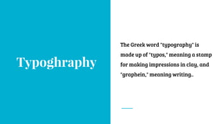
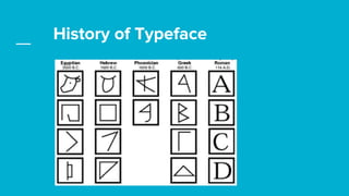
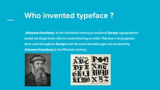
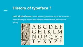
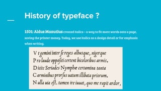
Mastering Typography
Behance.net/sbshahria
dribbble/sbshahria
Typoghraphy
The Greek word "typography" is
made up of "typos," meaning a stamp
for making impressions in clay, and
"graphein," meaning writing..
1.What Typography ?
Typography is the art and technique of arranging type to
make written language legible, readable, and appealing when
displayed.
Typeface vs Font
Typeface : A typeface is a design created by a typographer or type designer. It
incorporates the specific letter-forms that include the variations of stroke weight, the
forms of serifs, the counter shapes, the finial styles, the lengths of ascenders and
descenders, and any other characteristics that differ from one type design to another.
Typeface vs Font
Font : A font is the digital representation of a typeface. It is a collection of all the
characters of a typeface in one size (12pt/1in) and one style (bold/italic). For example,
Arial in 12pt size is a font, Arial in 18pt size is a font, and Arial bold in 24pt is also a
font. Adobe's type glossary lists a font as “one weight, width, and style of a typeface.”
Typeface vs Font
Font-family: The complete assembly of all sizes and styles of one typeface forms a
type family. Web designers sometimes refer to it as a “font family” because that is the
name of the CSS declaration. Usually the type family has the same name as the
typeface. A type family may contain many variations, but all variations are based on
common design characteristics. For example, the Caslon family consists of styles such
as Roman (Regular), Italic, Semibold, Semibold Italic, Bold, and Bold Italic. Each of the
style and weight combinations is a typeface, and together they form a type family.
History of Typeface
Who invented typeface ?
Johannes Gutenberg : In the thirteenth century in medieval Europe, typographers
would use single letter tiles to create lettering on walls. This was a very popular
form used throughout Europe until the metal movable type was invented by
Johannes Gutenberg in the fifteenth century.
History of typeface ?
1470: Nicolas Jenson created Roman Type, inspired by the text on ancient
roman buildings. It was far more readable than blackletter, and caught on
quickly.
History of typeface ?
1501: Aldus Manutius created italics – a way to fit more words onto a page,
saving the printer money. Today, we use italics as a design detail or for emphasis
when writing.
History of typeface ?
1734: William Caslon created a typeface which features straighter serifs and
much more obvious contrasts between thin and bold strokes. Today, we call this
type style ‘old style’.
History of typeface ?
After that John Baskerville , Firmin Didot and Giambattista Bodoni deveoped
some another font for better legability.
History of typeface ?
1816 William Caslon IV created the first typeface without any serifs at all. It was
widely rebuked at the time. This was the start of what we now consider Sans Serif
typefaces. During this time, type exploded, and many, many variations were
being created to accommodate advertising.
Classification of Typefaces
1. Serif
2. Sans-serif
3. Script
4. Display / Decorative
Serif Font
Serif typefaces are called “serifs” in
reference to the small lines that are
attached to the main strokes of
characters within the face. Serif
typefaces are most often used for body
copy in print documents, as well as for
both body text and headlines online.
Sans Serif Font
Sans-serif typefaces are called such
because they lack serif details on
characters. Sans-serif typefaces are
often more modern in appearance than
serifs. The first sans-serifs were
created in the late 18th century.
Script Font
Fonts that fall into the script category
are those that have the appearance of
hand lettering with a brush,
calligraphy pen or pencil.
Decorative Font
Decorative and display fonts became popular
in the 19th century and were used extensively
on posters and advertisements. This style of
type and lettering could be artistic and eye-
catching in a way that wasn’t considered
previously. William Morris launched the Arts
and Crafts movement and as part of the
experimentation and innovation of the time,
developed the Troy typeface.
Difference Between Kerning,
Leading and Tracking
Space is as much a design tool as color or form. The spaces between
letters is defined in three ways. Three ways are kerning, Leading ,
Tracking.
Kerning
In typography, kerning is the process of
adjusting the spacing between characters in a
proportional font, usually to achieve a visually
pleasing result. Kerningadjusts the space
between individual letter forms, while tracking
(letter-spacing) adjusts spacing uniformly over
a range of characters.
Leading
Leading refers to the distance between the
baselines of successive lines of type. The term
originated in the days of hand-typesetting,
when thin strips of lead were inserted into the
forms to increase the vertical distance between
lines of type.
Tracking
In typography, letter-spacing, usually called
trackingby typographers, refers to a consistent
degree of increase (or sometimes decrease) of
space between letters to affect density in a line
or block of text. Letter-spacing should not be
confused with kerning.
Practice, Practice, and Practice some more.
Constant practice sharpens your skills. Knowing typography rules and guidelines can improve
practically everything you design that has a key typographic component. Practicing these rules
over and over helps you to easily master them. It’s only through actual training that you get to
fully understand how each rule works.
Anatomy of a Typeface
http://typedia.com/learn/only/anatomy-of-a-typeface/
Homework
Goals for next meeting

Basic to Mastering Typography

  • 1.
  • 2.
    Typoghraphy The Greek word"typography" is made up of "typos," meaning a stamp for making impressions in clay, and "graphein," meaning writing..
  • 3.
    1.What Typography ? Typographyis the art and technique of arranging type to make written language legible, readable, and appealing when displayed.
  • 4.
    Typeface vs Font Typeface: A typeface is a design created by a typographer or type designer. It incorporates the specific letter-forms that include the variations of stroke weight, the forms of serifs, the counter shapes, the finial styles, the lengths of ascenders and descenders, and any other characteristics that differ from one type design to another.
  • 5.
    Typeface vs Font Font: A font is the digital representation of a typeface. It is a collection of all the characters of a typeface in one size (12pt/1in) and one style (bold/italic). For example, Arial in 12pt size is a font, Arial in 18pt size is a font, and Arial bold in 24pt is also a font. Adobe's type glossary lists a font as “one weight, width, and style of a typeface.”
  • 6.
    Typeface vs Font Font-family:The complete assembly of all sizes and styles of one typeface forms a type family. Web designers sometimes refer to it as a “font family” because that is the name of the CSS declaration. Usually the type family has the same name as the typeface. A type family may contain many variations, but all variations are based on common design characteristics. For example, the Caslon family consists of styles such as Roman (Regular), Italic, Semibold, Semibold Italic, Bold, and Bold Italic. Each of the style and weight combinations is a typeface, and together they form a type family.
  • 7.
  • 8.
    Who invented typeface? Johannes Gutenberg : In the thirteenth century in medieval Europe, typographers would use single letter tiles to create lettering on walls. This was a very popular form used throughout Europe until the metal movable type was invented by Johannes Gutenberg in the fifteenth century.
  • 9.
    History of typeface? 1470: Nicolas Jenson created Roman Type, inspired by the text on ancient roman buildings. It was far more readable than blackletter, and caught on quickly.
  • 10.
    History of typeface? 1501: Aldus Manutius created italics – a way to fit more words onto a page, saving the printer money. Today, we use italics as a design detail or for emphasis when writing.
  • 11.
    History of typeface? 1734: William Caslon created a typeface which features straighter serifs and much more obvious contrasts between thin and bold strokes. Today, we call this type style ‘old style’.
  • 12.
    History of typeface? After that John Baskerville , Firmin Didot and Giambattista Bodoni deveoped some another font for better legability.
  • 13.
    History of typeface? 1816 William Caslon IV created the first typeface without any serifs at all. It was widely rebuked at the time. This was the start of what we now consider Sans Serif typefaces. During this time, type exploded, and many, many variations were being created to accommodate advertising.
  • 14.
    Classification of Typefaces 1.Serif 2. Sans-serif 3. Script 4. Display / Decorative
  • 15.
    Serif Font Serif typefacesare called “serifs” in reference to the small lines that are attached to the main strokes of characters within the face. Serif typefaces are most often used for body copy in print documents, as well as for both body text and headlines online.
  • 16.
    Sans Serif Font Sans-seriftypefaces are called such because they lack serif details on characters. Sans-serif typefaces are often more modern in appearance than serifs. The first sans-serifs were created in the late 18th century.
  • 17.
    Script Font Fonts thatfall into the script category are those that have the appearance of hand lettering with a brush, calligraphy pen or pencil.
  • 18.
    Decorative Font Decorative anddisplay fonts became popular in the 19th century and were used extensively on posters and advertisements. This style of type and lettering could be artistic and eye- catching in a way that wasn’t considered previously. William Morris launched the Arts and Crafts movement and as part of the experimentation and innovation of the time, developed the Troy typeface.
  • 19.
    Difference Between Kerning, Leadingand Tracking Space is as much a design tool as color or form. The spaces between letters is defined in three ways. Three ways are kerning, Leading , Tracking.
  • 20.
    Kerning In typography, kerningis the process of adjusting the spacing between characters in a proportional font, usually to achieve a visually pleasing result. Kerningadjusts the space between individual letter forms, while tracking (letter-spacing) adjusts spacing uniformly over a range of characters.
  • 21.
    Leading Leading refers tothe distance between the baselines of successive lines of type. The term originated in the days of hand-typesetting, when thin strips of lead were inserted into the forms to increase the vertical distance between lines of type.
  • 22.
    Tracking In typography, letter-spacing,usually called trackingby typographers, refers to a consistent degree of increase (or sometimes decrease) of space between letters to affect density in a line or block of text. Letter-spacing should not be confused with kerning.
  • 23.
    Practice, Practice, andPractice some more. Constant practice sharpens your skills. Knowing typography rules and guidelines can improve practically everything you design that has a key typographic component. Practicing these rules over and over helps you to easily master them. It’s only through actual training that you get to fully understand how each rule works.
  • 24.
    Anatomy of aTypeface http://typedia.com/learn/only/anatomy-of-a-typeface/
  • 25.
  • 26.