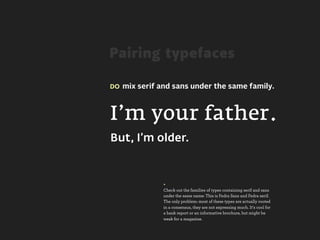
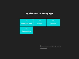
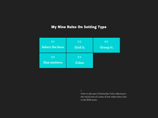
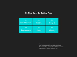
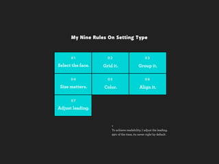
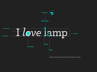
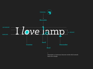
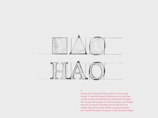
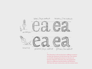
Download as PDF, PPTX


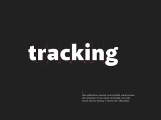

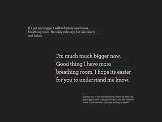


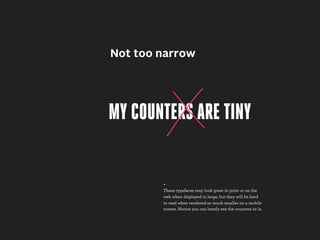
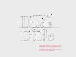
![[-]Space
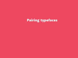
+
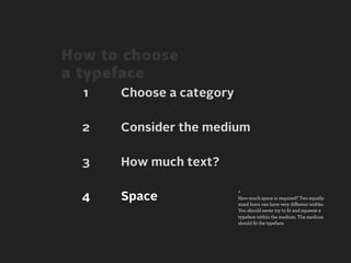
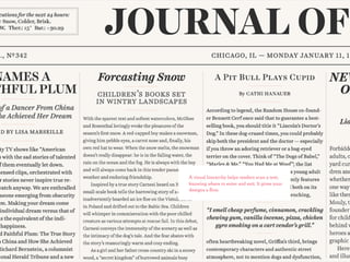
Every design has whitespace (negative space), but
the problem is that not every design has enough.
Its a very under-utilized element. For those who
don’t understand what whitespace is, the following
slide will give you an idea of what whitespace is.](https://image.slidesharecdn.com/thingsiknowabouttype-fieldguide-121030022134-phpapp02/85/Things-I-Know-About-Type-Field-Guide-45-320.jpg)

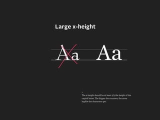
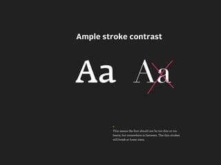


This document provides an overview of typography principles and best practices for setting type. It discusses selecting appropriate typefaces, using a grid system, grouping similar information, using size, color and alignment to create hierarchy, adjusting leading and kerning for readability. The document emphasizes the importance of legibility, readability, and using techniques like adequate whitespace and appropriate choices for mobile screens.