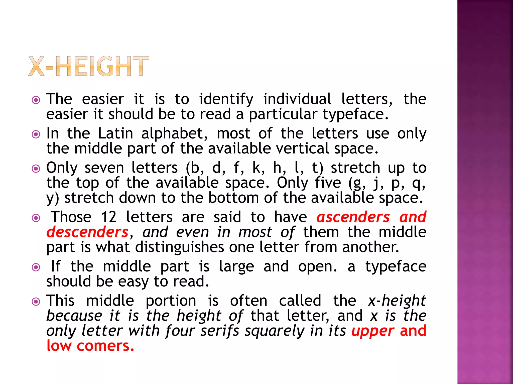
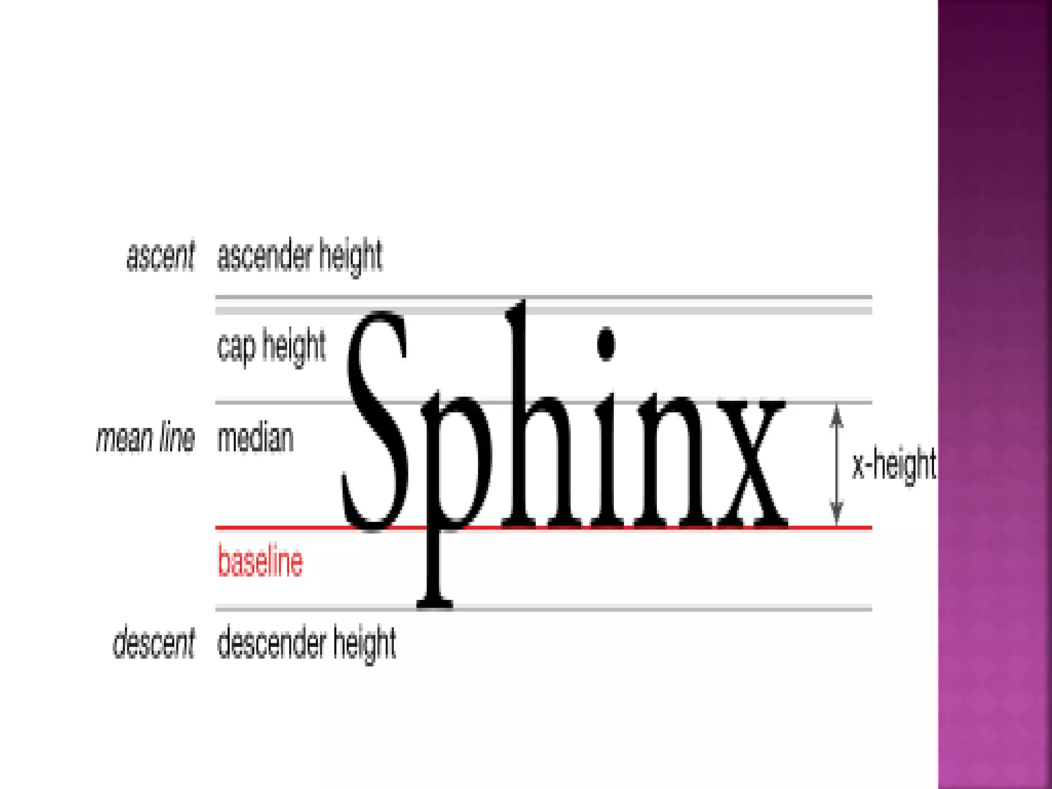
This document discusses typography and typefaces. It begins by defining typography as the design and use of letterforms in printing. It then defines a typeface as a set of fonts that share design features like weight, style, and width. The document goes on to categorize and provide examples of different sans serif typeface classifications like grotesque, neo-grotesque, geometric, humanist, and informal. It also discusses typographic measurements like points, picas, and ems. The document concludes by discussing characteristics that make some typefaces like Helvetica easy to read.
Do you want to learn about typography art technique? Then come to Graphic Designing Institute in Delhi which allows you to write content in various ways.
Here we are giving an comprehensive presentation on typography. the presentation will be help full for both the beginner and professional graphic designer.
part 2 of 2 for the Unit 2 typography introduction
(NOTE: one of the fonts did not come through --- on the Old Style/Transitional Slide --> that is NOT Goudy; that's Arial).
part 2 of 2 for the Unit 2 typography introduction
(NOTE: one of the fonts did not come through --- on the Old Style/Transitional Slide --> that is NOT Goudy; that's Arial).
➢ Words and symbols in any form, spoken or written, are the most common means of communication.
➢ Texts in the form of words, sentences, and paragraphs are used to
communicate thoughts, ideas, and facts in nearly every aspect of our lives.
➢ Text is a vital element of multimedia menus, navigation systems, and content.
➢ Multimedia developers must use words carefully and accurately.
A font is a graphical representation of text that may include a different typeface, point, size, weight, color, or design. The picture shows some examples of different computer fonts.
How to Make a Field invisible in Odoo 17Celine George
It is possible to hide or invisible some fields in odoo. Commonly using “invisible” attribute in the field definition to invisible the fields. This slide will show how to make a field invisible in odoo 17.
Ethnobotany and Ethnopharmacology:
Ethnobotany in herbal drug evaluation,
Impact of Ethnobotany in traditional medicine,
New development in herbals,
Bio-prospecting tools for drug discovery,
Role of Ethnopharmacology in drug evaluation,
Reverse Pharmacology.
The French Revolution, which began in 1789, was a period of radical social and political upheaval in France. It marked the decline of absolute monarchies, the rise of secular and democratic republics, and the eventual rise of Napoleon Bonaparte. This revolutionary period is crucial in understanding the transition from feudalism to modernity in Europe.
For more information, visit-www.vavaclasses.com
Model Attribute Check Company Auto PropertyCeline George
In Odoo, the multi-company feature allows you to manage multiple companies within a single Odoo database instance. Each company can have its own configurations while still sharing common resources such as products, customers, and suppliers.
The Art Pastor's Guide to Sabbath | Steve ThomasonSteve Thomason
What is the purpose of the Sabbath Law in the Torah. It is interesting to compare how the context of the law shifts from Exodus to Deuteronomy. Who gets to rest, and why?
Unit 8 - Information and Communication Technology (Paper I).pdfThiyagu K
This slides describes the basic concepts of ICT, basics of Email, Emerging Technology and Digital Initiatives in Education. This presentations aligns with the UGC Paper I syllabus.
Palestine last event orientationfvgnh .pptxRaedMohamed3
An EFL lesson about the current events in Palestine. It is intended to be for intermediate students who wish to increase their listening skills through a short lesson in power point.
The Indian economy is classified into different sectors to simplify the analysis and understanding of economic activities. For Class 10, it's essential to grasp the sectors of the Indian economy, understand their characteristics, and recognize their importance. This guide will provide detailed notes on the Sectors of the Indian Economy Class 10, using specific long-tail keywords to enhance comprehension.
For more information, visit-www.vavaclasses.com
2024.06.01 Introducing a competency framework for languag learning materials ...Sandy Millin
http://sandymillin.wordpress.com/iateflwebinar2024
Published classroom materials form the basis of syllabuses, drive teacher professional development, and have a potentially huge influence on learners, teachers and education systems. All teachers also create their own materials, whether a few sentences on a blackboard, a highly-structured fully-realised online course, or anything in between. Despite this, the knowledge and skills needed to create effective language learning materials are rarely part of teacher training, and are mostly learnt by trial and error.
Knowledge and skills frameworks, generally called competency frameworks, for ELT teachers, trainers and managers have existed for a few years now. However, until I created one for my MA dissertation, there wasn’t one drawing together what we need to know and do to be able to effectively produce language learning materials.
This webinar will introduce you to my framework, highlighting the key competencies I identified from my research. It will also show how anybody involved in language teaching (any language, not just English!), teacher training, managing schools or developing language learning materials can benefit from using the framework.
Synthetic Fiber Construction in lab .pptxPavel ( NSTU)
Synthetic fiber production is a fascinating and complex field that blends chemistry, engineering, and environmental science. By understanding these aspects, students can gain a comprehensive view of synthetic fiber production, its impact on society and the environment, and the potential for future innovations. Synthetic fibers play a crucial role in modern society, impacting various aspects of daily life, industry, and the environment. ynthetic fibers are integral to modern life, offering a range of benefits from cost-effectiveness and versatility to innovative applications and performance characteristics. While they pose environmental challenges, ongoing research and development aim to create more sustainable and eco-friendly alternatives. Understanding the importance of synthetic fibers helps in appreciating their role in the economy, industry, and daily life, while also emphasizing the need for sustainable practices and innovation.
The Roman Empire A Historical Colossus.pdfkaushalkr1407
The Roman Empire, a vast and enduring power, stands as one of history's most remarkable civilizations, leaving an indelible imprint on the world. It emerged from the Roman Republic, transitioning into an imperial powerhouse under the leadership of Augustus Caesar in 27 BCE. This transformation marked the beginning of an era defined by unprecedented territorial expansion, architectural marvels, and profound cultural influence.
The empire's roots lie in the city of Rome, founded, according to legend, by Romulus in 753 BCE. Over centuries, Rome evolved from a small settlement to a formidable republic, characterized by a complex political system with elected officials and checks on power. However, internal strife, class conflicts, and military ambitions paved the way for the end of the Republic. Julius Caesar’s dictatorship and subsequent assassination in 44 BCE created a power vacuum, leading to a civil war. Octavian, later Augustus, emerged victorious, heralding the Roman Empire’s birth.
Under Augustus, the empire experienced the Pax Romana, a 200-year period of relative peace and stability. Augustus reformed the military, established efficient administrative systems, and initiated grand construction projects. The empire's borders expanded, encompassing territories from Britain to Egypt and from Spain to the Euphrates. Roman legions, renowned for their discipline and engineering prowess, secured and maintained these vast territories, building roads, fortifications, and cities that facilitated control and integration.
The Roman Empire’s society was hierarchical, with a rigid class system. At the top were the patricians, wealthy elites who held significant political power. Below them were the plebeians, free citizens with limited political influence, and the vast numbers of slaves who formed the backbone of the economy. The family unit was central, governed by the paterfamilias, the male head who held absolute authority.
Culturally, the Romans were eclectic, absorbing and adapting elements from the civilizations they encountered, particularly the Greeks. Roman art, literature, and philosophy reflected this synthesis, creating a rich cultural tapestry. Latin, the Roman language, became the lingua franca of the Western world, influencing numerous modern languages.
Roman architecture and engineering achievements were monumental. They perfected the arch, vault, and dome, constructing enduring structures like the Colosseum, Pantheon, and aqueducts. These engineering marvels not only showcased Roman ingenuity but also served practical purposes, from public entertainment to water supply.
How to Create Map Views in the Odoo 17 ERPCeline George
The map views are useful for providing a geographical representation of data. They allow users to visualize and analyze the data in a more intuitive manner.
Digital Tools and AI for Teaching Learning and Research
Science of font
1. Compiled by:
Dr. Arpita Sharma
Assistant Professor,
Dept. of Agricultural Communication, College of Agriculture
GBPUA&T, Pantnagar
Email Id: sharmaarpita615@gmail.com
AAC-640
Publication, Production and
Editing
2. The design and use of letterforms in printing
is a special subject called typography.
In printing, letterforms are divided into
typefaces, which are something like species
in the natural sciences.
A typeface is an alphabet with specific
characteristics by which it can be
distinguished from any other typeface.
3.
4.
5.
6. Sans serif fonts have a reputation of being
more modern, casual, informal and friendly
that serif fonts.
Although serif fonts dominate the world of
print particularly for long sections of body
copy.
They are also the frequent choice of the
publishers of children's books because the
letters are easier to recognize.
7. In print, small serifs can break up when
they are reversed out of a dark color or
photograph; sans serif type is almost always
the better choice in this instance.
Sans serif fonts work well for short sections
of text, such as credits and captions. When
a project calls for very small type sizes,
sans serif type is easier to read.
9. Grotesque sans serif typefaces were the first
ones that were commercially available.
They were designed in the 19th and early
20th centuries and had some awkward
curves with little variation in stroke width.
Franklin Gothic
News Gothic
Akzidenz-Grotesk
10. Neo-Grotesque fonts (also known as
Realists or Transitionals) are more polished
than the grotesque san serif typefaces.
This classification includes the most
frequently used sans serif fonts.
Helvetica
Univers
Arial
Bell Centennial
Geneva
Impact
11. Geometric san serif fonts are built on
geometric shapes rather than on early
letterforms or calligraphy.
They display little or no stroke weight
contrast.
Futura
Avenir
Bauhaus
Kabel
Avant Garde
Eurostile
12. Humanist typefaces are identified by their
calligraphic influence and uneven stroke
weights and most of the fonts bearing this
description are more legible choices than
other san serif faces.
Gill Sans
Frutiger
Myriad
Optima
Trebuchet
Calibri
13. Informal sans serif fonts are often used as
novelties, so they are less frequently used
than other sans serif fonts. They include
Eneas Expanded
Italo
Barrio
ABeeZee
Bahiana
High School USA Sans
14. In typography, a typeface (also known as
font family) is a set of one or more fonts
each composed of glyphs that share common
design features.
Each font of a typeface has a specific
weight, style, condensation, width, slant,
italicization, ornamentation, and designer
or foundry (and formerly size, in metal
fonts).
15. Type is measured in special units.
The point (pt) is the smallest unit.
One point is 0.01384 of an inch or 0.3515
mm.
For practical purposes, we can say there are
72 points in an inch or 28.5 points in a
centimeter.
Points are used to measure the size of type.
The size of a typeface is basically the
distance from the highest point to the lowest
point in the alphabet.
16. Points are also used to measure small
distances in space between lines or
characters in type.
The pica is the second principal measure
of length. One pica equals 12 points.
Picas are used to measure the width of a line
of type or the dimensions of a type area.
The text lines on this page are a maximum of
27 picas wide.
The area of text type is 27 × 54 picas.
17. Picas and points are measures of linear
distance.
An em is a measure of area.
It is not a fixed size.
It is an area equal to the square of the size
of type being used.
A 10 pt em is 10 x 10 pt.
A 14 pt em is 14 x 14 pt.
18. Ems are used to measure space in
typesetting.
For example, the first line in a paragraph
may be indented 1 or 2 ems. Or a paragraph
quoted from another work may be indented 1
em on either side.
19. It is widely available on almost every form of
typesetting equipment.
• It is available in all sizes, from 6 pt to 72 pt,
and has a wide range of symbols and accents.
• It is easy to read.
• It is compact: a large number of words fit on
a page.
• There are no fussy details. It does not call
attention to itself.
• It is neutral. It can be used for many different
kinds of messages.
• People are used to reading it. They feel
comfortable with it.
20. Helvetica is perhaps the most popular of several sans serif
faces that look similar. If Helvetica is unavailable,
typesetters may have Univers or Megaron.
Helvetica is popular for several reasons.
• It has a clean, modem look.
• It is easy to read, especially in short texts.
• It is compact.
• It or its look-alikes are widely available on all typesetting
systems.
• It is available in a wide range of sizes and weights
(regular, light, bold,
• It is especially good for lettering on charts, graphs,
maps, and
• It is neutral in character, and therefore good for a
variety of work.
• It works well with a variety of other typefaces.
21. The easier it is to identify individual letters, the
easier it should be to read a particular typeface.
In the Latin alphabet, most of the letters use only
the middle part of the available vertical space.
Only seven letters (b, d, f, k, h, l, t) stretch up to
the top of the available space. Only five (g, j, p, q,
y) stretch down to the bottom of the available space.
Those 12 letters are said to have ascenders and
descenders, and even in most of them the middle
part is what distinguishes one letter from another.
If the middle part is large and open. a typeface
should be easy to read.
This middle portion is often called the x-height
because it is the height of that letter, and x is the
only letter with four serifs squarely in its upper and
low comers.