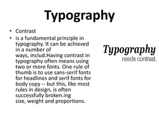
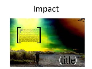
Call Girls in Kalkaji Delhi 8264348440 call girls ❤️
Presentation1
1.
2. Typography
• Contrast
• is a fundamental principle in
typography. It can be achieved
in a number of
ways, includ.Having contrast in
typography often means using
two or more fonts. One rule of
thumb is to use sans-serif fonts
for headlines and serif fonts for
body copy -- but this, like most
rules in design, is often
successfully broken.ing
size, weight and proportions.
3. Readability
• Legibility is critical in typography -- the
point of type, after all, is to be read.
Some fonts are legible in all sizes, and
others are designed to be displayed only
in large sizes. These are called display
fonts. Other fonts are designed to be
legible at small sizes, but don't look good
when displayed large.
5. Readability
• One font that is both legible at small sizes and
suitable as a headline font is Helvetica. While
admittedly done to death, it's hard to make
Helvetica look bad. And it's still the go-to font
for designers looking for a legible but
attractive caption font.
6. Fonts to Avoid
• Certain fonts, whether through misuse or bad
design, have developed a stigma among
designers.
• These fonts may have a place, but it is not in
design.
7. Fonts to avoid
• Not only do these fonts have a stigma behind
them, but they encourage laziness. One
theory of design says that your typeface
should not have any implications about the
content. You should not even be consciously
aware that the typeface is there. You may be
attempting to be cheeky or playful by using
these fonts, but they serve only to detract
from what could have been good design.
8. Fonts to avoid
• Unless you're writing a comic book, don't use
Comic Sans. Unless you're writing a screen
play, don't use Courier. And unless you're
designing an ironically inaccurate depiction of
an Egyptian scroll, don't use Papyrus.
• And Curlz MT? That one should be selfexplanatory.
9. Eyeliness
• When elements in a layout line up, they create
eyelines.
• Eyelines lead a viewers eye across a
spread, creating what designers call "movement."
It creates a sense of unity across both pages in a
spread.
• Guidelines provide an easy way to create
eyelines.
• A successful spread will have at least one eyeline
to guide a viewer across both pages of the layout.
10. White Space
• White Space
• White space is, quite literally, the space that is
not filled by any objects. A lot of white space
can be used to create a clean look, whereas
very little white space can be intentionally
chaotic.
• There are varying levels of white space, from
the space between the characters of a
typeface to the size of the margins in a layout.
11. Impact
• Impact can be established in any number of
ways. A good place to start is with the elements
discuss above: sound typography, eyelines and
white space.
• Sometimes, however, great photography or
simplicity in design can create impact all by
itself.