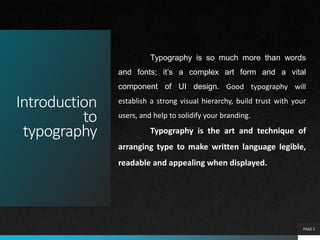
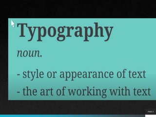
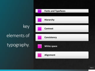
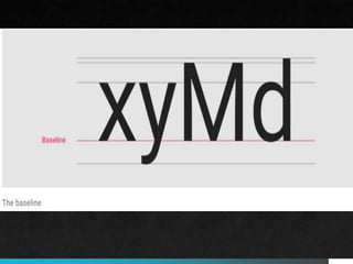
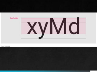
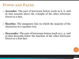
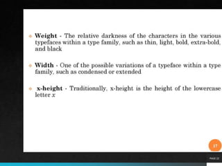
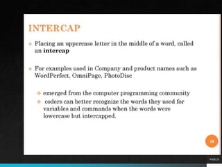
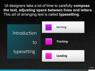
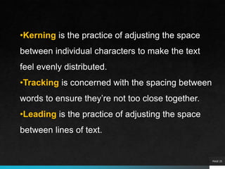
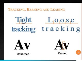
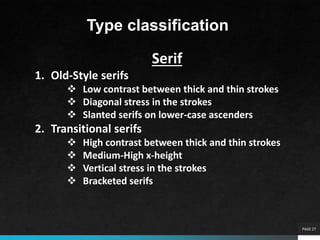
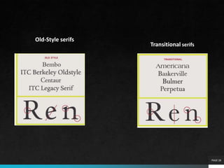
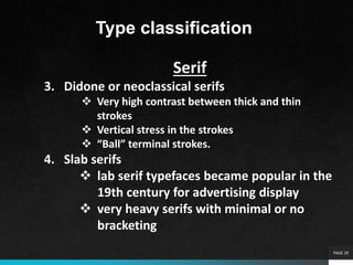
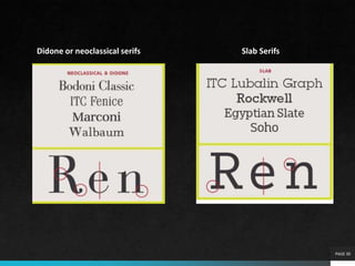
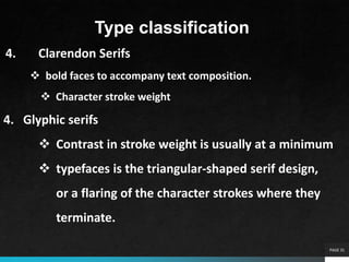
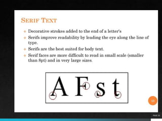
Unit3
TYPOGRAPHY
PAGE 1
Introduction
to
typography
PAGE 2
Typography is so much more than words
and fonts; it’s a complex art form and a vital
component of UI design. Good typography will
establish a strong visual hierarchy, build trust with your
users, and help to solidify your branding.
Typography is the art and technique of
arranging type to make written language legible,
readable and appealing when displayed.
PAGE 3
key
elements of
typography.
Fonts and Typefaces
Hierarchy
Contrast
Consistency
White space
Alignment
PAGE 4
Fontsand
Typefaces
The terms ‘font’ and ‘typeface’
are often used interchangeably,
but they actually refer to
different things.
A typeface is a family of related
fonts, while fonts refer to the
weights, widths, and styles that
constitute a typeface. For
example, Ariel is a typeface,
and Ariel Bold is a font.
PAGE 5
PAGE 6
Hierarchy
Typographical hierarchy is the process of using sizing, color, contrast, and
alignment to guide users on which text should be noticed and read first. A
typical example of typographical hierarchy is size: headings should always
be larger than subheadings and standard text. Below, you can see that the
headings are considerably larger than the body text.
Contrast
Like hierarchy, contrast helps to convey which ideas or messages you want
to emphasize to your readers. You can create contrast by playing with
varying typefaces, colors, styles, and sizes to create visual impact and
break up the page’s text.
Consistency
Though it might seem like a contradiction to the above points, consistency
is key if you want to avoid a confusing and messy interface. It’s good
practice to establish a consistent hierarchy of typefaces (one consistent
font for headers, another for subheadings) and stick to it.
PAGE 7
White space
Also known as ‘negative space,’ white space is the blank area around
text or graphics. It mostly goes unnoticed by the user, but white
space is vital for establishing hierarchy and keeping the interface
uncluttered.
Alignment
Alignment is the process of unifying and composing text, graphics,
and images to ensure equal space, size, and distance between each
element. For example, aligning your text to the right will seem
counterintuitive for readers who read left to right.
Type properties
PAGE 8
A typeface is a collection of letters.
While each letter is unique, certain
shapes are shared across letters. A
typeface represents shared patterns
across a collection of letters.
Typefaces that are selected for their
style, legibility, and readability are
most effective when following the
fundamental principles of
typographic design.
PAGE 9
PAGE 10
PAGE 11
PAGE 12
Baseline
PAGE 13
The baseline is the invisible line
upon which a line of text rests. In
Material Design, the baseline is an
important specification in measuring
the vertical distance between text
and an element.
Typefaces that are selected for their
style, legibility, and readability are
most effective when following the
fundamental principles of
typographic design.
Capheight
PAGE 15
Cap height refers to the height of a
typeface’s flat capital letters (such as
M or I) measured from the baseline.
Round and pointed capital letters,
such as S and A, are optically
adjusted by being drawn with a slight
overshoot above the cap height to
achieve the effect of being the same
size. Every typeface has a unique cap
height.
X-height
PAGE 17
X-height refers to the height of the
lowercase x for a typeface, and it
indicates how tall or short each
glyph in a typeface will be.
Typefaces with tall x-heights have
better legibility at small font sizes, as
the white space within each letter is
more legible.
Ascenders are an upward vertical stroke found in certain
lowercase letters that extend beyond either the cap height or
baseline. Descenders are the downward vertical...
Ascenders are an upward vertical stroke found in certain
lowercase letters that extend beyond either the cap height or
baseline. Descenders are the downward vertical stroke in these
letters. In some cases, a collision between these strokes can
occur when the line height (the vertical distance between
baselines) is too tight.
Ascenders and descenders
PAGE 21
PAGE 22
PAGE 23
Introduction
to
typesetting .
kerning
Tracking
Leading
PAGE 24
UI designers take a lot of time to carefully compose
the text, adjusting space between lines and letters.
This art of arranging text is called typesetting.
PAGE 25
•Kerning is the practice of adjusting the space
between individual characters to make the text
feel evenly distributed.
•Tracking is concerned with the spacing between
words to ensure they’re not too close together.
•Leading is the practice of adjusting the space
between lines of text.
PAGE 26
PAGE 27
Type classification
Serif
1. Old-Style serifs
 Low contrast between thick and thin strokes
 Diagonal stress in the strokes
 Slanted serifs on lower-case ascenders
2. Transitional serifs
 High contrast between thick and thin strokes
 Medium-High x-height
 Vertical stress in the strokes
 Bracketed serifs
PAGE 28
Old-Style serifs
Transitional serifs
PAGE 29
Type classification
Serif
3. Didone or neoclassical serifs
 Very high contrast between thick and thin
strokes
 Vertical stress in the strokes
 “Ball” terminal strokes.
4. Slab serifs
 lab serif typefaces became popular in the
19th century for advertising display
 very heavy serifs with minimal or no
bracketing
PAGE 30
Didone or neoclassical serifs Slab Serifs
PAGE 31
Type classification
4. Clarendon Serifs
 bold faces to accompany text composition.
 Character stroke weight
4. Glyphic serifs
 Contrast in stroke weight is usually at a minimum
 typefaces is the triangular-shaped serif design,
or a flaring of the character strokes where they
terminate.
PAGE 32
Sans Serif Type Styles
 Grotesque Sans Serif
 Square Sans Serif
 Geometric Sans Serif
 Humanistic Sans Serif
PAGE 33
Script Type Styles
 Formal Scripts
 Calligraphic Scripts
 Blackletter & Lombardic Scripts
 Casual Scripts
 Decorative Styles
PAGE 34
Anti-alias
Text antialiasing is a technique used to smooth the
edges of text on a screen.
PAGE 35
Sometimes abbreviated as AA, anti-aliasing is a term
used to describe the software process of making the
edges of graphics objects or fonts smoother.
Accomplished by adding additional pixels in-between
the edges of an object and its background. Anti-
aliasing improves the appearance of polygon edges,
so they are not "jagged" but are smoothed out on
the screen.
PAGE 36
In the example image, we show a zoomed and non-
zoomed 'e' without antialiasing (top) and with anti-
aliasing (bottom). As shown in the top example, the
edges appear to be jagged without antialiasing when
using a bitmap font. Programs that support text
antialiasing have an option that can be checked or
selected to enable antialiasing.
PAGE 37
PAGE 38
Special font effects
PAGE 39
Text with font effects applied
Examples of the shadow, outline, emboss, and engrave font
effects
Shadow darkens the text and adds a slight shadow behind it.
Outline removes the solid fill of the text, leaving just an
outline.
Emboss makes the text look like it’s raised off the page in
relief.
Engrave makes the text appear pressed into the page.
A font that is created in the required point size when
needed for display or printing. The dot patterns
(bitmaps) are generated from a set of outline fonts,
or base fonts, which contain a mathematical
representation of the typeface.
PAGE 40
A scalable font made of point-to-point line segments.
Like vector-based images, vector fonts are easily scaled
but lack the hints and mathematically defined curves of
outline fonts, such as Adobe Type 1 and TrueType
The two major scalable fonts are Adobe's Type 1
PostScript and Apple/Microsoft's TrueType.
scalable fonts eliminate storing hundreds of different
sizes of fonts on disk.
PAGE 41
PAGE 42
Bitmap font
A bitmap font is a font with jagged edges when enlarged,
instead of a scalable font where no matter what the size,
it looks the same. Bitmap fonts are comprised of several
dots that make up a single character.
bitmapped font that is designed from scratch for a particular font size will always look
the best,
PAGE 43
The picture above is an example of scalable font vs. a
bitmap font. As you zoom in on Computer Hope, there is
no degradation in quality with a scalable font. However,
it's the complete opposite when we zoom into a bitmap
font.
PAGE 44
PAGE 47
Using
in Text in Multimedia
Definition of Text
1. Text is words and symbols in any form, spoken or written, are
the most common system of communication.
2. Text is used in most Multimedia applications.
3. With multimedia technology, text can be combined with
other media in a powerful and meaningful way to present
information and express moods.
4. Text is the easiest to manipulate.
PAGE 48
PAGE 49
PAGE 50
PAGE 51
PAGE 52
Using
in Text in Multimedia
Text Usages
1. Heading / Title
2. Bullet / list
3. Paragraph
4. Scrolling text
5. Navigation
6. Text as graphics
PAGE 53
PAGE 54
PAGE 55
PAGE 56
PAGE 57
What is meant by font editing?
The ability to change text by adding, deleting and rearranging letters, words,
sentences and paragraphs. Text editing is the main operation users perform in
word processors, which typically also handle graphics and other multimedia files.
Which one is the example font editing and designing tool?
FontCreator. FontCreator is a Windows-only font editor. It has an advanced set of
features that make it suitable for professional font designers and an easy-to-use
interface that’s beginner-friendly. You can create and edit high-quality TrueType,
and OpenType fonts as well as convert scanned vector graphics into glyphs
PAGE 58
5 best font editors
1) Fontlab Studio. FontLab is expensive
2) FontCreator. Boasting over 4.5 million downloads
to date, FontCreator is a popular font editor
among creatives.
3) Fontographer. FontLab also created
Fontographer for those with less of a budget.
4) Glyphs.
5) Robofont.

Typography

  • 1.
  • 2.
    Introduction to typography PAGE 2 Typography isso much more than words and fonts; it’s a complex art form and a vital component of UI design. Good typography will establish a strong visual hierarchy, build trust with your users, and help to solidify your branding. Typography is the art and technique of arranging type to make written language legible, readable and appealing when displayed.
  • 3.
  • 4.
    key elements of typography. Fonts andTypefaces Hierarchy Contrast Consistency White space Alignment PAGE 4
  • 5.
    Fontsand Typefaces The terms ‘font’and ‘typeface’ are often used interchangeably, but they actually refer to different things. A typeface is a family of related fonts, while fonts refer to the weights, widths, and styles that constitute a typeface. For example, Ariel is a typeface, and Ariel Bold is a font. PAGE 5
  • 6.
    PAGE 6 Hierarchy Typographical hierarchyis the process of using sizing, color, contrast, and alignment to guide users on which text should be noticed and read first. A typical example of typographical hierarchy is size: headings should always be larger than subheadings and standard text. Below, you can see that the headings are considerably larger than the body text. Contrast Like hierarchy, contrast helps to convey which ideas or messages you want to emphasize to your readers. You can create contrast by playing with varying typefaces, colors, styles, and sizes to create visual impact and break up the page’s text. Consistency Though it might seem like a contradiction to the above points, consistency is key if you want to avoid a confusing and messy interface. It’s good practice to establish a consistent hierarchy of typefaces (one consistent font for headers, another for subheadings) and stick to it.
  • 7.
    PAGE 7 White space Alsoknown as ‘negative space,’ white space is the blank area around text or graphics. It mostly goes unnoticed by the user, but white space is vital for establishing hierarchy and keeping the interface uncluttered. Alignment Alignment is the process of unifying and composing text, graphics, and images to ensure equal space, size, and distance between each element. For example, aligning your text to the right will seem counterintuitive for readers who read left to right.
  • 8.
    Type properties PAGE 8 Atypeface is a collection of letters. While each letter is unique, certain shapes are shared across letters. A typeface represents shared patterns across a collection of letters. Typefaces that are selected for their style, legibility, and readability are most effective when following the fundamental principles of typographic design.
  • 9.
  • 10.
  • 11.
  • 12.
  • 13.
    Baseline PAGE 13 The baselineis the invisible line upon which a line of text rests. In Material Design, the baseline is an important specification in measuring the vertical distance between text and an element. Typefaces that are selected for their style, legibility, and readability are most effective when following the fundamental principles of typographic design.
  • 15.
    Capheight PAGE 15 Cap heightrefers to the height of a typeface’s flat capital letters (such as M or I) measured from the baseline. Round and pointed capital letters, such as S and A, are optically adjusted by being drawn with a slight overshoot above the cap height to achieve the effect of being the same size. Every typeface has a unique cap height.
  • 17.
    X-height PAGE 17 X-height refersto the height of the lowercase x for a typeface, and it indicates how tall or short each glyph in a typeface will be. Typefaces with tall x-heights have better legibility at small font sizes, as the white space within each letter is more legible.
  • 19.
    Ascenders are anupward vertical stroke found in certain lowercase letters that extend beyond either the cap height or baseline. Descenders are the downward vertical... Ascenders are an upward vertical stroke found in certain lowercase letters that extend beyond either the cap height or baseline. Descenders are the downward vertical stroke in these letters. In some cases, a collision between these strokes can occur when the line height (the vertical distance between baselines) is too tight. Ascenders and descenders
  • 21.
  • 22.
  • 23.
  • 24.
    Introduction to typesetting . kerning Tracking Leading PAGE 24 UIdesigners take a lot of time to carefully compose the text, adjusting space between lines and letters. This art of arranging text is called typesetting.
  • 25.
    PAGE 25 •Kerning isthe practice of adjusting the space between individual characters to make the text feel evenly distributed. •Tracking is concerned with the spacing between words to ensure they’re not too close together. •Leading is the practice of adjusting the space between lines of text.
  • 26.
  • 27.
    PAGE 27 Type classification Serif 1.Old-Style serifs  Low contrast between thick and thin strokes  Diagonal stress in the strokes  Slanted serifs on lower-case ascenders 2. Transitional serifs  High contrast between thick and thin strokes  Medium-High x-height  Vertical stress in the strokes  Bracketed serifs
  • 28.
  • 29.
    PAGE 29 Type classification Serif 3.Didone or neoclassical serifs  Very high contrast between thick and thin strokes  Vertical stress in the strokes  “Ball” terminal strokes. 4. Slab serifs  lab serif typefaces became popular in the 19th century for advertising display  very heavy serifs with minimal or no bracketing
  • 30.
    PAGE 30 Didone orneoclassical serifs Slab Serifs
  • 31.
    PAGE 31 Type classification 4.Clarendon Serifs  bold faces to accompany text composition.  Character stroke weight 4. Glyphic serifs  Contrast in stroke weight is usually at a minimum  typefaces is the triangular-shaped serif design, or a flaring of the character strokes where they terminate.
  • 32.
  • 33.
    Sans Serif TypeStyles  Grotesque Sans Serif  Square Sans Serif  Geometric Sans Serif  Humanistic Sans Serif PAGE 33 Script Type Styles  Formal Scripts  Calligraphic Scripts  Blackletter & Lombardic Scripts  Casual Scripts  Decorative Styles
  • 34.
  • 35.
    Anti-alias Text antialiasing isa technique used to smooth the edges of text on a screen. PAGE 35
  • 36.
    Sometimes abbreviated asAA, anti-aliasing is a term used to describe the software process of making the edges of graphics objects or fonts smoother. Accomplished by adding additional pixels in-between the edges of an object and its background. Anti- aliasing improves the appearance of polygon edges, so they are not "jagged" but are smoothed out on the screen. PAGE 36
  • 37.
    In the exampleimage, we show a zoomed and non- zoomed 'e' without antialiasing (top) and with anti- aliasing (bottom). As shown in the top example, the edges appear to be jagged without antialiasing when using a bitmap font. Programs that support text antialiasing have an option that can be checked or selected to enable antialiasing. PAGE 37
  • 38.
  • 39.
    Special font effects PAGE39 Text with font effects applied Examples of the shadow, outline, emboss, and engrave font effects Shadow darkens the text and adds a slight shadow behind it. Outline removes the solid fill of the text, leaving just an outline. Emboss makes the text look like it’s raised off the page in relief. Engrave makes the text appear pressed into the page.
  • 40.
    A font thatis created in the required point size when needed for display or printing. The dot patterns (bitmaps) are generated from a set of outline fonts, or base fonts, which contain a mathematical representation of the typeface. PAGE 40
  • 41.
    A scalable fontmade of point-to-point line segments. Like vector-based images, vector fonts are easily scaled but lack the hints and mathematically defined curves of outline fonts, such as Adobe Type 1 and TrueType The two major scalable fonts are Adobe's Type 1 PostScript and Apple/Microsoft's TrueType. scalable fonts eliminate storing hundreds of different sizes of fonts on disk. PAGE 41
  • 42.
  • 43.
    Bitmap font A bitmapfont is a font with jagged edges when enlarged, instead of a scalable font where no matter what the size, it looks the same. Bitmap fonts are comprised of several dots that make up a single character. bitmapped font that is designed from scratch for a particular font size will always look the best, PAGE 43
  • 44.
    The picture aboveis an example of scalable font vs. a bitmap font. As you zoom in on Computer Hope, there is no degradation in quality with a scalable font. However, it's the complete opposite when we zoom into a bitmap font. PAGE 44
  • 47.
    PAGE 47 Using in Textin Multimedia Definition of Text 1. Text is words and symbols in any form, spoken or written, are the most common system of communication. 2. Text is used in most Multimedia applications. 3. With multimedia technology, text can be combined with other media in a powerful and meaningful way to present information and express moods. 4. Text is the easiest to manipulate.
  • 48.
  • 49.
  • 50.
  • 51.
  • 52.
    PAGE 52 Using in Textin Multimedia Text Usages 1. Heading / Title 2. Bullet / list 3. Paragraph 4. Scrolling text 5. Navigation 6. Text as graphics
  • 53.
  • 54.
  • 55.
  • 56.
  • 57.
    PAGE 57 What ismeant by font editing? The ability to change text by adding, deleting and rearranging letters, words, sentences and paragraphs. Text editing is the main operation users perform in word processors, which typically also handle graphics and other multimedia files. Which one is the example font editing and designing tool? FontCreator. FontCreator is a Windows-only font editor. It has an advanced set of features that make it suitable for professional font designers and an easy-to-use interface that’s beginner-friendly. You can create and edit high-quality TrueType, and OpenType fonts as well as convert scanned vector graphics into glyphs
  • 58.
    PAGE 58 5 bestfont editors 1) Fontlab Studio. FontLab is expensive 2) FontCreator. Boasting over 4.5 million downloads to date, FontCreator is a popular font editor among creatives. 3) Fontographer. FontLab also created Fontographer for those with less of a budget. 4) Glyphs. 5) Robofont.

Editor's Notes

  • #3 When you see text on a website or app, what you don’t see is that a UI designer has worked hard behind the scenes to balance the style, arrangement, and aesthetic of the letters to elicit emotions and convey specific messages to the user. It’s typography that guides users around the interface—and without proper typography, the user experience will take a hit. 
  • #36 Anti-aliasing smoothes edges by estimating the colors along each edge. Instead of pixels being on or off, they are somewhere in between. For example, a black diagonal line against a white background might be shades of light and dark grey instead of black and white.