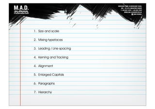
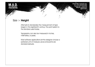
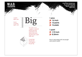
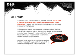
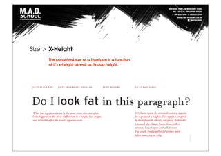
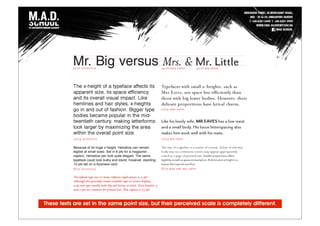
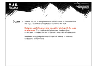
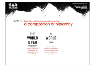
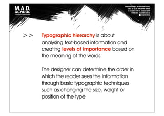
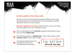
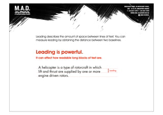
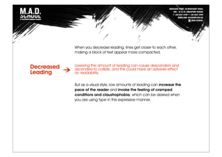
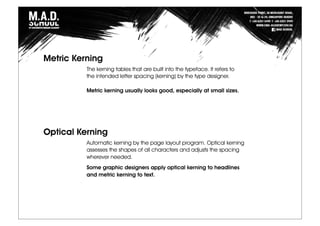
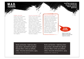
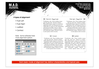
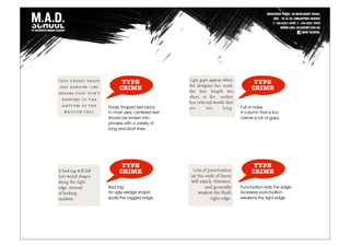
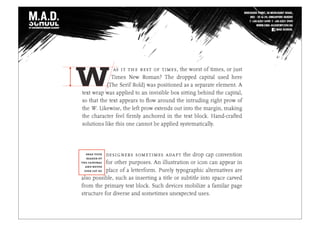
This document provides a summary of key concepts in typography and communication design, including:
1. Size and scale of typefaces can be measured in points, picas, pixels and other units. Larger x-height and cap height increase perceived size.
2. Leading, or line spacing, impacts readability and pace of reading. Too little or too much leading can cause issues.
3. Kerning and tracking adjust spacing between letters and groups of letters, respectively. Well-designed typefaces require minimal kerning while tracking can squeeze or spread out text.
4. Alignment, hierarchy, paragraphs and other typographic techniques help structure information and guide the reader through varying importance and relationships between
Typography is an imperative, yet sometimes overlooked aspect of the design process. Educating yourself on the basics of type with the help of this SlideShare will give you some insight into the intricate world of typography, and give you some actionable tips on how to make your business stand out from the competition.
Here we are giving an comprehensive presentation on typography. the presentation will be help full for both the beginner and professional graphic designer.
Do you want to learn about typography art technique? Then come to Graphic Designing Institute in Delhi which allows you to write content in various ways.
Yesterday the 11th of June 2015, the User Experience department took us down the exciting path of fonts and typography.
Facilitated by Crystal Chijindu, we came to realize the importance of Typography as an intricate element of design and idea development.
Have a good read and don't forget to share.
The typography by Fady El-Masry
Typography (from the Greek words τύπος (typos) = form and γραφή
(graphe) = writing) is the art and technique of arranging type in order to make
language visible. The arrangement of type involves the selection of typefaces,
point size, line length, leading (line spacing), adjusting the spaces between
groups of letters (tracking) and adjusting the space between pairs of letters
(kerning). Type design is a closely related craft, which some consider distinct
and others a part of typography; most typographers do not design typefaces,
and some type designers do not consider themselves typographers. In modern
times, typography has been put into motion — in film, television and online
broadcasts — to add emotion to mass communication.
Typography is performed by typesetters, compositors, typographers, graphic
designers, art directors, comic book artists, graffiti artists, clerical workers,
and anyone else who arranges type for a product. Until the Digital Age,
typography was a specialized occupation. Digitization opened up typography
to new generations of visual designers and lay users, and it has been said that
“typography is now something everybody does.
Basic to Mastering Typography.In this Slide i tried to share some tips and inspiration and some major discuss about Basic to Mastering Typography.I hope you enjoy it all.
You’re probably creating content with the goal of generating demand and collecting leads, but are you also creating content to arm your Sales Team?
As marketers, we can’t forget that content can also support Sales, equipping them with the support materials and selling tools that they need to succeed.
Browse through our slides to read more about creating content that your Sales Teams can use to close more deals. You'll learn about:
- Different ways to leverage content for sales enablement
- Aligning content creation with insight from Sales
- Creating content to educate prospects and manage objections
Zaragoza Comedy
Continúa el ciclo del humor en la ciudad, y lo hace de la mano del inclasificable Chiquito de la Calzada. Un genuino maestro del chiste que alcanzó cotas de popularidad asombrosas. Vendrá acompañado de JJ Vaquero. El guinonista y cómico mas transgresor del Hormiguero traerá sus monólogos irreverentes. Una velada desternillante. ¡Por la gloria de mi madre!.
Auditorio de Zaragoza, Sala Mozart
Sabado 24 22:00 Horas
Horarios de interés
Basílica de
El Pilar
6:45-21:30
Todos los días
La Seo
Lunes cerrado
Sabado 10:00-12:30
15:00-18:00
Domingo 10:00-11:30
Resto de días 9:00-13:30
16:00-18:30
Museos arqueológicos
Lunes cerrado
Domingos 10:00-13:30
Resto de días 10:00-20:30
Aljafería
10:00-20:30
Todos los días
Domingos entrada gratuita
Jorge Drexler en el Principal
El artista uruguayo, ganador de un Oscar, de varios Premios de la Música y nominado en multiples ocasiones a los Grammy, viene presentando su último trabajo: Amar La Trama. Sin abandonar su habitual melancolía sorprende con unos arreglos de viento y percusión que aportan un mayor vitalismo.
Teatro Principal
Martes 20 Abril 21:00 horas
Quinto concierto del Grupo Enigma
Nuestros amigos del Grupo Enigma, Orquesta de cámara del Auditorio de Zaragoza, nos ofrecen esta semana un interesante concierto con la colaboración de la mezzosoprano Alda Caiello. Nos sorprenderán con un repertorio que incluye piezas de Gabriel Erkoreka, Luis de Pablo y Luciano Berio.
Auditorio de Zaragoza, Sala Luis Galve
Martes 20 Abril 20:15 horas
El Lago de los Cisnes
Este conocidísimo Ballet de Chaikovski llega al escenario del Principal de la mano del Ballet del Teatro Nacional de Brno. La compañía checa cumplirá un siglo en breve y en su gira europea está cosechando grandes críticas.
Teatro Principal
Lunes 19 Abril 21:00 horas
The Rockefeller Foundation recently concluded a three-year initiative focused on maximizing the number, quality and accessibility of green jobs in the United States. The Sustainable Employment in a Green US Economy (SEGUE) initiative was launched based on a recognition that the twin challenges posed by high unemployment and climate change created an opportunity and imperative to invest in green jobs in the United States and around the world. SEGUE grant-making focused on advancing the knowledge, innovation, standards and institutions necessary to catalyze growth in the green economy and unlock greater demand for green jobs.
This initiative supported several major research efforts, including an independent, developmental evaluation of the SEGUE initiative by Abt Associates, that yielded important insights on what it would take to create more green jobs and a sustainable green economy.
Would you like your team to provide you ideas for improvement on a regular basis? Would you like to see them contribute more in general? If you answered ‘yes’ to either question, you might be forgetting the value of your team members, the frontline associates. From the plant to the boardroom, every person can provide you perspectives that propel your organization to success.
“Typography matters because it helps conserve the most valuable resource you have as a writer—reader attention.”
“Space in typography is like time in music. It is infinitely divisible, but a few proportional intervals can be much more useful than a limitless choice of arbitrary quantities.” - Robert Bringhurst
➢ Words and symbols in any form, spoken or written, are the most common means of communication.
➢ Texts in the form of words, sentences, and paragraphs are used to
communicate thoughts, ideas, and facts in nearly every aspect of our lives.
➢ Text is a vital element of multimedia menus, navigation systems, and content.
➢ Multimedia developers must use words carefully and accurately.
Design For Good Presentation - Ngee Ann PolyPedro Aguirre
Design For Good presentation for Ngee Ann Poly students.
Design For Good is the first design competition that is focus on youths in Singapore.
We want youth to make a change and make an impact in community and society.
MTC Integrated Program - Youth at Risk and People with DisabilitiesPedro Aguirre
We are conducting a creative program for youth at risk and people with disabilities, we are looking for partners that can help with the program, specially on helping our graduates enter the job market.
Social Enteprise Education and CreationPedro Aguirre
We conducted a Social Enterprise course for secondary school students in Singapore. Students created 5 Social Enterprises and in order to make things happen we launched a crowdfunding campaign for the projects.
MTC Recruitment Volunteers Presentation - March 2014Pedro Aguirre
Are you looking for opportunities to become a volunteer? Make The Change gives you the opportunity to give back and volunteer in great creative projects.
http://www.facebook.com/makethechangesg
Capture Aspirations Workshop is a photography workshop for youth at risk in Singapore. We had 4 sessions:
- Nature Photography
- Street Photography
- Art Photography
- Community Photography
https://www.facebook.com/MakethechangeSG
Brand U is program that enables participants to develop their confidence, improve their presentation skills and build their own personal brand, that will empowers them to achieve their dreams.
I am business development professional with work experience in big multinational companies and small start up companies. I have experience developing projects in USA, Mexico, Belgium, Germany, India and Singapore.
In addition I am a dynamic public speaker, I had been invited to speak at several leadership development conferences in: Belgium, Brazil, Serbia, Germany, Portugal, France, Spain, Mexico and Singapore.
Specialties
Digital Marketing, Leadership Development, HR, Intercultural Communication, Sustainability, Project Management
Honest Reviews of Tim Han LMA Course Program.pptxtimhan337
Personal development courses are widely available today, with each one promising life-changing outcomes. Tim Han’s Life Mastery Achievers (LMA) Course has drawn a lot of interest. In addition to offering my frank assessment of Success Insider’s LMA Course, this piece examines the course’s effects via a variety of Tim Han LMA course reviews and Success Insider comments.
Biological screening of herbal drugs: Introduction and Need for
Phyto-Pharmacological Screening, New Strategies for evaluating
Natural Products, In vitro evaluation techniques for Antioxidants, Antimicrobial and Anticancer drugs. In vivo evaluation techniques
for Anti-inflammatory, Antiulcer, Anticancer, Wound healing, Antidiabetic, Hepatoprotective, Cardio protective, Diuretics and
Antifertility, Toxicity studies as per OECD guidelines
Embracing GenAI - A Strategic ImperativePeter Windle
Artificial Intelligence (AI) technologies such as Generative AI, Image Generators and Large Language Models have had a dramatic impact on teaching, learning and assessment over the past 18 months. The most immediate threat AI posed was to Academic Integrity with Higher Education Institutes (HEIs) focusing their efforts on combating the use of GenAI in assessment. Guidelines were developed for staff and students, policies put in place too. Innovative educators have forged paths in the use of Generative AI for teaching, learning and assessments leading to pockets of transformation springing up across HEIs, often with little or no top-down guidance, support or direction.
This Gasta posits a strategic approach to integrating AI into HEIs to prepare staff, students and the curriculum for an evolving world and workplace. We will highlight the advantages of working with these technologies beyond the realm of teaching, learning and assessment by considering prompt engineering skills, industry impact, curriculum changes, and the need for staff upskilling. In contrast, not engaging strategically with Generative AI poses risks, including falling behind peers, missed opportunities and failing to ensure our graduates remain employable. The rapid evolution of AI technologies necessitates a proactive and strategic approach if we are to remain relevant.
2024.06.01 Introducing a competency framework for languag learning materials ...Sandy Millin
http://sandymillin.wordpress.com/iateflwebinar2024
Published classroom materials form the basis of syllabuses, drive teacher professional development, and have a potentially huge influence on learners, teachers and education systems. All teachers also create their own materials, whether a few sentences on a blackboard, a highly-structured fully-realised online course, or anything in between. Despite this, the knowledge and skills needed to create effective language learning materials are rarely part of teacher training, and are mostly learnt by trial and error.
Knowledge and skills frameworks, generally called competency frameworks, for ELT teachers, trainers and managers have existed for a few years now. However, until I created one for my MA dissertation, there wasn’t one drawing together what we need to know and do to be able to effectively produce language learning materials.
This webinar will introduce you to my framework, highlighting the key competencies I identified from my research. It will also show how anybody involved in language teaching (any language, not just English!), teacher training, managing schools or developing language learning materials can benefit from using the framework.
June 3, 2024 Anti-Semitism Letter Sent to MIT President Kornbluth and MIT Cor...Levi Shapiro
Letter from the Congress of the United States regarding Anti-Semitism sent June 3rd to MIT President Sally Kornbluth, MIT Corp Chair, Mark Gorenberg
Dear Dr. Kornbluth and Mr. Gorenberg,
The US House of Representatives is deeply concerned by ongoing and pervasive acts of antisemitic
harassment and intimidation at the Massachusetts Institute of Technology (MIT). Failing to act decisively to ensure a safe learning environment for all students would be a grave dereliction of your responsibilities as President of MIT and Chair of the MIT Corporation.
This Congress will not stand idly by and allow an environment hostile to Jewish students to persist. The House believes that your institution is in violation of Title VI of the Civil Rights Act, and the inability or
unwillingness to rectify this violation through action requires accountability.
Postsecondary education is a unique opportunity for students to learn and have their ideas and beliefs challenged. However, universities receiving hundreds of millions of federal funds annually have denied
students that opportunity and have been hijacked to become venues for the promotion of terrorism, antisemitic harassment and intimidation, unlawful encampments, and in some cases, assaults and riots.
The House of Representatives will not countenance the use of federal funds to indoctrinate students into hateful, antisemitic, anti-American supporters of terrorism. Investigations into campus antisemitism by the Committee on Education and the Workforce and the Committee on Ways and Means have been expanded into a Congress-wide probe across all relevant jurisdictions to address this national crisis. The undersigned Committees will conduct oversight into the use of federal funds at MIT and its learning environment under authorities granted to each Committee.
• The Committee on Education and the Workforce has been investigating your institution since December 7, 2023. The Committee has broad jurisdiction over postsecondary education, including its compliance with Title VI of the Civil Rights Act, campus safety concerns over disruptions to the learning environment, and the awarding of federal student aid under the Higher Education Act.
• The Committee on Oversight and Accountability is investigating the sources of funding and other support flowing to groups espousing pro-Hamas propaganda and engaged in antisemitic harassment and intimidation of students. The Committee on Oversight and Accountability is the principal oversight committee of the US House of Representatives and has broad authority to investigate “any matter” at “any time” under House Rule X.
• The Committee on Ways and Means has been investigating several universities since November 15, 2023, when the Committee held a hearing entitled From Ivory Towers to Dark Corners: Investigating the Nexus Between Antisemitism, Tax-Exempt Universities, and Terror Financing. The Committee followed the hearing with letters to those institutions on January 10, 202
Acetabularia Information For Class 9 .docxvaibhavrinwa19
Acetabularia acetabulum is a single-celled green alga that in its vegetative state is morphologically differentiated into a basal rhizoid and an axially elongated stalk, which bears whorls of branching hairs. The single diploid nucleus resides in the rhizoid.
Synthetic Fiber Construction in lab .pptxPavel ( NSTU)
Synthetic fiber production is a fascinating and complex field that blends chemistry, engineering, and environmental science. By understanding these aspects, students can gain a comprehensive view of synthetic fiber production, its impact on society and the environment, and the potential for future innovations. Synthetic fibers play a crucial role in modern society, impacting various aspects of daily life, industry, and the environment. ynthetic fibers are integral to modern life, offering a range of benefits from cost-effectiveness and versatility to innovative applications and performance characteristics. While they pose environmental challenges, ongoing research and development aim to create more sustainable and eco-friendly alternatives. Understanding the importance of synthetic fibers helps in appreciating their role in the economy, industry, and daily life, while also emphasizing the need for sustainable practices and innovation.
Palestine last event orientationfvgnh .pptxRaedMohamed3
An EFL lesson about the current events in Palestine. It is intended to be for intermediate students who wish to increase their listening skills through a short lesson in power point.
A Strategic Approach: GenAI in EducationPeter Windle
Artificial Intelligence (AI) technologies such as Generative AI, Image Generators and Large Language Models have had a dramatic impact on teaching, learning and assessment over the past 18 months. The most immediate threat AI posed was to Academic Integrity with Higher Education Institutes (HEIs) focusing their efforts on combating the use of GenAI in assessment. Guidelines were developed for staff and students, policies put in place too. Innovative educators have forged paths in the use of Generative AI for teaching, learning and assessments leading to pockets of transformation springing up across HEIs, often with little or no top-down guidance, support or direction.
This Gasta posits a strategic approach to integrating AI into HEIs to prepare staff, students and the curriculum for an evolving world and workplace. We will highlight the advantages of working with these technologies beyond the realm of teaching, learning and assessment by considering prompt engineering skills, industry impact, curriculum changes, and the need for staff upskilling. In contrast, not engaging strategically with Generative AI poses risks, including falling behind peers, missed opportunities and failing to ensure our graduates remain employable. The rapid evolution of AI technologies necessitates a proactive and strategic approach if we are to remain relevant.
The French Revolution, which began in 1789, was a period of radical social and political upheaval in France. It marked the decline of absolute monarchies, the rise of secular and democratic republics, and the eventual rise of Napoleon Bonaparte. This revolutionary period is crucial in understanding the transition from feudalism to modernity in Europe.
For more information, visit-www.vavaclasses.com
5. Attempts to standardize the measurement of type
began in the eighteenth century. The point system is
the standard used today.
Typography can also be measured in inches,
millimeters, or pixels.
Most software applications let the designer choose a
preferred unit of measure; picas and points are
standard defaults.
Size > Height
6. 1 pica
1/6 inch
12 points
16 pixels
1 point
1/72 inch
0.35mm
Pica is associated with line-length
and column width.
7. A letter also has a horizontal measure, called its set width. The set width
is the body of the letter plus a sliver of space that protects it from
other letters. The width of a letter is built-in to the proportions and visual
impression of the typeface.
Some typefaces have a narrow set width, and some have a wide one.
You can change the set width of a typeface by fiddling with its horizontal
or vertical scale. This distorts the line weight of the letters,
however, forcing heavy elements to become thin,
and thin elements to become thick.
Instead of torturing a letterform, choose a typeface
that has the proportions you are looking for, such as
condensed, compressed, wide, or extended.
Size > Width
8. The perceived size of a typeface is a function
of it’s x-height as well as its cap height.
Size > X-Height
9. These texts are set in the same point size, but their perceived scale is completely different.
10. Scale > Scale is the size of design elements in comparison to other elements
in a layout as well as to the physical context of the work.
Designers create hierarchy and contrast by playing with the scale
of letterforms. Changes in scale help create visual contrast,
movement, and depth as well as express hierarchies of importance.
People intuitively judge the size of objects in relation to their own
bodies and environments.
11. Scale > Scale is the relationship among elements within
a composition or hierarchy
12. Typographic hierarchy is about
analysing text-based information and
creating levels of importance based on
the meaning of the words.
The designer can determine the order in
which the reader sees the information
through basic typographic techniques
such as changing the size, weight or
position of the type.
>>
14. Combining typefaces is like making a salad.
Start with a small number of elements representing different colors, tastes,
and textures. Strive for contrast rather than harmony, looking for emphatic
differences rather than mushy transitions.
Give each ingredient a role to play: sweet tomatoes, crunchy cucumbers,
and the pungent shock of an occasional anchovy.
When mixing typefaces on the same line, designers usually adjust the point
size so that the x-heights align.
When placing typefaces on separate lines, it often makes sense to create
contrast in scale as well as style or weight.
Try mixing big, light type with small,
dark type for a criss-cross of
contrasting flavors and textures.
big, light type
with small, dark type
15.
16. TYPE
CRIME
These typefaces are from the
same family, BUT they are too
close in weight to mix well.
TYPE
CRIME
These two type styles are
too similar to provide a
counterpoint to each other.
• Counterpart is similarity. It brings unity and harmony to type design
• Counterpoint is contrast It brings opposition and dissonance to type design
20. Leading describes the amount of space between lines of text. You can
measure leading by obtaining the distance between two baselines.
Leading is powerful.
It can affect how readable long blocks of text are.
21. When you decrease leading, lines get closer to each other,
making a block of text appear more compacted.
Lowering the amount of leading can cause descenders and
ascenders to collide, and this could have an adverse effect
on readability.
But as a visual style, low amounts of leading can increase the
pace of the reader and invoke the feeling of cramped
conditions and claustrophobia, which can be desired when
you are using type in this expressive manner.
Decreased
Leading
22. Increasing leading can reduce the pace of a piece of text;
it can slow the reader by introducing more white space.
It can display a more relaxed feel in text blocks.
Too much leading can cause continuity problems, as the eyes
of the reader is required to travel a greater distance between
lines of text.
Increased
Leading
LEADING / LINE SPACING
23. • Example 1 is set to a negative
value (a value that is smaller
than the type size). You can
see the ascenders colliding
with descenders and its effects
on readability and aesthetics.
• Example 2 is set at an often-
recommended value, which is
120% of the type size. This
means that if your font size is
10pt, then leading should be
set at 12pt.
• Example 3 is set to 200% of
the type size. You’ll notice the
disruption in the pace and flow
of reading the text.
24. In summary, here are a few leading guidelines:
• Leading can affect text blocks in different ways. A short block of text
versus a long block of text will be affected by leading in its own way.
Just because it works well on one doesn’t mean it will work equally
well in the other.
• The more words you have in a line, the more leading you will need to
maintain a pleasurable reading experience.
• If you increase word-spacing (the space between each word), you’ll
have to increase leading to improve the readability of the text block.
26. Leading is so named because traditional
print shops put strips of lead between lines
of type to increase vertical space.
(During much of the letterpress era, movable type was composed by hand for each
page. Cast metal sorts were composited into words and lines of text and tightly bound
together to make up a page image called a forme, with all letter faces exactly the
same height to form an even surface of type. The forme was mounted in a press, inked,
and an impression made on paper.)
28. Kerning is an adjustment of the space between two letters. Kerning adds
or subtracts space between letters to create more visually appealing
and readable text.
The characters of the Latin alphabet emerged over time; they were
never designed with mechanical or automated spacing in mind. Thus
some letter combinations look awkward without special spacing
considerations.
Working in a page layout program, a designer can choose to use
metric kerning or optical kerning as well as adjusting the space
between letters manually where desired.
A well-designed typeface requires little or no additional kerning,
especially at text sizes.
Kerning >
29. Metric Kerning
The kerning tables that are built into the typeface. It refers to
the intended letter spacing (kerning) by the type designer.
Metric kerning usually looks good, especially at small sizes.
Optical Kerning
Automatic kerning by the page layout program. Optical kerning
assesses the shapes of all characters and adjusts the spacing
wherever needed.
Some graphic designers apply optical kerning to headlines
and metric kerning to text.
30. Tracking is overall letter spacing.
Tracking differs from kerning in that tracking is the adjustment of
space for groups of letters and entire blocks of text.
You can apply tracking to all text or selected portions. You can use
selective tracking to squeeze more characters onto a line to save
space or prevent a few words from carrying over to another page
or column of text.
Tracking often changes line endings and shortens lines of text.
Tracking can be further adjusted on individual lines or words to
improve hyphenation and line endings.
Tracking >
33. • Flush Left
• Flush RIght
• Justified
• Centred
Note: Some softwares have
more alignment options
Each basic mode of alignment has distinct characteristics and typical uses.
4 types of alignment
34. Poorly Shaped text block.
In most uses, centered text
should be broken into
phrases with a variety of
long and short lines.
Full of holes.
A column that is too
narrow is full of gaps.
Bad rag.
An ugly wedge shape
spoils the ragged edge.
Punctuation eats the edge.
Excessive punctuation
weakens the right edge.
TYPE
CRIME
TYPE
CRIME
TYPE
CRIME
TYPE
CRIME
36. Roman letters are designed to sit side by side, not on top of one another.
Stacks of lowercase letters are especially awkward because the ascenders
and descenders make the vertical spacing appear uneven, and the varied
width of the characters makes the stacks look “weak”.
Capital letters form more stable stacks than lowercase letters. Centering the
column helps to even out the differences in width.
Many Asian writing systems, including Chinese, are traditionally written
vertically; the square shape of the characters supports this orientation.
The simplest way to make a line of Latin text vertical is to rotate the text from
horizontal to vertical. This preserves the natural affinity among letters sitting on
a line while creating a vertical axis.
Vertical Text
38. Mexican Street Signs. Photographs by Andrea Marks. Stacked letters often appear on commercial street signs, which often employ thin, vertical
slices of space. The letters in these signs were drawn by hand. Wide characters and squared-off Os stack better than narrow letters with traditional
rounded forms. In some instances, the letters have been specially aligned to create vertical relationships, as in the "Optica" sign at right, painted
on a sliver of flat molding inside a door frame.
39. SIMPATICO Poster for the Public Theatre, 1994.
Designer: Paula Scher/Pentagram. Type set on
a vertical baseline creates movement across
the poster. The theater’s logo, which also
employs a vertical baseline, can be easily
placed on street banners.
Instead of stacking letters, designers
often change the orientation of the
baseline to make vertical lines
40. PARALLELEN IM SCHNITTPUNKT
(CROSSING PARALLELS) Poster, 1997.
Designer: Gerwin Schmidt. Publisher: Art-Club
Karlsruhe. The axes of type and landscape
intersect to create posters that are simple,
powerful, and direct. The text is mirrored in
German and French.
Instead of stacking letters, designers
often change the orientation of the
baseline to make vertical lines
42. Enlarged capitals, also called versals, commonly mark the entrance to a
chapter in a book or an article in a magazine.
Dropped capitals are traditional page device, especially for opening chapters in a book.
46. Use the “Space After Paragraph”
feature in your page layout program
to insert a precise increment of
space between paragraphs.
Skipping a full line often creates too
open an effect and wastes a lot of
space.
NOTE
Get in the habit of inserting a full paragraph return (Enter key)
only at the end of paragraphs; insert a line break when you
don't want to add additional space (Shift + Enter).
Space After
Paragraph
47. Line Break
[Shift + Enter]
Line Break
Line Break
Line Break
+ 1/2 Line
Space
Indent
49. Symbol
Too many signals.
Using paragraph spacing and indents together
squanders space and gives the text block a
flabby, indefinite shape.
TYPE
CRIME
50. On the web, paragraphs are usually marked with a skipped line, wasting lots of vertical space.
55. A typographic hierarchy expresses the organization of content, emphasizing
some elements and subordinating others.
A visual hierarchy helps readers scan a text, knowing where to enter and exit
and how to pick and choose among its offerings.
The concept of visual hierarchy is simple , the more important content
should look like more important, and the less important should look
like less important.
The user should be able to divide and
retrieve the data in chunks.
56. So, here we have our information in a liner continuous text presentation.
Acceptable, if it comes as a mobile text message etc.
But in a layout, this arrangement fails to guide and help the user
in getting information quickly.
Example:
57. Lets try using the White-space.
The spacing divides the information
into chunks and provides a better
visual hierarchy.
Now reader can at least focus on
reading one part of the information
at one time.
Example:
58. One way to establish Visual Hierarchy is Typographic variations.
The level of attention on an specific
element can be decided with the
type scale, weight, and alignment.
Now user automatically builds visual
relationship between elements and
we can make sure what should they
read first and what later.
Example:
59. Variations >
• Symbols
• Indents
• Line Break
• Indents
• Line Break
• Font change
• Indents
• Line Break
• Alignment
• Font change
• Line Break