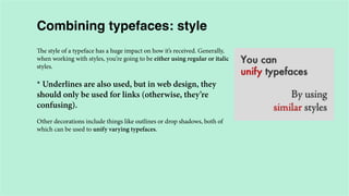
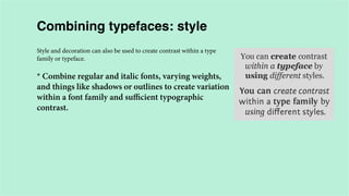
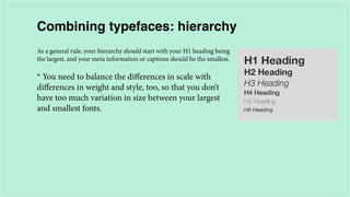
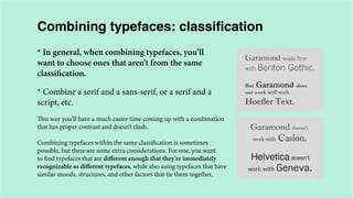
This document provides an overview of typography concepts including:
1. The importance of typography and how typefaces can affect readability and aesthetics.
2. Common type classifications like serif, sans-serif, display, and script and examples of popular typefaces within each classification.
3. Guidelines for combining typefaces effectively including considering factors like contrast, weight, structure, style, hierarchy, classification, color, texture, and mood.
Typography is an imperative, yet sometimes overlooked aspect of the design process. Educating yourself on the basics of type with the help of this SlideShare will give you some insight into the intricate world of typography, and give you some actionable tips on how to make your business stand out from the competition.
Yesterday the 11th of June 2015, the User Experience department took us down the exciting path of fonts and typography.
Facilitated by Crystal Chijindu, we came to realize the importance of Typography as an intricate element of design and idea development.
Have a good read and don't forget to share.
The typography by Fady El-Masry
Typography (from the Greek words τύπος (typos) = form and γραφή
(graphe) = writing) is the art and technique of arranging type in order to make
language visible. The arrangement of type involves the selection of typefaces,
point size, line length, leading (line spacing), adjusting the spaces between
groups of letters (tracking) and adjusting the space between pairs of letters
(kerning). Type design is a closely related craft, which some consider distinct
and others a part of typography; most typographers do not design typefaces,
and some type designers do not consider themselves typographers. In modern
times, typography has been put into motion — in film, television and online
broadcasts — to add emotion to mass communication.
Typography is performed by typesetters, compositors, typographers, graphic
designers, art directors, comic book artists, graffiti artists, clerical workers,
and anyone else who arranges type for a product. Until the Digital Age,
typography was a specialized occupation. Digitization opened up typography
to new generations of visual designers and lay users, and it has been said that
“typography is now something everybody does.
The term “Typography” comes from Greek words: “typos” (form) & “graphe” (writing). Easily the nemesis for most people - as a subject of understanding and application as well. This is my feeble attempt at explaining the very basics of "typography", its history, characteristics, terminology and best-practices.
Anatomy of letterforms
Evolution of letterforms & type classifications
Type terminology typefaces, type styles & type families
Measurements of type
Line spacing
Letter spacing and word spacing
Working with large bodies of type
Alignment for large bodies of type
Choosing and using a typeface
Good practises in graphic design, typography and editing: “Clear Layout. Basi...Tomasz Charnas
Graduates’ visual works and fragments of presentation about content design at Tischner European University by Tomasz Charnas, an editor, publisher, communication scientist and specialist in language and literature. Visual materials have been taken from original LinkedIn user guide prepared by the students' group.
It may be something we often overlook, but typography plays an essential part in the presentation process. Typography can change the entire look and feel of a presentation. Big Fish introduces the five way typography is powerful in your presentation.
Until fairly recently, a sixth-grader doing a book report had more typographic choice than CNN had for their (very expensive) website. With the advent of the CSS @font-face, web designers have more choice than ever before. This presentation covers the basics of typographic theory for the web, as well as how to embed web fonts in your WordPress site.
Given at the Western MA WordPress meetups, 5/30/12. A short presentation on webfonts. The talk featured a brief introduction to webfonts, considerations for picking the right webfont, and integrating webfonts into WordPress.
A very brief look at where certain aspects of typography on the web are today — specifically, methods for replacing OS defaults with other typefaces.
The slides are guides used for a quick (15-20 minute) talk at Refresh Lauderdale, rather than informational, with the exception of the references section at the end, which includes many great resources for typography in general, as well as for setting type on the web in all forms.
Your content is the most important feature of your website, so it's important to make sure that the text looks good and is easy to read no matter what device type or screen size it's being viewed on. One size does not fit all when it comes to typography, but you can use media queries to adjust type qualities such as size, line height, column width, margins, hyphenation, and even typeface depending on the viewport size. Learn how you can use CSS to apply design rules that will make your typography look better and perform better across devices. You'll also find out how typography affects the loading time of your website, and what you can do to improve performance.
Presented in 2015 at ConFoo and Albany UX. Presented in 2014 at WebVisions Chicago, Blend Conference, Frontend Conference Zurich, Refresh Ottawa, Mobile+Web Dev Conference, STC Summit, Bmoresponsive, ConvergeSE, and Girl Geeks Montreal.
Modernist Typography and the Swiss grid - Carlo GiannascaFrostSydney
Carlo Giannasca Partner and Head of Environments at Frost* Design shares some of his insights into the basics of modernist typography and the effective use of the Swiss grid system.
Grid Systems in Graphic Design by ADMEC Multimedia InstituteRavi Bhadauria
ADMEC Multimedia Institute is growing institute that is providing industry oriented training to the world at large. Being a multimedia institute we offer training for creating or designing content for information technology mainly.
Here we are giving an comprehensive presentation on typography. the presentation will be help full for both the beginner and professional graphic designer.
part 2 of 2 for the Unit 2 typography introduction
(NOTE: one of the fonts did not come through --- on the Old Style/Transitional Slide --> that is NOT Goudy; that's Arial).
Basic to Mastering Typography.In this Slide i tried to share some tips and inspiration and some major discuss about Basic to Mastering Typography.I hope you enjoy it all.
7 Alternatives to Bullet Points in PowerPointAlvis Oh
So you tried all the ways to beautify your bullet points on your pitch deck but it just got way uglier. These points are supposed to be memorable and leave a lasting impression on your audience. With these tips, you'll no longer have to spend so much time thinking how you should present your pointers.
Expert Accessory Dwelling Unit (ADU) Drafting ServicesResDraft
Whether you’re looking to create a guest house, a rental unit, or a private retreat, our experienced team will design a space that complements your existing home and maximizes your investment. We provide personalized, comprehensive expert accessory dwelling unit (ADU)drafting solutions tailored to your needs, ensuring a seamless process from concept to completion.
Book Formatting: Quality Control Checks for DesignersConfidence Ago
This presentation was made to help designers who work in publishing houses or format books for printing ensure quality.
Quality control is vital to every industry. This is why every department in a company need create a method they use in ensuring quality. This, perhaps, will not only improve the quality of products and bring errors to the barest minimum, but take it to a near perfect finish.
It is beyond a moot point that a good book will somewhat be judged by its cover, but the content of the book remains king. No matter how beautiful the cover, if the quality of writing or presentation is off, that will be a reason for readers not to come back to the book or recommend it.
So, this presentation points designers to some important things that may be missed by an editor that they could eventually discover and call the attention of the editor.
White wonder, Work developed by Eva TschoppMansi Shah
White Wonder by Eva Tschopp
A tale about our culture around the use of fertilizers and pesticides visiting small farms around Ahmedabad in Matar and Shilaj.
2. Why it matters?
The brand is the unique personality (Apple - Myriad).
Typefaces are artifacts that can be aesthetically pleasing and functional at
the same time (headlines/body text).
People can be affected by good typography without being actively aware
of it (like films).
Increased reading speed and reduced eye fatigue.
* Degree posters, branding products, CVs, portfolio,
reports, infographics, motion typography.
3. Classifying type
There are a number of different ways to classify
typefaces and type families. The most common
classifications are by technical style: serif, sans-serif,
script, display, and so on.
Typefaces are also classified by other technical
specifications, such as proportional vs. monospaced, or
by more fluid and interpretational definitions, such as
the mood they create.
4. Serif
Serif typefaces are called “serifs” in reference to the
small lines that are attached to the main strokes of
characters within the face.
Serif typefaces are most often used for body copy in
print documents, as well as for both body text and
headlines online.
The readability of serifs online has been debated, and
some designers prefer not to use serifs for large blocks
of copy.
5. 10 of the best serif fonts
1. Caslon
2. Garamond
3. Baskerville
4. Bembo
5. Bodoni
6. Clarendon
7. Rockwell
8. Georgia
9. Palatino
10. Lucida
6. Serif sub-types
1. Old Style serifs (Adobe Jenson and Centaur).
2. Transitional serifs - the most common
(Times New Roman, Baskerville, Georgia).
3. Modern serifs (Didot and Bodoni).
4. Slab serifs (American Typewriter).
7. Sans-serif
Sans-serif typefaces are called such because they lack
serif details on characters. Sans-serif typefaces are often
more *modern in appearance than serifs. The first
sans-serifs were created in the late 18th century.
8. Sans-serif sub-types
1. Grotesque. Grotesques are the earliest, and include
fonts like Franklin Gothic and Akzidenze Grotesk.
These typefaces often have letterforms that are very
similar to serif typefaces.
9. Sans-serif sub-types
2. Neo-grotesque. Include some of the most common
typefaces: MS Sans Serif, Arial, Helvetica and Univers
are all neo-grotesques. They have a relatively plain
appearance when compared to the grotesques.
10. Sans-serif sub-types
3. Humanist. Humanist typefaces include Gill Sans,
Frutiger, Tahoma, Verdana, Optima, and Lucide
Grande.
These are more calligraphic than other sans-serif
typefaces, and are also the *most legible (hence the
popularity of some of them for website body copy).
11. Sans-serif sub-types
4. Geometric. Geometric sans-serifs are more closely
based on geometric shapes. Generally, the “O”s in
geometrics will appear circular, and the letter “a” is
almost always simple, just a circle with a tail.
*They’re the least commonly-used for body copy, and
are also the most modern sans-serifs, as a general
rule.
12. Scripts: formal
Scripts are based upon handwriting, and offer very fluid letterforms.
There are two basic classifications: formal and casual.
Formal scripts are often reminiscent of the
handwritten letterforms common in the 17th and 18th
centuries.
*They’re common for very elegant and elevated
typographical designs, and are unsuitable for body
copy.
13. Scripts: casual
Casual scripts more closely resemble modern
handwriting, and date back to the mid-twentieth
century. They’re much less formal, often with stronger
strokes and a more *brush-like appearance.
Casual scripts include Mistral and Brush Script.
14. Display
Display typefaces are probably the broadest category and include the
most variation.
*The main characteristic is that they’re unsuitable for
body copy and are best reserved for headlines or other
short copy that needs attention drawn to it.
Display typefaces can be formal, or informal, and evoke any kind of
mood. They’re more commonly seen in print design, but are becoming
more popular online with the use of web fonts.
15. Proportional vs. Monospaced
* In proportional typefaces, the space a character takes
up is dependent on the natural width of that character.
An “i” takes up less space than an “m”, for example. Times New Roman is
a proportional typeface.
* In monospace typefaces, on the other hand, each
character takes up the same amount of space.
Narrower characters simply get a bit more spacing around them to
make up for the difference in width. Courier New is one example of a
monospace typeface.
*Avoid mixing
monospaced fonts with
proportional fonts.
16. Mood
The mood of a typeface is an important part of how it should be used.
* Commonly used moods include formal vs. informal,
modern vs. traditional, and light vs. dramatic.
Some typefaces have very distinct moods. For example, Times New
Roman is pretty much always going to be a traditional font, which is why
it’s so commonly used for business correspondence. Verdana, on the
other hand, has a more modern mood.
Some typefaces, like Helvetica, are more transcendent, and can convey
almost any mood based on the content and the other typefaces they’re
combined with.
17. Styles
There are three general styles you’ll find with many typefaces: italic,
oblique, and small caps. Small caps are often used for headings or
subheadings, to add variety to your typography if using a single typeface.
* Italic and oblique are often confused or used
interchangeably, but are two distinct styles.
Oblique type is simply a slanted version of the regular characters. You
could create this using the “distort” function in Photoshop, although
sometimes a separate oblique font is included within a typeface.
Italics are slanted like obliques, but are actually a separate set of
characters, with their own unique letterforms.
18. The Anatomy of a Typeface
The different letterforms within a typeface share a few common
characteristics. These characteristics can be important in determining
whether two (or more) typefaces work well together, or clash. Here are
the most basic parts of a typeface:
1. The baseline is the invisible line that all the characters sit on.
2. The meanline is the height of most of the lowercase characters within
a typeface, and is generally based on the lowercase “x” if there are varying
heights among the lowercase characters. This is also where the term
“x-height” comes from.
3. The cap height is the distance between the baseline and the top of
uppercase letters like “A”.
19. The Anatomy of a Typeface
The image shows three common parts to letterforms:
1. The stem is the main upright of any letter, including
the primary diagonal. It’s could be considered the
anchor of the character.
2. The bar is any horizontal part, which are sometimes
also called arms.
3. The bowl is the curved part of a character that
creates an interior empty space. The inside of a bowl is
a counter.
21. Combining typefaces: contrast
When combining typefaces, there are a couple of important principles
you’ll need to keep in mind, namely contrast and mood. Effectively
combining typefaces is a skill best learned through practice, and trialand-error.
* Contrast is the amount of difference between two
typefaces. Typefaces that are too similar tend to clash.
It is one of the most important concepts to understand when it comes to
combining typefaces. Without proper contrast, typefaces tend to clash,
creating a random, scattered look to your designs (and not in a good
way).
22. Combining typefaces: weight
The weight of a typeface plays a huge role in its appearance. We often
think of weight in terms of “light”, “regular”, “medium”, “bold”, etc. But
different typefaces have varying weights to begin with.
* Combining typefaces based largely on weight is a
fairly straight-forward way of creating typographic
contrast.
23. Combining typefaces: structure
* You either need to choose typefaces that have very,
very similar structures, or very different structures.
The structure of a typeface plays a huge role in how it works with other
typefaces. Letterforms that are only a bit similar are going to clash.
Typefaces that are very different in other ways can be unified by their
similar structures, though the reverse rarely works as well.
24. Combining typefaces: style
The style of a typeface has a huge impact on how it’s received. Generally,
when working with styles, you’re going to be either using regular or italic
styles.
* Underlines are also used, but in web design, they
should only be used for links (otherwise, they’re
confusing).
Other decorations include things like outlines or drop shadows, both of
which can be used to unify varying typefaces.
25. Combining typefaces: style
Style and decoration can also be used to create contrast within a type
family or typeface.
* Combine regular and italic fonts, varying weights,
and things like shadows or outlines to create variation
within a font family and sufficient typographic
contrast.
26. Combining typefaces: hierarchy
As a general rule, your hierarchy should start with your H1 heading being
the largest, and your meta information or captions should be the smallest.
* You need to balance the differences in scale with
differences in weight and style, too, so that you don’t
have too much variation in size between your largest
and smallest fonts.
27. Combining typefaces: classification
* In general, when combining typefaces, you’ll
want to choose ones that aren’t from the same
classification.
* Combine a serif and a sans-serif, or a serif and a
script, etc.
This way you’ll have a much easier time coming up with a combination
that has proper contrast and doesn’t clash.
Combining typefaces within the same classification is sometimes
possible, but there are some extra considerations. For one, you want
to find typefaces that are different enough that they’re immediately
recognizable as different typefaces, while also using typefaces that have
similar moods, structures, and other factors that tie them together.
28. Combining typefaces: classification
* One trick is to choose typefaces that are in the same
general classification, but fall under different subclasses (such as a slab serif and a modern serif, or a
geometric sans serif with a grotesk). This provides
more contrast right from the start.
29. Combining typefaces: colour & texture
When you need to add visual contrast or unify
disparate typefaces, the use of color and texture can do
wonders. For example, when you need to add contrast
among typefaces that are nearly identical (or within
a single type family), changing the color of some
elements instantly adds interest. Adding texture has the
same effect.
* Alternatively, if you have wildly different typefaces,
color and texture and unify those typefaces, creating
a harmonious look. The principles of color theory still
apply to typography, so be sure you don’t go overboard
combining colors.
30. Combining typefaces: extreme contrast
Extreme contrast can be a great option if you’re
working with display or script typefaces. In these
instances, it can be difficult to find typefaces with good
contrast that aren’t too dissimilar. So rather than trying
to do that, go for completely different typefaces.
* Try combining a rather simple typeface with
something more elaborate for the best results, rather
than two elaborate typefaces.
31. Combining typefaces: mood
The mood of the typefaces you select is vital to the way
they work together. Mood can be anything from formal
to casual, fun to serious, modern to classic, or anything
in between. This is where a lot of people run into
trouble with combining typefaces.
* Selecting typefaces that not only have similar (or
complementary) moods, but also have moods to
match the project you’re designing is crucial.
32. Customising a font
A nice and easy way of injecting a bit of personality
into some typography is to customise the type. The
smallest change will have an impact.
* Some of the most used favourites are; shortening
descenders, making the cross bar on letter ‘As’ stop
short on one side and cutting the corners off letters at
an angle.
33. Ligatures
Ligatures are sometimes considered antiquated, and
don’t show up often in web type. They’re not seen much
more often in print design, either.
But if your goal is to *create a typographic design
that has an antique, traditional, or very formal look,
adding ligatures can be a fantastic way to reinforce that
design style.
Ligatures can also improve readability among certain
characters, in certain fonts (especially italics and
obliques).
34. Hyphens and Dashes
Hyphens and dashes are two of the most improperly used characters in
typography. Hyphens should only be used when hyphenating words.
*There are two different kinds of dashes: the en-dash and the em-dash.
An en-dash is shorter, roughly the width of the letter “n” in a particular
font (hence, the name). An em-dash is wider, roughly the width of the
letter “m”.
En-dashes should be used when showing a range
(such as January–March) or when creating an open
compound word (South Carolina–Georgia border).
To create an en-dash, just use –. The em-dash is used mostly in informal
writing, and can replace commas, semicolons, colons, and parentheses.
They’re often used instead of commas to set apart independent clauses or
an abrupt change of thought. To create an em-dash, use —.
35. Ampersands
Ampersands (‘&’) are another special character that are sometimes used
in typographic designs. To create an ampersand, just use &.
They work well in headlines and similar short blocks of text, but aren’t
really appropriate for body text (despite the fact that many people seem to
use them that way).
*Ampersands are appropriate for use artistically, or
in instances where space is limited (like in a table).
Don’t use an ampersand just as an abbreviation for
the word “and”.
If using an ampersand artistically, you may find that ampersands in
italic fonts are more attractive than their regular counterparts. Italic
ampersands tend to follow the older style, and closely resemble the letters
“e” and “t”, which make up the Latin word “et” (which translates to “and”).
36. Tips and tricks
*It is usually recommended to stick with high quality
typefaces you know the names of.
Many free or cheap typefaces are going to be missing
important glyphs, and this will kick you later if you
don’t take care of this up front. Especially if you are
doing some important commercial work.
However, there are some websites that have great
collections of free fonts (like fontsquirrel.com, you just
need to be selective).
37. Hanging qoutes
*Hang quotes in the margin of the body of text.
By not doing so a quotation mark that is flush with
the text will interrupt the left margin and disrupt the
rhythm of the reader. Hanging quotes keeps the left
alignment intact and balanced therefore increasing
readability.
38. Length of a line (measure)
The measure is the length of a line of type. To a reader’s
eye, long or short lines can be tiring and distracting.
A long measure disrupts the rhythm because the reader
has a hard time locating the next line of type. The only
time a narrow measure is acceptable is with a small
amount of text.
For optimum readability you want the measure to be
between 40-80 characters, including spaces.
* For a single-column design 65 characters is
considered ideal.
39. Paragraph alignment
Range left - the most popular and rightly so.
Range left is easy to read, easy to set and gives a nice, clean left-hand edge
for your eye to return to.
* It is good for most of the things, and the only thing
to look out for is horrible ragged edges on the right.
Towards the end of the job, start looking at line breaks and tiny words
that look like they are hanging off the edge.
Time spent looking at these edges and adjusting them using all of your
typographic tricks, like word spacing etc. will give you a smart looking
paragraph. There is no point in doing this at the beginning of a job unless
you absolutely know that the copy won’t change.
40. Paragraph alignment
Range right
It is usually the preserve of *decorative text or a small
amount aligning to a logo, on a business card for
instance. It isn’t easy to read and your eye has to do
gymnastics every time it reaches the end of the line.
Centred
Centred text is good for *adverts and posters. Don’t
use it for any length of text you would actually like
someone to read. It’s fine for headlines or things like
photo captions. But for paragraphs, it’s not suitable.
41. Paragraph alignment
Justified
A common type of text alignment in print media is
“justification”, where the spaces between words are
stretched or compressed to align both the left and right
ends of each line of text.
*Treat the last line of a paragraph separately. A good
way of finishing a column of justified text is to range
left last line.
42. Character and Word Spacing
The space between characters and words can be broken down into a few different areas. The basics are kerning,
tracking, and word spacing.
*Kerning.
Is the space around specific characters, is generally done automatically within individual font files. Programs
like Photoshop or InDesign give you some control over kerning between individual characters, but on the web
it’s mostly impractical.
*Tracking.
One place you’ll always want to use letter spacing (tracking) is between strings of capital letters (includings
small caps) and strings of numbers. Set a letter spacing of around .1em between capital letters, small caps, or
numbers to improve legibility.
*Word spacing.
It can greatly improve readability if done correctly, as it makes word recognition easier. People often read
words just by recognizing their shapes, and increasing the space slightly around each word can speed up this
process.
43. Tips and tricks
* Kern upside down
Kerning upside down is a well-used and tested
technique. This enables you to see your letterforms
and the space between them without actually reading
the words - bringing meaning to them. If you’re
doing something fancy with the kerning based on the
meaning, it won’t work, but otherwise it’s a well-used
and tested technique and one you should try if you’re
struggling with kerning character pairs.
Should be used for headings and subheadings only.
44. Leading
Leading is the space between lines of text and
probably one of the more commonly known elements
of typography. Leading will greatly effect the
readability of your text content. Leading will need to
be changed based on the type face, size, weight and
measure used.
* Generally stick with about 2-5pt’s larger leading
than font size depending on the type face, size, etc.
and how it feels reading it.
45. Read the text
*First read the text and try to find a visual equivalent
for its characteristics, mood, atmosphere, and so on,
within the fonts.
Always start by choosing a typeface for the body text
that’s related to the message of the text and the images,
but also to the proportions of the spreads.
The headlines should either support the shapes and
impression of the body text – for example, by choosing
them from the same family – or be in strong contrast.
46. Tips and tricks
* Create rhythm and consistency
The best font kerning has good rhythm and
consistency. One character sitting next to another
should appear rhythmic and balanced. One way of
achieving this is to *step back from the monitor and
observe the text.
Does the text ‘box’ appear as one equal shade? Or does
it appear darker between some characters and lighter
between others?
47. Use a baseline grid
*Establish consistent typographic vertical spacing.
Grids aren’t just for structural layouts. It helps keep
the page balanced and proportional throughout your
template.
48. Hyphenation
The difference between “just okay” typography
and professional-level typography is usually in the
details – like hyphenation. Often overlooked, proper
hyphenation is essential for optimum readability and
getting your message across.
Five hyphenations in a row is unacceptable
49. Sprinkle variety
Think of the hierarchy of your page as a conversation at
a party with the viewer.
*Make something stand out, and pepper the body
text with visual reminders that this is an interesting
conversation.
Break up the boring small talk with a visual
arrangement, pace and elements that keep us
interested.
g
50. Useful resources
Font Squirrel: www.fontsquirrel.com
Free fonts have met their match. We know how
hard it is to find quality freeware that is licensed for
commercial work. We’ve done the hard work, handselecting these typefaces and presenting them in an
easy-to-use format.