Download as PDF, PPTX
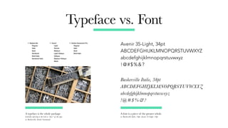
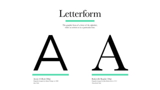
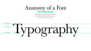
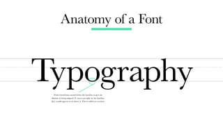
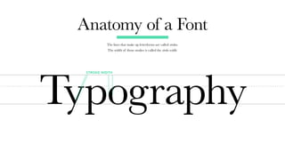
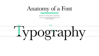
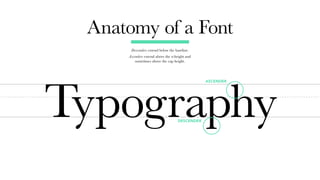
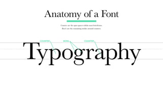
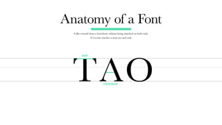
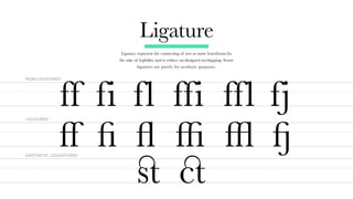
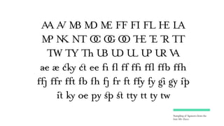
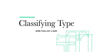
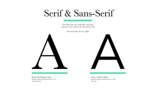
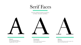
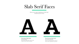
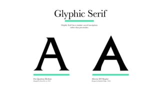
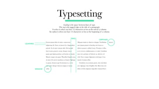
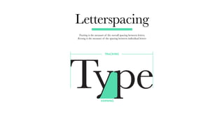
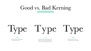
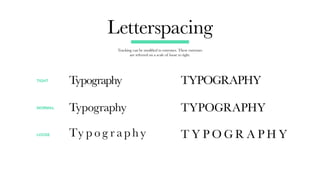
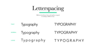
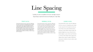
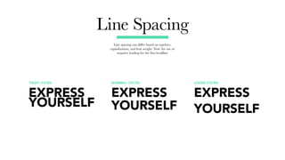
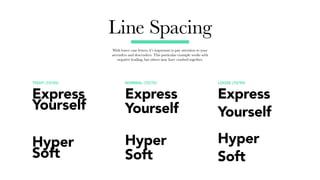


The document is a comprehensive guide on typography, covering its history, terminology, and various classifications of typefaces and fonts. It explains important concepts like the difference between typeface and font, the anatomy of letters, and principles of typesetting, including line spacing and letter spacing. The document also includes anecdotes and insights from renowned type designers, emphasizing the importance of understanding type design in visual communication.


![[JavaScript Library] - Simple jQuery](https://cdn.slidesharecdn.com/ss_thumbnails/random-130218085016-phpapp02-thumbnail.jpg?width=640&height=640&fit=bounds)


![Tell a Story! [Be the Batman]](https://cdn.slidesharecdn.com/ss_thumbnails/nextbigpresentation-151230131358-thumbnail.jpg?width=640&height=640&fit=bounds)