
Recommended
More Related Content
What's hot
Viewers also liked
Viewers also liked (19)
Similar to Sans-Serif Vs. Serif Fonts - Presentation by Feroza Ali
Similar to Sans-Serif Vs. Serif Fonts - Presentation by Feroza Ali (20)
More from Hamad Pervaiz
Recently uploaded
Recently uploaded (20)
Sans-Serif Vs. Serif Fonts - Presentation by Feroza Ali
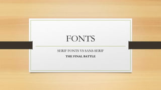
- 1. FONTS SERIF FONTS VS SANS-SERIF THE FINAL BATTLE
- 2. Some text about the fonts • Serif and sans-serif are two different type of fonts. Although these fonts are not much different. The only difference is the ‘line’. The text you’re reading is serif. • While, right now, the text you’re reading is sans-serif. You see, it’s pretty informal and doesn’t have corner lines to make it look fancy.
- 3. How did they get their names? • Well, that’s the main thing. How did they get their names? As per Wikipedia, Sans and Serif are two different words, originated from two different languages, Dutch and French. • Sans means ‘without’ while Serif means ‘line’. That’s why we’re discussing lines a lot.
- 4. Where they are used. • Well, here’s a lil’ infographic to explain what they feel like. Image from: noupe.com
- 5. Serif Fonts Uses • Serif fonts are usually used in text books because they are easier to read since they make individual letters easier to recognize for humans. Using sans-serif in web blogs won’t be a good idea because human minds take a bit’ longer to recognize words written in sans-serif while it works perfect with Serif fonts. • Times Roman, Courier, New Century Schoolbook, and Palatino are some examples of Serif fonts.
- 6. Sans-serif font uses • Sans-serif fonts are usually used to write headings of articles and other stuff. For instance, say a magazine. Usually, sans-serif is used on the front page. Since they are big, they are pleasant to eyes. • Helvetica, Avant Garde, Arial, and Geneva are examples of Sans-serif font. • According to a studies, sans-serif fonts are difficult to read.
- 7. That’s it! • Presentation by: Feroza Ali, A1, Beaconhouse College, Lahore.