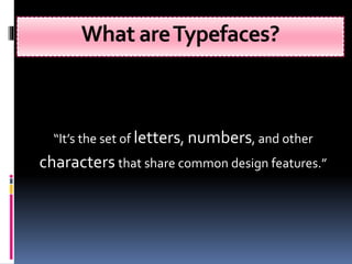
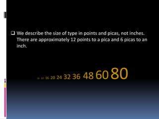
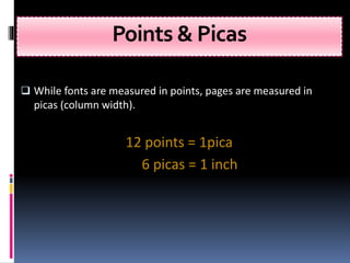
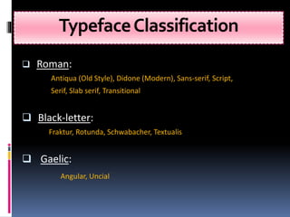
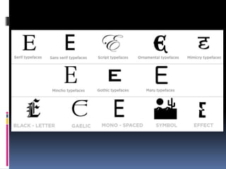
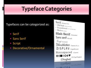
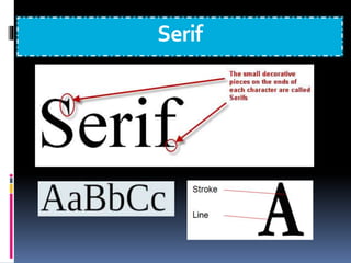
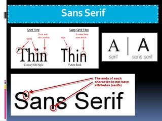
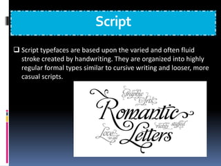
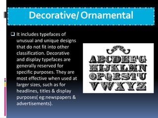
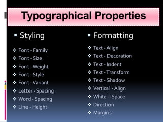
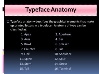
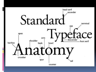
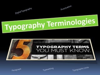
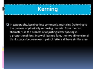
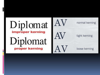
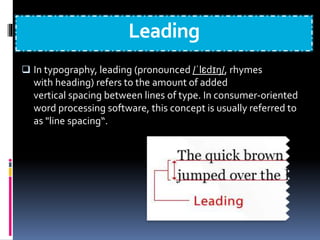
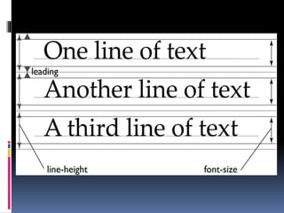
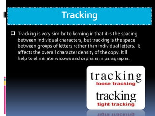
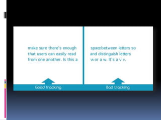
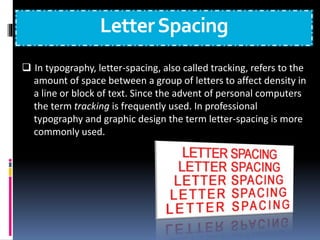
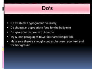
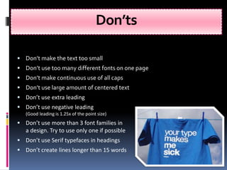
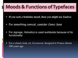
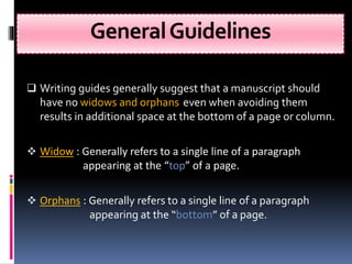
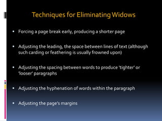
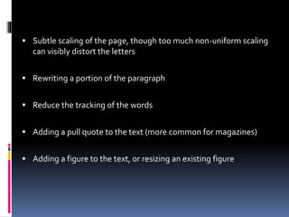
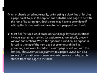
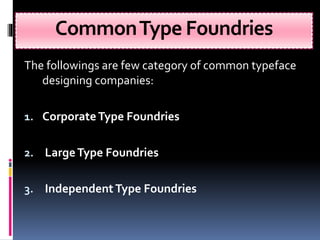
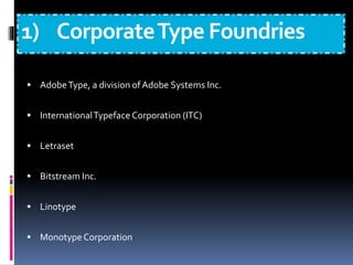
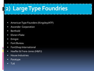
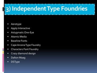
Presented By:
ADMEC Multimedia Institute
www.admecindia.co.in
- An Overview
Introduction
 Here we are giving brief
overview on typography, its
significance, typefaces,
categories & classification of
typefaces, typeface
anatomy and basic
typography terminology….
 Also you will read about
some practical guidelines
about the use of typefaces
What isTypography?
“The art and skill of designing
communication by means of the printed
words.”
“Typography is means by which words,
conceived in someone’s mind and then
put down on paper are made
available to the world at large."
Significance
 Typography forms integral part of a good graphic design.
 Largely used to create moods.
 Crucial in the design of advertisements, magazines, newspaper
and corporate identities.
 Different fonts suggest different context & ideas.
 Some typefaces even have special functions.
What areTypefaces?
“It’s the set of letters, numbers, and other
characters that share common design features.”
 We describe the size of type in points and picas, not inches.
There are approximately 12 points to a pica and 6 picas to an
inch.
10 12 16 20 24 32 36 48 6080
Points & Picas
 While fonts are measured in points, pages are measured in
picas (column width).
12 points = 1pica
6 picas = 1 inch
TypefaceClassification
 Roman:
Antiqua (Old Style), Didone (Modern), Sans-serif, Script,
Serif, Slab serif, Transitional
 Black-letter:
Fraktur, Rotunda, Schwabacher, Textualis
 Gaelic:
Angular, Uncial
TypefaceCategories
Typefaces can be categorized as:
 Serif
 Sans Serif
 Script
 Decorative/Ornamental
Serif
SansSerif
Script
 Script typefaces are based upon the varied and often fluid
stroke created by handwriting. They are organized into highly
regular formal types similar to cursive writing and looser, more
casual scripts.
Decorative/Ornamental
 It includes typefaces of
unusual and unique designs
that do not fit into other
classification. Decorative
and display typefaces are
generally reserved for
specific purposes. They are
most effective when used at
larger sizes, such as for
headlines, titles & display
purposes( eg:newspapers &
advertisements).
Typographical Properties
 Styling  Formatting
 Font - Family
 Font - Size
 Font -Weight
 Font - Style
 Font -Variant
 Letter - Spacing
 Word - Spacing
 Line - Height
 Text - Align
 Text - Decoration
 Text - Indent
 Text -Transform
 Text - Shadow
 Vertical - Align
 White – Space
 Direction
 Margins
TypefaceAnatomy
 Typeface anatomy describes the graphical elements that make
up printed letters in a typeface. Anatomy of type can be
classified as:
1. Apex 2. Aperture
3. Arm 4. Bar
5. Bowl 6. Bracket
7. Counter 8. Ear
9. Link 10. Shoulder
11. Spine 12. Spur
13. Stem 14. Stress
15. Tail 16. Terminal
Paragraph
 A paragraph is a self-contained unit of a discourse in writing
dealing with a particular point or idea. A paragraph comprises
of one or more sentences. Common terms used are:
 Alignment
 Justification
 Leading
 River
 Sentence spacing
 Widows and orphans
Punctuation
 Punctuation is the use of spacing, conventional signs, &
certain typographical devices as aids to the understanding
and correct reading, both silently n aloud, of handwritten &
printed texts. Common terms used are:
 Hanging punctuation
 Hyphenation
 Quotation mark
 Prime mark
 Dashes
DigitalTypography
 Digital typography or desktop publishing refers to the creation of
documents using page layout skills. DTP software can generate
layouts & produce typographic quality text and images
comparable to traditional typography & printing.Terms used:
 Character encoding
 Font formats
 Hinting
 Rasterization
 Typesetting software
 List of typographic features
 Web typography
Typesetting
 Typesetting is the composition of text by means of arranging
physical types or digital equivalents.
 Type design
 Type foundry
 Calligraphy
 Phototypesetting
 Letterpress
 Typeface
 Font
 Punchcutting
 Pangram
TypographicUnits
 Typographic units are the units of measurement used in
typography or typesetting.Common terms used are:
 Agate
 Cicero
 Em
 En
 Figure space
 Measure
 Paren space
 Pica
 Point
 Thin space
TypeTraits
Kerning: space between characters
Leading: space between lines of type
Tracking: space between words + characters
(how a line of text is spaced out at the PARAGRAPH level)
Kerning
 In typography, kerning- less commonly, mortising (referring to
the process of physically removing material from the cast
character)- is the process of adjusting letter spacing in
a proportional font. In a well-kerned font, the two-dimensional
blank spaces between each pair of letters all have similar area.
Leading
 In typography, leading (pronounced /ˈlɛdɪŋ/, rhymes
with heading) refers to the amount of added
vertical spacing between lines of type. In consumer-oriented
word processing software, this concept is usually referred to
as "line spacing“.
Tracking
 Tracking is very similar to kerning in that it is the spacing
between individual characters, but tracking is the space
between groups of letters rather than individual letters. It
affects the overall character density of the copy. It’ll
help to eliminate widows and orphans in paragraphs.
LetterSpacing
 In typography, letter-spacing, also called tracking, refers to the
amount of space between a group of letters to affect density in
a line or block of text. Since the advent of personal computers
the term tracking is frequently used. In professional
typography and graphic design the term letter-spacing is more
commonly used.
Do’s
 Do establish a typographic hierarchy
 Do choose an appropriate font for the body text
 Do give your text room to breathe
 Try & limit paragraphs to 40-60 characters per line
 Make sure there is enough contrast between your text and
the background
Don’ts
 Don’t make the text too small
 Don’t use too many different fonts on one page
 Don’t make continuous use of all caps
 Don’t use large amount of centered text
 Don’t use extra leading
 Don’t use negative leading
(Good leading is 1.25x of the point size)
 Don’t use more than 3 font families in
a design. Try to use only one if possible
 Don’t use Serif typefaces in headings
 Don’t create lines longer than 15 words
Moods & Functions ofTypefaces
 If you seek a feminine mood, then you might use Isadora
 For something comical, consider Comic Sans
 For signage, Helvetica is used worldwide because of its
functionality
 For a classic look, try Garamond, designed in France almost
500 years ago
GeneralGuidelines
 Writing guides generally suggest that a manuscript should
have no widows and orphans even when avoiding them
results in additional space at the bottom of a page or column.
 Widow : Generally refers to a single line of a paragraph
appearing at the “top” of a page.
 Orphans : Generally refers to a single line of a paragraph
appearing at the “bottom” of a page.
Techniques for EliminatingWidows
 Forcing a page break early, producing a shorter page
 Adjusting the leading, the space between lines of text (although
such carding or feathering is usually frowned upon)
 Adjusting the spacing between words to produce 'tighter' or
'looser' paragraphs
 Adjusting the hyphenation of words within the paragraph
 Adjusting the page’s margins
 Subtle scaling of the page, though too much non-uniform scaling
can visibly distort the letters
 Rewriting a portion of the paragraph
 Reduce the tracking of the words
 Adding a pull quote to the text (more common for magazines)
 Adding a figure to the text, or resizing an existing figure
 An orphan is cured more easily, by inserting a blank line or forcing
a page break to push the orphan line onto the next page to be with
the rest of its paragraph. Such a cure may have to be undone if
editing the text repositions the automatic page/column break.
 Most full-featured word processors and page layout applications
include a paragraph setting (or option) to automatically prevent
widows and orphans.When the option is turned on, an orphan is
forced to the top of the next page or column; and the line
preceding a widow is forced to the next page or column with the
last line.This automatic adjustment to a page's layout can be a
source of frustration for someone who is unaware of why text is
shifted from one page to the next.
CommonType Foundries
The followings are few category of common typeface
designing companies:
1. CorporateType Foundries
2. LargeType Foundries
3. Independent Type Foundries
1) CorporateType Foundries
1
 AdobeType, a division of Adobe Systems Inc.
 InternationalTypeface Corporation (ITC)
)
 Letraset
 Bitstream Inc.
 Linotype
 MonotypeCorporation
2) LargeType Foundries
2
 AmericanType Founders (Kingsley/ATF)
 Ascender Corporation
 Berthold
 Elsner+Flake
 Emigre
 Font Bureau
 FontShop International
 Hoefler & Frere-Jones (H&FJ)
 House Industries
 Paratype
 T26
3) IndependentType Foundries
 Aerotype
 Apply Interactive
 Astygmatic One-Eye
 Atomic Media
 Baseline Fonts
 CapeArconaType Foundry
 Characters Font Foundry
 Crazy diamond design
 Dalton Maag
 DSType
 Emtype Foundry
 FelicianoType Foundry
 Fontosaurus
 Fountain
 Galapagos Design Group
 Greater AlbionTypefounders
 JY&A Fonts
 MVB
 TheType Fetish
 Thirstype/Village
ADMEC Multimedia Institute
For more info you can visit
www.admecindia.co.in
For course related enquiry, ring us at:
9811-81-81-22, 011-3130-5055, 011-3203-5055
Compiled By: Admec Students and Staff
Can send feedback at: @admecinstitute

Tips and Tricks how to use Typography

  • 1.
    Presented By: ADMEC MultimediaInstitute www.admecindia.co.in - An Overview
  • 2.
    Introduction  Here weare giving brief overview on typography, its significance, typefaces, categories & classification of typefaces, typeface anatomy and basic typography terminology….  Also you will read about some practical guidelines about the use of typefaces
  • 3.
    What isTypography? “The artand skill of designing communication by means of the printed words.”
  • 4.
    “Typography is meansby which words, conceived in someone’s mind and then put down on paper are made available to the world at large."
  • 5.
    Significance  Typography formsintegral part of a good graphic design.  Largely used to create moods.  Crucial in the design of advertisements, magazines, newspaper and corporate identities.  Different fonts suggest different context & ideas.  Some typefaces even have special functions.
  • 6.
    What areTypefaces? “It’s theset of letters, numbers, and other characters that share common design features.”
  • 7.
     We describethe size of type in points and picas, not inches. There are approximately 12 points to a pica and 6 picas to an inch. 10 12 16 20 24 32 36 48 6080
  • 8.
    Points & Picas While fonts are measured in points, pages are measured in picas (column width). 12 points = 1pica 6 picas = 1 inch
  • 9.
    TypefaceClassification  Roman: Antiqua (OldStyle), Didone (Modern), Sans-serif, Script, Serif, Slab serif, Transitional  Black-letter: Fraktur, Rotunda, Schwabacher, Textualis  Gaelic: Angular, Uncial
  • 11.
    TypefaceCategories Typefaces can becategorized as:  Serif  Sans Serif  Script  Decorative/Ornamental
  • 12.
  • 13.
  • 14.
    Script  Script typefacesare based upon the varied and often fluid stroke created by handwriting. They are organized into highly regular formal types similar to cursive writing and looser, more casual scripts.
  • 15.
    Decorative/Ornamental  It includestypefaces of unusual and unique designs that do not fit into other classification. Decorative and display typefaces are generally reserved for specific purposes. They are most effective when used at larger sizes, such as for headlines, titles & display purposes( eg:newspapers & advertisements).
  • 16.
    Typographical Properties  Styling Formatting  Font - Family  Font - Size  Font -Weight  Font - Style  Font -Variant  Letter - Spacing  Word - Spacing  Line - Height  Text - Align  Text - Decoration  Text - Indent  Text -Transform  Text - Shadow  Vertical - Align  White – Space  Direction  Margins
  • 17.
    TypefaceAnatomy  Typeface anatomydescribes the graphical elements that make up printed letters in a typeface. Anatomy of type can be classified as: 1. Apex 2. Aperture 3. Arm 4. Bar 5. Bowl 6. Bracket 7. Counter 8. Ear 9. Link 10. Shoulder 11. Spine 12. Spur 13. Stem 14. Stress 15. Tail 16. Terminal
  • 20.
    Paragraph  A paragraphis a self-contained unit of a discourse in writing dealing with a particular point or idea. A paragraph comprises of one or more sentences. Common terms used are:  Alignment  Justification  Leading  River  Sentence spacing  Widows and orphans
  • 21.
    Punctuation  Punctuation isthe use of spacing, conventional signs, & certain typographical devices as aids to the understanding and correct reading, both silently n aloud, of handwritten & printed texts. Common terms used are:  Hanging punctuation  Hyphenation  Quotation mark  Prime mark  Dashes
  • 22.
    DigitalTypography  Digital typographyor desktop publishing refers to the creation of documents using page layout skills. DTP software can generate layouts & produce typographic quality text and images comparable to traditional typography & printing.Terms used:  Character encoding  Font formats  Hinting  Rasterization  Typesetting software  List of typographic features  Web typography
  • 23.
    Typesetting  Typesetting isthe composition of text by means of arranging physical types or digital equivalents.  Type design  Type foundry  Calligraphy  Phototypesetting  Letterpress  Typeface  Font  Punchcutting  Pangram
  • 24.
    TypographicUnits  Typographic unitsare the units of measurement used in typography or typesetting.Common terms used are:  Agate  Cicero  Em  En  Figure space  Measure  Paren space  Pica  Point  Thin space
  • 25.
    TypeTraits Kerning: space betweencharacters Leading: space between lines of type Tracking: space between words + characters (how a line of text is spaced out at the PARAGRAPH level)
  • 26.
    Kerning  In typography,kerning- less commonly, mortising (referring to the process of physically removing material from the cast character)- is the process of adjusting letter spacing in a proportional font. In a well-kerned font, the two-dimensional blank spaces between each pair of letters all have similar area.
  • 28.
    Leading  In typography,leading (pronounced /ˈlɛdɪŋ/, rhymes with heading) refers to the amount of added vertical spacing between lines of type. In consumer-oriented word processing software, this concept is usually referred to as "line spacing“.
  • 30.
    Tracking  Tracking isvery similar to kerning in that it is the spacing between individual characters, but tracking is the space between groups of letters rather than individual letters. It affects the overall character density of the copy. It’ll help to eliminate widows and orphans in paragraphs.
  • 32.
    LetterSpacing  In typography,letter-spacing, also called tracking, refers to the amount of space between a group of letters to affect density in a line or block of text. Since the advent of personal computers the term tracking is frequently used. In professional typography and graphic design the term letter-spacing is more commonly used.
  • 35.
    Do’s  Do establisha typographic hierarchy  Do choose an appropriate font for the body text  Do give your text room to breathe  Try & limit paragraphs to 40-60 characters per line  Make sure there is enough contrast between your text and the background
  • 36.
    Don’ts  Don’t makethe text too small  Don’t use too many different fonts on one page  Don’t make continuous use of all caps  Don’t use large amount of centered text  Don’t use extra leading  Don’t use negative leading (Good leading is 1.25x of the point size)  Don’t use more than 3 font families in a design. Try to use only one if possible  Don’t use Serif typefaces in headings  Don’t create lines longer than 15 words
  • 37.
    Moods & FunctionsofTypefaces  If you seek a feminine mood, then you might use Isadora  For something comical, consider Comic Sans  For signage, Helvetica is used worldwide because of its functionality  For a classic look, try Garamond, designed in France almost 500 years ago
  • 38.
    GeneralGuidelines  Writing guidesgenerally suggest that a manuscript should have no widows and orphans even when avoiding them results in additional space at the bottom of a page or column.  Widow : Generally refers to a single line of a paragraph appearing at the “top” of a page.  Orphans : Generally refers to a single line of a paragraph appearing at the “bottom” of a page.
  • 39.
    Techniques for EliminatingWidows Forcing a page break early, producing a shorter page  Adjusting the leading, the space between lines of text (although such carding or feathering is usually frowned upon)  Adjusting the spacing between words to produce 'tighter' or 'looser' paragraphs  Adjusting the hyphenation of words within the paragraph  Adjusting the page’s margins
  • 40.
     Subtle scalingof the page, though too much non-uniform scaling can visibly distort the letters  Rewriting a portion of the paragraph  Reduce the tracking of the words  Adding a pull quote to the text (more common for magazines)  Adding a figure to the text, or resizing an existing figure
  • 41.
     An orphanis cured more easily, by inserting a blank line or forcing a page break to push the orphan line onto the next page to be with the rest of its paragraph. Such a cure may have to be undone if editing the text repositions the automatic page/column break.  Most full-featured word processors and page layout applications include a paragraph setting (or option) to automatically prevent widows and orphans.When the option is turned on, an orphan is forced to the top of the next page or column; and the line preceding a widow is forced to the next page or column with the last line.This automatic adjustment to a page's layout can be a source of frustration for someone who is unaware of why text is shifted from one page to the next.
  • 42.
    CommonType Foundries The followingsare few category of common typeface designing companies: 1. CorporateType Foundries 2. LargeType Foundries 3. Independent Type Foundries
  • 43.
    1) CorporateType Foundries 1 AdobeType, a division of Adobe Systems Inc.  InternationalTypeface Corporation (ITC) )  Letraset  Bitstream Inc.  Linotype  MonotypeCorporation
  • 44.
    2) LargeType Foundries 2 AmericanType Founders (Kingsley/ATF)  Ascender Corporation  Berthold  Elsner+Flake  Emigre  Font Bureau  FontShop International  Hoefler & Frere-Jones (H&FJ)  House Industries  Paratype  T26
  • 45.
    3) IndependentType Foundries Aerotype  Apply Interactive  Astygmatic One-Eye  Atomic Media  Baseline Fonts  CapeArconaType Foundry  Characters Font Foundry  Crazy diamond design  Dalton Maag  DSType
  • 46.
     Emtype Foundry FelicianoType Foundry  Fontosaurus  Fountain  Galapagos Design Group  Greater AlbionTypefounders  JY&A Fonts  MVB  TheType Fetish  Thirstype/Village
  • 47.
    ADMEC Multimedia Institute Formore info you can visit www.admecindia.co.in For course related enquiry, ring us at: 9811-81-81-22, 011-3130-5055, 011-3203-5055 Compiled By: Admec Students and Staff Can send feedback at: @admecinstitute